

Visual Consistency in Ecommerce UX: The Right Photos Turn “No Difference” Into a 13% Increase in Proceeding to Checkout [Case Study]
A lot of AB testing and conversion rate optimization discussion is focused on adding or removing elements from the site. For example:
- Does free shipping messaging help or hurt? (Our case study on this)
- Should we add quick links on the homepage? (Our case study on this)
- Does an upsell after adding to cart help or hurt? (Our case study on this)
- Does a sticky add to cart element help or hurt? (Our case study on this)
When running and writing about those tests, what is often given secondary importance is the visual aesthetic of the new layout or designs being tested.
Even the way ecommerce teams, our clients, talk about these tests is mostly about the the existence of these elements or not: “So should we keep the carousel or not?” They don’t place as much value to the detail of the design of that element once it’s added.
What I mean is that:
- The font, placement, size, and colors of your free shipping messaging could affect whether it increases conversion rate or not.
- The photography, layout, and design details of how you propose the upsell could affect whether it increases conversion rate or not.
- Same for sticky add to cart.
These details are tedious to test. If you design something you think is good and the test shows no difference, what do you do? How do you even know if it’s that the whole hypothesis is proven false (e.g. maybe upsells don’t increase AOV for this site), or it’s just a design detail which, if you fixed, would change the outcome?
You don’t know. That’s the hard part.
And practically speaking, most AB test programs typically have a queue of other tests the team (and executives) are itching to launch. So you don’t have the luxury of trying 5 different design concepts for one hypothesis (Aside: We don’t use hypotheses, we ask questions instead).
But that doesn’t mean you shouldn’t recognize and keep in mind that the details of designs can affect the outcome of tests, sometimes heavily.
An increasing number of ecommerce AB tests we are running these days has led me to be reminded of this. And here I’ll profile one particularly telling example.
At the bottom of each category page (or “product listing page”) for an electronics ecommerce site, we wanted to test putting links to the other categories. There was one extremely dominant category on this site and we wanted to expose customers to complimentary products in other categories.
We had two design concepts drawn up to test whether these category links would increase sales of other products or affect conversion rate in any way. Functionally, they were identical, but one used product photos and the other used lifestyle photos. Here are some mockups using a camping site as an example (not our client).
Adding a “Discover More” section using product only photos:

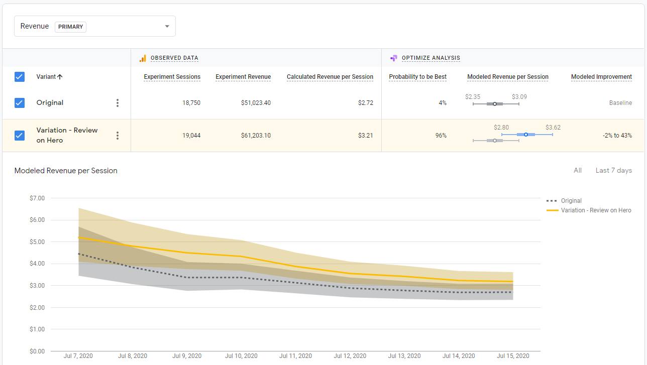
Adding the same section using lifestyle photos:

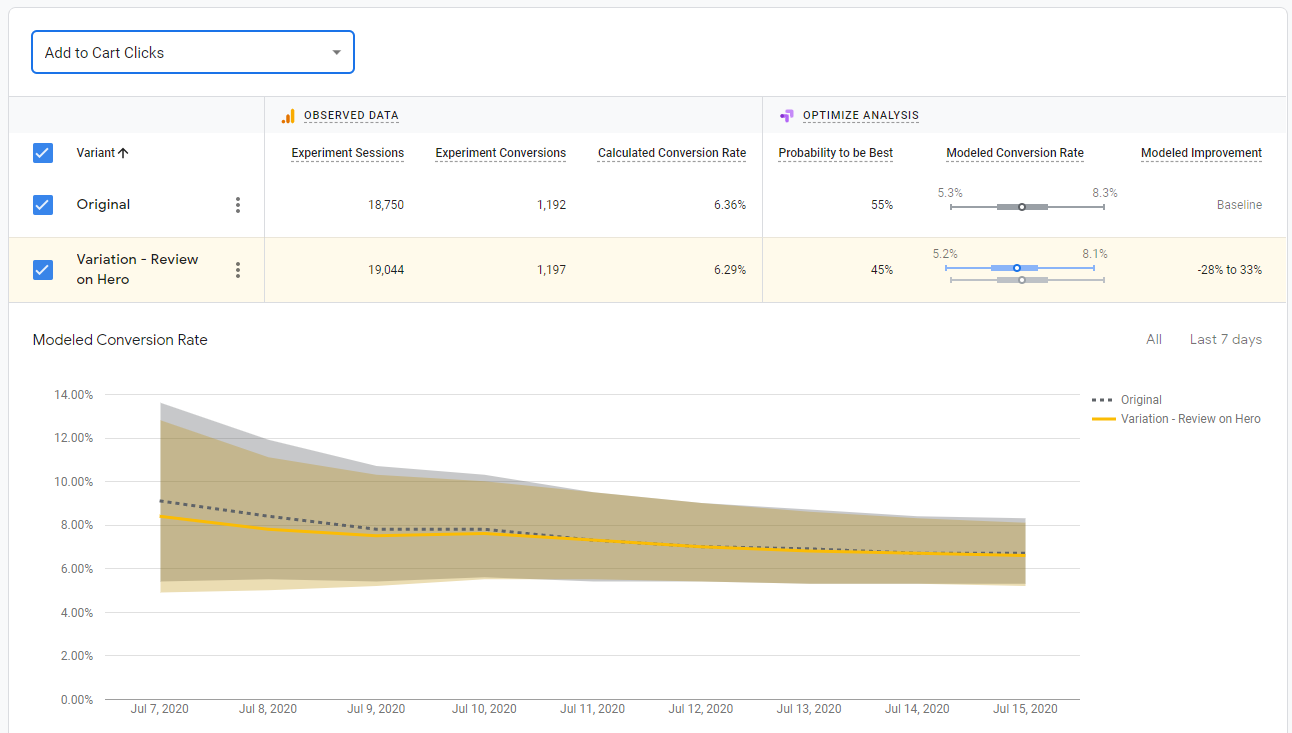
Here is the key result: the product only photos increased proceed to checkouts by 13.5% with 97% statistical significance and increased transactions by 23% with 89% statistical significance while the lifestyle photos showed no statistically significant difference in any key metric. Specifically, proceed to checkouts and transactions did not get higher than 50% statistical significance in the lifestyle photo version — in other words, not even close to statistical significance.
(The test was run for 3 weeks with over 550 proceed to checkouts per variation over 20,000 sessions per variation).
What’s interesting is that both our team and the client’s design team preferred the lifestyle photos! We felt the existing pages were too full of “product on grey background” images and the lifestyle photos added interest and color to the page. We thought it helped the overall brand look and feel.
But if we had run only the lifestyle photos, we would have concluded this test made no difference and moved on. Instead we saw a sizable increase in visitors making it to the checkout page and an non-negligible increase in transactions (albeit with only 89% statistical significance) in the product only variation. So we can see that this idea will likely help conversion rate and sales on the site and is worth either implementing or at the very least exploring further.
(Note: A 13% increase in customers making it to checkout is substantial, and it’s very common to see a statistically significant increase in checkout pageviews before you see the same increase in actual transactions, so a 97% stat sig increase in proceed to checkout along with an 89% stat sig increase in transactions means you are on to something).
The difference was just a change in photos. This is something many teams would not test. We almost didn’t test it. But this difference mattered here. Our hypothesis of why is that the product photo version was visually consistent with the rest of the page. Although the lifestyle photo version looked more visually interesting, perhaps people were more likely to dismiss that section as ads (banner blindness) or just not give it the same attention as browsing the products above because it didn’t look like the products above.
Either way, the lessons are clear:
- When you’re testing “Does this thing help or hurt?” don’t forget that the details in how you design “this thing” may affect the outcome of the test.
- If you have the luxury of being able to test multiple variants of a concept, do it.
- If you can only test one variant, design multiple variants first and discuss as a group the pros and cons of each design, so you can hopefully settle on the version that gives you the best chance.
- When discussing the designs, don’t forget about visual consistency on a page. It’s not just about what you think looks the most clicks for that element, but also about how it fits with the rest of the page. Be careful about throwing in a design that is strikingly different form everything else. It doesn’t mean you never should do that, sometimes you want things to stand out, but think carefully about whether a visual inconsistency is intentional and will have your desired effect or not.
Adding Support Icon to Navbar Increased Conversion Rate 7%
We just added 11 new tests to our ecommerce A/B test database and I wanted to highlight one of them in this article.
It’s become very common to have a floating support widget on the bottom right of ecommerce sites. For example like this on Casper.com:
But in a recent A/B test, we tested having a support icon in the navbar instead of the bottom right corner, to see if it would get more usage and be more prominent. Similar to what Road Runner Sports does here (“Contact Us”):
In the test for our client, the icon in the nav simply opened up the support chat widget, just like the floating icon on the bottom right. In our AB test 1% of all visitors clicked on the support icon in the nav and amazingly, it increased the overall site conversion rate by 7% with 96% statistical significance.
Mind you this is a 7% increase in transactions. Many CRO teams run AB tests like this and measure a winner via clicks on the element they’re testing, or add to cart clicks or some other non-transaction, non-revenue metric. It’s easy to make clicks on some element go up. It’s harder to get more people to buy from your store.
Don’t Overlook the UI of Support
“Support” is one of the 9 buckets in our Purpose Framework and is often overlooked. Brands spending time testing the color of add to cart buttons or testing other small UI changes over and over again should consider testing whether their customer support team can help increase conversion rate with tests like these.
It can be executed in different ways and doesn’t have to be how we did it (an icon in the navbar that opens up a chat widget). Tuft and Needle, a competitor of Casper’s mentioned above has an interesting take where a support phone number is in the top bar, while a chat widget is still on the bottom right:
And Zappos, famous for their customer service has the words “Customer Service” which brings up a dropdown and an “Available 24/7” 1-800 number listed prominently in the top left of their site:
But other brands make it really hard to reach support. Many seem to outright discourage reaching out to support; you have to hunt through footer links to find a way to send an email.
Others are more well-meaning but their UX does not help them. Take BottegaVerde.com, for example. Can you find the help icon on this busy cart page?
It looks like they are trying to make it prominent by listing it over the order summary but it’s hard to find it with all that’s going on in the cart page.
Yes, customer support has a cost, but weighing whether a 5% or 10% increase in sales by increasing customers reaching out to support makes sense from an ROI standpoint would be time well spent for most ecommerce brands.
Want more?
- Join our email newsletter to get our latest articles and AB tests
- Our foundational Purpose Framework for Ecommerce CRO
- Why we base AB tests on Questions Instead of Hypotheses
The Purpose Framework for Ecommerce Conversion Rate Optimization
Most ecommerce companies who do A/B testing don’t actually have a CRO strategy. They just run one off tests, one after another, based on the problem of the day:
- Our PDP photos aren’t as good as competitors, let’s test it!
- The CEO likes our competitor’s checkout process, let’s test that!
- The personalization platform’s sales rep says we need to move their container up the page, let’s try that!
If a test wins, you slap high fives and move on to the next one. If it loses, you shrug and move on to the next one.
This is not a strategy. This is random one-off testing.
In fact, we have a name for it. We call it “tunnel vision testing”.
The problem with tunnel vision testing is that there is little to no accumulated learning. This month you think of 4 things to test. Next month you think of another 4 things to test. A year from now, you think 4 more things to test.
But none of these tests are connected.
If someone asks you “What works in CRO for your site?” People who do tunnel vision testing respond by listing off a few tests, like:
“Well this filters tests worked. And then this test on checkout worked.”
They can’t connect the dots between tests and paint a larger picture of what’s going on in their site.
A strategy, on the other hand, means you view the conversion rate optimization (CRO) of your site holistically.
To do this, you need a framework that ties every test together into a larger story about what does and (equally important) doesn’t compel your customers to act, to buy, to convert.
After running hundreds of A/B tests on ecommerce sites over the last 4 years, we’ve developed such a framework. We call it the Purpose Framework for ecommerce CRO because it categorizes every A/B test on an ecommerce site as having one of 8 Purposes.
These purposes connect every test together.
Like brush strokes on a painting, they work together to form a picture of what moves the needle and what doesn’t; what your customers care about and what they don’t; what affects conversion rate and what doesn’t.
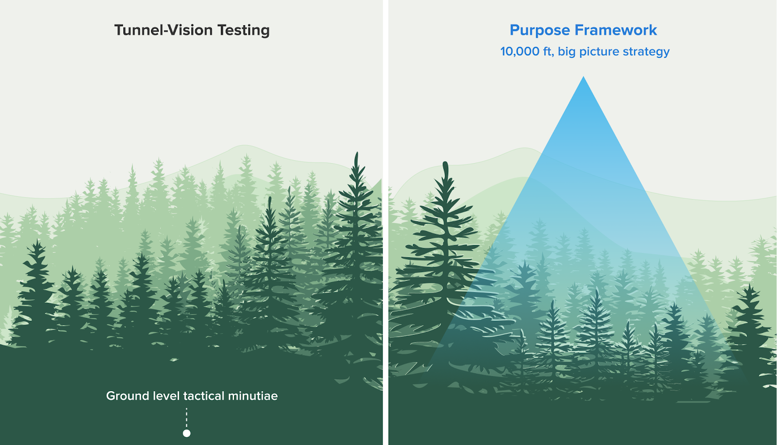
So when everyone else is only focused on the day-to-day, test-by-test minutiae (the trees) at the ground level, you have a system to see the 10,000 ft view at the strategy level (the forest).
Doing ecommerce CRO like this leads to a much richer understanding of what moves the needle, so we can focus on what matters and stop wasting time on what doesn’t.
This article will walk through our Purpose Framework in detail and show it applied on real client case studies. But first let’s dig further into why Tunnel-Vision Testing is so common and the negative consequences it leads to.
Note: You can see all of the A/B tests we’ve ever run on ecommerce sites , organized by Purpose in our Growth Rock live database of A/B tests.
If you’re interested in working with us to help your ecommerce brand increase online conversion rate, you can learn more and reach out here.
Tunnel-Vision Testing: How Most Companies Do CRO
From what we’ve seen, every ecommerce A/B test has a story for why it’s being run.
- Someone on merchandising wanted to test this new product video
- Blogs say ecommerce websites need to focus on cart abandonment, so let’s run tests on the cart page
- Marketing ran a heatmap on the checkout page and now wants to test it
- The CEO says Amazon does it this way, so she wants to test it on our site too
Each of these tests may have a legitimate reason it’s being run, that’s why tunnel-vision testing is so prevalent. That’s not the problem. The problem is that the testing is done in an unconnected, one off way: what you learn from some copywriting test is thought to be unrelated to the product video, the CEO’s Amazon copycat test is unrelated to marketing’s checkout page test, and so on.
Note that this is a problem even if “conversion research” or “analytics” was used to motivate a test, because often those research activities are done in the same one-off, ad hoc way as A/B tests. Someone happened to be looking in Google Analytics, and noticed the bounce rate on a page was high and now wants to add some social proof, testimonials, or move the CTA around.
That is still ad hoc, even though it involved analytics.
As a general rule: If you’re not connecting an A/B test to the big-picture CRO strategy of the site’s entire user experience, you’re still just doing tunnel vision testing.
When you do this, you can spend years testing and have barely improved your understanding of what really moves the needle for your customers and conversion rate. You know a lot about individual elements (“We tested that!”), but little about the big picture.
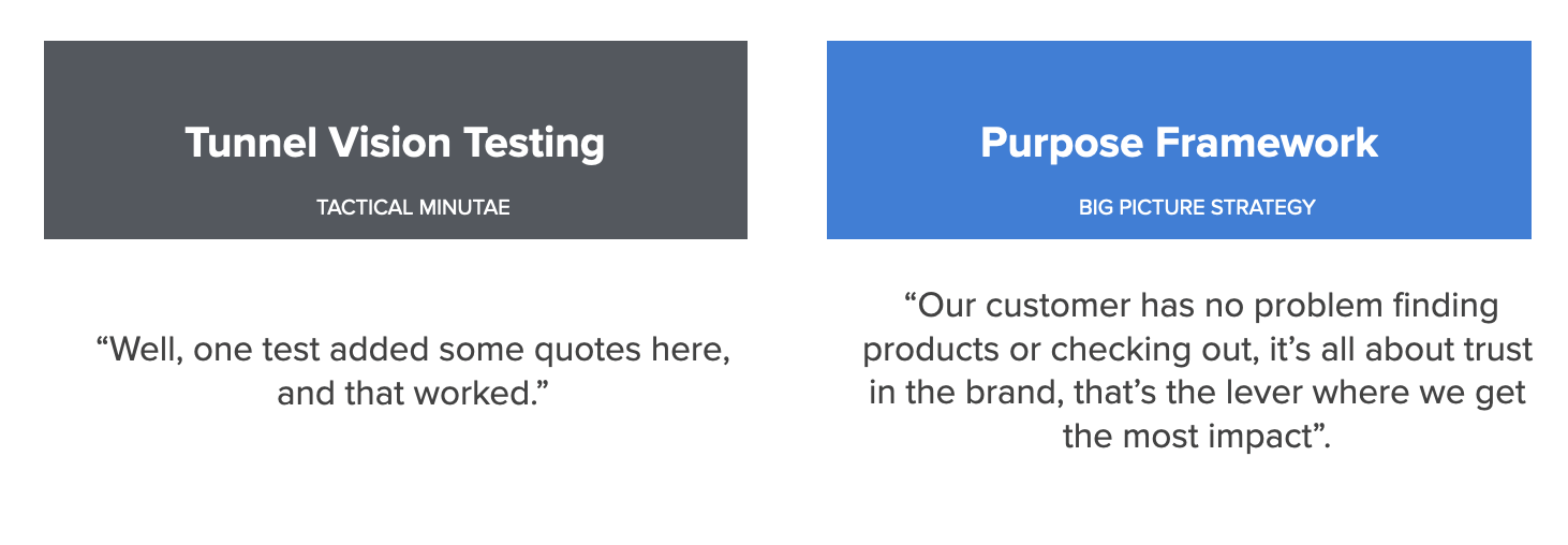
Litmus Test: Answering “What Conversion Optimization Have You Already Done?”
When we ask ecommerce managers what they’ve already done in conversion optimization, almost all of them just rattle of a few tests that come to mind:
“Well, one test made entering a credit card easier, and that worked.”
“Another added new product images, and that also worked.”
They don’t say things like:
“Our customer has no problem finding products or checking out, it’s all about trust in the brand, that’s the lever where we get the most impact”.
That is strategy-level knowledge!
See the difference?
Think about what’s required to have the strategy-level of understanding of your ecommerce store. You need to know how a series of tests, together, create a larger story about your customers and what matters to them.
How do you get that level of understanding? Where you can say “this matters”, and just as important, “these other things don’t matter”?
Our Purposes Framework for Ecommerce Conversion Rate Optimization
Years ago we identified the problem (tunnel vision testing) but had yet to find a solution. We tried various solutions (like our old framework Usability vs. Desirability) but they weren’t enough.
The breakthrough came when we realized that all ecommerce A/B tests we’ve ever done (Here’s a live database of all of them) have one of 8 purposes:
- Brand – Increase trust, credibility, or appeal of the overall brand.
- Discovery – Make it easier to find or discover the right product
- Product Appeal – Make individual products more appealing with messaging, positioning, or imagery.
- Product Detail – Highlight or specify details of products (like ingredients in a lotion or specs of a car part) that help customers choose
- Price & Value – Make the price to value ratio better
- Usability – Reduce UX friction (e.g. reduce form fields)
- Quantity – Increase average order value or cart size
- Scarcity – Give a sense of urgency by highlighting limited time or quantity to purchase
For example, here are the purposes behind a few A/B test case studies we’ve published:
- Review Star Rating on Product Page – Product Appeal and Brand as the star rating makes both a specific product and the overall brand more appealing.
- Free Shipping Messaging – This is Price & Value.
- Sticky Add to Cart – This is pure Usability as it simply changes some UX on the product page
- Moving the Size Guide Link – This is Product Detail as size is a detail that can affect purchase decisions for apparel.
Clarity around these eight purposes developed slowly in the course of our work. First we started calling some tests “Brand” tests, others “Discovery” and others “Product”. Those were the only three buckets we had.
Then, we tied A/B tests to the page on the site where the test ran (e.g. Listing page tests were “Discovery”) but realized later that page is less relevant. A test on the cart that shows “You may also like” products is about Discovery just the same as tests on the listing page.
Slowly we added more and more purposes until we got to those eight. They seem to sufficiently capture all tests we run for ecommerce clients without getting overly specific.
As this picture got clearer, we noticed the power of these purposes: they could tie tests together that were done over months or years of work to give us a bigger picture understanding of what customers want.
For example, we could get “aha” moments like these:
- “Wow, tests about site search, filters, or finding products in some way are winning often” (Discovery)
- “Interesting, for this client, free shipping, discounts and promo codes work really well, but for this other client, they don’t make any different” (Price & Value)
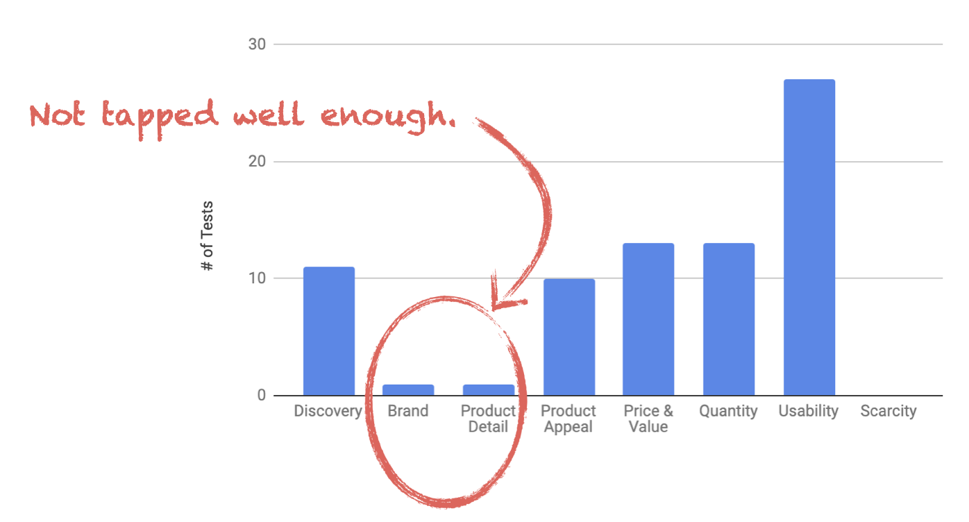
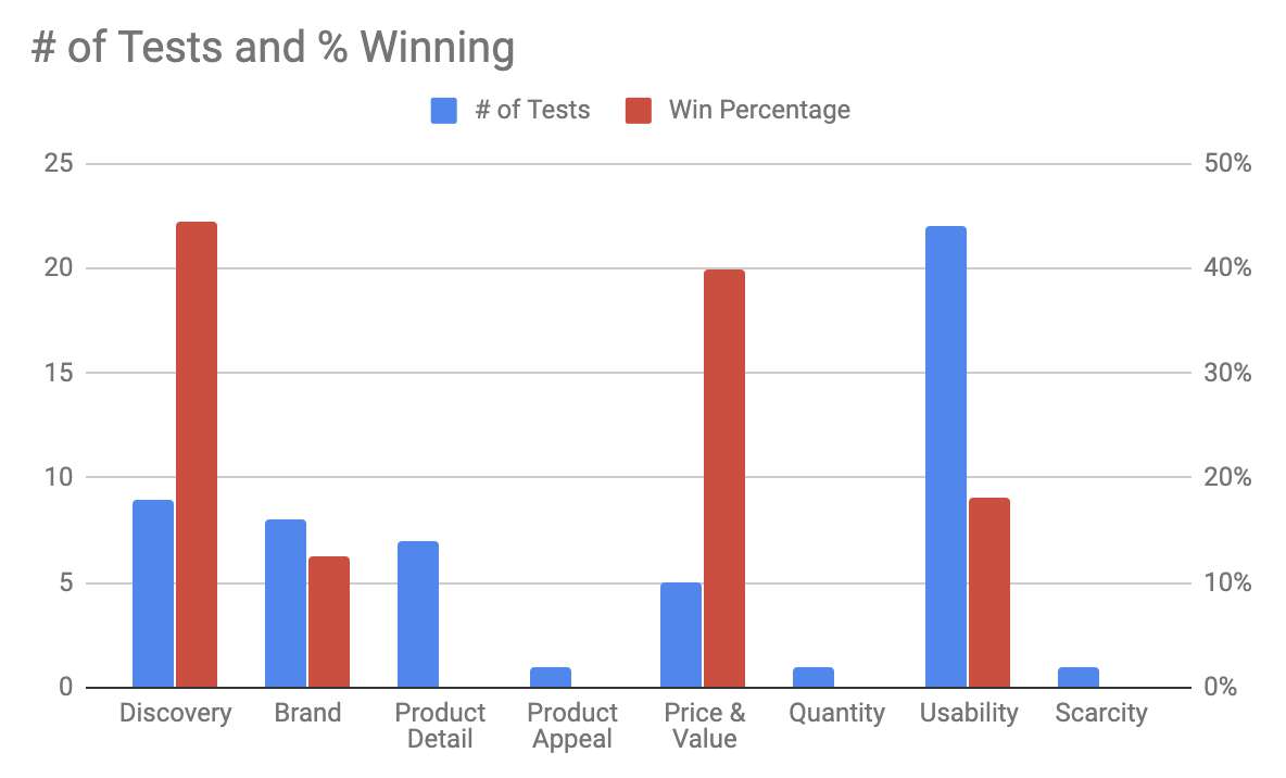
Eventually, we got our act together and started carefully labeling and counting tests by purpose. As we’ll show below, it helped produce insightful graphs like this:
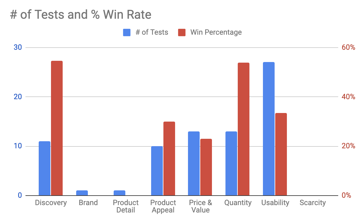
You can see with the blue bars how many tests we’re running in each category and ask: Why aren’t we doing Brand or Product Detail tests? Does that make sense? Can we defend that decision?
You can see with the red bars how many are winning and ask: Which purposes win more? How can we use that to do more of what works?
Once you start seeing this 10,000 ft view of what affects the conversion funnel on your site, everything changes. Every A/B test you do from that moment on is connected. It feeds into the larger picture of which purposes move the needle and which don’t.
You develop a CRO strategy.

How to Implement The Purposes Framework
Implementing this framework requires labeling each test with its main purpose(s), tracking the wins and losses, and analyzing and graphing the data.
Step 1 – Track Purposes – Track every test you’ve done and label them with one or two purposes each. We do this in a spreadsheet. Here’s a recent month for a client:

Allow for 2 purpose labels because many tests touch on more than one.
For example, the first test in the screenshot above is on some UX changes we made on the filters in the left navigation area of their listing page. We labeled this with Discovery, because filters on listing pages help the customer find and discover products, and Usability is because it was a UX optimization with the left nav, meant to make it easier to use.
Two purposes at most per test has been enough. More than that seems to overcomplicate things (if tests are labeled with too many purposes, you’ll wash out trends in the data).
Step 2 – Lifts – Track if each test showed a statistically significant change in conversion rate.
That’s done in our “Lift” column above. Importantly, we mark a test as having a difference even if the “control” won. For this analysis we want to know which purposes affect conversion rate. So we’re less interested in which variation won but rather that a test, and its purposes, resulted in a measurable difference in conversion rate. If it moves the needle, we count it.
Step 3 – Page – Track on which page of the site the test was run. We use 6 page categories: home, navigation, listing, PDP (product detail page), checkout, and sitewide. Just as we’ll count and monitor which Purposes we’re testing more of, we’ll also want to monitor which pages we’re testing heavily on and which we’re ignoring.
Step 4 – Analyze Once you have an entire spreadsheet full of these for your site, you can then count:
- How many tests you’ve been running within each purpose
- How many of each resulted in statistically significant conversion rate or revenue differences
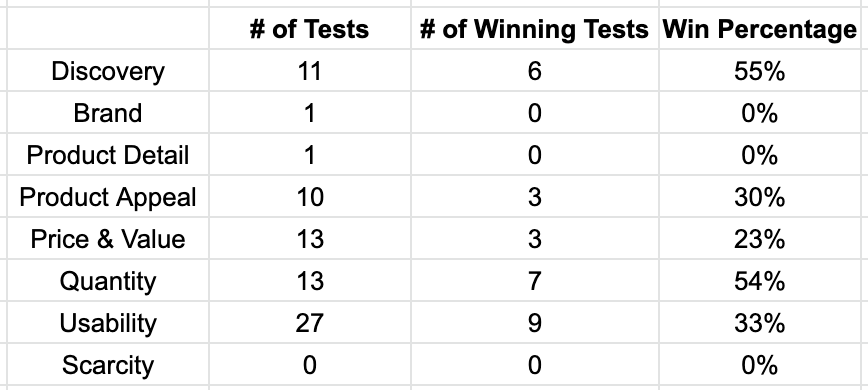
For example here is a table of these stats for one of the first clients we ever implemented this framework on:
Seeing the data is only the beginning. Graphing it, analyzing it, and building a strategy with it is where it gets interesting.
For that let’s use some case studies.
Case Studies: How The Purpose Framework Revealed Impactful Insights About CRO Strategy
We first implemented the purpose framework for a client in the food space with about 30 – 50 products in the store. At the time, we had been working together for over a year, running multiple A/B tests every month.
We’d had many winners, a great relationship, and felt we were doing CRO strategically, but with the benefit of hindsight, we were doing tunnel vision testing. The purpose framework, as we’ll show here, revealed impactful insights about CRO strategy for this client.
Tier 1 Analysis: Can We Defend Where We’re Spending Testing Time?
The Tier 1 question to ask in this process is: Are we testing in the Purpose buckets that make the most sense? Is it defensible?
To answer this, we graphed how many tests had been run on each purpose.
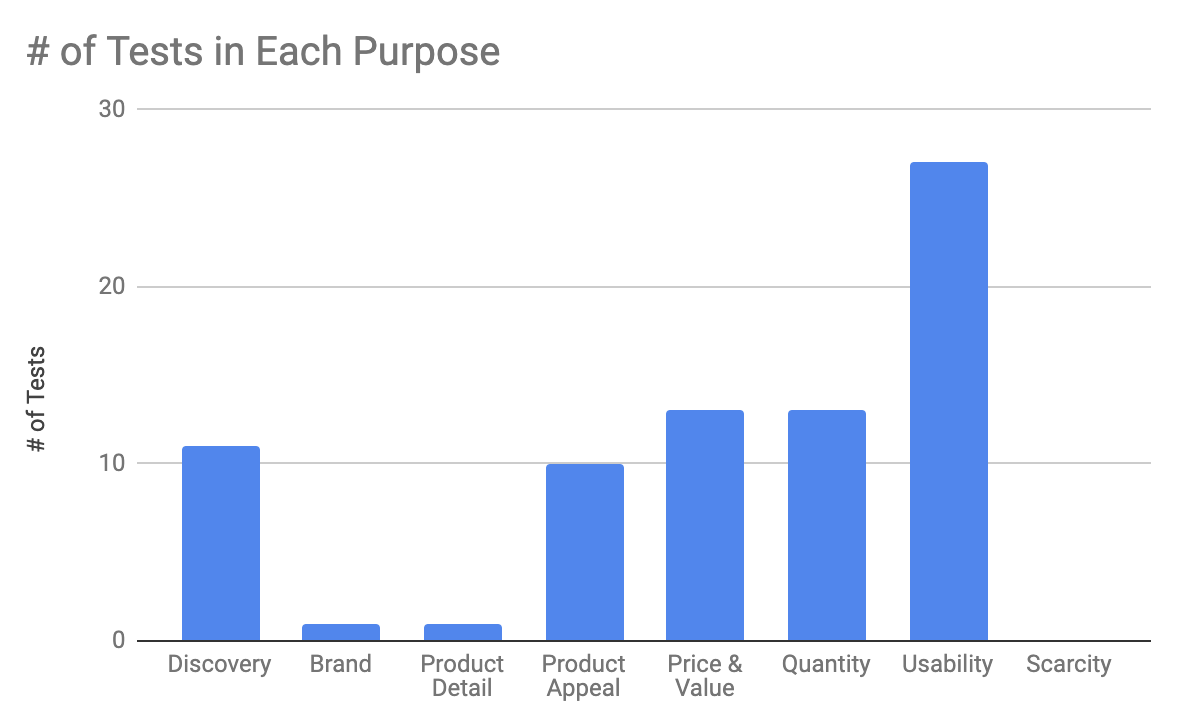
Seeing our test history grouped by Purpose like this was striking. The armor of tunnel vision testing started to crack. We started to view the site holistically (the original goal!). Strategy–level insights and questions arose.
Why had we run so few brand tests? And so many Usability tests?
This client has an awesome brand. They’re one of the first players in their niche, and they grew their brand with content for years before selling anything. So they have authority. People in this space respect them. They were also one of the first to sell the flagship product that all competitors in this niche are now selling.
So why had we not tested doubling down on these brand strengths?
We had no good answer.
Instead, the graph shows a lot of usability tests. Why? We think doing a lot of usability tests is common, and a byproduct of tunnel vision testing. When you don’t think strategically about what you want to test and why, you default to usability tests because they’re easier to think about. Big picture strategy is hard. Testing UX minutiae is easy: “Should we add our phone number on this page?” “Should move the product video in the PDP to this other spot?” “Should we hide the shipping costs or show them?”
But there was so much more we could have tested on brand. What about homepage tests that talk about how they are the original, dominant brand in this space? What about testing different value propositions and brand messaging? What about mentioning this on the listing page? What about showing the mass number of total positive reviews accumulated to date?
This simple graph got us to ask tough questions like these for each of the eight Purposes.
The 8 Purposes Are Like Bricks on a Wall. You Tap on Them With A/B Tests.
The eight purposes are like bricks on a wall you’re trying to take down. Each A/B test is a tap on a brick.
“Let’s tap on Brand with this homepage messaging test.”
“Let’s tap on Quantity and Discovery with different upsells on the shopping cart.”
Tap…tap…tap.
You’re trying to see which bricks move. To do this you need to tap multiple times on each brick. If you don’t tap at all on a brick, or you only tap, lazily, once or twice, you rob yourself of the opportunity to see if moves. There could be an entire world of tests behind that purpose that you’re leaving on the table because you didn’t have a system to tell you: Hey, these bricks haven’t been touched.
Tier 2 Analysis: Contrast With Win Rate
Next, we plotted the win rate as well:

This adds the next layer of understanding. For this client, for example:
- Discovery and Quantity tests are winning at a high percentage (more than half the time).
- Usability tests aren’t winning as much but we’re doing a bunch of them.
Those are great insights, but stopping there doesn’t give you enough information to really know why certain purposes are winning. You need to understand the “why” to know how to do more of what works. To do this, you need to dig into each Purpose bucket and analyze which tests are winning in that bucket and why. That’s where you’ll find the real patterns that you can exploit to string together multiple winning tests.
Case Study: Stringing Together Winning Tests
For example, it turns out for this food client that Discovery and Quantity have a high win rate. Why?
We dug in and found that it was a series of tests around upsells. Most of these tests were labeled both Discovery and Quantity because the desired action from presenting product upsells is to increase the quantity of items purchased (aka “cart size”) and we do that by helping the online shopper Discover new products.
Once we learned about this pattern we kept poking at these purposes (Discovery and Quantity via upsells) with more A/B tests and they kept moving the needle:
- Early on, we tested emphasizing product bundles on the homepage with a quiz: +7.2% increase in revenue per visitor with 99% stat sig
- Later we added an upsell to the cart: +4% increase in orders, 98% stat sig
- Then we did another cross sell of similar products: +16% average order value (AOV) with 98% statistical significance. It was only for subscription orders not one time orders, but a nice win nonetheless.
- Then we tested a price threshold after which we’d give a free gift (another product): +7% increase in AOV with 95% stat sig
- Then we offered a product bundle as an upsell of a single item product: +3% increase in revenue per visitor with 93% statistical significance

Case Study: Learning That Luxury Shoppers Are Still Moved By Price
As a second example, let’s look at a client in the women’s luxury apparel space. They have a ton of products (1000+ skus). This analysis paints a different picture than the food client above:
Here Discovery and Price & Value are winning at the highest rate, why?
Insight #1: Huge store has product discovery issues
In the Discovery category, we found tests winning that were about (1) site search and (2) product recommendation containers.
Why are those tests winning?
This client had 1000+ products spread across many departments (shirts, pants, jackets, bags, shoes, lotion and beauty, jewelry). It’s a massive store. So product discovery is a huge pain point (in particular for new customers). Search obviously helped a lot. But so did recommending products at the right part of the page.
They are different ways of attacking the product discovery problem. This is a currently active client and we’re continuing to investigate both, but having this big picture (10,000 ft) view helps focus our work and give us confidence that we are solving important conversion optimization problems, not just throwing darts at a board.
Insight #2: Luxury shoppers are still affected by price
The win rate of the Price & Value category was interesting because this a luxury ecommerce business. Many of their products are designer: e.g. $2000 handbags, $4000 coats. So, everyone’s thinking was that these customers aren’t price constrained and therefore typical department store style Price & Value tactics to increase conversions like promotions and coupon codes shouldn’t affect these luxury shoppers.
Fortunately, we didn’t avoid tapping on the Price & Value brick because of this assumption. You can see in the graph that we’ve only done five tests with a Price & Value purpose, but 2 out of 5 have already shown conversion lifts, for an intriguing 40% win rate.
Those tests included changing some promotion copy on the promo bar at the header, so clearly their “luxury shoppers” do notice those things and are affected by them (+22% in conversion rate, 95% stat sig). Second, we tested a financing option (like Affirm, or AfterPay) and found that including these payment options increased conversion rate significantly (+15% with 94% stat sig).
These early tests shape strategy by telling us, “Ah, this shopper, although on a luxury apparel site, may be price sensitive.”
Insight #3: There is nuance inside each purpose
This is not to say CRO is easy. When we tapped on this Price & Value brick further by putting free shipping and free returns” copy in the cart drawer, or near the add to cart button on the product page, conversion rate decreased.
The lesson is: there is nuance inside each purpose. Offering financing seems important. Sometimes changes in the promo bar copy are important. But maybe “Free shipping and Free Returns” copy is distracting (in particular when it’s near call to action buttons). Or maybe it cheapens the shopping experience and thereby the brand because potential customers expect everything to be free in the shipping and return policies of luxury online retailers? Again, we will continue to investigate. But look at how, with the purposes framework, we can do so knowing that we are following a larger framework and systematically improving the site, instead of just bouncing around from one idea to the next with no larger strategy in place (e.g. “What about the cart abandonment rate?!” “Let’s add some trust signals!”)
Checklist to Implement This Yourself
Here is a checklist of implementing the Purposes Framework at your ecommerce company to build a CRO strategy and escape from tunnel vision testing:
- Start keeping track of every A/B test you’ve run in a spreadsheet
- Next to each test, note the purposes (at most two per test) and whether the test caused a statistically significant change in conversion rate or revenue/AOV
- Add up how many tests you’re running in each purpose bucket. Can you defend the distribution?
- Next, plot the number of tests run along with the win rate for each purpose bucket. Dig into each purpose bucket and look for patterns in why tests are winning or losing.
If you do this, you’ll defeat tunnel vision testing and begin to build an actual CRO strategy for your ecommerce store.
You can see our live database of every ecommerce A/B test we’ve run, labeled, of course, by purpose here.
If you’re interested in working with us, you can learn more and reach out here.
Finally, you can join our email newsletter to get articles like this and AB test breakdowns periodically.
Do Reviews or Star Ratings on Product Detail Pages Increase Conversion Rate? (A/B Test Case Study)
We’re noticing that it’s become trendy for a lot of fashion brands to not place reviews on their product pages (“PDP”). You don’t see “stars” on the top right like you’re used to on most ecommerce sites.
A notable brand that does this is LouisVuitton.com:
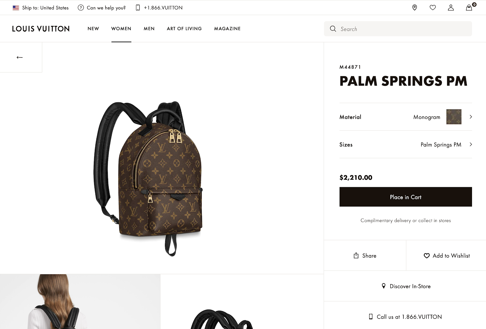
No reviews anywhere for this product. This does give a brand the feeling of luxury. Louis Vuitton is basically implying:
“Why even have reviews?” This is a $2,210 backpack we’re talking about here. You know who we are.”
Why cheapen a site like that with quotes by Susan from Missouri or Steven from New York complaining that the shipping was slow or the zipper got stuck? We get it.
But we’re increasingly noticing that smaller brands are also doing this. For example, the menswear brand buckmason.com also has no reviews:
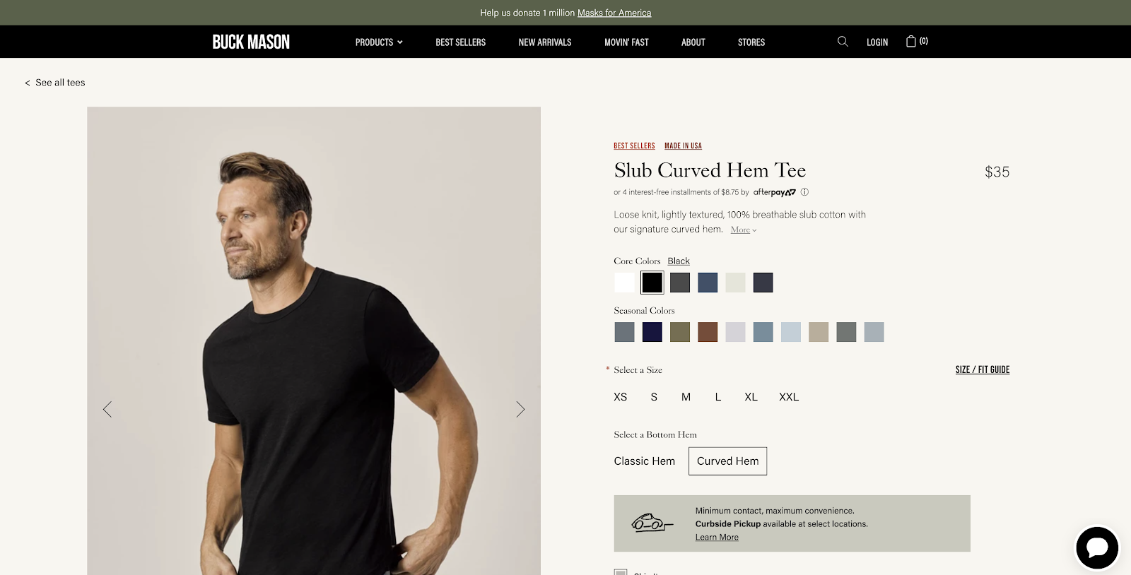
In this case, this is a brand that’s younger (est. 2013), is digitally native, and most everyone has not heard of. Can they get away with it too?
Does this help conversion rate?
Does it also give them an air of luxury?
Or are they leaving conversions on the table by forgoing product reviews?
These are complex questions but recently one of our clients that also sells apparel ran into a similar situation. In their case, they did have product reviews, but did not show the summary of review stars in the top right of their PDP like you’re used to in most e-commerce stores, like Amazon:
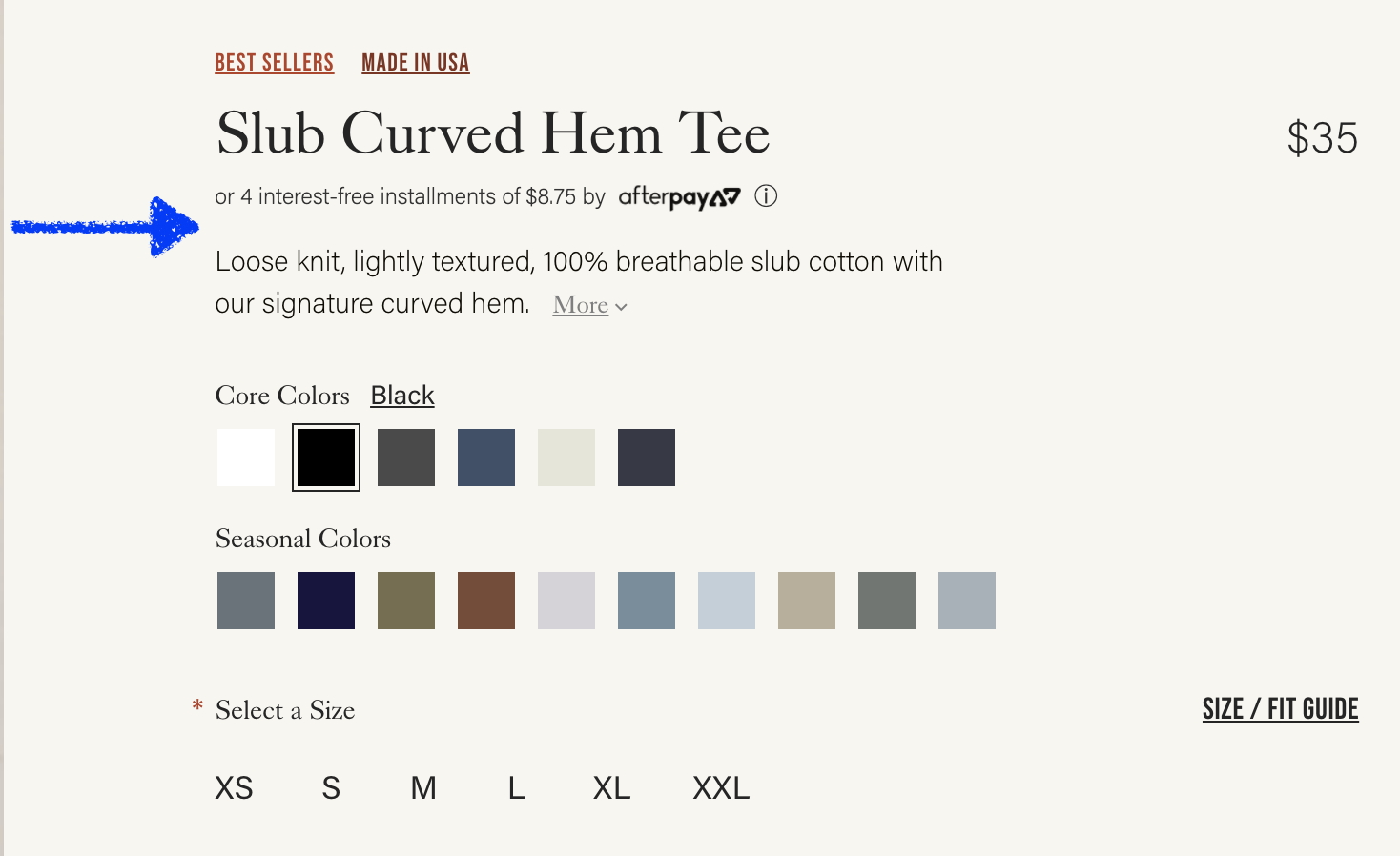
So we tested it by adding a review star rating summary for each product:
As per our Question Mentality framework, instead of making a hypothesis (which causes bias and reduces learning), we asked a series of questions that we wanted the test to help answer. Specifically:
- If reviews are at the bottom of the page, does putting the star rating summary at the top of the PDP help?
- Do customers care enough to have it affect conversion rate?
- Or will they just scroll down?
- Does this change AOV (promote purchase of more expensive products)?
Adding the review star summary (Variation B) increased conversion rate by +15% with 94% statistical significance and increased revenue per session by 17% with 97% statistical significance.
Average order value (AOV) was slightly higher in the variation +2.4% but not by much so most of the revenue increase was from the increase in conversion rate.
So clearly, customers did care, and having the review star rating summary at the top of PDPs does affect their decision to purchase.
But we dug further…
Why Product Star Ratings May Affect Purchases But Not Add To Carts
Again, our question mentality framework encourages us to ask further questions of the results so we get more learnings than typical A/B testing teams who would pat themselves on the back on this test and move on to another one.
So we wanted to know more.
And we noticed that the add to cart rate was the same in the control and the variation.
Why would this summary of the star rating increase purchase rate but not add to carts?
We think it’s because ecommerce shopping behavior is not linear the way many management teams and designers commonly think about it.
Those of us working on an e-commerce site think of the shoppers’ path like this:
Homepage > Listing page > Product page > Add to Cart > Cart page > Checkout > Purchase!
But customers don’t do this. They don’t do each step sequentially, one neatly after the other. In the case of this particular A/B test, a common behavior pattern we’ve seen from e-commerce shoppers is:
Add to cart > Browse some more > Think about purchasing > Come back to the PDP for products you already added to cart to browse further and decide if you actually want this product enough to buy > Decide to purchase or not
That bolded step is common and important. We’ve seen it in many user recordings.
In particular, this client is selling $100+ luxury fashion items. So not an essential purchase nor usually an impulse purchase. It is likely to be “mulled over” and thought about quite a bit before purchasing:
“Do I really want this? Is this the best option? Will I look good in it? What if it doesn’t fit? Should I buy now or wait? Can I afford it?”
During this mull over process, customers often come back to the PDP to look at photos, read reviews, read descriptions, and try to convince themselves to buy.
Clicking add to cart is simply a way for shoppers to “bookmark” an item. We’ve seen this in many other clients’ sites as well. It doesn’t necessarily mean purchase intent is there…yet. That’s why add to cart rates are so much higher than purchase rates. We routinely see add to cart rates as high as 15% from the PDP when purchase rates are maybe 5%.
What did the remaining 10% do? They added to cart and decided not to buy. They were not convinced enough. You can imagine how many of them went back to the product page (PDP) to think about it some more.
So our best interpretation of these results is that this summary of reviews for this store helped convince shoppers to purchase after they had added to cart. It emphasized the social proof aspect of the product and increased product appeal that way.
Using our Purposes Framework to Connect This Test to a Larger CRO Strategy for The Client
As per our Purposes Framework for ecommerce CRO, we analyze the purpose of each test and afterwards think through the implications of the test result on the rest of the store and its implications on our overall CRO strategy.
This way each A/B test is not a one-off test, done in a silo, unrelated to the subsequent tests. That’s how most CRO teams do A/B testing and it limits A/B tests by preventing them from cohesively working together to form a larger CRO strategy.
Via our Purposes Framework, this test has purposes of “Product Appeal” and “Brand” because seeing a positive star rating increases credibility and desire for both the product and the brand.
So, since these seemed to move the needle, instead of just saying good job and walking away as most CRO teams tend to do with a single A/B test, we think through what other similar Brand and Product Appeal tests we could run to further poke at these purposes and see if they move the needle. For example:
- Can we emphasize social proof and positive product reviews elsewhere on the site?
- What if the homepage had featured reviews? Would this kind of social proof make a difference at that part of the site?
- How can we better add review star emphasis at the listing page besides just the star rating for every product near its photos?
- Can we show a cumulative star rating for the entire brand on the homepage or listing page?
- What if we show the star rating for a product in the cart or during checkout? Would that further increase conversion rate?
This is how you transform one off, haphazard, unrelated A/B tests into a CRO strategy. We connect them via our 6 purposes we have defined that all ecommerce A/B tests fall into, and we track over time which purposes move the needle more or less for each company we work with.
As a result, we get more learnings from this test and more test ideas rather than just moving on to the next, unrelated test.
Implications for Your Store
This test sparks a few questions worth asking for your store:
- If you don’t have reviews, consider: is that really “up leveling” your brand image? How can you test this? It is possible to A/B test the existence of reviews in your store entirely. Email us if you want to discuss this further.
- If you have reviews, is the summary of the star rating high enough on the page? In particular, on mobile, is it visible above the fold for common phone sizes?
If you’re interested in working with us on your ecommerce CRO, you can learn more about our service or fill out the form here.
You can also read these related articles:
- A/B test hypothesis? No thanks: Our foundational article on why, when everyone else bases A/B tests on hypotheses, we use questions instead
- Sticky Add to Cart Case Study: An A/B test case study on whether you add to cart area should be “sticky” as the page scrolls
- ROI of A/B Testing: When Is A/B testing Worth It?
- Usability vs. Desirability Framework: (This review star rating case study was a perfect example of a simple change making a big impact because it falls into the desirability bucket
A/B Test Hypotheses are Broken, Here’s What We’re Using Instead
The long standing advice on running A/B tests has been to base every test on a hypothesis, but we, as an A/B testing agency, are no longer doing this.
On paper, basing A/B tests on hypotheses seems logical and reasonable. But over years of running these tests on ecommerce and SaaS websites, we’ve noticed that basing website A/B tests on hypotheses creates bias from the team running and monitoring the test results, and this bias has negative consequences.
Specifically:
- Consequence #1: It can lead to stopping tests too early and thinking a variation won when it didn’t. Teams may then implement losing variations that hurt conversion rate.
- Consequence #2: Hypothesis-bias leads teams to gloss over A/B test results too quickly, thereby dramatically reducing learning, which is the most vital long term benefit of A/B testing.
To avoid those two consequences, we, as a CRO (conversion rate optimization) agency, are no longer basing our client’s tests off of hypotheses. Instead, we’re formulating all A/B tests around a series of questions.
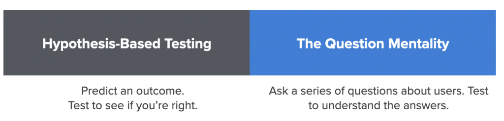
This is a subtle but powerful tweak to hypothesis-based testing, and we’re calling it The Question Mentality for A/B testing. This name was carefully chosen to show that it involves changing a team’s entire mentality around AB testing.
As we argue below, the Question Mentality avoids the outcome bias of hypothesis-based AB testing and therefore:
- Reduces the risk of stopping tests too early
- Reduces employees or consultants tying their career reputations to the outcome of tests
- Dramatically increases the amount of learning and understanding that the company gets from every AB test
So far, for us, it has resulted in a wonderful mental shift in how we and our clients view each and every AB test. And we’ve enjoyed the benefits of the Question Mentality while still having the goal of increasing conversion rate with every test. We just do it in a way that gives us a far richer understanding of what’s really happening so that we learn more from each test and thereby have a higher shot of running more winning tests in the future.
In this article, we’ll discuss:
- How hypothesis-based A/B testing leads to bias
- The negative consequences of that bias (how it hurts your long term conversion rate goals)
- How the Question Mentality can solve these challenges (and yield far richer learnings about customers’ desires, preferences, the friction they encounter on your site)
- Case studies of A/B tests we’ve run for ecommerce clients and how the question mentality improves our understanding
If you’re an ecommerce company interested in working with us for A/B testing and CRO, you can learn more about our service and contact us here.
Hypothesis-Based Testing Leads to Bias
First, let us show you how A/B testing hypotheses in a marketing setting (e.g. testing a website) lead to bias, and then the consequences of that bias.
To quickly define it, a hypothesis is a prediction of the result of an A/B test. Something like this: “If A happens, it’ll result in B because of C.”
When teams base an A/B test on a hypothesis, a bias emerges: they take on a mentality that they’re betting on one outcome over another. This is natural, you’ve stated what you think will happen, so there is some confirmation bias in wanting it to happen.
This is true even if your hypothesis is a “good hypothesis”, which many people in A/B testing circles define as being backed by evidence or data such as customer survey results, user testing, heatmaps, or analytics. Good hypotheses will cause bias just the same as bad ones — perhaps even more so because the evidence and strategy behind it will lead teams to be all the more convinced their hypothesis “just has to be true”.
But, in business settings, that bias is significantly greater than in a science lab. In a lab, (where A/B testing originated) scientists aren’t going to make more money if their hypothesis is true or false (at least not directly) — they are, if they are doing science properly, just after the truth.
But in website A/B or “split” testing, there is extreme bias in one result over another because there is both (1) money and (2) career reputation at stake.
Founders or owners have bias because a “winning” A/B test makes them more money. This is a totally natural and understandable bias, which they can’t be faulted for. But it has consequences that we’ll discuss below that can hurt the business.
In-house employees have bias because A/B tests where their hypothesis wins makes them look good in front of managers and executives, because it’s seen that their idea “made the company more money”. It helps their career if “their” test “wins”.
Marketing agencies (like us) have bias because of the same reasons: it makes us look good and it makes our clients more money. In fact many CRO agencies’ websites directly state a promise of “making more money” for clients:

So, in every A/B test, the in-house team or the agency is heavily biased to wanting their variation to have a higher conversion rate than the original because it makes everyone look good. We’ve seen, and felt, this bias first hand.
I want to emphasize that this bias is natural: growing revenue is obviously the goal (including for us and our clients).
But this bias is dangerous, and can counterproductively result in hurting the company’s conversion rate and thus long term revenue potential.
Let’s see these consequences in action with an example.
Consequence #1: Hypothesis Bias Leads to Stopping Tests Too Early
The first consequence that this bias causes is a mental and emotional pull to stop tests too early.
Let’s look at a hypothetical scenario that is identical to what we’ve seen happen countless times across many clients over the years.
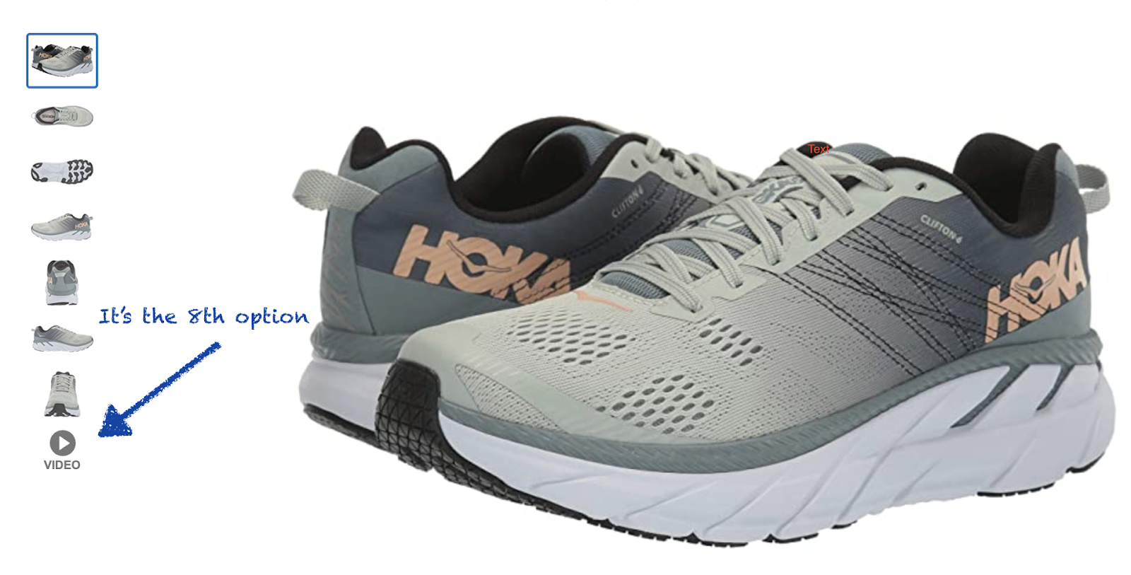
Say we are working on Zappos’ product detail page (PDP) and someone has a hypothesis that adding a video walkthrough of their shoes will increase conversion rate because it will let users see the shoes “in action” and be closer to the experience of really “feeling” the shoes:
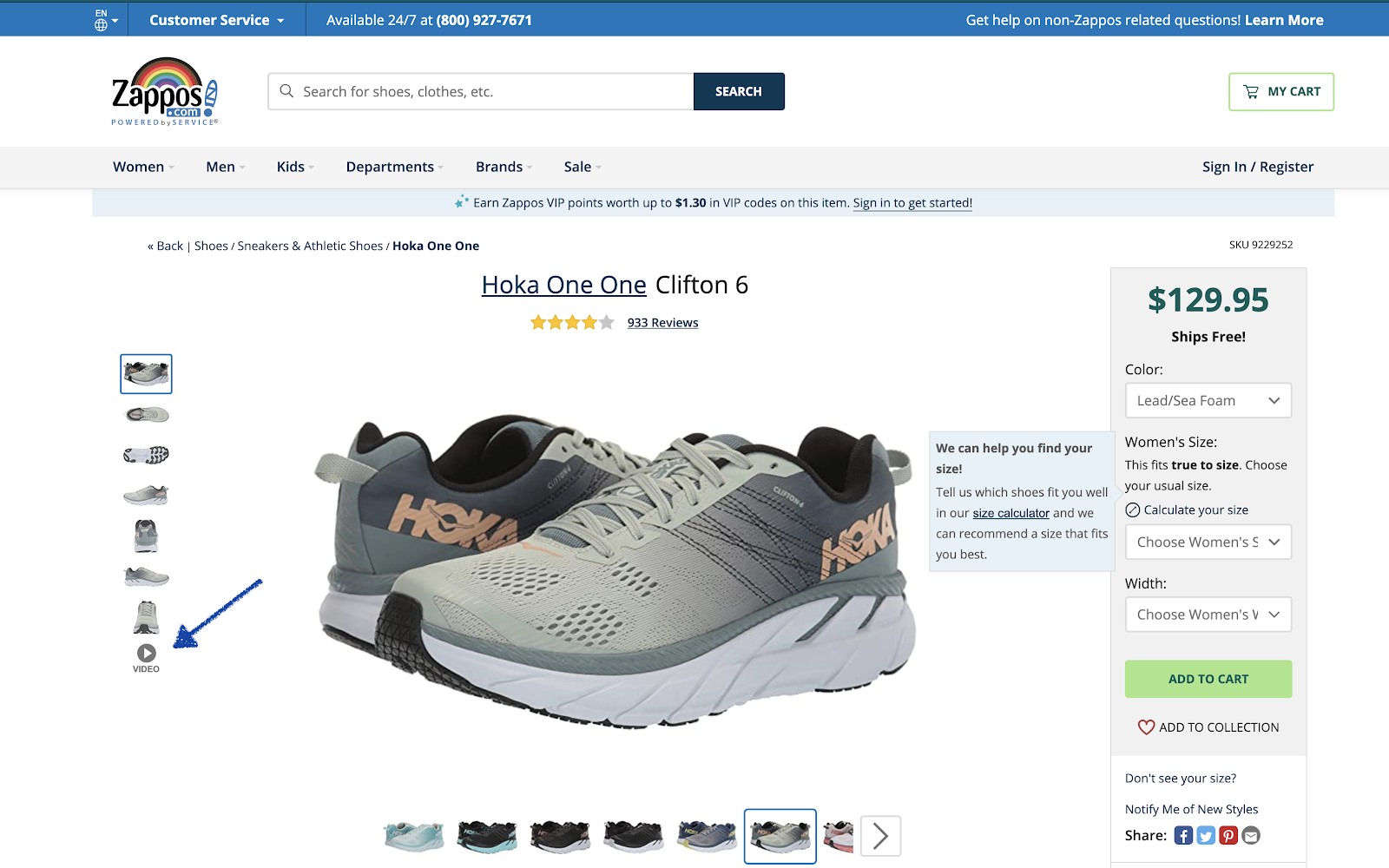
Let’s assume the above screenshot is the variation, where we add a video to the image carousel, and the test is run against a control where that video doesn’t exist.
Let’s say the team is really excited about it. Maybe a few people on the team have been wanting to place videos on PDPs for years, advocating for it, and went to great lengths to record some awesome videos for top selling products. The creative team was involved. They hired a video crew. It was a big deal.
And everyone on the ecommerce team is really convinced that the videos have to increase conversion rate. They say things like:
- “Oh, this is for sure going to win.”
- “At the very least it’ll break even, there’s certainly no way it will hurt”
- “Why wouldn’t this increase conversion rate? It wouldn’t make any sense!”
All of these are reasonable, understandable expectations. But we don’t run AB tests because we’re sure of the result. We run AB tests because we aren’t sure.
So the test begins.
One week of data is collected. And the result looks like this:

4.86% increase! Yes, the statistical significance is only 71%, so it’s not a statistically significant result, but what a nice increase. Surely the team’s hypothesis is being confirmed and this test is bound to win, right? Why waste time running the test for longer?
If the company is doing $20 million a year off of sales from the PDP and now the variation is producing 5% more sales from the PDP, if all else is equal that’s $1,000,000 per year in extra revenue from this test.
It is very tempting in this scenario to stop the test and quickly implement the variation.
It’s also the wrong move.
We’ve lived through this scenario so many times. Multiple folks from the client’s team suggest: Ok this is obviously going to be a winner as we expected, let’s stop the test and implement the variation. Why wait to get more data? We were all expecting this to win, obviously it’s on it’s way to winning, let’s implement it.
In fact, one time we even saw old AB test reports that a client’s previous CRO firm had prepared and that firm had stopped a test at 70%-ish statistical significance and said something to the effect of: “Normally we’d wait for significance but since this is so obviously winning, we’re stopping the test and we recommend that you implementing it.”
This is extremely dangerous.
Stopping an AB test requires two criteria: statistical significance and enough visitors, aka sample size (we discuss this in more detail in this article). If you consistently stop tests too early because folks are “really sure” the variation is “going to be” a winner, you will inevitably end up declaring winners that aren’t actually winners.
That means, worst case, you could actively hurt conversion rate. With more data, the variation could have been shown to be worse than the control. You just didn’t know. Now you’re changing the site for the worse and have no idea. More commonly though, you could simply implement a variation that in fact made no difference and think it’s making a huge difference.
Now in this Zappos hypothetical example, if you made this mistake, the team would spend massive resources making product videos thinking they’re helping when it may in fact be doing nothing, or worse, hurting.
But implementing the wrong variation is only the start of the issues that hypothesis bias creates in AB testing. The bigger issue, in our mind, is how it reduces learning. This has consequences way beyond that one particular test. Let’s explore this next.
Danger #2: Hypothesis Bias Prevents Getting Rich Learnings About Your Customers
Let’s continue the above example about adding a video to the PDP with the hypothesis that it will increase conversion rate by increasing product appeal.

In our example, we pretended that the variation with the video was “in the lead” (showing a higher conversion rate than the control) early on, and the management team felt their hypothesis was confirmed and wanted to stop the test.
A common scenario.
What is equally common is that whenever teams end up stopping a test, they tend to make a conclusion without asking important questions about how users interacted with the change.
Questions like:
- How many users actually watched the video?
- How far into the video did they get?
- Of only the users who watched the video, how much did their conversion rate increase vs. the users who didn’t watch the video?
- Did the video also increase add to cart clicks?
- Do customers watch it more when the PDP is their landing page vs when they start on another page on the site?
And those are just the basic questions.
There are more advanced questions to ask, like: How does the answer to these questions change by product?
- Do these videos affect higher priced products more than lower priced?
- Do they affect certain categories like running shoes above more than dress shoes (where style is more important than function/flexibility)?
- Does it affect men’s shoes vs. women’s shoes the same?
Hypothesis bias leads teams to not explore these questions and just quickly call a test a winner or loser based on one metric (eg. checkout rate or, worse, add to carts) . Not caring about these nuances means teams are not really learning the real reasons for A/B test results. It means they’re not really understanding user preferences and behavior.
If you’re not learning the true preferences, desires, and fears of your online shoppers, you’re massively disadvantaged compared to your competition long term.
The Question Mentality: Base A/B Tests On a Series of Questions
Unlike a hypothesis like, “I think a video of the shoes on the PDP will increase conversion rate because…”, the Question Mentality would have us base this test on a series of tiered questions:
- Do users care about watching a video of someone talking about and playing with the shoes?
- Will they watch?
- Will it affect add to cart rates?
- Does it change how much other information they read on the PDP?
- Does it affect how many PDPs they look at before making a purchase? Because it could possibly give them more information and let them make a decision more quickly?
- Can we sell more expensive products better with videos?
- And thus does it move the needle on ultimate conversion rate at all?

Look at the difference!
On one side you have a single prediction of outcome, which pulls you, psychologically and emotionally, to having tunnel vision on one metric and judging success by that one metric.
On the other side you are setting up the test on a series of important questions about your users’ psychology and preferences. This pulls you towards wanting to set up the test in a way that can help you understand so much about your customers and their desires.
What that results in is:
- More goals are measured at the start of the test, giving you a far richer picture of the customer’s preferences. How many times have you run an A/B test, the results were not clear cut, and you end up asking follow up questions that you don’t have the answer to: “Wait so did anyone click on/watch/interact with this element?” No one knows. When you start a test with questions instead of a hypothesis, you set up goals to answer these questions.
- The team is led towards finding the truth, not catering to a bias. Think of the difference in your mentality when you read that question list about this simple video test above. What does it make you want? It makes you want to know the answers! That’s very different from stating “I think the video will increase conversion rate,” which makes you want a single outcome to come true.
- You no longer think about a test being a “loser”, which is a limited and incorrect view of A/B testing. When you have a question list like the one above, how could a test be a “loser”? No matter the outcome, the answers to the questions will be so educational, and that education can lead to many subsequent winning tests.
Example Differences between Hypothesis-Based Testing and The Question Mentality
Every AB test in the world can only have 3 outcomes:
- A wins
- B wins
- No difference
Hypothesis-based testing makes only the second outcome interesting. The Question Mentality makes all 3 of those outcomes interesting because you learn from each one and that learning can lead to future winning tests.
If the Video Reduces Conversion Rate
For example, if adding the video results in the surprising outcome of reducing conversion rate, that could be labeled as a “loser” in the traditional approach. But the answers to the questions in the Question Mentality approach would be fascinating. Perhaps you’ll discover that a good chunk of your visitors did watch the video, but that led to them not viewing as many different PDPs, and perhaps that leads to them not seeing as many different shoe options and thus be less likely to find the one they love.
If you can confirm this with future tests, this tells you something extremely important about your Zappos customers: They need to see as many PDPs as possible to find the perfect product and thus be extremely likely to buy it. You can then design future tests to try to increase the number of PDPs (product pages) the customers see and see if perhaps that increases conversion rate.
If the Video Results In No Difference
If the video results in no difference (in statistics speak, this means the “null hypothesis” is true) , you would use your questions to explore in more detail what happened. Perhaps, as we have in past tests with videos on PDPs, you learn that most users don’t watch videos that are hidden inside image carousels.
So you notice that barely anyone clicked on the video, so you can’t make a conclusion on whether the video helps or not, so you can follow up by testing placing the video somewhere else on the page where they are more likely to see it.
We have seen that videos below the image carousel can increase views significantly and also increase conversion rate in some cases.
And there are many more examples: you could see that videos are more popular on mobile but less so on desktop. You could discover that videos on certain products seem to help whereas on others it doesn’t. The list goes on.
All of these learnings can be exploited via follow up tests that can increase conversion rate as a result of the learnings from this test.
That is strategic AB testing. Not just make a guess, test it, and moving on.
If you simply used the traditional hypothesis based approach, shrugged and said “Oh well, I guess it didn’t work” and moved on to the next test, think about how much you’d miss. You’d miss insights that could set up a series of winning tests in the future.
Question Mentality Case Studies
Finally, Let’s look at a couple of tests we’ve run for clients under the lens of the Question Mentality to see real examples of the value it’s created.
Testing a Customer Quiz on the Homepage
A client of ours in the food and supplements industry wanted to test having a customer quiz on their homepage to help customers determine which of their products are best for them.
The customer was asked to select their goal:

And based on what they chose, we presented products that were best to hit that goal.
The hypothesis method would frame this test in a simple way: The quiz will increase conversion rate by helping customers better find the right products that better align with their goals.
Framed this way you’re likely to measure and focus on just one conversion goal: increase conversion rate. (Or worse, clicks to the product pages as your goal).
But when analyzed via The Question Mentality, a much richer experience emerges. Think of all the questions you can ask with this test:
- Do customers interact with the quiz?
- Do customers add to cart more?
- Are they more likely to checkout because of this?
- Which goals are most popular?
- Does it change which products they gravitate towards?
- Does it change revenue or AOV?
- How do the results differ by source? Do visitors coming form Google interact with the quiz differently than returning customers?

And those are just the basic tier of questions. An advanced ecommerce CRO team can ask even more nuanced questions like:
Do the most popular goals differ by customer demographics (gender, age, location) and therefore does personalizing the way we present those goals change any of the above questions and outcomes?
Mindset Shift
Stop and think about the mindset shift that happens to the entire ecommerce team when this same test is viewed in the lens of the Question Mentality versus the simple hypothesis above.
When you ask all of those questions about this test, you approach the test more objectively, like a curious scientist whose goal is to understand the behaviors, preferences, and desires of their customers. Simply asking the questions changes the team’s psychology from “So did it win?” to “How does this affect the customer?” and “What does the customer want?” and “How can our site better serve them?”
You are also more likely to measure multiple goals instead of just one, to help you answer all of those questions.
Results of the Test
This test, it turns out, did have interesting results. The final ecommerce conversion rate did not change at all by adding the quiz.
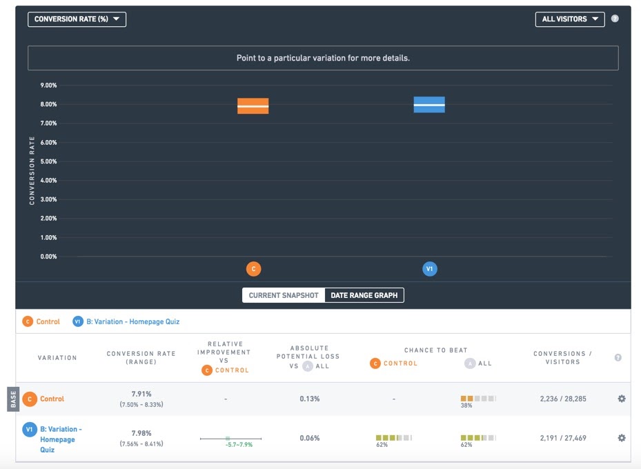
Statistically identical conversion rate
However, we noticed something interesting: the revenue per visitor was 8% higher for the visitors who saw the quiz, with 99% statistical significance:
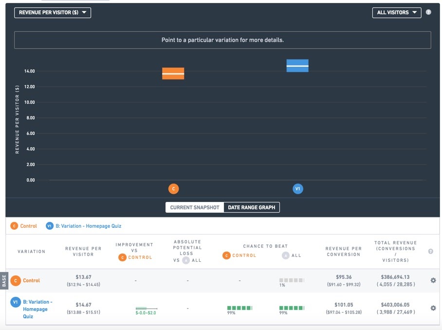
When conversion rate is identical, but revenue per visitor is higher, that means average order value (AOV) increased. And indeed above we see the AOV went from $95 to $101, a 6% increase.
Now, as per the Question Mentality, we don’t just pat ourselves on the back and move on, even when we get a “win” like this.
We continue to ask why.
What we discovered was that when the quiz was designed, for each desired fitness or performance goal that the customer selected, the answers surfaced a “bundle” pack as a product to help them with their goal. The bundle pack had a much higher price than the individual products. So, more users in the quiz variation were buying the bundle, which increased AOV.
What this taught us was less about the quiz and more about the order of products: the bundles were hard for users to find. They were interested in the bundles regardless of whether there was a quiz or not. And in fact, today this client no longer has the quiz on their homepage. It turns out we didn’t need it, we just needed to make the bundles easier to find and organize products by goal and users will make similar choices.
Had we run this test the hypothesis based way: make one hypothesis, measure one goal (conversion rate), report on just that one goal, make a decision. It’s highly likely we would have missed these valuable nuances and left millions in potential revenue on the table for this client.
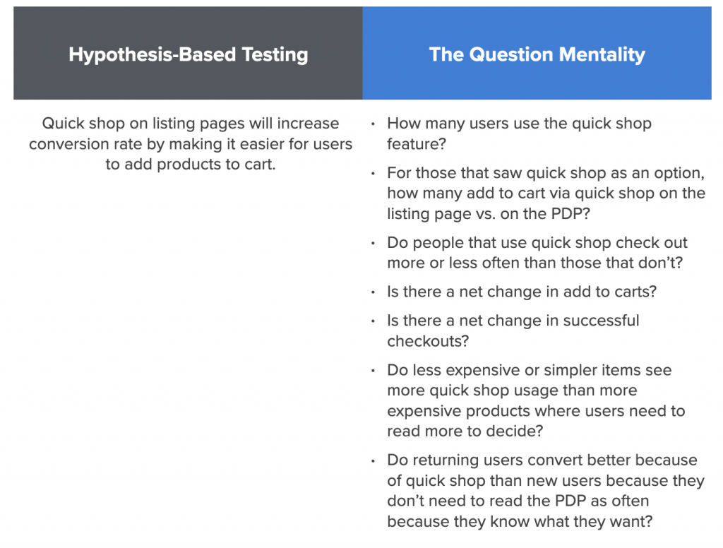
Testing Quickshop (or Quick Look) on Listing Pages
A second enlightening example contrasting the hypothesis based approach and The Question Mentality is Quick Shop (also called “Quick Look”) .
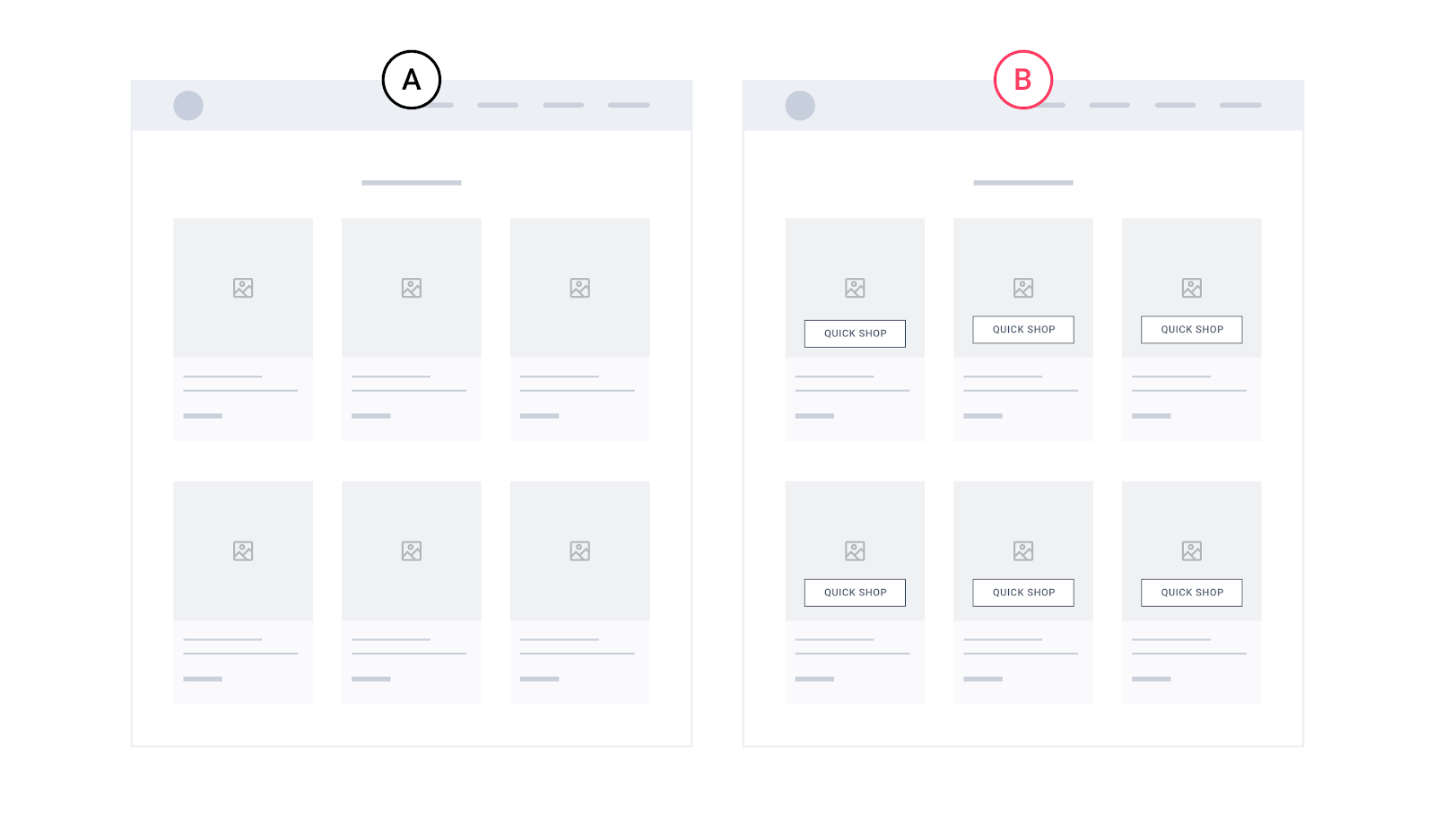
Think about sites you know that have a “Quick Shop” feature on their listing or collections pages, like this:

It lets you add items to cart directly from the listing page. So for J.Crew, that button opens this modal to let you add to cart:
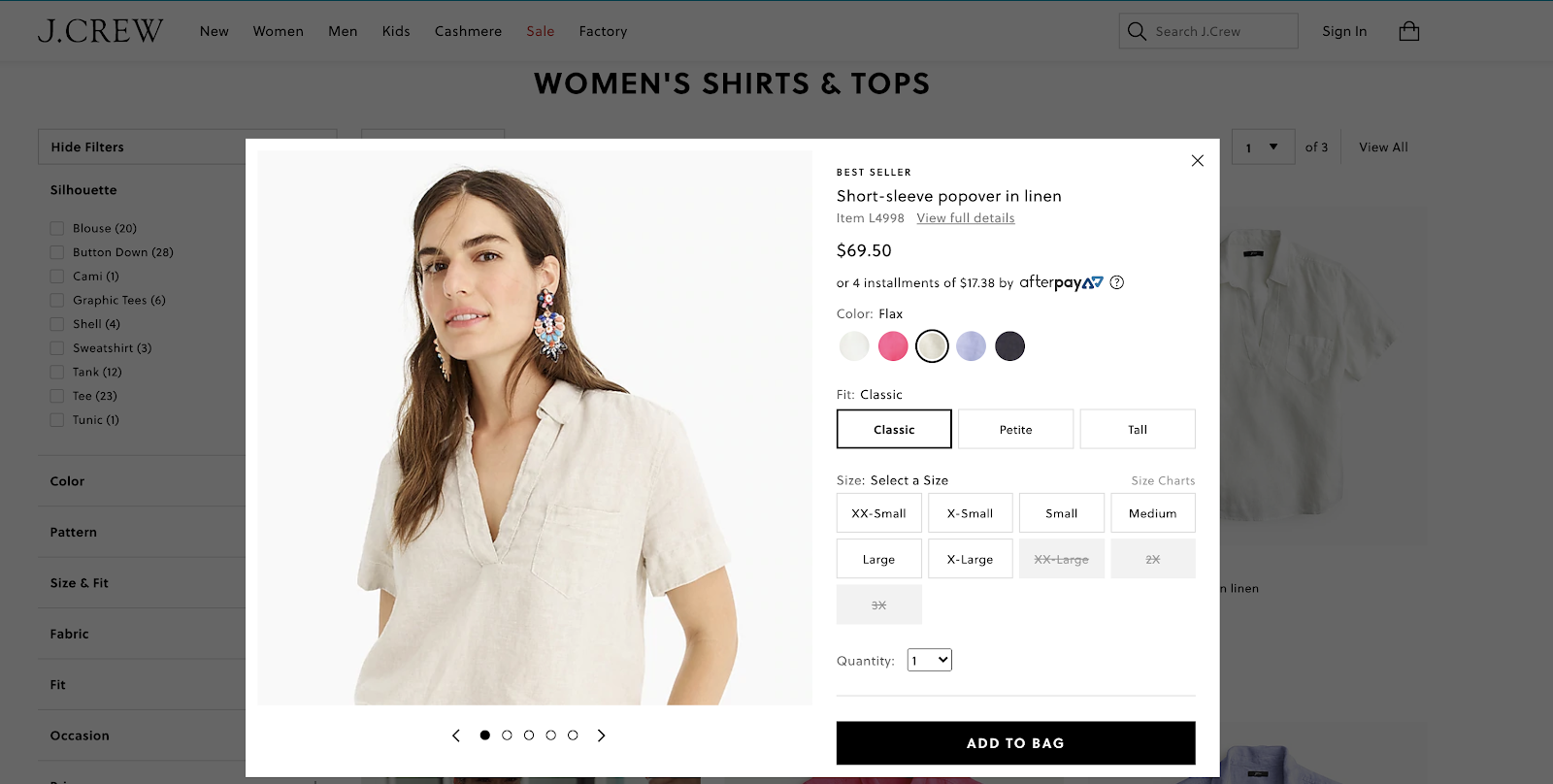
The customer doesn’t have to click into the product page at all to add items to cart.
Before reading further, stop and answer this question:
Do you think quick shop on these listing pages will help or hurt conversion rate on an ecommerce site? Should ecommerce sites have them or not?
What’s interesting is that there are popular, famous ecommerce sites that both have quick shop and ones that don’t. So it’s not an obvious best practice.
If you answered “Quick shop will for sure help conversion rate!” then it’s interesting to note that these sites don’t have quick shop on their listing pages:
- Homedepot.com
- Nike.com
- Macys.com
- Awaytravel.com
On the other hand if you answered “No, quick shop is not a good idea!” then it’s interesting to note that these sites do have quick shop features on their listing pages:
- Jcrew.com
- Allbirds.com
- Glossier.com
- Crateandbarrel.com
Which is right? What do Home Depot and Nike know that Allbirds and Glossier don’t? Or vice versa?
Testing Quick Shop via a Hypothesis Based Method
We tested quick shop for an apparel client with about 1000 products in their store (so browsing on listing pages was an important part of the customer experience).
An A/B test hypothesis for this test could be:
We think quick shop will increase conversion rate because it reduces costly page loads for the customer: they won’t have to wait for a product page (PDP) to load!
You would then run the test using either conversion rate (successful checkouts) or, worse, add to carts, as your metric of success. If that metric is higher for the variation with quick shop, the test is called a “winner”. If not, it’s labelled a “loser.”
Testing Quick Shop via The Question Mentality
Now contrast that simplistic view of the AB test with how you’d set it up with the question mentality. You’d frame the test on a series of questions you want answered:
- How many users use the quick shop features?
- For those that saw quick shop as an option, how many add to cart via quick shop on the listing page vs. on the PDP?
- Do people that use the quick shop CTA successfully finish checking out more or less often than those that don’t?
- Is there a net change in add to carts?
- Is there a net change in successful checkouts?
- Do less expensive or simpler items see more quick shop usage than more expensive products where users need to read more to decide?
- Do returning users convert better because of quickshop than new users because they don’t need to read the PDP as often because they know what they want?
- Who is the ideal target audience for the quiz?
I could go on, but you get the idea:
Teams using the question mentality to setup this test are:
- More likely to measure more goals in their ab testing tool, such as add to cart clicks, usage of different quick shop features, etc.
- More likely to analyze the results by segment (in say, Google Analytics) such as new vs. returning users, traffic source, or those that clicked on the quick shop feature vs. those that didn’t
As a result they’ll get a much more nuanced and thorough understanding of their users than those that just report back to the team: “It won!” or “It lost.” and move on to the next test.
Our Test Results and Questions It Answered
Our test showed almost identical conversion rate (successful checkouts) between the variations with and without quickshop:

Very interesting: across hundred of thousands of visitors, there was absolutely no change in conversion rate by having quick shop.
With the hypothesis method, at this point, many teams would say “Ok, that’s too bad, it doesn’t increase conversion rate.” and move on.
But by asking more questions, we can dig in and understand why a lot better. Most pressing is understanding:
Did it not increase conversion rate because no one used it or did they use it and it still didn’t change anything?
What we found is that having quick shop on the listing page does increase total add to carts, but those extra add to carts don’t lead to orders.
What this suggests is that customers may be using quick shop as just a way to bookmark items they are thinking about. It didn’t affect intent to purchase.
In fact, visits to the cart page were lower for the quickshop variation (albeit without statistical significance). So the quick shop option on the listing page, although it was used, didn’t even get more people to the cart, much less did it get more successful purchases. In fact, if anything not having the quick shop option could possibly result in more visits to the cart.

That’s really interesting.
And it’s just the tip of the iceberg. Like the question list above shows, we can dissect all sorts of nuances and see results by segment to understand how quick shop on listing pages affects user behavior.
How to Implement the Question Mentality With Your AB Testing Team
Changing from hypotheses based testing to the question mentality is not hard is not hard from an operational perspective: You simply introduce your team to this concept (you could just share this article with your team or discuss it at your next call) and have a place to list questions for each test. For example we use Trello to manage client’s AB tests, and we list questions there.
Second, have a step in our process where you review the goals of each test and make sure there are goals being measured that can answer all (or as many as possible) questions you listed.
That’s it from a logistics standpoint.
The key is to get buy in from the team, which, if you explain the arguments carefully as we’ve done here, should not be too difficult.
Using the Question Mentality will open up the ability to understand your customers in far greater detail and get lots of learning and value from every AB test. It will also help prevent the risk of stopping a test too soon and getting dangerously misleading data.
If you want to discuss working with our team to run your CRO and AB testing program, you can learn more about our service or contact us here.
If you have questions, ask away in the comments, we should be able to answer every one.
Moving Size Guide Link Increases Conversion Rate by 22% in Apparel Ecommerce AB Test
We recently ran an AB test for an apparel ecommerce client where we moved the “Size Guide” link up the PDP, closer to the size dropdown.
This test is interesting because CRO best practices suggest that typically, small changes yield small results, and on the surface, moving the location of a size guide link is a small change. After all, it’s auxiliary info that only a small fraction of apparel ecommerce shoppers even click on. Why would it’s position make a statistically significant difference in conversion rate?
So, if moving such a small link does make a significant difference in conversion rate, that would tell us that the size guide link may have relative importance for certain apparel ecommerce sites. For example, if a site normally has most sizes available, it may not make a difference. But if a site has many popular products that frequently have limited size availability, or they run out of certain sizes often, it may make a big difference.
In general, this means that assessing whether a feature is important and whether adjusting it qualifies as a big change or a small change may not be obvious, and definitely is not universal. A small single link can be a big deal if it’s critical to the buying decision for a large amount of users. This is store dependent and can even be product dependent.
Note: You can learn more about our CRO service for ecommerce brands here.
Details of this Size Guide AB Test for Apparel Ecommerce
In the original (how the live site was, pre-testing), the size guide link was really low on the page, in the description section. In our Variation, we moved the size guide up above the size dropdown:

Again, this is seemingly a “small” change. What percentage of users even click on the size guide in the first place? We ran Hotjar heatmaps on these product pages, and on desktop, out of 348 users, only 2 clicked the size guide link (1.65%) and on mobile, out of 1356 users tracked, only 3 (0.31%) tapped the size guide.
Results and Implications: 21% increase in conversions, 22% increase in AOV
To our surprise, variation B increased conversion rate by 21% with 96% statistical significance after 10 days. We should note that this is a lower traffic site, so both the original and variation had less than 200 conversions per variation (over 20,000 sessions per variation), so these results should be taken with a grain of salt, despite statistical significance being > 95% (See our article on stopping an AB test). The variation also showed a 22% increase in average order value (AOV). As a result revenue per session was up a whopping 46%.
So the results are noteworthy despite the low traffic.
Obviously the size guide makes more contextual sense near the size dropdown — that’s hard to argue. But in CRO, there is a principle of lowering distraction by reducing or moving links that don’t get a lot of links. So one could argue that size guide links are not used often and thus may distract from the add to cart experience and can be moved lower on the page.
This test suggests that may not be true for many apparel ecommerce sites.
Finally, we urge the reader to not interpret these results as: “So we should test the placement of every little link on our site!” That will lead to inefficient testing. Just because moving the size guide link caused an increase in conversions, AOV, and as a result, revenue per visitor, that doesn’t mean moving any small link on a PDP will do that. It means that there is evidence that the size guide link could be important to make a buying decision.
So the real questions ecommerce UX teams should be asking are: what information is important for our customers to make a buying decision (for our particular products)? And is that information in a contextually appropriate position? Is it easy to find? Could it be improved?
If you’re interested, you can learn more about our CRO service for ecommerce brands here.
Further Reading:
- Ecommerce pricing presentation test case study
- Sticky add to cart ab test case study
- Our massive mobile checkout best practices study
Ecommerce Pricing AB Test: Adding Savings Percent Can Increase Conversion Rate
We recently ran more than one pricing AB test on an ecommerce apparel client to gauge whether or not you should list the savings percentage next to the price of products. Although this might seem to be a “small” test, as per our usability vs. desirability framework, increasing the perceived value of a product is square in the desirability category, which, we argue in that article, typically has a greater chance of affecting conversion rate than usability tweaks (button colors, etc.). In addition, previous tests for this client showed that customers were heavily swayed by price and discounts.
We tested this on the listing page and the product detail page.
The original (“A”) for these tests looked similar to JCPenney.com:

For our client (who is also in apparel), there was also a “was” price and a “now” price — above, JCPenney happens to refer “now” as “after coupon”. Showing the current price (“now”) next to an anchor price (“was”) is a very common presentation of price in apparel ecommerce. Large department stores like Macys.com, Kohls.com, for example, also present their price this way:

But what we tested for this client was adding a simple percentage savings number in addition to the was and now prices. This is how Nordstroms.com presents their price, for example:

Note the “40% off”. That’s what we were interested in. Could that simple “40% off” make a difference?
The hypothesis for why it would help conversion rates is that it could more easily highlight the savings — the thinking being that customers aren’t likely to do math in their head, and when you have an entire listing page of products with two prices each, it’s just too much mental math to internalize. Customer may fail to realize, at a glance, which products are on the steepest discounts.
The opposite argument is that adding more numbers about price could contribute to color and confusion, which perhaps could even hurt conversion rates by making the page look messy (this is a real phenomenon) or by creating more distractions from the CTAs (calls to action).
Pricing AB Test #1: Adding Savings Percentage
We tested presenting this in 2 different colors, so it was an A/B/C test. In both variations the savings percentage was presented as “You Save #%”. In both variations, we added this savings percentage on the product detail page (PDP) and the product listing page (PLP, or “category page”).
The conversion rates to completed order for all three variations were within 0.3% of each other — amazingly close to the same. Here is a snapshot from the Optimizely results dashboard for this client (btw, if you’re curious about our experience with different platforms, here are our thoughts on Optimizely vs. VWO vs. Adobe Target):

You can see the amount of data we collected was significant (yes, this site gets a lot of traffic) — 280,000 visitors per variation for 3 variations, collected over 2 weeks. And yet the conversion rates were nearly identical.
Why did this result in “no difference”? Does this mean that ecommerce shoppers simply ignore percentage savings next to was and now prices?
We actually thought so, until we did a follow up test months later.
Pricing Display AB Test #2: Different Savings Percentages
A key aspect of the previous test, which showed no difference, was that the savings percentage was the same for all products on the site. This site has about 1000 different SKUs at one time, and all of them (except special items) had a 30% difference between the was and now prices.
The fact that adding this percentage did not change conversion rate tells us that listing the savings in a product’s price as a percentage instead of two dollar amounts, by itself doesn’t seem to do much for conversion rate. (Take the usual disclaimer in statements like these that this applies to this site in this instance, there are always exceptions in CRO).
But what we tested next was placing the savings percentage back on PLPs and PDPs during a period when the store had different pricing for different products.
In this test we did not have multiple colors, simply an A and a B variation, with and without the percent off.
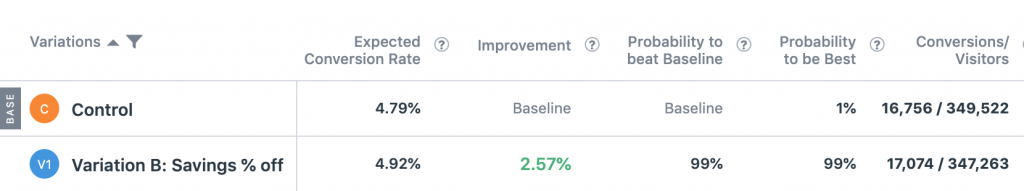
This test showed a 2.57% lift in conversion rate from PLPs and PDPs with 99% statistical significance. Revenue per visitor also increased by 2.54% with 95%. This was across 700,000 visitors and 18,000 conversions.
The lift was higher on mobile than desktop. On mobile the lift was 3.61% with 99% significance and desktop only 2.22% lift with, notably, only 89% statistical significance, which by the industry convention of 95% statistical significance to declare a test “significant” would be declared “no difference”.
Nonetheless, even if the lift was for mobile only, it shows a stark difference from the first test which was very much “no difference”.
What does this tell us?
Price Presentation Is a Function of the Price of Other Products
These results tell us that price presentation — a huge needle mover in ecommerce — is not about price from single items. It’s a collective phenomenon. It’s a function of the price of all of your products. Customers view pricing of one product as a part of a collective, where relative differences matter a lot in buying psychology.
The savings percentage was clearly overlooked when it was the same number for all products. But when it changed product to product, it drew the attention of customers and perhaps drew them to certain products with steeper discounts and increased conversion rate. The fact that revenue per visitor also increased means that this was done without simply attracting customers to lower AOV products. The percentage discount mattered, not necessarily the final price.
Overall this suggests the following for ecommerce brands:
- If you have was and now prices and different savings percentages per product, definitely consider testing showing the percentage off
- In general test price presentation carefully, it can make notable differences in conversion rate but stopping after one failed test may leave revenue on the table
If you’d like to read more articles related to this or more ecommerce AB test case studies, here are some suggestions:
- Our usability vs. desirability framework for CRO and ab testing
- Our research study of mobile checkout best practices across the 40 largest U.S. ecommerce sites
- Case Study: Adding a sticky add to cart button on PDPs
- Case Study: Adding Free Shipping messaging in different locations
- Case Study: Adding a Growth Rock coined ‘Link Bar’ to improve mobile navigation
Finally, if you’d like to learn more about our ecommerce CRO agency, you can do so here.
Optimizely vs Adobe Target vs VWO: Our Perspective after Running Hundreds of AB Tests

Optimizely vs Adobe Target vs VWO (Visual Website Optimizer) is a decision we’ve helped many clients work through. We’ve run hundreds of AB tests for ecommerce clients using all three platforms (we estimate we run 200+ AB tests annually), so in this article, we’ll compare the pros and cons of each and give our hands-on industry experience and discuss what differences we’ve seen from practical use, and where we don’t see much of a difference.
We hope this article will provide a nice contrast to the surface level comparisons from software comparison sites and from the marketing documents from both Optimizely, VWO, and Adobe.
In addition to differences between the platforms, we also share strategy nuggets in this article, such as:
- Why your AB tests should measure more than just one or two conversion goals
- When to use click goals versus pageview goals
- How we setup preview links so we can easily do QA (quality assurance) on multi-page tests
Who we are: We’re an ecommerce conversion rate optimization (CRO) agency. We design and run AB tests in multiple platforms every day. You can learn more about how we can help your ecommerce brand increase conversion rates, or join our email list to get new articles like this one emailed to you.
Finally, we got lots of help on this article from Brillmark, an AB test development agency we partner with and highly recommend.
[su_box title=”Contents” box_color=”#1079ce” class=”table-of-contents”]
- Setting Up Goals
- Preview Links
- Results Interface
- Statistical Model
- Integration with Analytics
- VWO’s CRO Package
- Developing Tests
- Other Features
- Pricing and Which to Choose
[/su_box]
How We Came Up With This Review
This list is from our experience actually developing and running conversion optimization programs for ecommerce clients using all three a/b testing tools.
This article was not influenced in any way by any of the software platforms we discuss, and we have no affiliate relationship with any of the platforms.
We simply run ecommerce ab tests all day, every day, via our agency. Below, we first discuss the main functional differences in using the software, then we discuss what we know about pricing for each platform at the end and give some recommendations of situations where you may want to go with each of the platforms.
Setting up Goals in Optimizely vs Adobe Target vs VWO
We’ve emphasized this in its own article before and mention this to every client we work with: setting up proper goals is essential to every AB test.
To recap briefly here:
- It’s not enough to measure just one goal in an AB test (for example, revenue) — you could miss the detail of why that goal increased, decreased, or stayed the same.
- Don’t just measure the immediate next step only declare winners and losers on just that goal — for example, measuring the success of an AB test on the ecommerce product detail page with only “Add to cart clicks” as your only goal. We’ve seen add to cart clicks differ from completed checkouts more times than we can count.
- Be careful about tests where one goal increases (even with statistical significance) but related goals don’t agree with that result. Try to have an explanation for that or flag that test as one to retest later (e.g. transactions increases, but views on checkout, cart, and add to cart clicks are flat, and the test was on the category or listing page. Why would that be?)
So the solution to these problems is two fold:
- Have a Standard Goal Set that lets you measure key steps in the entire conversion funnel. For example in ecommerce, have a standard set of goals for transactions, revenue, views of key pages in the checkout flow, cart page views, and add to cart clicks.
- Define Unique Goals for Specific AB Tests: For tests that add, remove, or edit certain elements, you can add specific goals that measure usage and engagement of those elements. For example, if you add something in the image carousel of a product page, you can add a unique click goal inside that carousel (in the alt images for example) to see if your treatment affected how many people use the carousel. This is in addition to your standard goal set, not in replacement of it.
So, in order to do this, it should be easy to setup and re-use goals within your a/b testing solution.
Two Most Common Types of Conversion Goals: Pageview vs. Click Goals
Finally, there are largely two types of goals that we find most useful in AB testing:
- Pageview Goals
- Click Goals
Pageview Goals
You typically use pageview goals for the most critical metrics. (a) checkouts or final conversions (via the receipt, success, or thank you page) and (b) preceding pages (the checkout flow).
Click Goals
Clicks goals are most useful for measuring user engagement on certain items, and as substitutes when you can’t use pageview goals (for example submitting a form that doesn’t redirect to a thank you page. You can also use a form submission event goal for this.). In terms of the “engagement” use case, we find this most useful when you are testing the effect of a certain element on conversion rate.
Using a common ecommerce example, say you are testing the impact of a particular widget or feature on a product page.
For examples using Boots.com’s mobile cart as an example, say you are testing the impact of a “save for later” link:

What goals should you include in this test?
First, you want the usual ecommerce checkout flow goals: These are a series of pageview goals through the checkout flow, like shipping, checkout, conversions (completed orders or transactions) and revenue.
Those goals will teach you if including this link negatively impacts checkouts and thus immediate conversion rate.
But they don’t tell you the complete customer experience story: you also want to know if people actually use that link. So you’re going to want one click goal for the link itself and perhaps pageview goals for any page you get to after you click that link (company dependent).
Thus both pageview goals and click goals are useful.
(Note: This example is ecommerce, because that’s what we work on exclusively now, but it applies to other website types as well. For example when we did SaaS AB testing, we’d similarly want to measure clicks on pricing option boxes and other elements we added to marketing pages.)
Which Platform is it Easier to Create Conversion Goals In?
In general, we find Optimizely and VWO much easier than Adobe Target for setting up conversion goals. We found some pros and cons when comparing Optimizely vs VWO that may help you pinpoint the platform right for you.
In Optimizely and VWO you can create goals at the platform level and have them be re-usable across multiple experiments.
In Optimizely, you can go to Implementation > Events and manage your list of events and create new ones.

In particular, look how easy it is to create a click goal (We’ll contrast this with doing it in Adobe Target later):

The equivalent in VWO is their frequently used goals section in the setup area of every AB test:
Unlike in Optimizely, there isn’t a central “AB test goal management” section inside the AB testing product of VWO. You just can see your most frequently used goals in a list as per the above screenshot when creating goals for any test you’re building. Perhaps this is slightly more cumbersome than Optimizely’s central events area, but we find this more or less equivalent.
[Aside: VWO does have a “Goals” section in their CRO product, more on that below. None of our clients have their CRO product, just AB testing, so we don’t have direct experience with it, but it seems this is more for tracking certain conversion metrics overtime site wide rather than a database of goals to use in AB tests.]
Also, just like in Optimizely, adding click goals is just as easy as pageview goals:

In contrast, in Adobe Target, you can create click goals, but there are some restrictions. Namely, you can only do this in tests you create using the visual editor method, it doesn’t work for experiments created using the form method.
To actually add the goal, you have to get into the Target visual editor and click on the element you want. When you do that, Target will let you select which CSS selector you want to target for the click (e.g. class or ID). The restriction is that this can’t be updated during the test. So in certain situations, like if the element ID or class changes dynamically for every new session and the selector selected by adobe visual editor is static, and you can’t modify it manually.
Pro Tip: Create a Base Experiment Template
Regardless of which platform you’re developing in, we find it convenient to develop a base experiment template that has key javascript and CSS you use and goals and audience settings you often use.
This gives a standardization to your AB tests that’s useful. Our strategists find it convenient to see goals in the same order, with the same set in every experiment. It makes results interpretation easier. Meanwhile our developers have a set template for writing their test code. This also allows developers to switch off, where one can finish a test that another started, help each other out, etc.
Preview Links in VWO vs Optimizely vs Adobe Target
Preview links are important to do QA (quality assurance) on AB test variations.
Quickly, unlike traditional development where you develop in a staging or development server, QA there, then push to production, in AB test development you develop inside the AB test platform, and QA the variations on the production server directly using preview links. Preview links are unique links that let you see a page as the variation, but you need the link to see the variation, no real users on the live production site will ever see it.
All 3 platforms (and basically every AB testing platform) has preview links, but there are some subtle differences in how they convenient they are to use.
First is how easy is it to see if goals are firing and measuring properly?
In Optimizely, there’s a preview widget that let’s see you see details about the experiments running, see a live feed of events Optimizely is picking up on, and more.

It’s pretty convenient for QA-ing a split test. For example you can click on elements and see in the events feed if Optimizely is picking that up as a click goal. So you can see, before you launch, if all your goals are measuring properly. For many tools, it requires checking logs and consoles, but this feature lets any non-technical employee do the same.
The other useful thing we use the preview snippet for is to see pages in certain audience and experiment conditions.

For example, note this tab above is called “Override”. What that means is you can enter audiences and experiments that you want to turn on and off for the purposes of viewing the page. This is useful for us since we’re always running multiple tests on a clients’ site at one time. So if a test is running on the PDP for example and we’re QA-ing a new test in the pipeline also on the PDP, we can preview it with the current test turned off. This is useful and speeds up the AB test development process (otherwise you’d have to wait until the first test concluded to QA and finish developing the new test).
VWO has a similar preview widget, but its features are more limited. It just let’s you choose the variation of the experiment you are previewing that you want to see, and shows you some log data to make sure things loaded properly:

It doesn’t show you click and event firings as you click around the site and load different pages.
Preview Widgets Help You Easily Perform QA on Multi-page Tests
One other convenient thing about the preview widget for both Optimizely and VWO is that it lets you browse around the entire site and “stay” in the variation.
This is really useful for multi-page experiments, which are common for most companies doing a/b testing.
Say you have an AB test running on all PDPs. If you get one preview link for one PDP, and you open it, you can see how the variation will look on that one page, but what about on other pages? Maybe other PDPs have longer product names, more photos, or different elements that could “break” the variation. It’s useful to test the variation code on multiple PDPs to check for this.
Normally with just one preview link, if you click off of that page, you don’t remain the variation, you just enter the normal live site.
But with the preview widget above in Optimizely and VWO, you can stay in the variation regardless of where you go on the site. So you can check as many PDPs in this example as you like and see how the variation looks on all of them. This helps speed up QA a lot.
Adobe Target does not have a preview widget like this. You simply get a preview link, and that’s it. This is a bit inconvenient, but not unmanageably so. What our developers do is add a javascript “QA cookie” into test code when they develop the test. This is a cookie that keeps you in the variation once you open the preview link. We set the cookie to expire in 1 hour. So then once someone opens a single preview link, they are “in” the variation for an hour, and can browse around the site and see every page as a user in the variation would.
We actually use this QA cookie method for all split testing platforms, including Optimizely and VWO, because although the preview widgets in Optimizely and VWO are useful, it requires you logging into the Optimizely or VWO account and clicking preview to get to it. So when a developer finishes coding a test and passes it to QA, it’s actually really convenient for the QA team, the designers, and the clients, who aren’t always logged into the right account, to just get a single link that keeps them in the variation.
Results Page User Interface
In our view, the results page UI is one of the biggest differences between Optimizely vs VWO.
In Optimizely there is a single long page of results and graphs for all goals, which is easy to scroll through:

…and there’s a nice summary of the results themselves at the top that you can horizontally scroll through:

In our opinion VWO’s results page UI is a little clunkier.
We use the “Goals” report almost exclusively, more on the difference between this and the “Variations” report later.
You have a list of goals on the right and you have to click into them one by one to see the results.

When you click on each, you get a bar graph with numerical results underneath.

You can click the Date Range Graph to see the cumulative conversions. It doesn’t have an option to see the conversion rate by date like the Optimizely graphs do.
This is largely serviceable and fine. When deciding between Optimizely vs VWO, we recommend VWO to most companies getting started with AB testing because these minor inconveniences are well worth the cost savings vs. Optimizely in our opinion for most companies starting with AB testing. But if you’re a power user, this is something to keep in mind.
Adobe Target has, in our opinion, the clunkiest results page.
First, it opens with only one goal’s results displayed:

Note above it has only one goal under “Shown Metrics”. So you have to manually select the other goals to include in your report.
Then, the second annoyance is that once you do select all your goals to be displayed, there is a clunky accordion UI where you have to manually “open” and “close” one goal after another to see the results of all of them. By default, all but your first goal show just the high level results without percentage increase or statistical significance, which isn’t that useful.
Here it is with all accordions closed:

Here it is with one goal’s results open:

Again, these aren’t major annoyances.
As many have written before (most notably, Evan Miller’s “How Not to Run an AB Test”) you shouldn’t be checking AB test results all the time anyways.
Nonetheless if you start to really integrate testing into your company’s CRO processes, you will start to use these features often. So in this article we wanted to be transparent with all pros and cons that we’ve encountered, even if they are small annoyances, and simply tell you later what we think is a big deal and what is not.
Statistical Model Used in Reporting Results
We’ll be brief here as a lot has been written about statistical models for interpreting AB test results, and we’ve found that ecommerce teams start falling asleep when we talk about AB test statistics too much.
In terms of platforms, both VWO and Adobe Target use more “standard” calculations of statistical significance (stat sig = 1 – p-value). VWO uses a z-score based calculation for it’s “Chance to Beat” number. Adobe Target uses a traditional confidence level in its results reporting.
Optimizely, however, is unique in that it uses a statistical model it developed with professors at Stanford that it calls it’s “stats engine”. This is a somewhat recent feature that rolled out at a similar time as Optimizely X (which is what they call their testing tool now). The math behind this is complex, but the end result for you, the user, is that Optimizely claims that with it’s statistics calculation, you can “peek” at the result whenever you want, and the moment it hits your significance threshold (say 95%), you can stop the test.
That’s actually really convenient, but in our experience we have seen multiple instances where Optimizely has reported 90%+ statistical significance, but after collecting more data, it goes back down.
Integration with Analytics
As you start to do AB tests, a proper integration with your regular analytics tools becomes borderline essential. In our experience, there are two main reasons why:
- Other Metrics – You’ll want to know how the variations in the experiment differed in metrics that you did not think to create goals for beforehand (e.g. time on site, visits to some other page on the site you didn’t think of, etc.)
- Consistency with Analytics – You’ll want to validate the ab test platform’s results with your own analytics platform
(1) Other Metrics
No matter how careful you are in measuring plenty of goals in your AB tests, inevitably, you’ll have tests where everyone will want to know how the variations contrasted in metrics you didn’t measure as goals in the ab testing platform.
Often, ambiguous results (a couple metrics increasing for the better, others not) will lead the team to want to know auxiliary information (e.g. “Well, how did this affect email capture?” or “Did more of them end up visiting [this other page]?”). Or you simply may want to know about other metrics related to user experience that you didn’t think to include as goals when launching the test (“Did the bounce rate decrease?”, “How was time on site affected?”)
Integrating your AB testing software with other metrics will let you answer these questions when they arise because you can create segments in analytics (Google Analytics, for example) for the variations of your AB test and see how they differ in any metric that the analytics platform measures.
(2) Consistency with Analytics
A common issue in AB testing is not seeing the lifts from AB tests manifest themselves in analytics once the winning variant is implemented on the site. This problem is almost always due to other factors affecting conversion rate, not the AB test being “invalid”.
For example, natural fluctuations in site conversion rate can be massive (due to day of the week, different promotions, ad traffic changes, etc.), and an improvement in conversion rate of 10% from the PDP to checkout will easily get buried in those fluctuations. That doesn’t mean it’s not important. For an 8 figure brand, that 10% increase is worth a lot annually. It just means AB testing is the way to measure that, and expecting to see a noticeable bump from implementing the winner when your normal fluctuations are huge is not reasonable.

All three testing solutions have ways to integrate with analytics, but for companies already on Adobe Analytics, obviously with Target, you get the potential perk of both software platforms being part of the same software company. Note, however, in our experience, that advantage is minimal. Why? Because if you can push AB test data from any platform into your analytics software, it essentially doesn’t matter if the AB testing software and analytics software are made by the same company.
Here are links to integrating with Analytics:
- VWO to Google Analytics
- VWO to Adobe Analytics
- Optimizely to Google Analytics
- Optimizely to Adobe Analytics
Perks of VWO’s “CRO Package”
One unique feature of VWO that we think is pretty useful is what they call their “CRO” package. Just to be clear, you can buy just AB testing for them, or buy this CRO package in addition. You can learn all the details on their CRO page, but we want to highlight just a few features we think are worth considering here.
In short, their built in user research tools, which they group under “Analyze”, are pretty useful when offered in a single platform that also does AB testing.
Here’s why: Yes, you can get heatmaps, recordings, forms and surveys in many other tools. But, having them integrated with your AB testing tool lets you get heatmaps or recordings, for example, on a variation by variation basis.
This means you can see differences in user behavior between original and variation of an AB test.
The need for this comes up in our normal work with clients all the time. You set up and run a test, and just like we explained in the analytics integration section, you realize after the results come in that you’re curious about user behavior that can’t be measured by only the goals you thought to create: (“Did they actually use this feature?” “Did they scroll a lot to see more images?” etc.) Other times you may want to see if you missed something at the QA step and want to see recordings to make sure customers did not encounter an error in a variation you designed.
By using a third party analysis tool like Hotjar or Full Story, it is possible to integrate to the AB testing tool, but it’s more tedious and in our experience sometimes doesn’t work well. With VWO, you can easily get heatmaps and recordings of different variations.

Actual AB Test Development
Our developers don’t feel like there’s much of a difference in developing in either platform. In all cases, developers typically develop a variation locally, then upload the code into the platform and test via preview links. All the platforms seem to handle this just fine.
Other Features
The above sections were the things that matter to us the most. Here we’re going to rapidly go over other features you may want to consider:
- Multivariate testing – Advanced CRO teams may want to run multivariate tests (mvt) which is possible in all three platforms
- Server Side testing – Optimizely has a robust “Full Stack” product offering that lets you run server side AB tests and AB tests on iOS and Android. VWO also lets you run tests on mobile apps. Adobe Target also lets you run server side tests.
- Personalization – All 3 platforms advertise having personalization solutions, although it seems Target and Optimizely have the most robust offerings here, especially at the enterprise level.
Pricing and Which to Choose
It’s hard to discuss pricing definitively because all 3 optimization platforms (like many software platforms) change their pricing often, pricing is a function of your traffic levels, pricing is a function of the features you buy, and pricing is also a function of other licenses you may already have (e.g. Adobe Experience Cloud). So, sadly, it’s not as simple as us listing out prices here.
But in general, we’ve found that VWO (here are is their pricing plan page) is the most affordable testing solution by a long shot, followed by Target, then Optimizely.
For more than 2 million visitors per year to test with, expect to pay at least $1000 per month, with plans getting much higher than that quickly.
For clients that are just starting AB testing, we almost always suggest VWO as it’s the most affordable and we think the majority of your success in a CRO program has to do the with the strategy you implement and knowing what to test, not the software you choose.
That said, if you think it’s likely you’ll things like enterprise level personalization, or personalization across multiple device types, and Optimizely’s unique features are important to you, it would also be a good option to consider.
Finally, if you already are on Adobe Marketing Cloud and want to make sure you stay integrated, Target may be a good option to consider.
Not sure? Feel free to reach out to us and ask us what you’re considering and we can give our honest opinion.
And if you are an ecommerce brand looking to implement a strong, results driven CRO program with a team that has lots of experience doing this, you can learn more about working with us here.
[Note: Not evaluated in this article are other ab testing solutions such as: Google Optimize, Monetate, AB Tasty, and more. We may write subsequent articles contrasting these platforms.]
Sticky Add to Cart Button Example: Actual AB Test Results
In our work with dozens of ecommerce companies over the last 5 years, we’ve noticed that the design and UX of the add to cart section (buy buttons, options, quantity controls) is debated a lot.
- Should you make the add to cart button sticky?
- Should we make the entire section sticky?
- Should we hide some selections (size, color, flavor) or show all?
- Should we show all sizes as buttons or shove them in a dropdown?
- In what order should we present the different options?
This case study is about the first question.
In this article, we present results from a couple AB tests where we tested having the entire add to cart area be sticky versus not sticky on desktop devices for an ecommerce site in the supplement space.
The variation with the sticky add to cart button, which stayed fixed on the right side of the page as the user scrolls showed 7.9% more completed orders with 99% statistical significance. For ecommerce brands doing $10,000,000 and more in revenue from their desktop product page traffic, a 7.9% increase in orders would be worth $790,000 per year in extra revenue.
But, not all instances of making add to cart controls sticky have increased conversion rate, as we share below.
In our experience, sticky add to cart areas on desktop product pages are less common than on mobile, so this result suggests many ecommerce brands, marketing teams, and store owners may benefit from AB testing sticky add to cart buttons or entire add to cart areas being sticky on their product detail pages.
In general, this type of test is squarely in the “Usability” purpose of our Purpose Framework.

Usability tests are changes to UX, and typically what most people think of when they hear “AB testing”. But generally, they aren’t where you get consistent, long term increases in conversion rate, because most modern ecommerce websites already have good enough UX. Instead, we suggest: (1) tracking and plotting which purposes you’re testing more often and which are winning and (2) being more intentional about deciding which purposes are likely to move the needle for your customers and systematically focusing on them it.

We explain more in our Purpose Framework article linked to above for those that are curious. You can also see all ecommerce A/B tests we’ve ever done, organized by purpose, in our live database.
Note: If you’d like to run AB tests like this to help increase your ecommerce site’s conversion rate or improve user experience, you can learn about working with our ecommerce CRO agency here.
Building a Data Driven Culture: AB Tests Can Help Settle Endless Debates

The conference room: Where the sticky add to cart button is likely debated non-stop with little useful progress is made.
When you read about AB tests online, most articles have a nice predictable pattern: (a) We had a great hypothesis. (b) we tested it (c) it worked and got a conversion lift!
But when you do enough AB testing (we run hundreds of AB tests on ecommerce sites every year, which we transparently catalog here), you come to learn that most tests don’t end up so neat and clean.
So instead, we urge you to think of an alternative, but also valuable use case of AB testing:
Run a test to learn about your customers even when you could make arguments for either variation being “better” and there isn’t consensus on which one is “obviously going to win” (a phrase we often hear clients use).
Let’s use this article’s example to learn why this “ab tests for learning” use case is so useful: For this sticky add to cart button example, in the traditional design process, people in the company would debate in a conference room (or by email, or in Slack), about having a sticky vs. non-sticky add to cart area on their product page.
They’d go in circles fighting with each other about which is better, which is more on brand, which competitors do something similar, and on and on.
Then, either the higher ranking person wins or an executive steps in and gives their official decision like Caesar at the Colosseum (even though 99% of the time the executive is not a UX expert).
But in reality, neither side knows which will do better. Both arguments are legitimate. And the one important contingent that does not have a seat at the table is the customer. An AB test lets your customers give their input.
And, finally, whichever variation “wins” is important but not as important as the learnings about how your customer thinks, what they prefer, and what is more persuasive to them, all of which you could learn by simply running a test.
So, with all this on our minds, we ran this test.
The Variations: Fixed vs. Sticky Add to Cart Buttons
The variations were simple. One of them (A), the buy box was not sticky and in the other (B) it was sticky. (Aside: Read why we anonymize clients here.)

In this case, the client’s product page had a sticky buy box (variation B) to begin with, and it hadn’t yet been tested. The reason we decided to test this was because there was a content-focused culture around the brand, so we felt it was important to learn how much users want to be left alone to read content versus having a more in your face request to buy following them down the page.
One can make a theoretical argument for both variations:
- Argument for variation A (not sticky): You don’t want the site to act like a pushy salesperson, hovering over your shoulder when you’re just trying to read about the product and its benefits. It will turn people off.
- Argument for variation B (sticky): People can read about the product just fine, and reminding them of the ability to add to cart will increase the percentage of people that do so.
This is why, by the way, we use The Question Mentality and base A/B tests on a series of questions instead of old fashioned hypotheses where someone pretends they know what the outcome will be “Sticky is better! Trust me!”.
In this test there are really just two main questions to answer:
- Does making the add to cart area sticky affect add to cart rates?
- Does it affect conversion rate too? In other words if people add to cart more, do they actually check out more?
Results: Sticky Add to Cart Button Gets More Orders by 8%
In this test, the sticky add to cart variation showed 7.9% more orders from the product pages with 99% significance. The sticky version also showed an 8.6% increase in add to carts with 99%+ significance. The test ran for 14 days and recorded approximately 2,000 conversions (orders) per variation.
Referencing the arguments for either side above, this test gave the marketing department and us valuable information about the customer (and saved a potentially conversion hurting future change of undoing the sticky add to cart area).
Despite this brand’s heavy focus on content, despite the customers’ needs to read a lot about product uses, benefits, ingredients, and more, having an ever-present add to cart area seemed to be okay with the customer. It did not annoy the customers, and in fact seems to increase the percentage of them that decided purchase. This is a useful learning, despite this test largely being in the usability category, not desirability.
(Note: This is true of this store, it may not be true of yours. Hence we always suggest at the end of case studies that you should “consider testing” this. We don’t say you should just “do” this.)
This learning can actually be extended beyond the product pages to content pages such as blog posts where we can test being more aggressive with product links and placements to see if similar results can be achieved there.
This is why we love using AB testing for learning.
Update: Sticky Add to Cart Button on Mobile Product Pages Also Increased Conversion Rate
Since first writing this case study, we tested multiple UX treatments for a sticky add to cart button on the mobile PDP of this exact same supplement ecommerce store. The smaller screen real estate on mobile devices, of course, means finding CTAs like the add to cart button can be more difficult, so making the add to cart button sticky could improve user experience.
We tested three variations: (A) No sticky add to cart button (B) Sticky add to cart button that simply scrolls the user to the add to cart area on the product page (C) Sticky add to cart button that causes the add to cart area to slide up from the bottom of the page like a hidden drawer.

We observed a 5.2% increase in orders for variation C where the add to cart area slides up like a drawer, with 98% statistical significance. This test ran for 14 days and had over 3,000 conversion events (orders) per variation (so over 9,000 conversion events total).
Add to cart clicks increased by a whopping 11.8% on variation C (>99% statistical significance) and by 6% on variation B. So actual use of the button was substantially increased by making the add to cart button sticky on the mobile PDP.
Variation B — where clicking on the sticky add to cart button simply scrolls users to the add to cart area on the PDP — on the other hand showed no statistically significant difference in conversion rate from the original. As per an insightful reader comment below, this discrepancy between variation C showing a clear lift and variation B showing no difference could be explained by:
- The slide up “drawer” of add to cart functionality (choosing a flavor, quantity, etc.)in variation C may have kept users focused on that step because it feels like you’re in a new “sub-page” of sorts instead of just scrolling to another part of the PDP.
- Also that means on the PDP itself there was no space taken up by add to cart functionality in variation C like choosing flavors so users got to see more persuasive “content” about the product on the PDP.
This suggests that similar conversion gains can be realized on mobile product pages, but the details of how to implement them and the UI/UX that will cause a conversion increase are important. Questions? Let’s discuss in the comments.
If you have questions about whether your store should test sticky add to cart functionality, how to execute it (e.g. Shopify plugins vs. manual coding), or about working with us, you can ask us in the comments, send us an email, or learn about working with us.
Or join our email newsletter to get our latest articles and AB tests.
Our Foundational Ecommerce CRO Articles
- Our Purpose Framework
- Our Question Mentality
- Our live database of all A/B tests we’ve ever done
- Our collection of ecommerce UX breakdown videos
Other Single A/B Test Case Studies
E-commerce Free Shipping Case Study: How much can it increase conversion rate?
We know free shipping is a massive needle mover for ecommerce customers. In this short case study we share results from two AB tests we’ve done that help answer:
Where is the best place to put your free shipping and free returns messaging to get the biggest lift in conversions?
Test 1: Free Shipping messaging placement for furniture ecommerce site increases conversion rate 19%
Hypothesis:
On the original site, free shipping and free returns was already mentioned in the promo bar at the top of the page which was visible sitewide.

We hypothesized that due to (a) banner blindness and (b) too many competing messages in the promo bar, this message was not getting across.
Where could we place this message that would be least likely to be missed and most likely to influence the buying decision?
We settled on placing it below the add to cart button on the product detail pages (PDP).

Result
We saw a 19% increase in orders with 99.9% statistical significance. The test ran for 2 weeks and recorded over 1,500 conversions.
Implications
In many ways, this test is fascinating. In the original, the free shipping and free returns messaging is already mentioned in the promo bar, at the top of the page, sitewide.
How could customers not see this?
This result suggests there is truth to the idea that banner blindness and competing messaging hurts the effectiveness of that message.
If you offer free shipping and free returns, or have other key value propositions (like an active discount code or promotion) you should strongly consider testing where free shipping and returns messaging is placed, and certainly test adding it near your add to cart button on the PDP. Most brands from what we’ve seen either put them in promo bars (not bad) or save them for graphics on the homepage (much worse).
Test 2: Free Shipping copy for a Supplement Company Does Not Affect Conversion Rate
We tested something very similar for a niche supplement company.
Hypothesis
In this case, we actually hypothesized it would perform better because there was no mention of free shipping on the site except in fine print. (Definitely not in a sitewide promo bar like the example above).
Just like the above test, we put free shipping copy below the add to cart button:

The only differences were:
- The copy said “Free US Shipping & Returns instead of “Free Shipping & Free Returns”
- There was a dropdown caret that had more details on the 30 day return policy. The schematic above for B (our variation) shows the caret expanded. Upon pageload it was collapsed, i.e. the box with return details was not visible.
Results
After 2 weeks and over 5,000 conversions, we saw no difference in conversion rate between the original and variation. The conversion rates were almost identical!
Implications
For this brand we actually tried a few different placements of free shipping copy including in a promo bar and still found it made no difference on conversion rate.
Why could that be?
AB tests tell you what and you have to hypothesize as to why.
In this case it could be several reasons:
- This is a specific, niche supplement space where there are only a few providers and most provide free shipping, so it may be expected by the customer.
- This is a much lower price point than the first example (furniture) so perhaps in the first example the thought of a hefty shipping cost and hassle of returning furniture is a huge friction point that the copy helped assuage.
- The supplement brand is very content heavy, so readers may be far more sure they want to buy after reading up on the details and details like shipping cost don’t matter as much.
- Finally, the customers for the supplement brand may simply be less price sensitive due to its niche characteristic. In fact, later we did pricing tests that also showed little difference (to be profiled in a later case study).
Disclaimers
One lesson we’ve learned over and over is that while there are UX patterns that seem to perform better across multiple ecommerce sites, there are always plenty of exceptions. So what works for one site, doesn’t always work for another. The two examples above show that.
So we encourage you to learn, take inspiration, and think critically about the case studies above and how they may apply to your store. Then, we encourage you to run your own tests before simply implementing these UX treatments on your site.
If you’d like to talk to us about improving conversion rates for your ecommerce brand, you can learn more about working with us here.