

Mobile Checkout Best Practices and Trends in Ecommerce
Our ecommerce conversion optimization team has done an extensive analysis of the mobile checkout experience of the top 40 ecommerce sites in the U.S. (by traffic, according to the Alexa.com Shopping category). In this article, we present the results and analyze the impact of this data on current mobile checkout best practices and mobile ecommerce trends.
This analysis includes:
- Key UX features in mobile checkout for each site (24 features total)
- The percentage of the top 40 sites that employ each feature
- When applicable, AB test data we have for each feature
- Our conversion optimization team’s recommendation for each feature
We’ve divided our analysis into 4 sections of mobile checkout:
Each section has between 4 and 8 features analyzed, with a total of 24 features discussed.
We go beyond just listing features to discussing which should be considered mobile checkout best practices and which can be ignored. For example, you’ll learn insights like:
- What percentage of these sites employ payment systems like Apple Pay
- What percentage have a save your cart feature?
- Does it matter if you add trust badges on shipping and how many sites do?
- Has our team AB tested these features and if so, what have we concluded?
- For 24 unique mobile checkout features
At the end, for reference, we’ve included screenshots of the mobile checkout flows of each of the top 40 sites we analyzed.
[su_note] Bonus: No time? Get a concise PDF summary of the data and our recommendation for each feature. [/su_note]
You can find details of our methodology, including the full list of the top 40 sites and the bottom of this page.
Finally, if you’d like to apply to work with us to increase your ecommerce conversion rates via AB testing, you can do so here.
Why Mobile Checkout Best Practices Are So Critical
Mobile checkout is arguably the most important ecommerce conversion optimization trend today.
Why?
Because most ecommerce stores have more mobile traffic than desktop, and it’s only going to get worse.
But mobile conversion rates are much lower than desktop. We typically see mobile conversion rates hover around half of desktop.
Brands with the best mobile checkout experiences will have a massive advantage over competitors for years to come. It’s our hope that this study will help your ecommerce site improve its mobile conversion rate through an improved checkout experience.
Mobile Shopping Cart Page Trends
Cart features we analyzed:
- Add to Cart Button Takes User To?
- Number of Upsells in the Cart
- Checkout Button Above the Fold
- Proceed to Checkout Button is Called?
- Displays Secure Checkout or Trust Badges
- Total Savings Highlighted in a Separate Line Item?
- Save Cart for Later Option?
- Keep Shopping Link?
Add to Cart Button Takes User To?
Designers love to talk about “minimizing clicks”. So in ecommerce companies, deciding what happens when the user clicks “add to cart” can be a source of debate:
Should you take them straight to the cart? This minimizes clicks if they will only check out with one item, but increases it if they will add multiple. For example Etsy.com, BestBuy.com, and Wiley.com all do this.
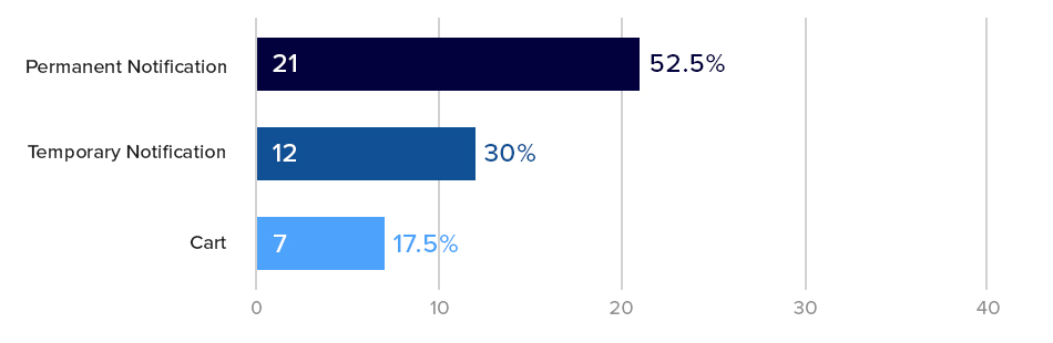
Should you use a temporary notification? (Appears, says they added to cart, then disappears) This bothers the user the least but may not be “in your face” enough to encourage checking out. Nike.com, HM.com, and Macys.com all do this. In general “sliders” or “drawers”, even on desktop checkout flows seem to be an ecommerce checkout design trend in the last few years.

Should you use a permanent notification that pops up or slides up? This is very clear, but may create more clicks for the user. Here is Walmart’s:

The majority (over 50%) of our Top 40 sites used a permanent notification. These are very similar to taking the user to cart, because they have an option to proceed to checkout immediately or review cart or continue shopping.
The key difference is a permanent notification can often be closed (with an “X” button) and the user remains on the product page without waiting for page loads, so the experience is faster then sending them to the cart.
What is Best Practice for Add to Cart Notifications? Our AB Tests Show…
We’ve tested different add to cart notifications before and haven’t seen large, impactful changes in conversion rate (on both mobile and desktop).
For example in one mobile specific test, we tried different styles of a permanent notification with differing amounts of information and size.
We saw clear differences in how many users clicked Proceed to Checkout vs. View Cart buttons (10% – 12%) with statistical significance but saw no net change in orders or revenue.
This suggests that the format of the add to cart notification may not make a huge impact in actual mobile conversion rates. As per our usability vs. desirability optimization framework, changes that affect a users desire to checkout (desirability) usually have a bigger impact than reducing friction (usability). This is a usability tweak so it’s unsurprising that it didn’t make a huge impact.
Growth Rock Recommendation: For high traffic or high transaction volume sites, this may be worth testing, but don’t hold your breath for large changes in mobile conversion rates (> 5%).
Number of Upsells in the Shopping Cart
65% of our top 40 ecommerce sites have upsells and cross sells on the cart page. Surprisingly 14 of the 40 sites we analyzed did not have any upsells or cross-sells on the cart.
On average, those that had shopping cart upsells, had 14 products recommended somewhere in the cart.
That’s a lot of products!
Typical mobile shopping cart upsell designs looked like this one, from Sears:

Upsells and cross sells are a huge factor for any ecommerce website because of their power to increase average order value (AOV).
What is the Mobile Shopping Cart Upsell Best Practice? Our AB Tests Show…
In our AB tests, we’ve seen upsells and cross-sells improve AOV significantly, but they are not always guaranteed to be effective.
Thus we strongly recommend every ecommerce site test this for themselves. Test different upsells, test including and not including upsells, and test how and where the upsells are presented.
In multiple tests, upsells have made no difference on AOV and revenue per visitor. As the site management team or owner, you want to know this so you can test alternative products, number of products, position, copy, etc.
On the other hand for those sites that don’t have upsells or cross-sells, they should for sure be tested as they have the potential of increasing our AOV and (most importantly) revenue per visitor, significantly.
None of our tests have yet to show a decrease in conversion rate due to the presence of upsells or cross-sells in the cart.
Checkout button is above the fold?

60% (24) of the top 40 sites had their checkout button above the fold on their mobile cart page.
A pretty well accepted ecommerce mobile checkout best practice is to put checkout buttons above the fold. You hear UX experts recommend this all the time.
But again, this is a usability tweak — where the checkout button is doesn’t affect a users desire to checkout. So should this be a best practice? What does the AB testing data say?
What is the Checkout Button Position Best Practice? Our AB Tests Show…
Because this is a usability tweak, we have only tested this once.
In that test, we did not see a statistically significant change in checkout rate by adding a proceed to checkout button above the fold, contrary to what the well accepted best practice would tell you. In a second variation where we added detailed savings and order total amounts in addition to the button, we actually saw a trend towards a 2% decrease in conversion rate (albeit with only 84% significance).
Growth Rock Recommendation: You can test this as your results may vary (very few UX trends apply to every site) but we’d suggest focusing efforts on bigger potential wins.
Ask what’s actually holding customers back from checking out? Chances are it’s not that they can’t find the checkout button.
Proceed to Checkout Button is Called?

We love to make jokes about people who think AB testing is about button colors and button text and other tiny details.
The vast majority of the time, details like this make no difference.
However, if you’re curious about the proceed to checkout button copy, above is what we found in our top 50 ecommerce sites. Most of the top 40 stores simply called their button “Checkout”.
Growth Rock Recommendation: Again, as per our Usability vs. Desirability framework, we don’t recommend spending too much time on small UX decisions like this.
Displays Secure Checkout or Trust Seals
![]()
Credibility icons and social proof is, for sure, an ecommerce design trend these days (e.g. 2017, 2018, and 2019). It is one of the most oft-mentioned tactics in the conversion optimization community.
But it’s interesting that less than half (42.5%) of our Top 40 sites had a security message or trust seal on their mobile cart page. Even fewer (only 17.5%) had credit card logos. It’s arguable whether credit card logos are necessary today as consumers now expect all sites to take all major credit cards.

Advertising a “secure checkout” experience on the other hand is more controversial. As we indicate in the payment section, our AB tests have not shown a lift in conversion by mentioned security, or using security badges, trust seals or icons.
It’s possible that at least some of the 57.5% of sites we analyzed that also don’t mention secure checkout or have trust seals on the cart page have also tested this and found it didn’t make much of a difference.
What are Trust Seal Best Practices on the Shopping Cart? Our AB Tests Show…
Of course social proof is a well-known persuasion tactic and we agree with its usage.
That said, we have not seen credibility icons or social proof quotes make a huge difference in most AB tests, in particular in the checkout flow.
As mentioned below, our few tests of credit card and security trust logos on the payment step have not shown a conversion lift.
Growth Rock Recommendation: This is an easy test to run and we suggest you try it as many have reported data suggesting trust seals and security messages improve conversion rate. Just don’t hold your breath for a conversion increase. If you have a trust seal or security message on your site currently, it could be worth testing removing it. In our view, if something is not helping, its best to remove it to keep experiences as clean and distraction free as possible.
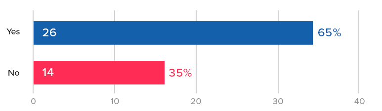
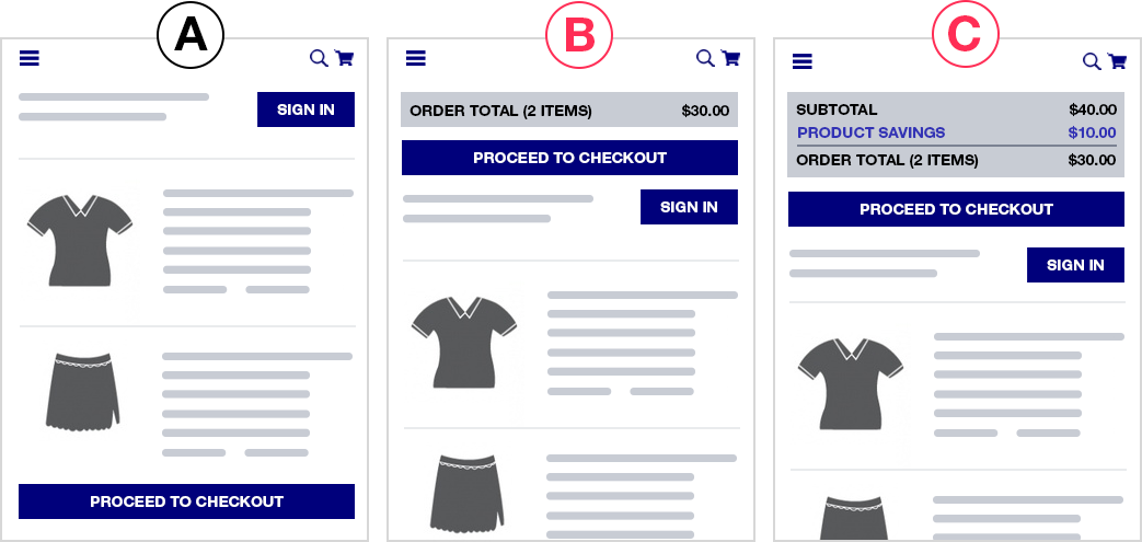
Total Savings Highlighted in a Separate Line Item?

Savings (or, more specifically, perceived savings) are a huge factor in for ecommerce stores. We’ve seen evidence of this for many different ecommerce brands: low price (AOV < $30), luxury apparel (AOV > $300), furniture (AOV > $1000), to name a few. User surveys and customer support interviews in luxury apparel even indicate that customers love feeling like they got a deal or “the best price” (even on a $1000 purse).
But only 35% of the Top 40 sites we analyzed have savings highlighted as a separate line item in their order total in the shopping cart:

So what is the best practice for how a store should highlight savings on the shopping cart page?
Our AB Tests Show…
We’ve observed something interesting in savings highlighting on the cart page: Highlighting savings at the product level seems to be significantly more important than highlighting it at the order total level.

In one store, we saw a 4% increase in revenue per visitors and 3% increase in checkouts when we highlighted savings on each product, vs no statistically significant increase in either metric when we only highlighted it at the order total level.
Save Cart for Later Option?

Cart abandonment is such an issue for ecommerce teams that even writing this sentence feels like a cliche.
But on mobile? It’s even worse. Mobile users are notorious for adding to cart, and dropping off. So features like this that can capture their email — as long as it doesn’t hurt checkouts, can be really impactful.
Here is an example from Nordstrom:

We’ve tested a save your cart feature on many ecommerce stores and the results have almost always been positive.
Most sites already have this ability built-in, if a user is logged in. So the easiest way to test this is to include a button or link in the cart page that says “Save Your Cart for Later” followed by “by creating a free account”.
In one of our tests, we saw a whopping 250% increase in account creations by adding this link. Why so big? Because most ecommerce sites have dismal account creation rate other than people who already buy. (When is the last time you decided to create an account when buying clothing online for example?)
So adding this incentive (save your cart) and clear CTA on a very high traffic page (cart) increases account creations dramatically.

But does this hurt checkouts?
This can often be a concern as you’re adding a secondary CTA on the cart page that could distract. Our save your cart tests haven’t shown a drop in checkouts. If anything both showed slight increases in checkouts.
Growth Rock Recommendation: All ecommerce sites should test adding save your cart functionality.
Keep Shopping Link?

Keeping distractions to a minimum is a key conversion principle across all website CRO. You want to keep users focused on their primary desired actions.
Thus, our team feels that a “Keep Shopping” or “Continue Shopping” link is not useful on the cart page. Users can already continue shopping in many ways.
- Back button
- Logo to go to the homepage
- The full navigation menu, which is present on almost all cart pages

Instead, we feel it can serve to distract from the primary CTA of proceeding to checkout.
Our AB tests show…
In fact, in one of our “save your cart” AB tests involved replacing the “continue shopping” link with “save your cart” and saw orders trending positive by 6% vs. original, albeit with only 83% statistical significance.
We hypothesized that removing the prominent “continue shopping” link in that instance may have been the true cause of the slight potential conversion rate increase rather than the save your cart link in that test.
About half of the top sites we surveyed had a continue shopping link. Notable sites without such a link in the cart include two of the biggest ecommerce sites today: Amazon, and Walmart.
Notably, for larger ecommerce stores like those, search is a major feature, and since normal nav elements remain on the cart, the search bar is, in effect, another “continue shopping” option for the user, rendering the “continue shopping” button less useful.
This redundancy is made starkly clear on Rei mobile cart page:
Growth Rock recommendation: Test removing your continue shopping link. In fact, consider replacing it with a “save your cart” link from the item above.
Pre-Checkout
Jump to:
- Guest Checkout Option?
- Separate Page to Choose Guest Checkout?
- Continue with Social Media Account Option?
- How Many Pages is the Mobile Checkout Flow?
Guest Checkout Option?
The vast majority (75%) of the sites we investigated have a guest checkout option. It’s well regarded at this point as a conversion “killer” to not have a guest checkout option.
These brands in our list do not have guest checkout and require account creation to checkout:
- Amazon.com
- Zappos.com (owned by Amazon)
- 6pm.com (owned by Amazon)
- Costco.com
- Target.com
- Wayfair.com

What do you notice? The majority are huge brands with household brand names in the U.S.
Half are Amazon or owned by them. Amazon, of course, is built on registrations which feed it’s business model including growing Prime subscribers.
Costco.com won’t even let you checkout of their physical retail store without being a member so that goes without saying.
So the only two unexpected brands on this list are Target and Wayfair. They are both big brands, one in brick and mortar retail, and the other online, but other than size and brand recognition, nothing in their brand ethos would suggest it’s an obvious move to require sign in. Thus, it’s an interesting decision by them to demand users create an account.
Notably, other household brand names as big or bigger than Target and Wayfair allow guest checkout. In particular, Walmart, Home Depot, and Ebay (which historically started out as sign up required to bid on items and only later allowed guest checkout.
Growth Rock Recommendation: Unless you have the brand recognition and size of Target and Wayfair, you should probably stick to allowing guest checkout. At the very least AB test removing it and calculate whether the drop in immediate purchases is made up for
Separate Page to Choose Guest Checkout?

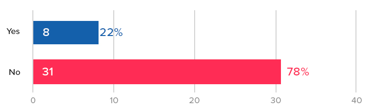
The majority of top ecommerce sites (56%) still send users to a separate page prior to the start of the checkout flow to choose whether to use guest checkout or create an account.
Once again, traditional UX theory suggests “minimizing clicks” should help conversion rate.
Our AB Tests Show…
We’ve seen indications of a conversion lift by removing this page but nothing particularly convincing. The closest was a test run to 880,000 visitors, where, where removing this page (and sending customers straight to the checkout page) showed an improvement in a conversion rate of 1.5% – 2%, which held steady over multiple weeks but ended with only 86% statistical significance.
Growth Rock Recommendation: We suggest you test this yourself if you have the resources to run at least 1 – 2 test a week. If your AB testing bandwidth is limited, focus on bigger wins. If you run this, pay attention to a potential tradeoff between new account creations and completed orders.
Aside: 84% of these pages present guest checkout second to sign in for returning users. While we haven’t tested this (if removing this page entirely makes only a small difference, optimizing this page doesn’t seem like a good use of time), we find it interesting that almost all brands visually prioritize returning user sign in over guest checkout when it’s widely accepted that guest checkout is necessary because the majority of checkouts are from non-registered customers.
Second, on mobile, 36% of the sites don’t even have the guest checkout option above fold (on iPhone 8). This seems like an easy UX fix to make to improve mobile conversion rates.

Continue with Social Media Account Option?
Poor mobile checkout rates are the massive elephant in the room problem for ecommerce stores. Most crossed over from “majority desktop” to “majority mobile” traffic sometime in the past 3 years. But mobile conversion rates are abysmal compared to desktop.
One big reason for that filling in a bunch of forms on your phone still stinks. Consumers just don’t want to do it. So we’ve seen time and again AB tests that improve mobile Add to Cart rates but barely move the needle on completed mobile orders.
Continue with Facebook, Continue with Google, etc. help the users out by using your address known from that social platform. You no longer have to fill all that in.

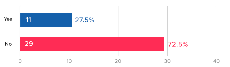
We found only 27.5% of the sites we examined have social options for checkout. We’re curious to see if that increases with time.
Growth Rock Recommendation: Test adding continue with social buttons as an alternative to normal checkout.
How Many Pages is the Mobile Checkout Flow?

Mobile users have less patience for page loads, so the conventional wisdom is to minimize the need for page loads, which slow them down and inevitably cause some fraction to bounce at each page load.
The average (and median) number of pages in the checkout flow of the sites we examined was right around 4.
The highest was REI.com at a whopping 7 pages of checkout (6 plus one for choosing guest checkout)

Each of their pages are small and easy, asking for just one thing at a time.
On the other hand, HomeDepot.com has only 2 pages (assuming you don’t checkout with an appliance that needs insurance coverage, etc.): (1) guest or sign in (2) the entire checkout form on one page.

The counter-argument to reducing checkout pages is that long forms on one page are intimidating and may scare away the user. The Home Depot checkout page looks intimidating as a long screenshot but on your phone you’re only seeing one part at a time.
Growth Rock recommendation: We’ve heard both sides of this debate in web UX in general, not just ecommerce checkout. We suggest you test this for yourself.
Mobile Shipping Page Trends and Best Practices
Jump to:
- Is There Some Form of Address Detection?
- Do They Have Instant Form Field Validation?
- Do the Number Fields Use Number Keypads?
- Is Site Navigation Hidden on Checkout Pages?
- Estimated Delivery Date Shown?
Is There Some Form of Address Detection?

One of the main reasons for low mobile checkout rates is how tedious it is to fill in forms on mobile.
One way to counter that is with address detection.
55% of the sites we examined had some form of address detection, most of which work like this:

Our team has only tested address detection once in the past few years and we did not see much of a change in conversion rate. It’s worth testing and not hard to implement. Google Maps API for example lets you easily add autocompletion with your form.
Growth Rock Recommendation: It could be worth testing address detection. Form filling on mobile is a known pain point. In our opinion, this should be a mobile checkout best practice because it simply makes form filling easier on the user. Nonetheless it has yet to catch on as an ecommerce trend (mobile or not) and thus the vast majority of ecommerce sites don’t yet have this feature.
Do They Have Instant Form Field Validation?

Continuing on the theme of making form fills as easy as possible, nothing is more annoying to mobile users than filling out a long form, clicking submit, then figuring out there’s an error and hunting around for it.
Yet, 27.5% of our top 40 sites had this poor UX!
Including
- Lowes
- Wiley
- Bhphotovideo
- Zappos
- Gap
- Forever21
- Gamestop
- Sephora
- REI
The solution is instant form field validation.
Here is the contrast, on Nordstroms, if I enter “1” in zip code and try to move on, it immediately tells me this is not a valid zip code. I fix it right there.

Whereas on Lowes.com, one of the culprits, I can enter “1” in zip code and be on my way and won’t know until I click “use this address”.

Growth Rock Recommendation: We haven’t done AB tests on instant form validation, but we don’t see a reason not to have it. Again, we think this should for sure be a mobile checkout best practice (really on all device types and sizes). Asking users to wait until they submit a form to see errors is just cumbersome. We recommend AB testing this (instead of implementing it outright) so you can see if any unintended consequences of instant validation may hurt your conversion rate. For example, some forms may be too quick to point out errors, causing users who are in the middle of typing an email address or phone number to see a red warning when they simply haven’t finished. If this hurts conversion rate, an AB test will indicate that for you so you can fix the problem.
Do the Number Fields Use Number Keypads?

Form filling on mobile is a pain because typing is a pain. One way to help is to make sure fields that only require numbers (phone, zip) use the phone’s number keypad with larger, fewer buttons than the regular keypad.
This is also in the category of obvious UX improvements. Yet 12.5% violated this rule including:
- Walmart
- Bodybuilding.com
- Gamestop
- Wayfair
- 6pm
For example here is J.Crew. When you click into zip, it immediately gives you a numbered keypad:

In contrast, here is H&M when you click into zip:

The UX is unnecessarily cumbersome. You have to click the number button on the left and then use the tiny number keys at the top of that keyboard.
Growth Rock Recommendation: You don’t need to AB test this, you can just implement this outright. There is no reason why a full keyboard is necessary for a number only field.
Is Site Navigation Hidden on Checkout Pages?

Distractions are the enemy of conversion rates. On that accord, it’s become commonplace to remove normal site navigation on checkout — on mobile and desktop.
On mobile, this means removing the hamburger menu and other icons in the navbar and often also unlinking the brand logo.
To let customer go back, there’s usually just one small link included. H&M has a great example of this:

However, several sites (27.5%) of our top 40 violated this rule and had full navigation available in checkout. Specifically:
- Amazon – As with many things, Amazon is maybe a unique case because the role the site plays in their customers lives is very different than other sites.
- Nordstrom – They have a hamburger menu present, although it’s content is drastically reduced during checkout
- Lowes
- Kohl’s
- Forever21
- RedBubble
- J.Crew
Lowes provides a very busy example of this:

Growth Rock Recommendation: We don’t see a need for sites that don’t have navigation to test adding it back in, however for sites on the list above that do, we strongly suggest AB testing a distraction-free alternative like H&M.
Estimated Delivery Date Shown?

The conversion motivated reasons for showing delivery date is two-fold:
- Simply answer a potential question in the customer’s mind. They may need it by a certain date or just be curious.
- Increase desire by making the purchase feel more imminent or real. If they think “I could have this by Monday” they may be more inclined to purchase.
65% of our top 40 sites had some indication of an estimated delivery or ship date, suggesting this has not widely caught on or been accepted yet.
We’ve tested adding estimated dates in the mobile checkout flow and have not seen any statistically significant lifts in conversion rate.
A caveat on the above result is that for that client, the estimated shipping and delivery date for each product is already on the PDP, therefore showing it again in checkout may not have added any additional motivation to complete the purchase (there was no question about this in the customers’ minds).
Mobile Ecommerce Payment Page Trends and Best Practices
Jump to:
- PayPal, Apple Pay, Amazon Pay Options?
- Does the Site Auto Detect Credit Card Type?
- Are There Trust Symbols on the Payment Page?
- What is the Final Payment Submit Button Called?
- Does Final Payment Submit Button Appear Above the Fold?
- Is There a Final Submission Confirmation or Review Page?
- Newsletter Opt-In or Opt-Out Option?
PayPal, Apple Pay, Amazon Pay Options?
This is a category to keep your eyes on closely. This could be the game-changing trend in mobile ecommerce over the next few years.
The entire mobile checkout experience including laborious form fills can be almost entirely skipped with an instant payment option like PayPal, Apple Pay, or Amazon Pay.
Look at how easy it is to checkout with Apple Pay on Kohls:
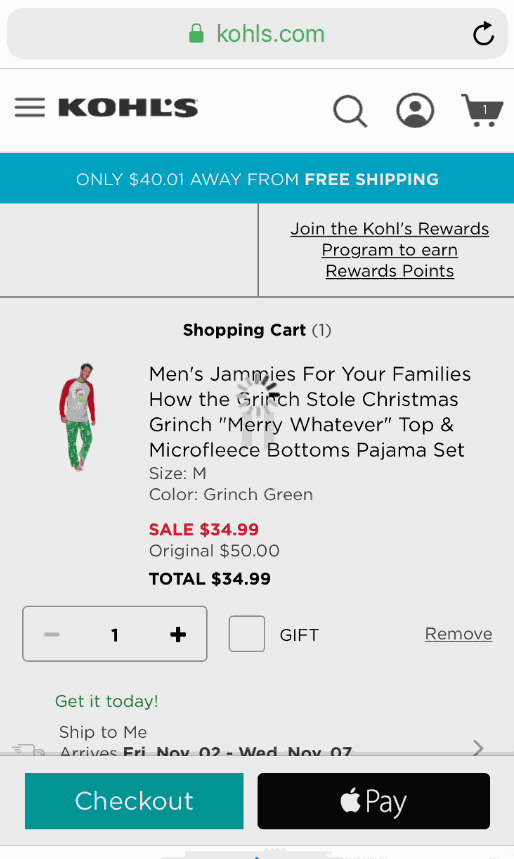
No need to fill in address. No need to fill in credit card. One click on the Apple Pay button and with my fingerprint I’ve paid for my Grinch who stole Christmas pajama pants.
Although this is the first year Growth Rock has published this study, in our own practice we’ve noticed a sharp rise in brands with Apple Pay, for example.

Growth Rock Recommendation: We are actively testing these payment options across multiple clients and strongly suggest you do the same. These instant payment options like Apple Pay should be a growing mobile ecommerce trend and in our mind should be regarded as a mobile checkout best practice (if they aren’t already).
Does the Site Auto Detect Credit Card Type?
In the category of unnecessary UX friction we have: asking the user to select Visa, Mastercard, Discover, Amex, etc.
You can detect it as they type their number as the abundant discussion when you Google “detect credit card type” would suggest.
Here is a nice StackOverflow discussion with a good summary of the ins and outs of this.
Only 10% of our Top 40 sites did not auto detect credit card type, but even that was surprising.
The culprits were:
- Wiley
- Macys
- Lowes
- Costco
- Gamestop
Growth Rock Recommendation: We have not tested this because this falls in the category of smaller usability tweaks that may very well help but often don’t “make the cut” at any given time for resources to devote AB testing to. For higher traffic and revenue sites it could very well be worth testing.
Are There Trust Symbols on the Payment Page?

One of the most common CRO “best practices” is to use trust symbols or badges, like these:

They can range from a full BBB or Norton badge to a tiny lock icon like HM.com:

Can’t find it? Exactly, it’s small.
But only 37.5% of our top 40 mobile sites had a trust symbol on the final payment page.
Is that bad? Maybe not. In a few tests we’ve done on trust symbols on checkout pages (not mobile only), we’ve seen largely no significant improvement in conversion rate by including the badges.
Our AB tests show…
Here are 2 AB tests that did not show an increase in conversion rate via trust badges.
In one test we added
- a Geotrust security badge
- a lock icon with SSL encryption copy
- credit card logos
…and saw no change in conversion rate.
This was for a site with the largest two age groups in Google Analytics demographic report being 55 – 64 and 65+ (thus, exactly the demographic you’d expect would need security badges).

In a second test, for a brand where the two largest age buckets were 25 – 34 and 35 – 44, we tested the inclusion of the following on the cart page:
- McAfee Secured badge
- Norton Secured badge
- Lock icon with “Shop with Confidence”
- A few store specific guarantees such as 20 year warranty and made in the USA
We saw no statistically significant difference in conversion rate. We tested multiple variations and the one with none of the above badges performed the worst during the test period, but the reduction in conversion rate from original was only 3.2% and statistical significance was only 68%. In other words, no statistically significant difference.
Growth Rock Recommendation: Do you need badges? Maybe not. Many brands on our list did not have them. They are very easy to test, so we suggest doing so. If for no other reason than to quell the debate about them in the office.
What is the Final Payment Submit Button Called?
Once again, we don’t think the name of this button is likely to matter, but it can be fun to see what competitors are using it, so here’s our histogram:

Growth Rock Recommendation: Pick something and save your mental energy for other things.
Does Final Payment Submit Button Appear Above the Fold?
Another CRO “truism” is placing things above the fold. We’ve seen this work well in many contexts. Mobile checkout is not one of them.
Our AB Tests Show…
In our tests, consumers don’t seem to care where the order or proceed to checkout buttons are, when they are ready, they know where to find them.
In our top 40 sites, slightly more than half (57.5%) did not have their final payment button above the fold.

Is There a Final Submission Confirmation or Review Page?

We find the final “review” or “confirmation” page an interesting discussion point.
Is it necessary?
Can the customer not review on the payment page?
Is it worth the extra page load and moment of pause?
The main arguments for this page are:
- To make sure there is no ambiguity for the customer before submitting their order
- Reduce customer service headaches post purchase if there are mistakes (e.g. wrong address)
- If you give them a chance to review, it will reduce errors on submission thereby increasing conversion rate
The counter-argument is of course that they may just be able to review on the final payment page itself and you don’t need to subject them to an additional page load.
We have not tested this but we think it’s interesting that there is very close to a 50/50 split in the top 40 sites.
Growth Rock Recommendation: This could very well be worth testing.
Newsletter Opt-In or Opt-Out Option?

Who likes email marketing more than ecommerce companies? No one. Well maybe email marketing software companies, but I digress.
55% of our Top 40 sites included an option to join a newsletter during checkout (almost always in the final payment step).
We did not test this (because we didn’t actually buy from all 40 sites) but it’s more than likely that 100% of the sites would put you on a newsletter after purchase even if they did not have a newsletter opt-in.
So it’s interesting to see that around 45% choose not to even give the customer a chance to “uncheck” the newsletter box and opt-out.
Several of these “NO” sites force you to sign up (Amazon, Zappos, Target) but many have a guest checkout option.
For example here is Gap’s final submit page, there was no box to join their newsletter the entire time. You bet Gap will start sending me emails the moment I order.

All 40 Top Ecommerce Site Mobile Checkout Flows
Our Methodology
How did you decide the top 40 ecommerce sites were?
There are many lists ranking the top ecommerce retailers in the US and globally.
Many claim to have information on sales volume, but this is questionable as many of the brands don’t release it publically, so it has to be inferred.
We felt the easiest way around this issue is simply to use Alexa.com’s top sites list for the category shopping. We started with 50 and removed 10 that weren’t really “ecommerce” from a traditional UX perspective, or duplicates.
So for example Netflix is #2 on Alexa’s shopping category, obviously analysis of their mobile checkout flow is not particularly useful for typical physical product ecommerce retailers, so we excluded them.
Also amazon.co.uk is largely a duplicate (from a UX perspective) of Amazon, so that was excluded.
The final list of 40 we used are below with screenshots of their mobile checkout flows.
Top 40 eCommerce Mobile Checkout Flows
[su_row]
[su_column size=”1/3″]#1 Amazon[metaslider id=”2045″][/su_column]
[su_column size=”1/3″]#2 eBay[metaslider id=”2066″][/su_column]
[su_column size=”1/3″]#3 etsy[metaslider id=”2084″][/su_column]
[/su_row]
[su_row]
[su_column size=”1/3″]#4 Walmart[metaslider id=”2110″][/su_column]
[su_column size=”1/3″]#5 Ikea[metaslider id=”2100″][/su_column]
[su_column size=”1/3″]#6 BestBuy[metaslider id=”2121″][/su_column]
[/su_row]
[su_row]
[su_column size=”1/3″]#7 Home Depot[metaslider id=”2148″][/su_column]
[su_column size=”1/3″]#8 Target[metaslider id=”2166″][/su_column]
[su_column size=”1/3″]#9 Nike[metaslider id=”2181″][/su_column]
[/su_row]
[su_row]
[su_column size=”1/3″]#10 Wiley[metaslider id=”2227″][/su_column]
[su_column size=”1/3″]#11 Cambridge[metaslider id=”2234″][/su_column]
[su_column size=”1/3″]#12 H&M[metaslider id=”2248″][/su_column]
[/su_row]
[su_row]
[su_column size=”1/3″]#13 Humble Bundle[metaslider id=”2262″][/su_column]
[su_column size=”1/3″]#14 Newegg[metaslider id=”2277″][/su_column]
[su_column size=”1/3″]#15 Body Building[metaslider id=”2289″][/su_column]
[/su_row]
[su_row]
[su_column size=”1/3″]#16 Nordstrom[metaslider id=”2317″][/su_column]
[su_column size=”1/3″]#17 Macy’s[metaslider id=”2331″][/su_column]
[su_column size=”1/3″]#18 Lowes[metaslider id=”2344″][/su_column]
[/su_row]
[su_row]
[su_column size=”1/3″]#19 B&H[metaslider id=”2364″][/su_column]
[su_column size=”1/3″]#20 Zappos[metaslider id=”2383″][/su_column]
[su_column size=”1/3″]#21 Costco[metaslider id=”2409″][/su_column]
[/su_row]
[su_row]
[su_column size=”1/3″]#22 Kohl’s[metaslider id=”2425″][/su_column]
[su_column size=”1/3″]#23 Gap[metaslider id=”2442″][/su_column]
[su_column size=”1/3″]#24 Urban Outfitters[metaslider id=”2458″][/su_column]
[/su_row]
[su_row]
[su_column size=”1/3″]#25 Wayfair[metaslider id=”2473″][/su_column]
[su_column size=”1/3″]#26 Forever21[metaslider id=”2487″][/su_column]
[su_column size=”1/3″]#27 Gamestop[metaslider id=”2503″][/su_column]
[/su_row]
[su_row]
[su_column size=”1/3″]#28 Sephora[metaslider id=”2517″][/su_column]
[su_column size=”1/3″]#29 Overstock[metaslider id=”2531″][/su_column]
[su_column size=”1/3″]#30 REI[metaslider id=”2544″][/su_column]
[/su_row]
[su_row]
[su_column size=”1/3″]#31 Redbubble[metaslider id=”2580″][/su_column]
[su_column size=”1/3″]#32 6pm[metaslider id=”2595″][/su_column]
[su_column size=”1/3″]#33 Staples[metaslider id=”2610″][/su_column]
[/su_row]
[su_row]
[su_column size=”1/3″]#34 iherb[metaslider id=”2619″][/su_column]
[su_column size=”1/3″]#35 Walgreens[metaslider id=”2635″][/su_column]
[su_column size=”1/3″]#36 JCPenney[metaslider id=”2648″][/su_column]
[/su_row]
[su_row]
[su_column size=”1/3″]#37 Sears[metaslider id=”2659″][/su_column]
[su_column size=”1/3″]#38 Barnes & Noble[metaslider id=”2677″][/su_column]
[su_column size=”1/3″]#39 Adidas[metaslider id=”2695″][/su_column]
[/su_row]
[su_row]
[su_column size=”1/3″]#40 JCrew[metaslider id=”2708″][/su_column]
[/su_row]
The Link Bar, an Ecommerce Mobile Homepage Navigation Alternative (to the Hamburger Menu)
Recent AB tests we’ve done suggest that many ecommerce sites could see an increase in mobile conversion rate by adding a “bar” of navigation links at the top of their mobile homepage, instead of relying solely on the hamburger menu.
We’re calling this a “Top Nav Link Bar”, or just “Link Bar”.

The Link Bar is an alternative to the much hated “Hamburger Menu”, which hides links behind the famous 3 bars (the hamburger). It’s hated enough to where simply Googling “hamburger menu” returns anti-hamburger menu articles in the top 5 results!
In this article, we’ll discuss the Link Bar concept via two AB test case studies where we saw increases in visits to product pages and purchase conversion rate.
Finally, we’ll also show a set of design examples from popular ecommerce sites that implement a Link Bar concept in different ways.
Our hypothesis is that the Link Bar lets shoppers get to the product pages faster by exposing product and category page links normally hidden behind the hamburger menu. One less click is required and the links are more prominent, so it increases the chances of users proceeding “down funnel” and seeing products.
Let’s get to the two case studies.
Note: We can also analyze your mobile ecommerce store user experience. Learn more about what we do here, or join our email list to get new articles like this one emailed to you here.
Mobile navigation Link Bar increase orders by 5% for an apparel store with 1000 products
First we have an apparel client that has over 1000 products across 9 categories (and multiple subcategories on their site).
So, pretty stereotypical ecommerce company.
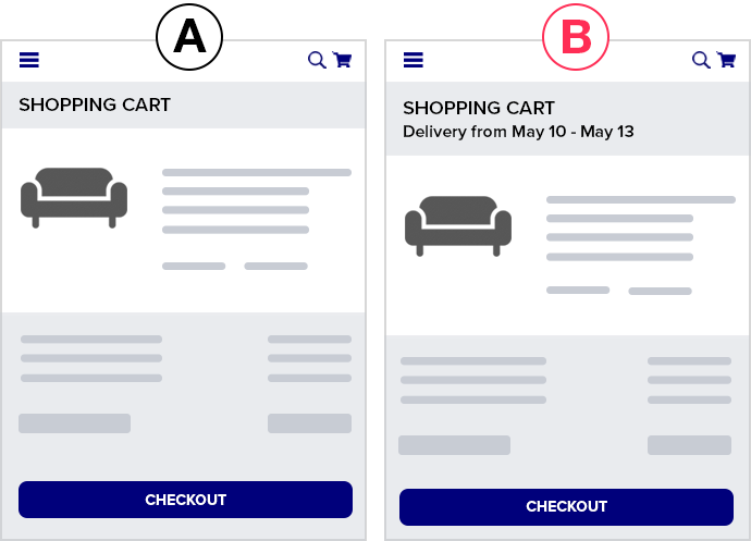
What did the mobile homepage look like?
Since we anonymize clients, let’s use the mobile homepage of a well known brand that had a similar layout: Urban Outfitters.
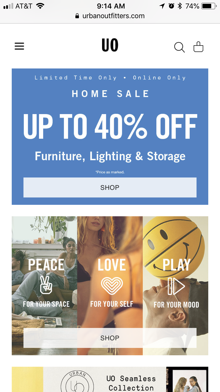
Key characteristics of this mobile homepage (that were true of our client’s mobile homepage):
- Large image based full bleed photos that change depending on the current marketing campaign (about once a month)
- Main navigation hidden inside the hamburger menu
- If you scroll down far enough there are eventually links to categories
Here’s what we tested:

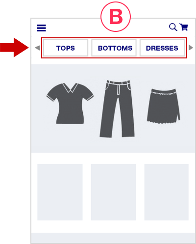
In the variation, we simply added the Link Bar, to the homepage only. There were 9 categories.
Note we didn’t replace the hamburger menu, it’s still there and still is the most thorough way to navigate the different product categories.
But it’s no longer the easiest way — the Link Bar is.
The Link Bar was left-right scrollable and had arrows to help indicate that.
Here are the results.
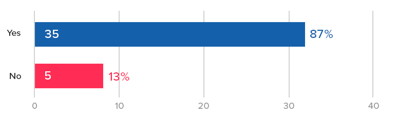
First, completed orders. After 28 days, we saw a 5% increase with 93% statistical significance:
Note Optimizely’s stat engine uses a more rigorous “two-tailed” statistical significance calculation, which does not give this any significance, but a traditional p-value calculation shows this:
So this is not a “runaway winner” by any means. The industry convention is to declare a winner if it reaches 95% statistical significance or higher when the test reaches your pre-determined number of visitors.
But that is, in the end, a “convention”.
With over 80,000 visitors, 2,300 conversion events per variation, and having run for exactly 4 weeks with the variation leading basically for the entire test, we felt the conclusion was “this is likely a winner and is more likely to perform better by 2% – 5% over longer periods.”
But that’s just one metric (albeit an important one). The story gets more interesting if you look at additional metrics.
Only the exposed listing pages showed an increase in pageviews
Pageviews of the category pages showed clear increases by 10% – 12% (with 99%+ significance), validating one of our critical hypotheses that the Link Bar would send more users “down funnel”.
For example here is the first category link on the left of the quick Link Bar we added (e.g. the “TOPS” link in the “B” mockup above):

The other two category pages showed similar results.
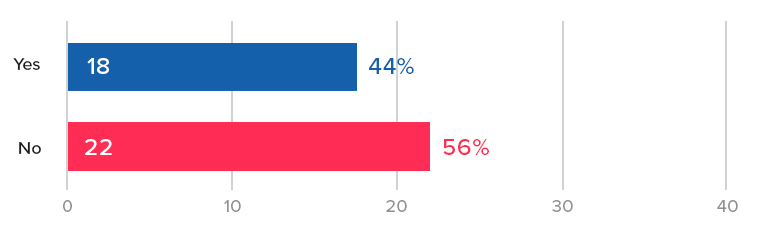
But those pageview increases were only seen for the exposed category links:
What about the links that were “hidden behind the scroll” in other words, you needed to use either the arrow, or scroll to the right to reveal them?
They showed no change in pageviews:

This was consistent for all the category page links that were hidden behind the scroll.
This confirms the original hypothesis of this test: Revealing links to product and category pages will increase the amount of customers reaching them.
Certainly if category pages that were just to the right in our Link Bar didn’t see an increase in pageviews, then hiding all links behind the hamburger menu does the site no favors in terms of getting shoppers to the products.
Takeaways for your mobile site:
- Test putting links to your most popular product categories at the top of your mobile homepage.
- Try making the bar scrollable and see if you can reproduce this result in your store.
- Do you see indications of an increase in completed orders like we did? Maybe your store shows a far more definitive increase in conversion rate than the slight possible lift we saw above.
Case Study 2: Health food brand sees 29% increase with a navigate Link Bar on the homepage
Next we have a very different ecommerce brand, in the health food space with 3 product flavors.
Again, the homepage had copy and images and links but you had to scroll down the page to get links to the 3 PDPs.
So we added the navigation Link Bar just like before:

The variation in this case had links directly to the PDPs of the 3 different flavors (which each had their own PDPs).
After 14 days, we saw a 29% increase in orders with 98% significance.
Traffic to this site was lower, however, so the test got only 139 vs. 107 conversions per variation. This is low. The difference is only about 30 orders, so again we have to put a qualifier that the variation “likely” performed better.
However there was no indication that it would perform worse than not having the links.
Link Bars can help expose customers to new products
In this case, of the 3 flavors, the second and third flavor saw a large increase in PDP pageviews (Chocolate and Strawberry in the mockup above): +25% more visits, and 77% with 99.9% stat significance and over 600 conversions per variation.
But, the most popular flavor did not see much of an increase.
Why?
In this case the site was known for their most popular flavor. Historically that was the only flavor for when the brand first launched. Referral links disproportionately went there, blog links disproportionately link to that flavor, and the homepage imagery and copy mostly talked about that flavor
So in this case the Link Bar served to expose more customers to the rest of the company’s offerings.
This is a nice additional benefit of Link Bars. Note that those alternative flavors were inside the hamburger menu also, but as we saw in the first case study, having them exposed on the page (via the Link Bar) showed a definitive increase in visitors to those PDPs.
Conclusions and how to apply this to your own mobile ecommerce site
Taken together both of these tests, on two very different ecommerce stores (1000 products vs. 3 products), suggest a similar theme:
Make it as easy as possible for mobile shoppers to get to your product offerings.
If you have hundreds or thousands of products, put links as close to above the fold as possible to your most popular categories.
In the first example above, a natural iteration of the test (that has not yet been tested) would be to stack the links instead of having them be in one scrollable row.

This will give shoppers an even better overview of exactly what the store offers.
This should send even more visitors “down funnel” and perhaps give the test a more definitive win over the baseline.
If you have only a few products, create top nav links to the product detail pages.
Finally, as always, you should test this yourself. Don’t assume these results will apply to your store.
Both of the AB tests above saw definitive increases in visits to the category or product detail pages, but the increases in order rate weren’t “runaway” winners, which we define as 99%+ significance with hundreds or thousands of conversion events for each variation.
That’s okay though, as we’ve written about before, not all ecommerce stores have the luxury of that much data. That doesn’t mean you throw up your hands and not test anything nor does it mean you should just use the old fashioned method of “debate designs in a room, loudest voice wins, and implement it outright”.
That’s even more dangerous.
Aside: We once had an in house designer form a client ask if they could implement a hamburger menu on desktop because it “looked sleek”. (Facepalm)
This is why testing is important, even if you don’t get picture perfect increases in conversion rate (99% significance, and thousands of conversions over many weeks).
What about desktop? Why is this mobile only?
The reason this isn’t relevant on desktop is because almost all ecommerce sites have exposed links to all categories (and often dropdowns to subcategories, aka a “mega menu”). So this is by definition almost always already implemented on desktop.
It’s just that the space constraints of mobile result in the hamburger menu.
Hopefully this article and this data we shared helps you start to think outside of needing to collapse everything behind the hamburger menu and starts opening up other possibilities.
On that note, our variations aren’t the only way to go about this. Here are several more examples of alternatives to the hamburger menu from different ecommerce mobile sites.
Ecommerce mobile homepage examples
Who is doing this well already?
Here are some other brands that have clear links at the top of the mobile homepage, getting rid of the complete dependence on the hamburger menu:
Gap.com
Gap has a lot of products and categories. They have clear links to the main categories at the top of their mobile homepage:

The use of photos is a nice touch and could possibly increase engagement with the links and clarity for certain stores.
Note the links are not sticky upon scroll, whereas the links to Gap Incs other brands at the top of the page are. Interesting.
Abercrombie
Also in the apparel world, Abercrombie chooses to simply split by Men and Women. This is worth testing versus a deeper category split like Gaps above:

Lowe’s
For search heavy stores, Lowes.com has a great example of both featuring search and using a suggested area to basically push some category links. We hadn’t been to Lowes.com on this device before so these were likely just categories they wanted to promote (versus a personalized list based on past visits).

Finally, here’s a more bold homepage concept by Cos Clothing, who doesn’t need a thin strip of suggested categories but rather just dedicates the bulk of the homepage to sending shoppers to the right categories.

(Note by the time we published this article the Cosclothing homepage had changed to include a promotion at the top instead of full bleed photos linking to women and men’s departments.)
They have full bleed images for women and men followed by clear links.
We would love to test something this bold with one of our clients.
Final Aside: the homepage is often sacred ground for ecommerce organizations. People fight and negotiate over screen real estate there. So even we, as a third party optimization agency, often have severe restrictions on testing the homepage, much less radically redesigning it. Much thanks to the two clients who let us run the tests featured above.
Want to work with us to improve your mobile conversion rate? Learn more about working with us here, or join our email list to get new articles like this emailed to you when we release them here.
Two ecommerce upsell AB tests that were worth $2 million+ in annual revenue

Not presenting related items at the shopping cart step could be costing many ecommerce stores millions in potential revenue.
In particular I’ve noticed while large, well known brands do this consistently (see examples below), mid-size ecommerce stores often don’t, and that’s likely a mistake.
In this article, we’ll show data from two AB tests where we added a one-click upsells and cross sells.
The first increased average order value (AOV) by $55 (worth millions in annual revenue).
The second increased conversion rate by 13%, which for any 8 figure or greater ecommerce store is also worth 7 figures in extra annual revenue.
Finally, we’ll also show (and analyze) 5 live examples from well known brands of upselling and cross selling related products at the cart stage.

This way we hope you can find an upsell implementation that works for you.
Note: We are a conversion optimization agency exclusively focused on ecommerce. Want our conversion and UX experts to evaluate your upsells or optimize your conversion rate? Learn more about what we do on the homepage or contact us via the red button at the top.
How do upsells and cross selling work in ecommerce?
Some people have all sorts of specific definitions of “upsell”, “cross sale”, and “downsell”.
Quickly, for our purposes, I prefer to use the more general definitions of upselling and cross-selling, which just mean you’re trying to get the customer to increase their order value by presenting additional items they might want.
It may be a more expensive item (upsell). or some add on items (cross sell). But here’s the most common type in ecommerce (discussed in more detail below):

Once you add to cart, Gap is showing 4 additional items I can consider. We’ll discuss the implementation details below (for example here you need to click into each product detail page (PDP), you can’t just add those items to cart) but that’s the idea.
For now, let’s talk strategy.
As the two case studies in this article below show, upsells and cross sells can either:
- Increase AOV
- Increase conversion rate
(If you’re curious how an upsell can increase conversion rate scroll down the second example.)
Let’s start with an AB test that does the former.
Upsells that increase AOV: $2 million/year extra revenue for an online furniture store
Our first example is from an online furniture store. Let’s say in this case that they sell sofas ranging from $850 to $2000+ with an AOV of $1200.
[su_note note_color=”#e7e7e7″]Note: They don’t actually sell sofas, but it’s analogous to sofas. You can learn how and why we anonymize brand identities here. All data we report is 100% real. [/su_note]
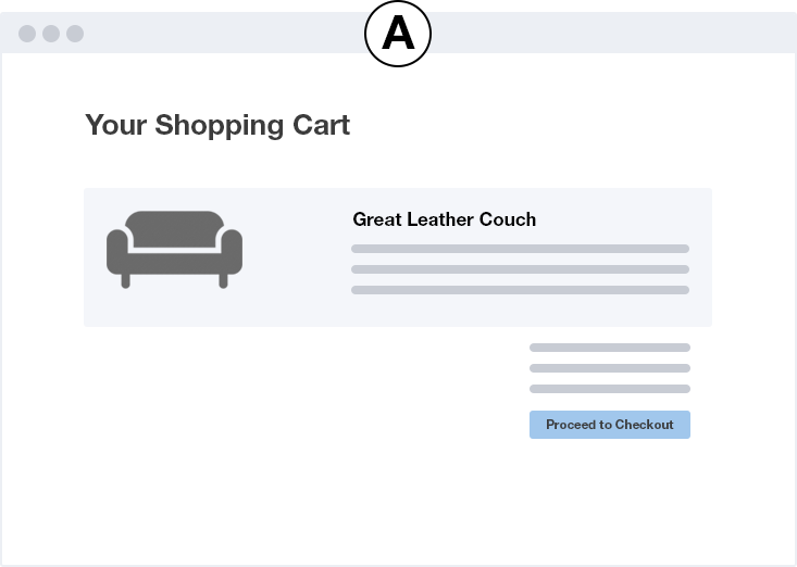
Their most popular sofas are leather, and what’s interesting in this case study is not the sale of the leather sofas, but of a particular upsell: a leather conditioning kit that helps protect the sofa, and costs between $40 – $80.
Something like this:

The conditioning kit is a perfect cross sell for a customer buying a leather sofa. It actively protects and lengthens the life of the thousand dollar or more purchase the customer is already making.
If you’re already spending $1500 on a leather sofa, why not pay $60 to protect it and make it last longer.
But these complimentary accessories were not easy to navigate to on the site at the time of this test. They weren’t promoted heavily.
So we hypothesized that mentioning it as an option at the cart step, and making it very easy to add to cart, would increase AOV.
Building our AB test from the hypothesis
You can turn a hypothesis into an actual UI/UX treatment in many different ways and this step is critical. Our hypothesis was:
Offering a leather conditioning kit as a one click upsell when a customer adds a sofa to cart will increase AOV and thus total revenue.
But how should we actually offer the leather conditioner in the cart?
With a photo?
As a one line item?
Do we add some copy to really “sell” it or keep it low key?
Will any of these decisions possibly hurt sofa conversions itself?
We opted to start low key because we felt that the change of going from not mentioning that leather conditioner at all to mentioning it was a big enough change.
Our variation design:

The pink strip is what we added.
We coded the plus icon to add the conditioning kit to cart on click. If the customer clicked the name of the conditioning kit instead, it took them to its product detail page (PDP).
Results
Typically we run tests for around 2 – 4 weeks, but we ran this test for 41 days (nearly 6 weeks)! Why so long?
Because what we were looking for here was change in AOV, but, the current AOV was above $1000, and the leather conditioning kit costs between $42 and $84.
So we were trying to detect a pretty small change.
After 41 days, over 4000 transactions and $5,600,000 revenue tracked, and AOV increased by $55, with 92% statistical significance.
The AOV increase held steady for the last 4 weeks of the test with statistical significance sitting in the 90% – 95% range the entire time.
Here is a plot of quantity sold per week of the upsell’s product SKU in Google Analytics’ ecommerce report:
Previously they were selling around 40 – 80 conditioning kits per week. Once we turned on the test (which means only 50% of users saw the variation), sales jumped immediately to 150 – 180 per week.
In fact, the warehouse ran out of leather conditioning kits when we turned this test to 100% of traffic and we had to turn it off temporarily until they could order more.
This increase in AOV, on average, was worth an extra $180,000 per month in revenue (that’s over $2,000,000 of extra revenue per year!).
Takeaways for your site
Ask yourself: Are there complimentary, lower priced products that pair with your main product(s) really well?
Walk through the typical buying and checking out funnel.
- Is it obvious to customers that these products exist? It should be.
- Is it easy for them to add them to cart? It should be.
- Does the copy position them in a way that makes it clear they compliment the primary products? It should.
Upsells that increase conversion rate: 13% increase in orders for a health food store
This second case study surprised even us when it happened.
Building on the success of upsell tests like the one above, we decided to test something similar for a online health food brand that sold nutrition bars (same disclaimer).
The key difference from the example above though is this: They only sold that one product in 3 different flavors.
That’s it. There were no other products. All 3 flavors had the same price point.
So how do you offer an upsell when you largely just have one product in 3 flavors?
It’s not the case that customers didn’t know about the other products: On the homepage, all 3 products were mentioned. In the navbar, all 3 products were mentioned. Even on each PDP the other 2 flavors were mentioned.
What we decided to do is this: When a customer adds a product to cart and an add-to-cart “drawer” slides in, we decided to offer a single “pack” of one of the other flavors at a discount (A below).
Packs typically cost around $8, but customers can only buy 2, 6, 12, or 18 packs (AOV for this site was around $57).
So when a customer added one of these to cart, our upsell offered a single pack of another flavor for $6 (B and C). That’s it, you can only add 1 of the alternate flavor, but you get a slight discount on it.
We tested two variations that were functionally similar but had slightly different designs (white border versus colored background).

Results: No change in AOV but an increase in conversion rate
Our hope for this test was that this would get more customers thinking about adding multiple flavors to their cart and thus increase AOV. In other words that they wouldn’t just stop at the single pack but decide “Well let me also add more of the other flavors”.
That didn’t happen.
But what did happen was positive. We simply saw an increase in orders (“conversion rate”) on the site as a whole.
Specifically we saw a 13.4% increase with 95% significance with over 1,000 conversion events (orders).
We tested two variations over 2 weeks with a slight design difference and both showed the 13% increase over the original (no cross sell) with 95% significance.
Why did a cross-sell increase conversion rate?
Why did adding a single nutrition bar of an alternate flavor increase conversion rate?
Our hypothesis is that customers simply wanted to take advantage of the “deal” on the alternate flavor. They get to the site, browse the flavors, pick a flavor, add it to cart.
Stop and think about what your mindset, as a customer, would be at that exact moment: A part of you will have a slight doubt about your flavor choice:
“Hmm, maybe that other flavor was better?”
“I wonder what that would taste like?”
“Should I go through with it and buy this?”
In our variation, at that moment, customers saw a small $6 discount offer on one of the other flavors .
We think for some fraction of customers this was enough to push them over the edge to buy.
Basically, the cross sell acted as a discount or add-on special offer that encouraged more purchases of the main product.
Takeaways for your site
If you don’t have upsells like the first example that compliment the main product and could possibly increase AOV, can you instead offer a similar product at a slight discount?
Are there multiple flavors or varieties of your product that customers likely debate about choosing?
Can you offer one of the other flavors at checkout at a slight discount?
Upsell and Cross sell examples in Ecommerce
Finally, for inspiration, here are a X upsell/cross sell examples from well known (and sometimes well optimized) ecommerce brands (in the U.S.).
Under Armour: Customers Also Bought
The most common types of upsells are in large SKU stores (in particular apparel) where they suggest other similar products when you add one to cart:

If you’re not testing something like this and you have a store with many products (over 20), you should test it immediately. Start without fancy algorithms and just put your most popular items there.
When testing these, try testing these implementation and UI details…
Test different algorithms or logic for suggesting products. This many not be easy to do with front end AB testing alone, but can be done. If you’re curious how, contact us to discuss.
Test number of items presented. Try minimizing carousels like what Under Armour does and show 4, or even 6 items if space allows.
Test showing and not showing product prices or even titles. You may be thinking “What?!” but this has precedence.
Gap: No Prices in Suggested Products
Bare Necessities: No Prices or Product Names

In general our experience is that showing more products and less carousel arrows is better. Requiring clicks will reduce the number of users seeing products.
Wayfair: Accessories Upsells
Exactly like the first case study at the beginning, Wayfair shows very complimentary accessories to large furniture items added to cart:

Try testing these UI and implementation details:
Test the number of upsell items. In our first client example at the beginning, we followed up the test profiled in this article with many other tests that also presented other upsells to the couch. They didn’t make much of a difference. Nothing beat just suggesting the conditioning kit as a single upsell.
Test different add to cart functionality. Above Wayfair lets you choose color and quantity. In a test not profiled here, allowing multiple quantities did worse than simply suggesting adding a single quantity in one click of a particular upsell. But this is very store dependent so should be tested
Harry’s Razors: Modal for Details
Similar to Wayfair, but at much smaller price points, when I add a razor, I get suggestions for sensible, complimentary products I can add.

A click on the plus sign, doesn’t add the balm, however, it pops open a modal where I can choose details:

This is an interesting choice. I’d be curious if they have tested this versus just a one click add to cart that defaults to Quantity 1 and the most popular size.
Especially for products like shave balm where customers aren’t expecting to be able to choose a size (unlike say, jeans) and it’s not obvious why someone would want to add more than 1, I would think this is a must test issue.
Want us to evaluate your upsells or optimize your conversion rate? Contact us on the homepage or via the red button at the top.
The Three (or Four) Safeguards to Stopping an AB Test

In AB testing, everyone talks about this best practice of ensuring tests reach 95% statistical significance before declaring a winner. But here is something most casual AB testers often don’t know: just because a test reaches 95% statistical significance, it doesn’t mean the results are valid and it doesn’t mean you should immediately stop it.
In this article we’ll illustrate why and explain what are proper safeguards to stopping a test. We’ll do that by starting with an illustrative example.
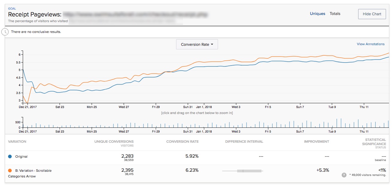
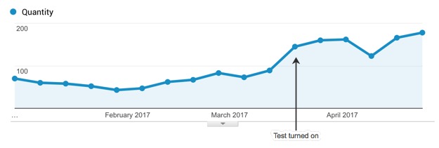
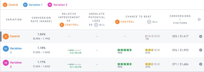
Here is a test we ran for an ecommerce client:
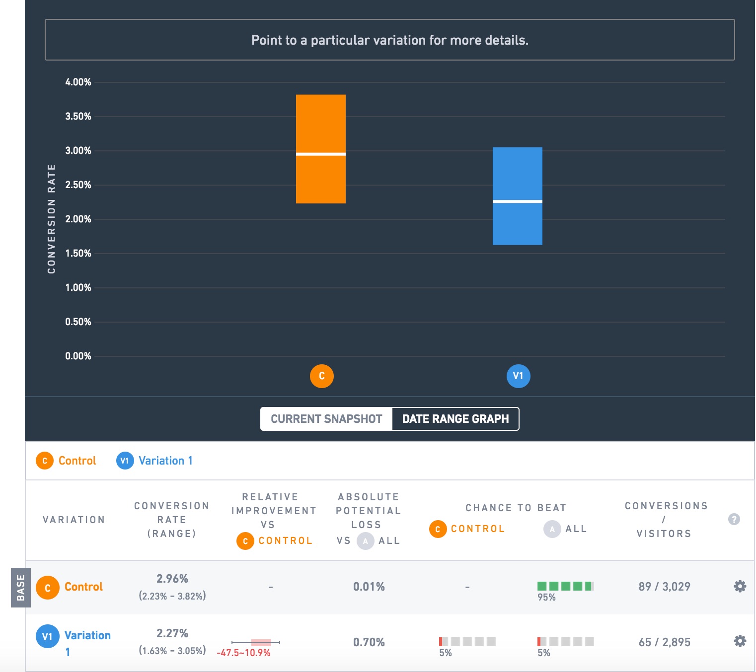
The goal we are measuring here is successful checkouts (visitors reaching the receipt page). The orange variation is beating the blue by 30.4% (2.96% vs. 2.27%), and the test shows 95% “chance to beat” or “statistical significance”!
That’s a big deal. This client has an 8 figure ecommerce business. Let’s say it’s $30 million a year in revenue and that this test is on a universal element like the navbar that is on every page of the site, so the lift applies to all traffic. A 30% lift in orders would be worth $9,000,000 in extra revenue a year!
This lure of extra revenue is enticing. Very much so. So much so that it can lead otherwise well-meaning people to make a grave mistake: stopping a test too early.
In this case, you might be tempted to think: well the test has run for reached 95% significance, which everyone says is the cutoff. It had 3000 visitors to each variation. This is convincing. Let’s stop the test and run the orange variation at 100%!
But here’s a secret: both variations were the same.
This was, in CRO parlance, and A/A test. We ran it not to “test significance” which Craig Sullivan, in that preceding link argues is a waste of time (and I agree), not to give us an opportunity to look smart by writing this article, but just to check if revenue goals were measuring properly (they were, thank you for asking).
So how in the world are you supposed to know that this test is not worth stopping? Or as CRO people say, how do you know when you’re supposed to “call” the test?
You actually need two safeguards to make sure you don’t get duped by random fluctuations of data, i.e. statistical noise.
Safeguard 1: Statistical Significance
Safeguard 2: Sample Size
In this case we saw it satisfied the first safeguard, statistical significance. But that’s why the 2nd safeguard, sample size, exists. This test only had 89 and 65 conversions per variation. That’s generally not enough. There is no hard and fast rule for how many visitors or conversions a test needs to be a big enough sample size. But you can use this famous Evan Miller sample size calculator to give you one estimate. As a general rule though, shoot for at least 100 conversions per variation. Many CRO blogs I’ve read say it should be more like 200 or 400 conversions per variation.
Why? Why is sample size important?
Because it helps ensure that situations like the above where random chance just puts a bunch more conversions in one variation (and the testing software says the difference in conversion rate is 95% statistically significant) don’t happen. It can’t stop it from happening. All of AB testing involves testing a sample (the people who hit your test while it’s on) and extrapolating to the future, so you can never be sure your results will hold, but a bigger sample size helps minimize this.
Safeguard 3: Time
Finally, we also rarely stop tests before they’ve run for 2 calendar weeks. Ecommerce purchases happen on a weekly cycle, with purchase behavior on Saturday and Sunday obviously being different than weekdays. So making sure that any differences in results hold after 2 of those cycles complete also ensures that we’re not over-reacting to some short term effect skewing results.
As an extreme example to illustrate this point, say you run a test that adds emphasis to a message saying a sale ends on Friday. You start this test on Wednesday. It’s quite likely that hwen you check the results on Thursday or Friday the variation which emphasizes that message is showing a higher conversion rate than the control. But how high? Its effect is likely to be much weaker on Saturday – Tuesday. Stopping this hypothetical test on Friday and declaring a 50% lift is not responsible. Wait at least 2 weeks and see what the effect is over a longer time period.
Or Decide On A Set Sample Size Ahead of Time (Safeguard #4)
Alternative to all this is a well regarded best practice in AB testing: just decide ahead of time how long you will run a test, stop the test when it hist that number of visitors or time period, and only declare winners for tests that meet your statistical significance threshold. This is strictly speaking, the proper way to do AB testing.
It’s explained well in this accompanying article to the Evan Miller sample size calculator.
Warning: that is a long and mathematical explanation. But in short because of the example I opened up with in this post, the idea is that tests will come in and out of statistical significance if you keep them running, so if you automatically stop tests the moment they hit your stat sig threshold, you’re likely counting winners when there are none.
The problem with this is many clients and businesses refuse to do it. They want to see results as they go. They want to make a call before set sample sizes, and the real world is rarely this clean and neat. A classic example is a test that you run for a while, say 4 weeks, it has tens or hundreds of thousands of visitors per variation, the variation is beating the original for almost the entire test and the statistical significance hovers at 92% for multiple weeks. How many ecommerce brands and management teams are willing to declare that no difference and move on? Very few in my experience. I think it’s okay to make a business decision there and implement the variation. You got the data (the variation was likely better than the original), and you are taking a calculated risk — specifically there is an 8% chance that there is no difference rather than a 5% chance.
As a way of accommodating this “business reality” of AB testing ecommerce sites, at Growth Rock, we also are careful to watch of statistical significance holds for multiple days or ideally weeks. If it does, then we know that we could have stopped the test a few days ago and nothing would have changed — we aren’t just insta-stopping it the moment it hit 95% statistical significance. Yes, this is not, strictly speaking, the “proper” way to declare validity, but we are making a calculated business decision and aware of the risks.
Finally, if you still need more convincing on this point, consider the common scenario of a test showing no difference and the brand implementing the variation anyways. Is that irresponsible of the brand? Absolutely not. That would be like saying “never make a change to your site that’s not AB tested”. I’ve heard that stated in forums and discussion boards. It’s a nonsensical idea. Of course business decisions, branding decisions, and marketing decisions need to be made all the time that you can’t AB test. Very few TV and radio ads over the years have been AB tested. That doesn’t mean they are bad or hurt the company. It simply means the business is taking a risk.
AB testing is simply a way of gathering some data that helps give you confidence that a change is more likely to help than hurt. There are times in the real world that that data will be imperfect. It won’t mean the laboratory criteria for a “winner”. That’s okay. the key is being aware and knowing that that risk is there — knowing what the data told you and just as importantly, what it didn’t tell you. If you are aware, you can still act on that data as you wish.
Bonus Points: Use Multiple Goals
Finally, in addition to the two safeguards above, you should also make sure you are tracking multiple goals through your purchase or signup funnel. You should be paying attention to supporting goals. Do the supporting goals show a consistent result? (They don’t have to, and they may not, but it’s good to know). In the A/A test example above, most actually did, but some did not, for example, here is the goal that tracks clicks on the size dropdown on the PDP, the results show largely no difference at all (note 45%, 55%, even chance of beating each other):

Tracking multiple goals will help give you a more holistic picture of what’s happening. I’m not saying all goals have to show the same result for a test result to be valid. But if just one or two goals are showing a big difference but the others aren’t, you should ask why that could be.
Ecommerce Goals for Optimizely or VWO: What goals should you use in AB tests?

I see a lot of clients use just these goals on ecommerce AB tests in Optimizely or VWO (Visual Website Optimizer):
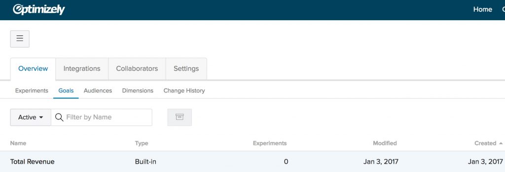
- Engagement (included by default by Optimizely)
- Revenue
- Checkouts
That’s a good start (Except engagement, have you ever made an actionable decision based on the engagement goal?).
But you could get a lot more information by adding upstream goals. Here are the most common that you should add:
- Add to cart button clicks
- Proceed to checkout page
- Pageview goals for your entire funnel
- All PDP pageviews
- Cart Pageviews
- Checkout pageviews (this can be multiple different pageview goals if your checkout flow is separate into different pages like /checkout/shipping, /checkout/payment/ etc.)
Here are some common scenarios for why the funnel goals are important
Note: If you’re curious about the difference between Optimizely vs VWO (plus Adobe Target), you can read our article here.
Scenario 1: You run a test and checkouts are up 10% with 92% significance
You are not tracking upstream goals: You are only measuring checkouts and not the upstream goals. You decide the test has been running for a while and is probably significant (this is dangerous, but that’s another topic). You stop the test and declare the variation a winner and implement it.
You are tracking upstream goals: You are measuring the funnel goals and notice that pageviews of the checkout page, pageviews of the cart page, and clicks on the proceed to checkout and add to cart buttons are down. So why are checkouts up? Something doesn’t look right so you run the test for another 2 weeks. After 2 weeks the checkout goal regresses to the other goals and is also down a few percent versus original. Phew, good thing you didn’t call the test early when checkouts were looking up.
Scenario 2: You implement a variation that everyone “just knows” is going to win.
You are not tracking upstream goals: Checkouts tank and are down 30% with 99% significance after 1 week. Uh oh. Why?! You sit around the room and debate a bunch of reasons why but in reality no one really knows.
You are tracking upstream goals: You notice in your upstream goals that add to cart and proceed to checkout goals are up 20% as expected but everyone drops off at the checkout page. Coincidentally your variation made some changes to that page as well. You look further. When looking at session recordings of the checkout page and notice there was some unintended behavior on mobile from your variation. You didn’t realize your variation pushed some important information far down the page. Culprit found! Now you can re-do the test with that mobile issue fix.
There are more scenarios than this, but these are two common situations (one with a positive checkout result and another with a negative) where tracking upstream goals can make a huge difference (possibly costing or making the company millions).
In our experience when a variation is a clear winner, all or most goals will show an upward trend. That is: more add to cart clicks, more views of the checkout page, more successful checkouts, more revenue.
Not all tests will show that and if you have a test that runs for a fixed period of time, reaches 99% significance, with hundreds or thousands of checkouts per variation over multiple purchase cycles (calendar weeks), it’s hard to argue with that, and that does happen.
But most AB tests (as anyone who has done a lot of testing will attest to) are not so textbook clean. Like anything in life, the majority of scenarios are in the grey area. When that happens, tracking more goals than just the end goal (checkouts and revenue) will help interpretation a lot.
Want help setting up goals for your ecommerce site in Optimizely? Contact us.
eCommerce Copywriting Case Study: 3 Advanced Tactics We Used to Increase Product Page Conversion Rates 13.9%

We partnered with copywriter Brian Speronello of Accelerated Conversions on this project. This case study was written by Brian and edited by Devesh and Brian.
Writing powerful eCommerce copy that improves conversion rates is one of the most effective ways to generate more revenue for your online business. Just by changing the words your visitors read when they come to your site, you can generate significant increases in sales for your company.
For example, online direct-to-consumer mattress brand Amerisleep was able to achieve a multi-million dollar increase in annual revenues just by rewriting their product details page. A/B testing showed that checkouts increased by 13.9% with 98% confidence.

Note: Our agreement with Amerisleep prevents us from publishing their actual product page traffic and conversion rates but for the integrity of the test we’re showing the confidence level and hundreds of conversion events per variation. The test was also run for multiple buying cycles.
GrowthRock performed the conversion testing for this project, and Brian Speronello from Accelerated Conversions (that’s me) wrote the copy.
In this eCommerce case study, I’m going to share three advanced copywriting techniques that helped drive the 13.9% increase in orders on the new product page for Amerisleep.
eCommerce Conversion Copy Tactic 1: Go Beyond Bush-League Benefits

If you’re reading this post, I’m going to assume that you’re at least moderately interested in conversion and copywriting strategy. You should already know why it’s important to promote benefits ahead of features.
(If not, before you invest time going over this case study, you should read more about the basics of copywriting. That way you’ll be able to get the most out of the strategies presented here).
This section is NOT about benefits versus features.
It’s pretty easy to tell the difference between a benefit and a feature. The former describes a result for the reader. The latter describes a function of the product or service.
Detecting Bush-League Benefits is more difficult, because it’s a matter of tone and perspective.
Bush-League Benefits are actual benefits that the target audience will get from your product or service. But they’re benefits that the end user doesn’t care about.
Effective copy doesn’t just focus on benefits before features. Sometimes it has to go through several layers of benefits to reach the deepest desires of the audience.
As an example, let’s look at a classic marketing and copywriting analogy: the electric drill.
A New Version of a Classic Marketing Tale
As the old saying about marketing a drill goes, the benefit of a drill is a hole in the wall. That’s the immediate result (benefit) that the user gets from the features the drill has. If you wrote copy for a drill that promoted how it puts holes in your wall, you would technically be promoting its benefits, since you’re not talking about features like torque or battery life.
But is “a hole in the wall” really what the reader wants?
Does a drill customer wake up in the morning and say “man, I really need some holes in my wall?” (And if so, why not just buy a few kegs and invite over the local frat? Problem solved.)
So while “a hole in the wall” is certainly a benefit of owning a drill, it’s a Bush-League Benefit because it doesn’t tap into the real desires of the audience. It doesn’t connect with a problem or desire that the audience actively thinks about on a regular basis.
So what’s the real benefit of having the drill?
Is it having holes that are a precise size? Is it the drill’s ability to make holes in a wall with little physical effort? To find out, you have to ask yourself why the customer would want the holes in the wall.
You’d probably come up with an answer like “to hang family portraits.” This response is far more emotional than “holes in the wall.” And it makes for a more compelling benefit to the reader.
For example, you can imagine a family moving into a new home and dreaming about hanging their family portraits above the fireplace. That’s how you know you’ve gone deeper than a Bush-League Benefit. From there you could write your copy targeting “hanging family portraits” as the real benefit of your drill.
But you’d be wrong. (Sort of…)
Because while the benefit of “hanging your family portraits” is definitely more emotional and compelling to the reader than holes in their wall, you can still go deeper.
What would happen if you asked “why?” again, researching the reason a family would want to hang their family portraits? They might say something like “We just moved into a new house, and we want to make it feel like home.”
Now you’re getting somewhere.
Which drill would you rather buy?
- Drill A: Our high-powered electric drill will put precision-sized holes in your walls.
- Drill B: A new drill from our company will let you hang your family portraits so your new house finally feels like home.
No contest, you’d take Drill B. Even though Drill A mentions a benefit (holes in your walls) it’s a Bush-League Benefit because it doesn’t connect to the emotions and desires of the audience.
The Challenge with Bush-League Benefits
The challenge with going beyond Bush-League Benefits is deciding when you’ve discovered a benefit that connects with the reader’s emotions enough to make them want to purchase. It’s also why I said Bush-League Benefits are a matter of tone and perspective, so you’d only be “sort of” wrong to use “hanging family portraits” as the main benefit in copy for the drill.
Maybe your audience wants their house to feel like home because they’re part of an elite social circle and care about their status or impressing their neighbors. Or maybe it’s because they’re looking to be featured in Better Homes & Gardens magazine or on HGTV.
Those desires are even more compelling than “making the house feel like home.” You could write your copy to focus on them, if you found they applied to the majority of your audience, and probably get even better conversions.
So it’s up to you to decide how deep you need to go based on your product or service and your audience. As a rule of thumb, the more expensive, complicated, or important your offer is for the reader, the more your copy needs to connect with their deepest hopes and fears.
But if you want your copy to convert well, it must connect the benefits of your product or service with needs and desires that are emotional and top-of-mind for the reader.
You can’t settle for Bush-League Benefits and expect to get a lot of buyers.
Going Beyond Bush-League Benefits with Amerisleep
If you asked novice copywriters to tell you the benefit of a new mattress, they’d probably say “getting more sleep.” And they’d be getting tricked by a Bush-League Benefit.
Don’t get me wrong, sleep is great. And because most people understand that, copy that uses sleep as the main benefit can get decent results all by itself.
However even though sleep can be an effective benefit on its own — in fact because it’s so easy to settle for using sleep as your main benefit — it’s actually a Bush-League Benefit that has tricked many copywriters. That’s because probing further into the reader’s desire for sleep reveals even more powerful motivators.
One of the biggest changes that we made on the Amerisleep product page was adding the following section. It’s short, but it plays a key role in connecting the Bush-League Benefit of “more sleep” with deeper aspirations of the audience. It relates “more sleep” with two highly emotional and nearly universal desires: An improvement in physical health and better mental performance at work.

This section positions sleep as the solution to better health, better job performance, and a higher quality of life. And it’s a mistake to trust the reader to make these connection on their own.
You have to remind readers about the important role sleep plays in how we feel each and every day before they start to care about getting more of it.
Only once the reader is actively craving sleep will “more sleep” move from a Bush-League Benefit to a real one. This section helps create that desire for sleep in the reader, and in turn it makes the other parts of the page where we talk about increasing sleep more persuasive.
So when it comes to your own copy, make sure that you connect the immediate benefit of your product or service to deeper and more compelling desires the audience has.
Otherwise you’ll just be peddling Bush-League Benefits.
eCommerce Copy Tactic 2: How to Shut Down the One Competitor Every Business Has in Common

There is one competitor that every single business in the entire world has in common. One competitor who is taking money out of the pockets of every company on the planet.
And my guess is that this competitor is not on your radar, even if you spend a massive amount of your time and effort analyzing your place in the market.
Can you name it?
It’s the status quo. Otherwise known as inaction or doing nothing.
If you analyzed the behavior of prospects who ultimately do not buy from you, which of the following situations do you think is more common?
- They spend their money with one of your competitors instead of you.
- They decide to save their money and not to buy from anyone.
Let’s say you run a website and you convert 10% of your visitors to customers. That’s an outstanding conversion rate, and yet 90% of your visitors still do not purchase.
Does that mean 90% of your visitors wind up buying from your competitors?
Obviously not! Otherwise their own conversion rates would be off the charts.
The market of people who explore their options but ultimately decide to do nothing is much larger than the market of people that choose your competition over you.
Rather than spending the majority of your time butting heads with your competitors, you should spend more of your time working to convert prospects who would otherwise do nothing at all. Not only is this a bigger market, but because your competition is likely focusing on trying to beat you, it’s also relatively uncontested.
Copy Techniques for Overcoming Inaction
No matter who you are or what you sell, your clients and customers are always going to prefer doing nothing to buying from you. Doing nothing is cheaper, easier, less uncertain, less mentally demanding, less socially and politically risky, and less stressful.
The only way to compete with the status quo is to vividly show the reader how doing nothing will lead to him or her being worse off. This is usually a great place to leverage loss aversion, where you show readers what they will lose or miss if they don’t take action. Another option is to ask the reader a question that follows the general outline “If you don’t do this, what will you do that is better?”
Here are some hypothetical examples from a cross-section of industries that show how you could use loss aversion and questions about alternative choices to make readers aware that doing nothing is actually worse for them:
- Appliances: If you don’t upgrade to a new, energy-efficient washing machine, it will cost you up to $1,000 more every year on your water and electricity bill. (Notice I didn’t say our energy-efficient washing machine. This is any of them. We’ll get to your company’s specific offer later.)
- Conferences: Last year people who attended our conference on average were able to add $300,000 to their bottom line by the end of the year using the techniques we teach. It’s your choice if you decide to join us or not — we’re not going to give you the hard sell. But if you don’t attend, do you have a better plan for adding $300,000 to your profits in the next 12 months?
- Dating Coach: I know the idea of working with a dating coach can make some people feel embarrassed — after all, shouldn’t we just naturally know what to do? The hard truth is that it’s not natural, and the social systems that used to guide us have gone away. So ask yourself what’s more embarrassing, working with someone to help you improve an important (maybe the most important) part of your life? Or doing nothing and continuing to get rejected by the people you’re attracted to and waking up next to an empty pillow every morning?
Overcoming Inaction with Amerisleep’s Copy
We applied this principle on the Amerisleep product page in the same segment of copy from the last example. We talked about the benefits of sleep, waking up without pain, not feeling groggy at work, and an overall better lifestyle. Then we said:
The number of daily problems that go away with a good night’s sleep is astounding — but that only happens if you actually do something to improve your sleep.
If you just keep things the same, you’ll keep getting the same disappointing results. And don’t you deserve better?
By clearly addressing how doing nothing makes readers worse off, it takes away a lot of the mental excuses they can use to justify maintaining the status quo.
It’s only after you’ve convinced readers that they need to take action to address a problem or desire they have — period — that positioning yourself as the best choice among your competitors pays off.
How to do that effectively is what we’ll be discussing next.
eCommerce Copy Tactic 3: Position Yourself as the Market Leader Using Comparisons
Once your prospects decide to take action on a problem or desire they have, their mindset changes. Before that, their number one question is “Should I even worry about this right now?”
After your prospects make up their mind to move forward though, they begin to ask “Who should I hire/How should I solve this problem?” instead.
When your prospects reach this stage in the decision-making process, it finally becomes effective for you to spend time proving how your offer is superior to your competition.
Here are a few techniques for making prospects see your company as their best choice, even if you operate in a crowded market.
Absolute Comparative Statements
Absolute comparative statements say that one thing is absolutely better than the other. Claims like better, bigger, and the best are absolute comparatives.
(If you’re wondering “doesn’t that make all comparative statements absolute?” I’ll show you how that’s not true in the next section on Faux Comparatives.)
The biggest mistake copywriters make when using comparatives is not being specific. If you’re going to use a comparative statement, you need to explain compared to what.
Too many companies will say “Our product is the best!” But that doesn’t answer the question “the best compared to what?” And without the “compared to what” piece, the comparison is ineffective.
Here are two examples of absolute comparatives from the Amerisleep product display page. I’ve bolded the comparative term and underlined the “compared to what” part of the sentence.
- On top of that, our foam is also the most environmentally friendly. Our patented foam-making process uses plants to replace some petroleum, and is the only manufacturing method that exceeds the standards of the Clean Air Act.
- Our foam is also better than traditional memory foam because it recovers its shape faster.
Absolute comparative statements are the most powerful way to make your offer appear superior than the competition. But what if you can’t say your product or service is absolutely better than the competition in any measurable way?
In that case, some copy trickery can help you give the impression you’re better than your competition, when really you’re only claiming to be equal.
I call these copy tricks “Faux Comparatives.”
How “Faux Comparatives” Let You Turn Equality into Superiority
Tell me what this sentence means:
- No other mattress is more supportive than Amerisleep’s Revere bed.
Most people would believe it says the Amerisleep Revere bed is more supportive than any other mattress…
But in reality it only says that no one is better — which means there could be many others that are equal.
Take another look at the sentence, this time with the implied meaning in parenthesis:
- No other mattress is more supportive than Amerisleep’s Revere bed (but there are several others that are equally supportive).
If you’re in a market where the offers are all relatively equal, you can claim that no one is better and be factually accurate. No one can say you’re making false advertising claims.
If the audience interprets “no one is better” to mean that “we are the best,” that’s their misunderstanding. Your job is to make the case for your product or service in the most compelling — and truthful — manner possible. If that misunderstanding works out in your favor, lucky you.
In some respects all marketing and copywriting is presenting the truth in the most flattering light. As long as the statements you make are true, choosing the words that make your copy the most convincing to the audience is just doing your job as a writer.
Here’s an example of how we used this Faux Comparative strategy on the Amerisleep product display page in the headline before describing the materials inside each mattress:

This headline suggests that Amerisleep’s mattresses are more carefully engineered than any other brand. It’s a great message to introduce before explaining what goes inside each mattress. However in reality all it says is that, while there aren’t any mattresses more carefully engineered, there may be others that are of equal quality.
Another Faux Comparative method that gives the impression of superiority, when you are actually only claiming equality, is adding “one of” to an otherwise absolute comparison.
Instead of saying that you are the best, the most, or the biggest, you can say you are one of the best, the most, or the biggest in your category.
Like with the last Faux Comparative, the reader will focus on the comparison that you are the best, most, or biggest in your category. They will think you are one of a select few who are at the front of the market, but in reality you could be one of many who are all equal.
We used this approach in the sub-headline for the copy from the previous Faux Comparative:
- Our innovative and proprietary materials let us build the one of most comfortable mattresses ever
We also used it in the eco-friendly section:

In both cases, it makes Amerisleep seem like they’re at the top of their market. But in reality, it could actually mean they are just one of many companies with similar characteristics.
Increasing Conversions from Your eCommerce Copy
You’ve just learned three eCommerce copy techniques that can increase your sales by double-digit percentages. But your conversions only go up if you invest the time to rewrite your copy. If you simply move on with your day now, nothing changes and your sales will stay the same.
So before you close this page, set aside time in your calendar or add an item to your to-do list to incorporate the three copy strategies from this article. Because if you’re not going to do anything with these ideas, why did you spend 15 minutes reading this case study? Without applying the tactics it covered, the all you just did was 15 minutes of mental masturbation.
(And if this section feels familiar…remember what I said about your biggest competitor being inaction?)
You can use the following checklist to apply the lessons from this case study:
- Highlight the primary benefits in your copy. Ask if they are emotionally engaging. If not, come up with benefits that your audience relates to more deeply — and if you can ask actual customers for feedback, even better.
- Add a section to your copy that discusses the costs, risks, and problems that your prospects will experience if they don’t buy from you.
- Find comparison terms, like more, better, and the best. Make sure that each one includes a “compared to what?” part of the statement.
- Where possible, add “no one is more…” and “one of the…” Faux Comparative statements so readers think aspects of your business that are only equal to the competition are actually superior.
But what if you’re legitimately focused on other priorities and can’t make the time to rewrite your copy — even though you want to? Or what if you want to go beyond these three tactics and get the maximum increase in your site’s sales and conversion rate?
In that case, you can contact me about working together on your site’s copy. And for conversion optimization, you can contact GrowthRock if you manage a 7 or 8-figure annual revenue site.
Should you AB test large site redesigns, and if so how?

An issue that’s come up with more than one client for us recently is when a large site redesign is “in the pipeline” and people in the company disagree about whether or not they should test the large redesigns or feature release.
The arguments for not testing large site redesigns is usually some flavor of the following:
These changes have been things we’ve wanted to do for a long time, we know we’re going to implement them, so why test them?
Sometimes I’ve heard it veiled in phrases like “This change is too important.” or “This will be too difficult to test.” But in the end the real reason is that some people in the company just don’t want to test it.
[su_note] Don’t buy the “this is too hard to test” argument. As I explain below, almost any site change can be AB tested with even the most basic AB testing tool. [/su_note]
You shouldn’t just agree blindly to this idea of not testing large redesigns, though, because if your site is bringing in enough revenue, the ROI of continuous AB testing can be significant.
Why large or inevitable site changes should still be AB tested
I’ll list my arguments for why you should still test large site changes in response to the various objections I listed above that we often here in our work.
My hope is, if you’re the person in the organization arguing for testing, you can use these arguments to help with your battle.
“This change is going to happen regardless of the test outcome”
I have a couple responses to this, one is nicer than the other.
The nicer response: That’s okay if the change will be implemented regardless, but don’t we want to know what the effect on revenue will be?
For example (and this is common): Say an 8-figure ecommerce company is finally updating their entire site design. Their site was made 6 years ago, parts were added piecemeal over time, sales have grown tremendously, but the site hasn’t caught up. It doesn’t have modern design, the checkout process is definitely not optimal, and it’s not mobile friendly. The company knows it needs to update the site. So they hired an expensive agency to totally redesign it.
Anyone who has AB tested elements of an ecommerce site knows that seemingly simple changes to single pages can swing orders by 10%. A 10% change in orders is worth millions for an 8-figure revenue company.
Even if you’re going to implement the large change regardless of the outcome, don’t you want to know if it will reduce revenues by over a million dollars?
If it does hurt sales, you can delay the launch a bit, hypothesize what parts of the new design could be causing the decrease, retest just those elements, and isolate the problem.
The not as nice response: Rolling out a large change without testing it first is irresponsible. See arguments above for why.
[su_note]Warning: Be careful if the web design agency is arguing that you should just roll out the changes and not test them. It’s not in their interest to see if their new design performs better or not. It’s in their interest to just tell you their design is fantastic and have you love it. Unfortunately customers and their wallets are the true (and ruthless) judge of whether the site is “better”. [/su_note]
The change is too big to test. AB testing is for front end changes, and this changes a lot more.
You don’t have to code the test in Optimizely or whatever testing platform you use. In fact, it’s not recommended that you do this for large tests. Instead, you should code and deploy the new design on your own servers with slightly modified URLs (site.com/home, site.com/page-1, etc) and have the AB testing program simply redirect users to both versions of the site. Most programs can do this.
This method can handle large changes as well.
It will be confusing if customers see two different experiences at the same time
First, every AB testing platform I’ve heard of cookies users so they’ll always see the same variation unless they clear cookies or use a different browser or device.
Second, to protect against confusion if they use separate devices (checking something at work vs. at home, etc.), on the new variation, you can always install a soft popup or bottom of page slider that says “Hey, we’re testing a new site design and would love your feedback. Let us know how you like it by…”.
Lastly, it’s just not that big of a deal. Modern companies test sites all the time now. Sites get updated, they change. Frankly, this idea that if you test a new site for a limited amount of time, and a fraction of customers see an inconsistent site experience for a while will “hurt your brand” is old fashioned marketing thinking.
This thinking relies more on “gut instinct” and opinions of people in conference rooms rather than data from the only opinions that matter: your customers.
Heard any other objections to testing large redesigns or features? Ask away in the comments.
If your business brings in 7 to 8-figures of annual revenue online and you’re interested in getting a conversion audit of your site to being increasing its conversion rate, email us or fill out the form on our homepage.
The ROI of AB Testing: When is AB testing worth it?

I have a simple 2-step criteria for determining if AB testing has a high enough ROI to be seriously considered for your marketing team:
- Criteria #1: Your business makes $2,000,000 or more in revenue
- Criteria #2: You get 100,000 monthly unique visitors or more to your site
Yes, like any numerical “cutoff”, these numbers are somewhat arbitrary (e.g. In the U.S. at 15.5 years old, you are too young to drive, but at 16.1 years, you’re not).
But, when you zoom out, cutoffs have reasoning behind them: You wouldn’t trust an 8 year old to drive, and waiting until people are 30 to drive is also ridiculous.
Similarly, instead of debating the numbers themselves, let’s discuss the reasoning so you can adjust the above numbers as needed for your business. (Fortunately, unlike a driver’s license, our 2 step criteria above aren’t hard rules).
Finally, I’ll also discuss a 3rd corollary rule that falls out of the reasoning behind the first two: If you fulfill the first two criteria and begin investing in AB testing but aren’t getting routine lifts in orders or sales of 5% – 10% or more, the ROI on your testing investment may also not be worth it.
Why a Revenue a Cutoff? Because AB testing isn’t free.
AB testing isn’t free. Even if you include software costs, the majority of AB testing costs are for the people needed to run the operation. This can come in two forms:
- An outside agency, that charges you a monthly rate. From my un-scientific survey of other CRO agencies, they typically charge between $2,000/m – $15,000/m, with most experienced ones being typically towards the middle/high end of that range: $5,000 – $10,000/month.
- Using internal employees, which also burn cash (almost always more than an agency).
I’ll soon have an entire article that dives into these costs and discusses how to choose between using in-house resources vs. outside. But for now, as an example, say your monthly AB testing costs are $5,000.
Deciding if a dedicated CRO program is “worth it” at $5,000/month is a matter of estimating:
- How much of a revenue lift you’re likely to achieve
- How long you’ll have to spend to achieve it
Before you get worked up about this, let me make this clear: it’s impossible to know the answers to these questions a priori.
But luckily, you’re not the first company to do AB testing, so we can look at what’s typical, conservative, aggressive, etc., based on past experience.
Because this is all speculation, however, I’m going to just boil things down to this general rule: assume you can get (1) a 10% increase in revenue in (2) 6 months of testing.
So, that means you’d spend $30,000 ($5,000/m for 6 months) and, if you were making $2 million in revenue before (bare minimum of the criteria above), you’ve increased annual revenues by $200,000/year.
That’s a 567% ROI from the first year of revenues alone. Pretty good.
At this point, let me re-iterate a point I made above about arbitrariness in different words: You may not get a 10% lift in 6 months, or, you may get way more than a 10% lift in revenue in 6 months, or you may get the lift in 2 months.
I can’t say.
You can’t say.
No one can predict this.
But, I know that 10% revenue lift in 6 months is reasonable and achievable — our agency has achieved this multiple times for multiple businesses.
[su_note] If you want to discuss whether this is achievable for your business and possibly get a few initial ideas to test from us, click here.[/su_note]
Now, similar to the driver’s license example, instead of arguing about whether you you should get a 10% or 25% or 7.72% lift in this time period, let’s zoom out and look at some extremes.
If you told me “For a 6 month AB testing campaign, we’ll need to see a 150% increase in sitewide revenue for it to be worth it.” I’d respond with “Maybe you should focus on something else.”
I’m not saying that’s impossible.
Anything is possible.
It’s possible you could do some user research for a month or two, discover some immense barrier to purchasing that was due to on-site elements, UI/UX, or product related issues, fix them, and see an increase in revenue of 150%.
That is possible.
But it’s just not common, and I’d go as far as to say it’s not even reasonable to expect 150% increase in revenue in a few months.
But 10%? That’s reasonable.
Examining Different Revenue Ranges
Revenue of $500,000 – $1,000,000
Let’s look at lower revenue numbers to see why I put our arbitrary criteria at $2 million.
At $500,000, 10% is $50,000 a year. That’s awfully close to the $30,000 you’d spend doing this for 6 months. Sure maybe you’d see that 10% lift in 3 months, but would you then stop your testing spend just to make sure your ROI was good? No, you’d keep going.
Or, you may only see 5% lift, which is only $25,000.
Either way, it’s not likely that at $500,000 sitewide revenue you’re going to get an outstanding, no-brainer ROI on AB testing.
After months of testing, you may only see an increase in revenue of between $50,000 – $150,000, and spend about $60,000 a year in AB testing costs. So although the ROI could be positive, it’s not a no brainer.
More importantly, for businesses in this revenue range, there are often bigger wins.
In my experience, these bigger wins are usually SEO or paid media optimization. Those two drivers of traffic can move the needle significantly.
I’ve seen in multiple client’s analytics, traffic double from one year to the next. If that fruit is still hanging for your business, pick it first. Don’t worry about trying to eek out 10% or even 35% lifts via CRO.
(Yes, it’d be ideal to do both, but resources are finite.)
Or, your business may be hitting the $500,000 or $1,000,000 revenue mark with some initial paid ad spend that is by no means saturated. If that’s the case, can you double paid ad spend and still maintain sufficient profitability?
The answer may be yes, the answer may be no, but that question should be asked and explored in great detail before starting up a CRO program from scratch.
Revenue Less than $500,000
Startups that are just starting to make money often ask us about AB testing.
If your company is making less than $500,000 in revenue, regardless of how much traffic you have, it’s hard to make the math work for CRO. If you make say $250,000/year, you could easily spend 6 months and $30,000 to get a 10% lift and you wouldn’t be making your money back.
[su_note] Aside: If you’re thinking, “I’m the founder and I’m barely paying myself,” stop. Your time is the most valuable, and almost always at this stage your focus should be on getting better product market fit.[/su_note]
More importantly, even if you did make your money back (or had a positive ROI) from CRO, it’s not likely to produce a step change in growth. The increase will be incremental, and your business is likely at a stage where you’re looking to find significant growth — so focusing there makes more sense. (Typically that opportunity is better product/market fit or traffic generation.)
Revenues of More than $10,000,000
Now, let’s look at 8 figure businesses and above with the same criteria.
A 10% lift, achieved in 3 – 6 months (reasonable), would yield over a $1,000,000 in annual revenue.
You’re not likely going to spend anywhere near $1,000,000 for 3 – 6 months of testing. Even if you paid $10,000 a month to an agency for 6 months, your ROI is significant: 1567% on a $60,000 investment.
Alternatively, even if you increased revenues by just 5%, that’s $500,000 of extra annual revenue — a 733% ROI.
This math, combined with our observation that 8 figure businesses have more often than not spent years optimizing traffic and paid advertising (and thus either don’t have super low hanging fruit or already have a healthy operation focused on cranking out consistent wins on those two fronts), means that starting up a CRO program for an 8-figure+ business is a no brainer.
[su_note] Note: Even understanding “what is reasonable?” is easier for an established company. They have a traffic history and a paid media history that they can look to. For example: Has your SEO traffic grown at 20% – 30% for the last 3 years? Great, you can probably expect the same this year. [/su_note]
The word “starting” in the previous sentence is particularly important because like any marketing initiative, the easiest wins are there for the taking at the beginning, so a site that has never before been formally “optimized” likely has some easy wins that can be realized by CRO (user research + hypothesis generation + ab testing) in the first 3 – 6 months.
Corollary Rule #3: You also need to be seeing consistent conversion lifts to get a good ROI on testing
So we see from the above analysis that a certain revenue range is required for reasonable lifts in conversion rate to yield increases in revenue that make testing “worth it”. But that means the inverse is also true: you need to achieve reasonable lifts in conversion rate for testing to be worth it!
If you check the boxes on the first two criteria:
- We have more than $2MM in revenue
- We have more than 100,000 monthly uniques
And you start investing in AB testing, great. That means the potential of seeing a great ROI on testing are there. But it doesn’t mean you will achieve that potential.
Continuing with the numbers in my examples above, you’d need to achieve a 10% lift in orders or sales on a consistent basis to realize your ROI potential.
If you are testing with a typical ad hoc or “conference room” approach (everyone sits around a conference room and throws up their favorite pet ideas to test), then it’s quite likely you won’t achieve that result. Feel free to reach out to us at the link below if you want to discuss was to solve this problem in your organization.
Final thoughts
Again, before you start drafting your comment arguing that my numbers are arbitrary, I want to emphasize (for the 15th time) that I’m fully aware they are arbitrary. Don’t use them to the exact digit. Adjust them for your business, and use the guiding principle, which is:
Before investing in CRO, first compare reasonably achievable revenue increases that CRO could produce versus the equivalent increases you could possibly get from other channels or initiatives (e.g. Improving the product, increasing traffic via SEO, paid ads, content marketing, etc.)
[su_note]Have a 7 or 8-figure business and want to a evaluation of conversion optimization opportunities for your business? Contact us.[/su_note]
Want updates when articles like this come out? Join our email list (at the top of this page).
The Usability vs. Desirability Framework for Conversion Rate Optimization
Truth be told, optimizing a website is a daunting task.
The same anxiety that makes writers stare at a blank page for hours or a musician futz around with their instrument for an afternoon is what makes it so hard. It’s this question that gnaws at you:
Where should we start?
There are big things: Let’s redesign the whole site! We need a new ecommerce platform!
There are little things: We need to reword this. What if we put the logos above the diagram?
And a million options in between.
Now, you can read case study after case study online (and they can often be great for inspiration and sparking creativity), but in my experience, random guesses only take you so far. Having a framework for tackling large projects like this can be transformative in turning a situation from “the loudest people’s opinions get tested first” into a systematic process for improving conversion rates and thus revenue.
This article isn’t going to lay out an entire framework for conversion optimization, but it will outline a foundational piece. (more…)
Checkout Form Optimization: Try Asking for Zip Code First
If you have a payment or checkout flow on your site, you should test asking for Zip Code first, and fill in the buyer’s City and State for them.
This should make it easier for them to fill in the form and, ideally, increase checkout rate and thus revenue. Doing this is not as hard since the brains behind it (filing in city/state from zip) has been done by other people.
Let me explain… (more…)