

Recent AB tests we’ve done suggest that many ecommerce sites could see an increase in mobile conversion rate by adding a “bar” of navigation links at the top of their mobile homepage, instead of relying solely on the hamburger menu.
We’re calling this a “Top Nav Link Bar”, or just “Link Bar”.

The Link Bar is an alternative to the much hated “Hamburger Menu”, which hides links behind the famous 3 bars (the hamburger). It’s hated enough to where simply Googling “hamburger menu” returns anti-hamburger menu articles in the top 5 results!
In this article, we’ll discuss the Link Bar concept via two AB test case studies where we saw increases in visits to product pages and purchase conversion rate.
Finally, we’ll also show a set of design examples from popular ecommerce sites that implement a Link Bar concept in different ways.
Our hypothesis is that the Link Bar lets shoppers get to the product pages faster by exposing product and category page links normally hidden behind the hamburger menu. One less click is required and the links are more prominent, so it increases the chances of users proceeding “down funnel” and seeing products.
Let’s get to the two case studies.
Note: We can also analyze your mobile ecommerce store user experience. Learn more about what we do here, or join our email list to get new articles like this one emailed to you here.
Mobile navigation Link Bar increase orders by 5% for an apparel store with 1000 products
First we have an apparel client that has over 1000 products across 9 categories (and multiple subcategories on their site).
So, pretty stereotypical ecommerce company.
What did the mobile homepage look like?
Since we anonymize clients, let’s use the mobile homepage of a well known brand that had a similar layout: Urban Outfitters.
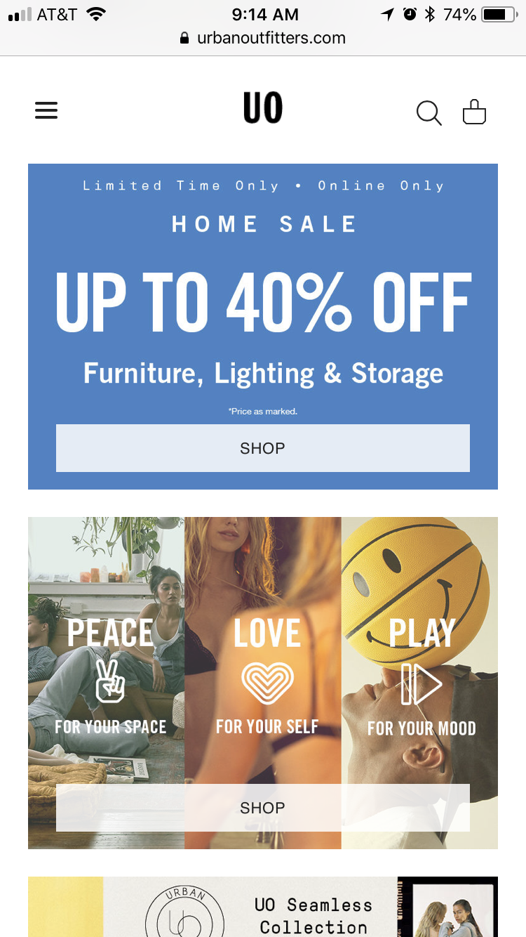
Key characteristics of this mobile homepage (that were true of our client’s mobile homepage):
- Large image based full bleed photos that change depending on the current marketing campaign (about once a month)
- Main navigation hidden inside the hamburger menu
- If you scroll down far enough there are eventually links to categories
Here’s what we tested:

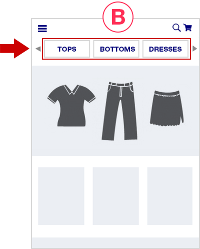
In the variation, we simply added the Link Bar, to the homepage only. There were 9 categories.
Note we didn’t replace the hamburger menu, it’s still there and still is the most thorough way to navigate the different product categories.
But it’s no longer the easiest way — the Link Bar is.
The Link Bar was left-right scrollable and had arrows to help indicate that.
Here are the results.
First, completed orders. After 28 days, we saw a 5% increase with 93% statistical significance:
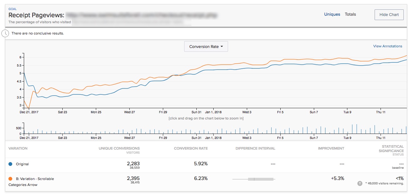
Note Optimizely’s stat engine uses a more rigorous “two-tailed” statistical significance calculation, which does not give this any significance, but a traditional p-value calculation shows this:
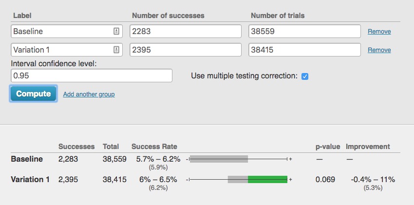
So this is not a “runaway winner” by any means. The industry convention is to declare a winner if it reaches 95% statistical significance or higher when the test reaches your pre-determined number of visitors.
But that is, in the end, a “convention”.
With over 80,000 visitors, 2,300 conversion events per variation, and having run for exactly 4 weeks with the variation leading basically for the entire test, we felt the conclusion was “this is likely a winner and is more likely to perform better by 2% – 5% over longer periods.”
But that’s just one metric (albeit an important one). The story gets more interesting if you look at additional metrics.
Only the exposed listing pages showed an increase in pageviews
Pageviews of the category pages showed clear increases by 10% – 12% (with 99%+ significance), validating one of our critical hypotheses that the Link Bar would send more users “down funnel”.
For example here is the first category link on the left of the quick Link Bar we added (e.g. the “TOPS” link in the “B” mockup above):

The other two category pages showed similar results.
But those pageview increases were only seen for the exposed category links:
What about the links that were “hidden behind the scroll” in other words, you needed to use either the arrow, or scroll to the right to reveal them?
They showed no change in pageviews:

This was consistent for all the category page links that were hidden behind the scroll.
This confirms the original hypothesis of this test: Revealing links to product and category pages will increase the amount of customers reaching them.
Certainly if category pages that were just to the right in our Link Bar didn’t see an increase in pageviews, then hiding all links behind the hamburger menu does the site no favors in terms of getting shoppers to the products.
Takeaways for your mobile site:
- Test putting links to your most popular product categories at the top of your mobile homepage.
- Try making the bar scrollable and see if you can reproduce this result in your store.
- Do you see indications of an increase in completed orders like we did? Maybe your store shows a far more definitive increase in conversion rate than the slight possible lift we saw above.
Case Study 2: Health food brand sees 29% increase with a navigate Link Bar on the homepage
Next we have a very different ecommerce brand, in the health food space with 3 product flavors.
Again, the homepage had copy and images and links but you had to scroll down the page to get links to the 3 PDPs.
So we added the navigation Link Bar just like before:

The variation in this case had links directly to the PDPs of the 3 different flavors (which each had their own PDPs).
After 14 days, we saw a 29% increase in orders with 98% significance.
Traffic to this site was lower, however, so the test got only 139 vs. 107 conversions per variation. This is low. The difference is only about 30 orders, so again we have to put a qualifier that the variation “likely” performed better.
However there was no indication that it would perform worse than not having the links.
Link Bars can help expose customers to new products
In this case, of the 3 flavors, the second and third flavor saw a large increase in PDP pageviews (Chocolate and Strawberry in the mockup above): +25% more visits, and 77% with 99.9% stat significance and over 600 conversions per variation.
But, the most popular flavor did not see much of an increase.
Why?
In this case the site was known for their most popular flavor. Historically that was the only flavor for when the brand first launched. Referral links disproportionately went there, blog links disproportionately link to that flavor, and the homepage imagery and copy mostly talked about that flavor
So in this case the Link Bar served to expose more customers to the rest of the company’s offerings.
This is a nice additional benefit of Link Bars. Note that those alternative flavors were inside the hamburger menu also, but as we saw in the first case study, having them exposed on the page (via the Link Bar) showed a definitive increase in visitors to those PDPs.
Conclusions and how to apply this to your own mobile ecommerce site
Taken together both of these tests, on two very different ecommerce stores (1000 products vs. 3 products), suggest a similar theme:
Make it as easy as possible for mobile shoppers to get to your product offerings.
If you have hundreds or thousands of products, put links as close to above the fold as possible to your most popular categories.
In the first example above, a natural iteration of the test (that has not yet been tested) would be to stack the links instead of having them be in one scrollable row.

This will give shoppers an even better overview of exactly what the store offers.
This should send even more visitors “down funnel” and perhaps give the test a more definitive win over the baseline.
If you have only a few products, create top nav links to the product detail pages.
Finally, as always, you should test this yourself. Don’t assume these results will apply to your store.
Both of the AB tests above saw definitive increases in visits to the category or product detail pages, but the increases in order rate weren’t “runaway” winners, which we define as 99%+ significance with hundreds or thousands of conversion events for each variation.
That’s okay though, as we’ve written about before, not all ecommerce stores have the luxury of that much data. That doesn’t mean you throw up your hands and not test anything nor does it mean you should just use the old fashioned method of “debate designs in a room, loudest voice wins, and implement it outright”.
That’s even more dangerous.
Aside: We once had an in house designer form a client ask if they could implement a hamburger menu on desktop because it “looked sleek”. (Facepalm)
This is why testing is important, even if you don’t get picture perfect increases in conversion rate (99% significance, and thousands of conversions over many weeks).
What about desktop? Why is this mobile only?
The reason this isn’t relevant on desktop is because almost all ecommerce sites have exposed links to all categories (and often dropdowns to subcategories, aka a “mega menu”). So this is by definition almost always already implemented on desktop.
It’s just that the space constraints of mobile result in the hamburger menu.
Hopefully this article and this data we shared helps you start to think outside of needing to collapse everything behind the hamburger menu and starts opening up other possibilities.
On that note, our variations aren’t the only way to go about this. Here are several more examples of alternatives to the hamburger menu from different ecommerce mobile sites.
Ecommerce mobile homepage examples
Who is doing this well already?
Here are some other brands that have clear links at the top of the mobile homepage, getting rid of the complete dependence on the hamburger menu:
Gap.com
Gap has a lot of products and categories. They have clear links to the main categories at the top of their mobile homepage:

The use of photos is a nice touch and could possibly increase engagement with the links and clarity for certain stores.
Note the links are not sticky upon scroll, whereas the links to Gap Incs other brands at the top of the page are. Interesting.
Abercrombie
Also in the apparel world, Abercrombie chooses to simply split by Men and Women. This is worth testing versus a deeper category split like Gaps above:

Lowe’s
For search heavy stores, Lowes.com has a great example of both featuring search and using a suggested area to basically push some category links. We hadn’t been to Lowes.com on this device before so these were likely just categories they wanted to promote (versus a personalized list based on past visits).

Finally, here’s a more bold homepage concept by Cos Clothing, who doesn’t need a thin strip of suggested categories but rather just dedicates the bulk of the homepage to sending shoppers to the right categories.

(Note by the time we published this article the Cosclothing homepage had changed to include a promotion at the top instead of full bleed photos linking to women and men’s departments.)
They have full bleed images for women and men followed by clear links.
We would love to test something this bold with one of our clients.
Final Aside: the homepage is often sacred ground for ecommerce organizations. People fight and negotiate over screen real estate there. So even we, as a third party optimization agency, often have severe restrictions on testing the homepage, much less radically redesigning it. Much thanks to the two clients who let us run the tests featured above.
Want to work with us to improve your mobile conversion rate? Learn more about working with us here, or join our email list to get new articles like this emailed to you when we release them here.
38 Comments
Gregoire d'Aboville
June 25, 2018As a user I’ve always hated hamburger menus.
I’m happy to see you testing this new option and excited by your results! Congrats Devesh!
DeveshKhanal
June 26, 2018Yeah so many people do! Thanks for the positive words.
HabitLauren
June 26, 2018Love seeing A/B tests like this and the actual numbers! I’m curious, why not run the test for Case Study 2 longer to get more transaction data?
I’d be interested to hear what kind of thresholds you guys use to stop tests.
Thanks for sharing these case studies!
DeveshKhanal
June 26, 2018Glad you liked it. Ideally yes we would have loved to get more data, but of course the real world always seems to have non-ideal factors. So in this case the we had a backlog of other tests to run for the client, and the client had a greater appetite for risk so after 2 weeks and big increase like that they felt like it was more important to implement it and move on (idea being the probability that B was a *loser* was very low) rather than wait to see exactly where it would settle after say 200 – 400 more conversion events. Honestly I think they made the right decision.
marcuzzer
July 4, 2018Interesting article, thanks for sharing! From the data you showed in the first case history we can tell for sure that the link bar drove more traffic to the first links it displayed.
I’m curious though to understand if we can infer that the link bar itself, as a UI element, is responsible for the increase of the order number by 5%. The link bar exposes and give more visibility to TOP, BOTTOM, DRESSES. Do these categories have higher conversion rate than others? If yes, what would have happened if you placed in the link bar categories that usually produce less orders? Or if you provide access to TOP, BOTTOM, DRESSES categories directly within the home page content, would the result change?
To sum up, is it the link bar, or the easier access to your best selling categories that made the difference in the experiment?
From an ergonomic standpoint I’d also add that the hamburger menu is in the most uncomfortable position for the users’ thumb to reach. This can also explain why everything that is easier to reach is preferred by the users.
These are just my thoughts, I know very little about the experiments, so maybe I made assumptions that totally do not match reality. Anyway, and I’m curious to understand more.
mramitpatel
July 5, 2018Isn’t this the same solution google has been recommending for quite some time?
They call it ‘tabbed navigation’…
https://material.io/design/components/tabs.html#tabs
Dustin Dawes
July 9, 2018I believe “navigation” has been a pattern for the web and applications since their inception.
This post has “invented” navigation.
DeveshKhanal
July 9, 2018Haha, I love how upset designers are getting with the idea that we “invented” something.
Vishwas Shetty
July 5, 2018Are there case studies where the link bar design didn’t yield positive results?
If no, would link bar be a universal design element that all e-commerce websites could use?
DeveshKhanal
July 9, 2018Yeah good question. We will continue to test it on future clients and update when we can. I have not seen other case studies like this.
But few things are “universal” that’s why we mention testing this on your own site first.
THE UX CHAP
July 6, 2018Great to hear another success story… I wrote this at the tail end of 2017 too, which may also interest you – https://medium.com/the-ux-chap/how-the-hamburger-menu-almost-led-to-a-triple-digit-million-pound-loss-ef6cdfa34f1e
DeveshKhanal
July 9, 2018nice, thanks!
disqus_9yiZijKI7S
December 31, 2018theuxchap no but
Nigel
July 6, 2018From a website development perspective this concept is similar to Priority+ naviagtion. A good way to implement the Lowes style scroller is with a plugin I wrote called priority nav scroller. https://nigelotoole.github.io/priority-nav-scroller/
Russell Huq
July 7, 2018Excellent read! “Browser size” segmentation likely would add more value to those A/B testing experiment results.
This article also reminds me of Lina Hansson, who addressed a similar issue in Conversions@Google 2018. She mentioned sites like Mango.com, Monki.com, which are practicing creative menus for the mobile devices. Amazon probably already far ahead of their competitors on UI matters like that.
DeveshKhanal
July 9, 2018You’re right browser size segmentation would help and that’s a good point.
Marcella_UX
July 8, 2018What I really HATE – are people that rename things that have been used for a very long time. This method is called BREADCRUMBS.
This is what’s wrong with digital design – NO RESEARCH. Here’s a Smashing Mag. article about BREADCRUMB menu’s AND BEST PRACTICES from 2009. And YES, Google has been a huge advocate of it and readily uses it in navigation on Google Drive.
https://www.smashingmagazine.com/2009/03/breadcrumbs-in-web-design-examples-and-best-practices/
Do your research. you haven’t discovered anything new. Use the proper, industry agreed upon term. Be a professional for goodness sakes.
Tim Stock
July 9, 2018Please read an article before getting angry. Breadcrumbs are hierarchical based links to allow you to see how you got to where you are. Tabbed links or ‘link bar’ is a set of links all on the same level. Not a Breadcrumb. Please, be a professional and read something properly, then discuss like a professional and don’t resort to shouting – that would be unprofessional.
andreehuk
July 9, 2018Agreed, Tim.
DeveshKhanal
July 9, 2018Thanks Tim for this defense. I did get some comments that “link bar” is really just a “nav bar” and that is fair. But it surely is not a “breadcrumb”.
Aside, we are testing having/not having breadcrumbs on the mobile PDP of one of the clients in this case study right now. Will see how that test turn sout.
Jesse Supaman Nichols
July 9, 2018Agreed with Tim. This is not the same thing as breadcrumbs, which are based on a hierarchical system. This comment feels like misdirected anger or something.
shoobe01
July 9, 2018So… this isn’t a joke?
You didn’t invent this. If you did, because you have never seen it anywhere else, read a book or try browsing the internet.
It’s a tab bar. An overflowing tab bar I’d call it now, though I didn’t name it explicitly in the book where I defined a lot of this: http://4ourth.com/wiki/Tabs
Also, try thinking outside the box more. You found the very obvious issue that this works Only For The Items Shown In The Tabs. Yes. Of course. Letting people see a few items is easy. The problem is letting people see a Lot Of Items.
Many misuse the hamburger because it nicely presents long lists once opened. Scrolling tabs are much much worse for very long list access as you have no sense of place, it is hard to scroll, it can only support short labels, and more.
I can go on and on about the assumption that hamburger menus are bad, and how to set up pages and architectures properly on mobile. As, indeed, I have:
https://www.uxmatters.com/mt/archives/2015/05/why-its-totally-okay-to-use-a-hamburger-icon.php
https://www.uxmatters.com/mt/archives/2015/07/back-the-stack-and-authentic-design.php
And probably others.
Tim Stock
July 9, 2018Erm, I don’t think this article’s author is suggesting they invented this. Especially as htere’s a whole section dedicated to other websites ‘already’ using this. All this article is doing is coming up with cases and research to suggest when it may be better to use this kind of navigation – whatever you want to call it.
DeveshKhanal
July 9, 2018I agree with a lot of this actually. The key is there’s ltos of talk about this but few published tests that show the effect of these on mobile ecommere *conversions*.
We don’t write for UX designers first, we write for ecommerce directors, VPs, etc. first. It so happened that this article went viral in design communities.
These managers and execs have designers on their own teams that debate and talk to them endlessly about what’s better and whose done what, what we should do, etc…but talk is cheap.
Data takes work. So actual tests that go all the way to conversion rate (not just clicks) as we’ve done are rare, so we published this to hopefully help a few of them.
hrbrt
July 9, 2018In the end it’s a matter of priority. How urgent is it to access the stuff hidden in the hamburger? Or is it needy to present the options all the time? The examples above show that you definitely need to access the gender sections – there is almost no sense to hide them. So, question what your customers and clients need and make the best of it.
DeveshKhanal
July 9, 2018I may phrase it differently. It’s a matter of converting visitors for these companies.
– Screen space is limited
– User attention is limited
So in your limited space, where should you send customers that best increases the likelihood that they will convert to buyers?
hrbrt
July 10, 2018Giving them easy access by the above mentioned examples is a good way. Nonetheless you could ALSO use the hamburger menu, too.
It’s more obvious to see the options than to explore them — so for fashion this should be working fine.
Tim Stock
July 9, 2018Some great research and thoughts on the options out there for navigation on mobile.
Interesting that angry people always misread articles like this – all seem to misinterpret it as an invention of something new, a claim of authorship or a coup against the status quo. Nope. It’s just some research to suggest that in some circumstances, there are other options that may perform better. Worse still are people who just don’t read the article and start shouting at the authors in a really unprofessional manner. Such a shame.
Thank you for your research and thoughts on this matter.
DeveshKhanal
July 9, 2018Thanks Tim for the thoughtful comments. I don’t mind the “this is so obvious!” comments because it begs the follow up question: then why do basically all mobile ecommerce sites still use hamburger menus?
(I could expand beyond ecommerce, but that is our expertise so we tend to stay there)
andreehuk
July 9, 2018From a user/designer perspective, we never like the hamburger as everyone tended to throw stuff in there.
For all client projects since 2013/4, we again removed the hamburger and added a subnav. ALL projects reported higher engagement numbers than what they had before.
DeveshKhanal
July 9, 2018Nice! Love to hear this.
Šime Vidas
July 9, 2018Huh, if you put links on the page, some people will click them? So that’s how your human brains work, interesting.
*flies back to space ship to report to alien invasion force*
DeveshKhanal
July 9, 2018It’s funny, we got a bunch of comments like this from designers on this article. There are 2 things misguided about this:
1. The key is not justifying a solution in hindsight, it’s asking “why does everyone do it this way?” and daring to test something else. The mobile navigation convention is the hamburger menu. If it was so obvious to not do that, why don’t we see more mobile link bars or navbars?
2. Clicking the links may be obvious, but having a navigation element on the homepage increase mobile checkouts (the point of all this) is definitely not obvious and is the more difficult result to achieve.
Šime Vidas
July 10, 2018Good points. Consider highlighting this in the article. (I arrived here from Twitter where people were joking about this, so it would be a good idea to make sure that people don’t get the wrong impression.)
Gabe Lee
July 12, 2018Love these posts, please keep em’ coming!
Tim
July 14, 2018This is good, but it really only works if the category names are small enough to fit the width of the phone screen (meaning the smallest phone screen). Chopping a button end off with a scrolling arrow is going to confuse more people than it helps. Especially older people. It’s also not good from an UI standpoint when the scrolling arrow sits right on top of a button.
I don’t really like hamburger menus. This menu system can work if the navigation elements are done right.
Matt Tanguay
January 17, 2020Have you also tested the impact of adding a section with the main categories right below the fold? How effective is that in contrast to a link bar above the fold?
I’m assuming that the link bar works better because it’s one of the first things users see without scrolling down, whereas a categories section needs some scrolling.
Thoughts?
Devesh Khanal
January 19, 2020“I’m assuming that the link bar works better because it’s one of the first things users see without scrolling down” I agree, although in our case, they see it the moment the page loads, don’t even have to scroll. Yes, we’ve seen good engagement from a similar link section below the fold. I don’t believe we have AB test results of adding such a section (below the fold) and measuring the impact on sales as we generally test a link bar (or equivalent) above the fold since that’s been working well for multiple stores.