

What if you could increase free trial sign ups…by a lot…by eliminating the word “free” from your landing page?
Well, I have a case study where we did just that.
We increased clicks by 139% and free trial sign ups by 73% by making a few simple changes to a SaaS home page.
The company is Wedbuddy.com. It lets users design a great looking wedding website really easily. It’s a cool company with a cool product. And they wanted more visitors to sign up for a free trial.
They already had a great looking homepage (screenshots below), so the question was: what changes could get more people to sign up instead of bouncing?
You would think emphasizing a no-risk, no-credit-card-required free trial would help.
Or you would think emphasizing all the cool features would help.
And you would certainly think adding more testimonials would help.
Alas, in this case, you’d be wrong.
We partnered up with the digital marketing agency SingleGrain to optimize Wedbuddy’s sales funnel.
I detail the key experiments that almost doubled their free trial sign up rates below, and in the free PDF bonus, I outline two more experiments that I was sure would increase conversion rates, but…
they didn’t.
Check them out to see if you’re making the same mistakes on your site.
[su_note]The Free Bonus: Get a summary of the A/B tests in this post plus 2 additional tests not included in the post, where I was sure I had increased conversion rates, but I was totally wrong. See if you’re making similar conversion killing mistakes on your site. Click here to get the bonus.[/su_note]
Let’s get started…
The SaaS Conversion Optimization Experiment
Here are the two main changes we made.
1. We changed the call to action (and nearby) copy from a focus on payments to a focus on value and convenience.
Wedbuddy’s original homepage had a call to action and nearby copy that really emphasized the “free” in free trial:
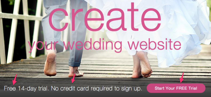
It makes sense. You have something that’s free: a free trial, a free book, a free product. So you want to emphasize it in your web copy. It could only help right?
Wrong.
Sometimes it can hurt. Here’s why:
For many products, but especially apps and software, emphasizing your free trial often serves only to remind your customers that it’s actually not free…eventually you will reach for their wallet…and they don’t want to deal with that.
So some fraction of them think, “Why go through the hassle of signing up, learning the software, and being barraged with upsell emails? Let me go look for a free alternative.”
Or, “No credit card required? Uh oh, they’re going to try and charge me eventually. Let me go look for something else.”
A little here, a little there, and slowly you start losing chunks of customers.
“But Devesh, those cheap customers were never going to buy from us in the first place!”
Not true.
Software, apps, and many other non-commodity products need to be used, played with, tried, and tested before a customer can fall in love enough to want to buy.
For example, I have Pandora premium – no ads, and as many skips as I want. I love it. Would I have bought it without being able to listen to free Pandora first? Not a chance.
But what if they had a “killer” landing page? No way. I’m not going to pay for a music service without listening first.
I have MOZ premium because I used OpenSiteExplorer enough to want more searches than the free version would allow:

Would I have bought it based on a description of what it does…without actually using the tool? Zero chance.
I bought Weebly after trying it free. I’m paying Mailchimp after trying it free.
I could go on, and I’m sure you could too.
The point is: People want to use software before they buy it.
So, focusing on converting visitors to free trial users is a great goal for a SaaS business.
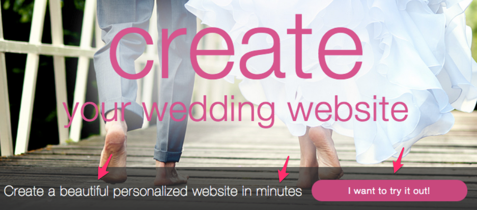
We tested this hypothesis for Wedbuddy by changing the copy to the following:
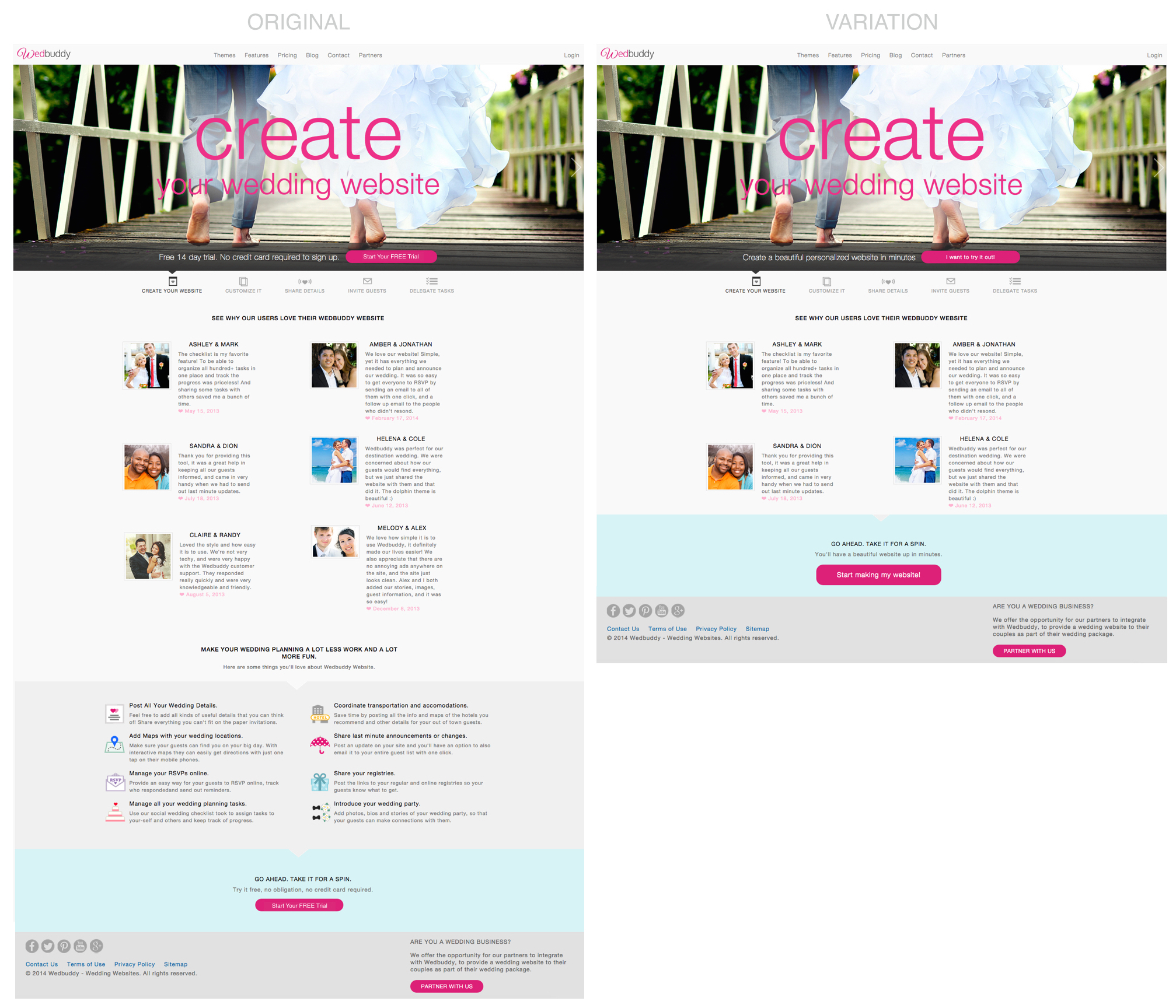
2.We reduced the size of the home page – removing the list of features and reducing the number of testimonials
I’m going to say this right off the bat: don’t universalize a case study where a longer or shorter home page does better. This is very situation dependent.
You. Have. To. Test. It.
In this situation, we hypothesized that visitors may be overwhelmed at the number of features. Here’s why…
Planning a wedding is stressful. There’s a million things to do, they cost a lot, most people have never done it before, and you just feel overwhelmed.
So your first thought on your wedding website is: I just want to get this done. It should look good, work the first time, and not be hard to set up. That’s it.
Now, I think Wedbuddy is a cool service, and their additional features (like pre-made checklists and task reminders) can genuinely help, but when you first land on the homepage, you’re not thinking about that.
It’s not a burning need.
You just want to see how easy it is to make a website that looks good and represents you well.
So in our variation for this experiment, we also reduced the size of the home page and put more emphasis on visitors simply trying it out themselves.
Here’s the final original and variation for this experiment (Click to enlarge):
Key Principle: Get inside your customers heads and understand their real motivations. That’s what was at work behind the two changes we made for this experiment.
Note that the best way to do this is with user interviews and surveys. We hadn’t done that yet when we ran this particular experiment, but I had two key things in place to substitute for it:
1. I researched wedding planning forums to understand what brides to be (vast majority of users were brides to be) were thinking – what they were focused on, how they articulated their pain points, etc. I found nuggets like this from wedding bee that supported my hypothesis above:

Lesson: If you’re just writing copy and running conversion tests based on “hunches”, you’re doing it like an amateur. Find out how your customers talk articulate their problems. What words do they use? What do they emphasize? What do they really, truly care about? And what, as it turns out, do they not care about? Really understanding these questions can be the difference between increasing your conversions vs. trying and trying and getting nowhere.
2. I had the advantage of having gone through wedding planning only 12 months before. (We’re very happy, thank you for asking.) So I knew first hand what it was like.
The Results: 139% increase in clicks and 73% increase in free trial sign ups
The combination of these two changes resulted in a huge increase in the number of clicks to try it now.
We ran the experiment for two weeks and saw the following:
A 139% increase in the number of clicks on the pink “Try it now” buttons:

An 87% increase in the number of people starting the signup process (seeing the first sign up page):

A 73% increase in the number of people completing the signup process:

All of these tests had a 100% “chance to beat baseline” (statistical significance).
Key Takeaways: How to Improve Your Marketing, Copy, and Conversions
If you’re trying to improve your marketing, copy, or conversions, here are some key lessons:
First, try copy that focuses on value and benefits rather than emphasizing costs and prices
Second, don’t assume that inundating the prospect with features is going to win them over, especially not on first contact.
Third, review the first and second points.
Bonus: We ran two more experiments on Wedbuddy’s homepage where our variations grossly underperformed the original and taught us a lot about what users actually want. I’ve summarized those results and analysis along with the experiment in this post in a beautiful PDF. It’s totally free. Get it by clicking exactly where I’m pointing to:

Your Turn: What pages, emails, or marketing do you know could be improved in your business? Let me know in the comments. I read every one and respond to almost all of them.
14 Comments
TheMikeBal
November 10, 2014Great work on this project Devesh!
DeveshKhanal
November 11, 2014Thanks Mike!
Rajan M
November 12, 2014Hi Devesh, landed here from backlinko. At a time when I am thinking of starting email subscription on my blog, your valuable info was a great help and immediately subscribed to your blog. One thing I’d like to have your suggestion though. My blog (workmoneyfun.com) is about giveaways, sweepstakes; basically people come to my blog to win products for free. At such, how can I make some money from my blog and what should I offer to my subscribers? Most blogs offer ebook but I don’t think my readers would be interested in receiving free ebooks. Any suggestion from you would be a great help for me.
DeveshKhanal
November 12, 2014Rajan, glad you found my writing useful!
Have you tried offering exactly what they’re looking for…free gifts? What about keeping one or two coupon codes, giveaways, or sweepstakes hidden behind an opt-in wall?
Julia
December 2, 2014Hi Davesh, really interesting case study. I have an e-commerce business, we’ve only launch in October but even though we had some targeted traffic on the website the conversion rate is 0%. I wonder if you could point us in the right direction? The website is wittydoodle.co.uk
DeveshKhanal
December 2, 2014Julia, happy to help. How much traffic have you had since October and how is that divided by source? (Feel free to answer via emails so you don’t have to discuss your business on blog comments: My email is in the contact link at the top or just hit reply to any email I’ve sent if you’ve signed up for my newsletter).
Tammy Hawk-Bridges
January 28, 2015Fantastic study Davesh! I was captivated by it! I especially loved how you went sought out your target and studied them in THEIR environment. So many marketers don’t even consider what their “Perfect Customer” even wants. Recently I have crushed it when it comes to traffic on my own website but my conversion is lacking so your tools are really helping me! Once again great read!
DeveshKhanal
February 3, 2015Tammy, by the way, it makes me really happy that you noticed and appreciated the customer research aspect of it…most people gloss right over it not understanding how important it is!
Tammy Hawk-Bridges
February 3, 2015Yes Devesh and this is why people struggle. It’s not about you – it’s about your customer or your reader. 🙂 I’m really glad to have found your blog. Thanks!
Kate H
December 11, 2015Good information! Would be awesome to see a follow up to learn if any of the changes made to increase trial signups then led to more trial users converting to paying customers.
DeveshKhanal
December 11, 2015Kate, Not sure what the latest with them was, but when I was still working with them, there were some product/pricing issues that were holding back paid signups. I’ve thought about writing a post about this, but in order for the classic SaaS free trial or freemium model to work well your product needs to have a wow factor. e.g. if you gave someone in 2005 an iphone for 30 days, there would definitely be a fair number that say “omg, where can i buy this?”
Kate H
December 11, 2015Thanks for the reply 🙂
Jim
September 11, 2019Fantastic study Davesh! I was captivated by it! I especially loved how you went sought out your target and studied them in THEIR environment. So many marketers don’t even consider what their “Perfect Customer” even wants.
Devesh Khanal
October 5, 2019Thanks Jim. Agree that customer research is critical to good hypotheses.