Truth be told, optimizing a website is a daunting task.
The same anxiety that makes writers stare at a blank page for hours or a musician futz around with their instrument for an afternoon is what makes it so hard. It’s this question that gnaws at you:
Where should we start?
There are big things: Let’s redesign the whole site! We need a new ecommerce platform!
There are little things: We need to reword this. What if we put the logos above the diagram?
And a million options in between.
Now, you can read case study after case study online (and they can often be great for inspiration and sparking creativity), but in my experience, random guesses only take you so far. Having a framework for tackling large projects like this can be transformative in turning a situation from “the loudest people’s opinions get tested first” into a systematic process for improving conversion rates and thus revenue.
This article isn’t going to lay out an entire framework for conversion optimization, but it will outline a foundational piece.
Introducing the Usability vs. Desirability Framework for Conversion Optimization
As we’ve run test after test for companies ranging from SaaS to ecommerce to commercial blogs, I’ve begun to think of all proposed site changes (and their associated hypotheses) in two categories:
1. Usability
2. Desirability

Let me be clear, I’m not saying these are two categories in a sea of many others. No, what I’m arguing is that all proposed website changes fall into one of those categories. Or, rarely, an overlap between the two.
In addition, this means if you want to make a change to your site, or landing page, or any key web element, you should be able to justify it using one (or both) of those categories.
Yes, it sounds like a cavalier, sweeping assertion. So let me explain.
Category 1: Usability Improvements: Making it Easier For Them
Usability improvements make it easier for the user to get from point A to point B.

They don’t, however, change how much the user wants to get to point B (point B’s desirability).
They include changes like this:
- Reduce distractions (this is almost always a good thing)
- Flip the order of elements
- Future pace a complex user flow
- Decrease load time
- Move items above the fold
- Increase the size of calls to action
- Change colors or adding pointer graphics
- Reduce form fields
All of these changes affect how easy it is for the user to understand, proceed, checkout, signup, or take any other desired action.
Here are some examples.
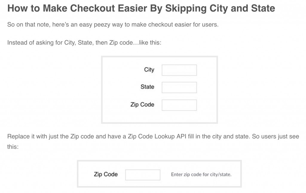
Our last article covered how to use Zip Code Lookups to prevent users from having to enter city and state unnecessarily:

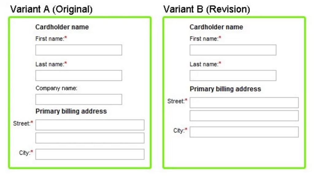
Or this famous case study of Expedia removing one field from their checkout form that increased profits by $12 million:

Note that none of these changes makes it the user want it more. It just removes confusion, or reduces time to complete an action, or somehow makes getting to their goal easier.
That’s usability.
Now let’s talk about desire.
Category 2: Desirability Improvements. Making Them Want it More
This is the category that many people tend to focus on (including me) when thinking of site changes. This includes all changes that make the product or service more desirable. These changes aren’t about making it easier to get from point A to point B but rather making point B more desirable of a destination to get to.

It includes changes like:
- Making the value proposition clearer
- Changing CTA copy to make clicks more desirable
- Changing feature oriented copy to benefit oriented
- Adding videos to sell the product
- Adding testimonials
- Adding trust logos
- Adding reassurance copy
These are often more involved tests that require design or copy assets. It requires a deeper understanding of customer psychology.
Here are some examples.
We increased clicks to a newsletter landing page by ~145% on two different sites by adding value propositions to the CTAs. A method we call the Likable Link Technique:

We increased email optins multiple fold by introducing more relevant offers to readers of a financial news site:

The Rare Case of Overlap
It’s rare, but in some cases changes may do both. For example
- Making product photos bigger – This can increase desirability by making the product look more appealing while at the same time letting users simply inspect the product more closely before purchasing (usability).
- Large Design Upgrade – Often design upgrades can both make the page more usable (fewer distractions, more visually striking calls to action) and increase trust or credibility (and thus desirability) of the brand and its products.
- Sweeping Changes where independent changes aren’t isolated but rather combine to produce a winning variation.
As an example of the last point, we improved a SaaS company’s free trial signups by 73% by making multiple changes including adding a value proposition near the CTA (desirability) and removing unnecessary distractions on the page (usability).

Which Category Should You Focus on First?
The answer to this question is to not answer this question. At least, not by yourself.
Instead, this question speaks to the importance of this principle: learn what your users’ barriers are.
The above examples showed how different usability and desirability changes really are. If you guess wrong and focus on the wrong category, you could spend months running test after test that get you nowhere.
For example, an ecommerce store that sells to teens and twenty somethings may have zero issues with usability: generally, this demographic can navigate sites easily and if they want something, will find a way to get it.
Or many SaaS sites initially have one simple goal: start a free trial, and getting to that conversion event has little to do with usability (signing up often just requires an email).
In these cases, increasing button sizes, or changing checkout forms may get you little results. The users’ main barriers to converting may be entirely based on not wanting your product enough, or not trusting the company, or not internalizing the benefits.
To figure this out, user research tactics are paramount. You can use methods like on page polls, post purchase surveys, screen recordings, and live user testing can help clarify where the main hangups are.
In other words, this UD framework speaks to the importance of user research in guiding conversion optimization projects:
First, figure out why users aren’t converting.
Then, give them what they want.
Have a question about usability vs. desirability on your site? Ask away in the comments. I answer almost every one.


2 Comments
Mohit Tyagi
July 1, 2016Brilliant Article Devesh. Should we also equate these two stages to buyer cycle?
Following are the stages in buying cycle a person goes through:
1. Need Recognition (Desirability-Relevance & Motivation)
2. Information Search (Desirability-Clarity, Usability-Aesthetics)
3. Evaluating Options (Desirability-Value Prop)
4. Purchase Decision (Usability-Reduce Friction, Desirability-Reduce Anxiety, Urgency)
I have tried to map but wanted to take your opinion on the same?
Daniel Trunfio
September 7, 2016Devesh Khanal really knows what time it is. He really has figured out what my company has been trying to do for years. Well done Devesh and team