


Most conversion rate optimization (CRO) “strategies” look like this. A team gathers in a conference room, everyone throws out their favorite pet idea, the loudest voice wins, and a test goes live. Six months later there’s a spreadsheet of wins and losses and no clearer idea of what actually makes customers buy.
We call this tunnel vision testing, and years ago, with the benefit of hindsight, we were doing it too.
The more sophisticated version has its own problems. Teams write a hypothesis (“adding a video will increase conversion rate”), which biases them toward a result, tempts them to stop the test the moment it’s trending their way, and turns every outcome into a referendum on somebody’s judgment. And because each test is isolated, learning doesn’t accumulate. Test 40 is its own independent idea tested in a silo so it teaches you no more than test 4 did.
We’ve been running A/B tests for ecommerce brands for 10 years, at a rate of roughly 200 a year, and we catalog every one of them publicly. Our strategy is built specifically to avoid those problems. In this article we’ll cover:
- How to decide whether CRO is even the right investment right now, using revenue and traffic thresholds, so you don’t build a strategy you can’t statistically run.
- How to define what you’re trying to learn, not only what you’re trying to lift, so tests answer business questions instead of settling arguments.
- How to categorize every test by Purpose (Brand, Discovery, Product Appeal, Product Detail, Price & Value, Usability, Quantity, Scarcity) so you can see which types of changes move the needle for your specific store.
- Why we replaced hypotheses with questions, which removes bias, prevents stopping tests early, and multiplies what you learn from each one.
- How to track the full funnel KPIs — add to cart, cart views, checkout steps, revenue, AOV — because that’s how you understand why a test won or lost.
- How to analyze by segment and turn every result into the next test, so your roadmap compounds instead of resetting each month.
Note: if you’d rather have someone run this for you, you can learn about our ecommerce CRO agency here.
A CRO Strategy Is a Plan for What You’ll Learn, Not a List of Changes You’d Like to Make
A CRO strategy is a systematic plan for what you’ll test, in what order, and what you intend to learn from it. That’s the difference between a real conversion rate optimization strategy and a to-do list of CRO tactics.
Tactics are the individual changes: moving a call-to-action (CTA), rewriting a product description, cutting a form field, adding a review widget to the PDP (product detail page). Strategy is what decides which of those is worth your next two weeks.
Here’s the tell that a team has tactics but no strategy. They can list the tests they ran, but they can’t tell you what those tests collectively taught them about their customers. Most CRO programs are heavy on tactics but completely missing strategy. Everyone has ideas of what to test, but they are testing them all as one off AB tests, there’s no connecting through-line, no strategy. .
Some clients ask about implementing CRO “best practices” for their ecommerce store but even most “best practice” tactics are borrowed from someone else’s store or from competitor analysis, which means they are specific to the products, customers and details of that brand and may not work with yours. We’ve watched plenty of popular “best practices” lose or do nothing at all for our clients. Reducing form fields is a classic example. We removed “How did you hear about us?” and “What industry are you in?” from a SaaS client’s form and after almost 100 conversion events per variation there was no difference — if anything, the fewer fields were trending toward hurting conversion rates. “Less form fields is better” is a popular best practice. It just wasn’t a real problem for that company’s users.
A working CRO strategy produces two things over time: revenue lift, and an accumulated understanding of what makes your specific customers buy. The second one is what makes the first one repeatable.
Before You Build a CRO Strategy: Do You Have the Traffic and Revenue for It?
Almost no one asks this first, and it’s the question that decides whether everything below is worth your time.
Two rough criteria: roughly $2 million or more in annual revenue and roughly 100,000 monthly unique visitors.
The traffic threshold is a bit arbitrary, but 100,000 is a nice round number that’s easy to remember, that’s why we cite it.. A/B tests actually need conversions, not visits, to reach statistical significance, and typically we look for around 3000 conversions per month. At a 3% conversion rate (a generous estimate for most brands), that works out to 100,000 visitors, hence us citing that number. If your store gets less than 3000 conversions per month, we suggest focusing on growing traffic rather than AB testing.
The revenue side is often ignored but just as important because AB testing isn’t free. At $2 million, a single test producing a 10% lift is $200,000 a year. Round math on a typical CRO engagement with an agency like ours is $10,000 a month, so $120,000 per year. So $2 million of annual revenue, with a couple winning tests a year is likely to get you ROI on that CRO agency, but below that it starts to get questionable. We broke down the full ROI math here if you want to run your own numbers.
Aside: these cutoffs are guidelines, not laws. Don’t apply them to the exact digit. The principle underneath is what matters: compare the revenue increase CRO could realistically produce against what the same money would produce in SEO, content marketing, paid media, or product.
One corollary most guides skip. Meeting the thresholds only creates the potential for good ROI. You still need to actually produce consistent 5 to 10% lifts in orders, and ad hoc conference room testing rarely delivers that.
Step 1: Define What You’re Trying to Learn, Not Only What You’re Trying to Lift
Set one revenue-level program goal tied to the business. “Increase revenue per session by 6% in two quarters” is a goal. “Improve conversions” isn’t.
Then split your test intent into two categories. Tests meant to earn are the likely wins that fund the program and keep stakeholders happy. Tests meant to learn are the bigger questions: does this target audience respond to price framing, does ingredient detail matter, does a bundle change what people buy?
Learning goals matter because the winning variation is the smallest thing a test produces. Understanding why it won is what makes the next five tests better.
A useful exercise: write down the business questions your leadership team actually argues about.
- Do customers care about ingredient detail, or is that our own obsession?
- Does free shipping messaging beat a discount?
- Do people need to see the product in use before they’ll buy?
- Are our “luxury” shoppers really insensitive to promotions, or do we just assume that?
That last one is worth dwelling on. We had a luxury apparel client selling $2,000 handbags and $4,000 coats, and everyone’s thinking was that these customers aren’t price-constrained, so department-store tactics like promos and coupon codes wouldn’t move them. Price & Value ended up being one of their highest win-rate categories. Their luxury shoppers did notice those things and were affected by them.
Those arguments are your testing themes, and they’re better roadmap material than any list of UI tweaks.
One warning. Be careful with vanity conversion goals. Newsletter signups, bounce rate, and add to cart clicks are easy to move. On an ecommerce site, optimize toward transactions, revenue, and average order value. It’s easy to make clicks on some element go up. It’s harder to get more people to buy from your store.
Step 2: Research Where the Real Barriers Are (Usability vs. Desirability)
Before you build a roadmap, figure out which of two problems you have.
Every proposed change to your site falls into one of two buckets. This was our original framework, before we developed the Purpose Framework. Usability changes make it easier for a customer to get from A to B. Desirability changes make B more worth getting to.
Usability changes: reducing form fields, cutting distractions, moving elements above the fold, faster load times, faster page load speed, bigger CTAs, clearer navigation. None of them make anyone want the product more.
Desirability changes: clearer value propositions, benefit-led copy, customer testimonials, trust badges and other trust signals, product video, reassurance copy near the buy button.
In our experience, changes that affect a user’s desire to check out usually have a bigger impact than reducing friction, largely because most modern ecommerce sites already have good enough user experience. Guessing the wrong bucket costs you months. A store whose target audience is twenty-somethings who live on their phones may have no meaningful usability problem at all, and a bigger add to cart button will not fix a trust problem or a price-to-value problem.
Which bucket to focus on is a user research question. On-page polls, post-purchase surveys, session recordings, live user testing, review mining, and drop-off points in your analytics will all tell you more than a conference room will.
Pro Tip: run research in parallel with your first tests. Most agency processes ask you to pause for six to ten weeks of discovery before a single test goes live. You can start testing the obvious things while the user feedback comes in.
Step 3: Build Your Test Roadmap Around the 8 Purposes
This is the part that turns a list of tests into strategic CRO.
Every A/B test on an ecommerce site can be categorized by the purpose it serves. (We go deeper on the mechanics in our A/B testing framework guide.) These are the eight buckets in our Purpose Framework:
- Brand – Increase trust, credibility, or appeal of the overall brand.
- Discovery – Make it easier to find or discover the right product.
- Product Appeal – Make individual products more appealing with messaging, positioning, or imagery.
- Product Detail – Highlight details (ingredients in a lotion, specs on a car part) that help customers choose.
- Price & Value – Make the price-to-value ratio better.
- Usability – Reduce UX friction, like cutting form fields or using a zip code lookup to auto-fill city and state at checkout.
- Quantity – Increase average order value or cart size.
- Scarcity – Create urgency by highlighting limited time or limited quantity.
Tag every test with its purpose. Some tests get two — our review star rating test was Product Appeal and Brand, because a star rating is social proof that makes both the individual product and the overall brand more appealing. Two is the practical ceiling. Past that the labels stop meaning anything.
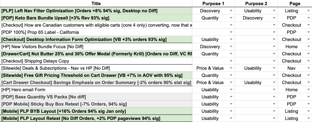
Then track which purposes win and which fall flat for your store. That pattern is your strategy.
Here’s what that looks like in practice. For one food client with 30 to 50 products, Discovery and Quantity were winning more than half the time. We dug in and found the pattern was a series of cart upsell tests, labeled both Discovery and Quantity because presenting upsells helps shoppers discover new products and increases cart size. So we kept tapping on those two purposes with more tests, and they kept moving the needle.
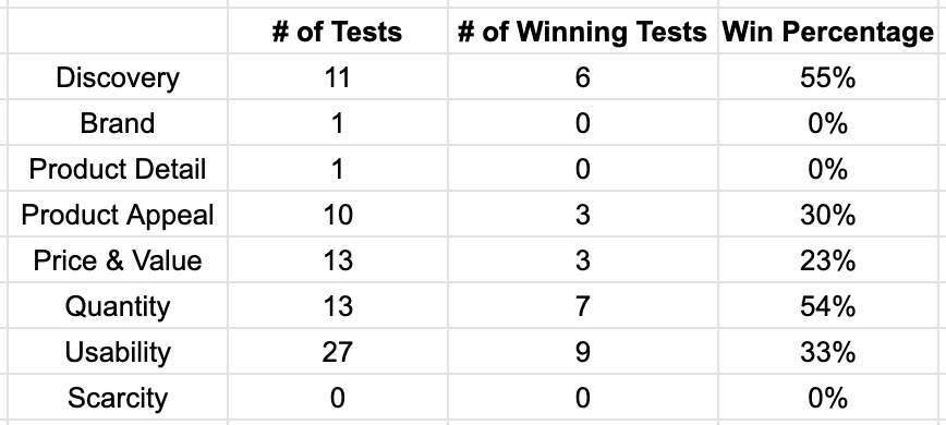
The same graph works in reverse. On another client we saw a wall of Usability tests and almost no Brand tests, for a client whose brand was their single biggest asset. Nobody decided that. It just happened. Big picture strategy is hard. Testing UX minutiae is easy.
After 15 or 20 tagged tests you know whether your customers respond to product detail or to price framing, and you can put your next quarter behind the answer instead of behind a guess.
It also solves the too-many-cooks problem. Ideas stop competing on volume and start getting slotted into purposes, then prioritized against what the evidence from your own store already says.
Step 4: Prioritize Tests by Revenue Impact, Not Page Traffic
Where a lift lands in the customer journey changes what it’s worth.
A 25% lift on the payment step is a 25% increase in transactions. A 25% lift in add to cart rate, on a store where only 40% of cart additions go on to check out, works out to 25% × 40%, or roughly a 10% increase in transactions. Same headline number, less than half the impact.
That’s why cart and checkout tests are usually the highest-leverage work on the roadmap. Any lift at the bottom of the sales funnel goes straight to your bank account.
Weigh traffic volume too. A brilliant test on a page with 800 monthly visitors will never reach significance, no matter how good the idea is.
Balance the roadmap between quick, low-build tests that keep momentum and bigger swings on high-traffic templates like the PDP, collection pages, and paid landing pages.
Mobile deserves disproportionate space on your roadmap. Most stores crossed over from majority-desktop to majority-mobile traffic years ago, and we typically see mobile conversion rates hover around half of desktop. That gap is the massive elephant in the room for most ecommerce stores, and usually the largest single opportunity on the site. It’s why we analyzed the mobile checkout flows of the top 40 ecommerce sites in the U.S. feature by feature.
If you want a concrete starting list of candidates, work through our ecommerce CRO checklist. Score tests by expected revenue impact, build effort, and how much you’ll learn. Not by how confident someone feels about the idea.
Step 5: Frame Tests as Questions Instead of Hypotheses
Almost every CRO guide treats hypothesis-driven testing as gospel. We stopped using it, and we wrote up why at length. We call the replacement the Question Mentality.
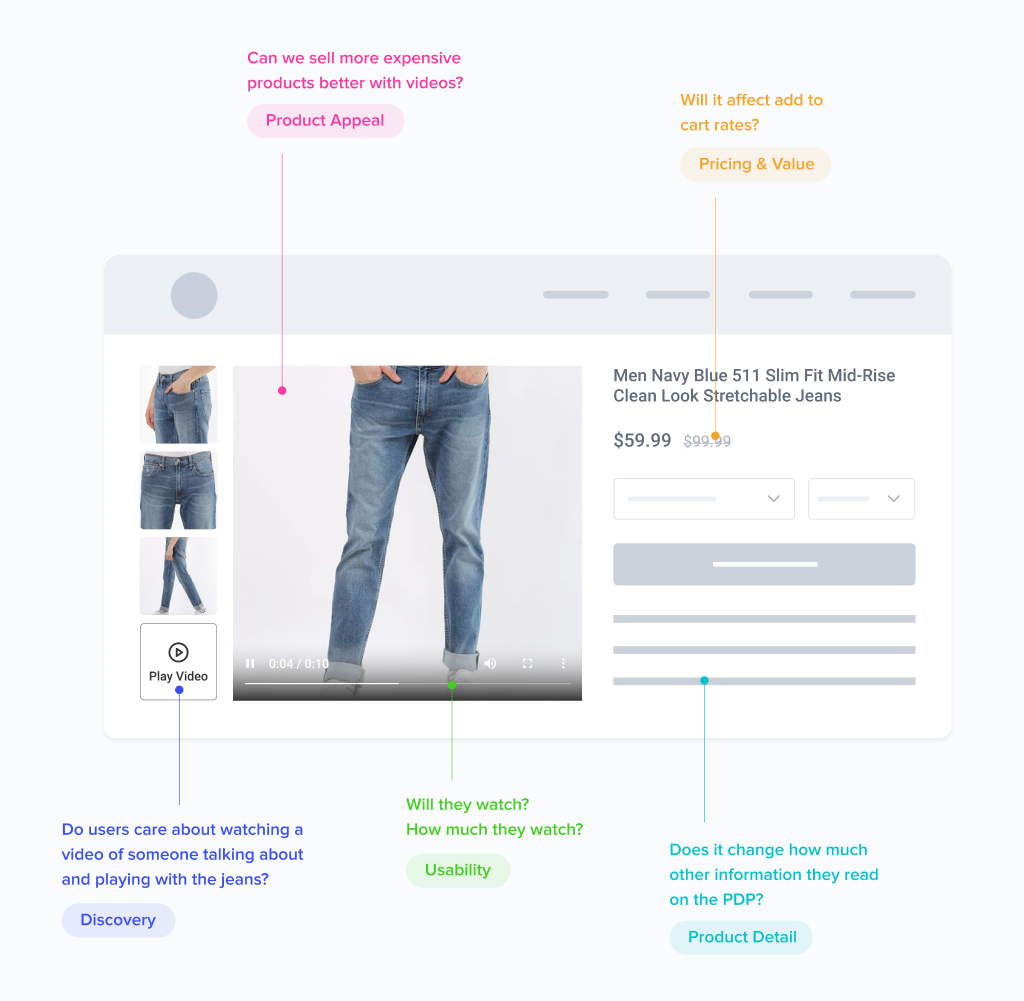
A hypothesis is a prediction, and predictions create bias. Once you’ve written down what you think will happen, you start rooting for an outcome instead of observing one. This is true even of a “good” hypothesis backed by survey data and heatmaps — arguably more so, because all that evidence convinces the team it just has to be true. And in a business setting, where money and career reputation are both at stake, that bias runs far stronger than it would in a science lab.
It shows up two ways. Teams call tests early because the numbers are trending the way they hoped, and early trends reverse constantly. Then the test ends, everyone pats themselves on the back or shrugs, and nobody asks what actually happened.
So instead of “adding a video will increase conversion rate,” we write a list of questions:
- Do users care about watching a video? Will they actually play it?
- How far into the video do they get?
- Of only the users who watched, how much did their conversion rate change versus users who didn’t?
- Does it affect add to cart rate?
- Does it change how much of the rest of the page they read?
- Does it change average order value, or just conversion rate?
Questions produce learning whether the variation wins, loses, or does nothing at all, which means no test is wasted. We don’t run A/B tests because we’re sure of the result. We run them because we aren’t sure.
There’s a practical side effect too. Every question you write implies a goal you need to track, so the question list forces a better measurement setup before the test ever launches.
Step 6: Set Up Full-Funnel Goal Tracking So You Learn Why, Not Just Whether
This is where most in-house programs fail, and we’ve written a full breakdown of the goal setup.
Tracking only transactions tells you a test lost. Tracking the conversion funnel tells you it lost because add to cart clicks went up but checkout starts went down, which is a completely different and far more useful piece of information.
Use a standard goal set on every test: transactions, revenue, add to cart clicks, cart page views, and pageviews of each step in your checkout flow.
Then add unique goals for the specific element you changed: video plays, accordion opens, size guide clicks, image swipes, review expansions. That’s how you find out whether anyone engaged with your idea at all. On one apparel test we ran Hotjar heatmaps and found that only 2 of 348 desktop users clicked the size guide link in its original position, and only 3 of 1,356 mobile users tapped it. Those two numbers reframed the whole test.
Use both pageview goals and click goals. Clicks show intent, pageviews confirm the user actually got there.
Integrate your testing tool with Google Analytics or Adobe Analytics so you can validate results and analyze metrics the testing tool never captured.
Finally, track AOV and revenue per visitor alongside conversion rate. Quantity-purpose tests can raise revenue meaningfully while leaving conversion rate flat. On one cart upsell test, average order value increased by $55 with 92% statistical significance after 41 days, over 4,000 transactions and $5,600,000 in tracked revenue. If conversion rate had been our only number, we’d have called that test a dud.
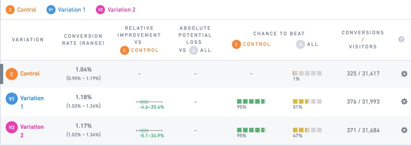
In our experience, when a variation is a clear winner, all or most goals trend upward together. When they don’t agree, that disagreement is the finding.
Step 7: Design, Build, and QA Variations That Don’t Undermine the Test
A test only measures your idea if the execution is good. An ugly or off-brand variation tests your design skills, not your concept.
For high-stakes tests, develop multiple design concepts rather than betting the whole idea on one execution. If a big idea loses, you want to know it was the idea and not the layout.
Design variations to pixel precision, and check visual consistency with the rest of the page. New elements that don’t match the site read as third-party ads, and users skip right past them. We ran a test where swapping lifestyle photos for product-only photos increased proceed-to-checkout by 13.5% — and mind you, both our team and the client’s design team preferred the lifestyle photos.
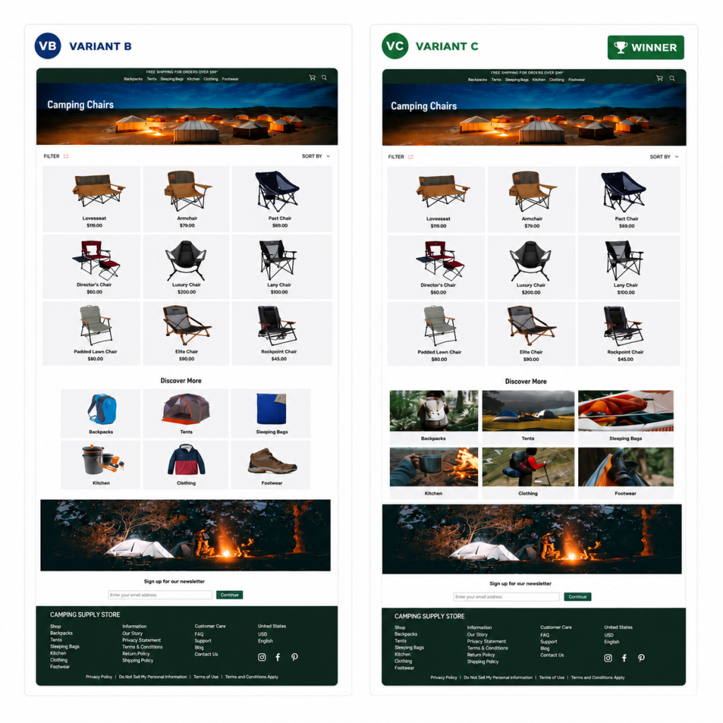
Code and QA across devices and browsers before launch. Flicker, broken mobile layouts, and misfiring goals all produce false losses, and a false loss is worse than no test, because you’ll wrongly cross a good idea off the list.
Give stakeholders preview links so the debate about the variation happens before the test goes live, not in week two.
This step is also where in-house programs bottleneck. Strategy gets approved, the roadmap looks great, and then the first variation sits in a dev queue for a quarter behind feature work.
Step 8: Analyze by Segment and Feed Learnings Back Into the Roadmap
Don’t stop at won or lost. Write down how the result changes your current understanding of which purposes matter to your customers.
Segment every result: new vs. returning visitors, traffic source, device, mobile vs. desktop. A flat overall result often hides a strong win in one segment and a loss in another, and that’s a finding, not noise.
Then read the whole funnel to explain the outcome. A/B tests tell you what happened, and you have to interpret why. State plainly what you now believe about your customers, and hold it loosely. It’s an interpretation, not a fact.
Be honest about how much weight a result can carry. We ran a size guide test that showed a 22% conversion rate increase, and we still told readers to take it with a grain of salt: it ran 10 days with under 200 conversions per variation, despite clearing 95% significance.
Every test should generate at least one follow-up: a refinement, a bigger version of the same idea, or a test of the same purpose on a different template.
Keep a searchable repository tagged by purpose, page, build size, and outcome, so patterns surface across dozens of tests instead of dying in old slide decks. We track six page categories — home, navigation, listing, PDP, checkout, and sitewide — alongside the purpose tags, so we can see which pages we’re over-testing as well as which purposes.
This is what makes CRO compound. Test 40 should be smarter than test 4 because of everything in between.
How to Use Your CRO Strategy to De-Risk a Redesign
A redesign is the single largest uncontrolled change most ecommerce brands ever make to their site. Plenty of good-looking redesigns lose revenue, and because they launch all at once, nobody can say which part did the damage. Our position on this is blunt: rolling out a large change without testing it first is irresponsible.
So test the redesign against the current site before full rollout, and where possible break it into testable pieces so you can tell which elements help and which hurt. And be careful if the design agency argues you should skip the test — it isn’t in their interest to find out whether the new design performs better. Customers and their wallets are the true, and ruthless, judge of whether the site is “better.”
Common CRO Strategy Mistakes We See at $2M+ Ecommerce Brands
- Obsessing over button colors and CTA copy. The vast majority of the time these make no difference. Pick something and save your mental energy for the roadmap.
- Stopping tests early on a promising trend. Statistical significance alone isn’t enough. You need enough conversion events and enough calendar time, and we rarely stop a test before it’s run two full weeks.
- Treating research as a one-time six-to-ten-week project rather than an ongoing input to the roadmap.
- Ignoring mobile, despite it being the majority of traffic at roughly half the conversion rate.
- Testing the loudest voice’s ideas first. This makes CRO a political process instead of a learning one, and the quiet cost is that people stop proposing bold tests.
- Building an in-house team before the volume justifies it. Internal headcount almost always costs more than an agency.
Agency vs. In-House: Who Should Run Your CRO Strategy
When we surveyed the market, conversion rate optimization agencies charged somewhere between $2,000 and $15,000 per month, with the more experienced ones toward the middle and high end of that range. (That was an un-scientific survey and it’s a few years old now, so treat it as a rough map, not a price list. For reference, our own retainer sits at $7,000 to $12,000 per month.)
Building in-house almost always costs more once you account for the roles a real program needs: a strategist, a designer, a front-end developer, and someone who can actually do the analyze results.
In-house wins on institutional context and dev access. Agencies win on pattern recognition, because they’ve run hundreds of tests across many stores and have seen which purposes tend to matter for which kinds of products.
A hybrid is common. An agency runs strategy, design, build, and data analysis, while your team owns the site and has final say on prioritization.
Whichever route you pick, judge it on consistent 5 to 10% lifts in orders and on how much you’re actually learning. Not on test volume.
How Growth Rock Builds and Runs CRO Strategies for Ecommerce Brands
We’re a boutique CRO agency working exclusively with ecommerce brands. We’ve been doing this for 7 years and have run hundreds of A/B tests for brands including TOMS, Denon, Empire Today, Amerisleep, Kettle & Fire, and Edible Arrangements.
Every program runs on the Purpose Framework and the Question Mentality — the two things described above. Clients learn which types of changes actually move their conversion rate and stop spending time on the ones that don’t.
We handle execution end to end: research, pixel-precise designs, multiple concepts on important tests, coded variations, full-funnel tracking setup, cross-device QA, and preview links before launch. We’re platform agnostic across the major CRO tools: Convert, VWO, Optimizely, and Adobe Target.
Our reports explain why a result happened, by segment and by funnel step, in terms of what it changes about our understanding of your customers. Every report ends with a recommended follow-up test.
And we maintain a live public database of every A/B test we’ve run, organized by purpose, so you can see our results — including the losers — before you ever talk to us. We also anonymize our clients in case studies, and that link explains why.
An ongoing program like this works best for stores doing at least 3,000 monthly transactions, and our ideal clients are above 20,000. If that’s you and you want an evaluation of your conversion opportunities, you can apply to work with us here.
Want more?
- Join our email newsletter to get our latest articles and AB tests
- Our foundational Purpose Framework for Ecommerce CRO
- Why we base AB tests on Questions Instead of Hypotheses
- When AB testing is worth it (the full ROI math)
- Our mobile checkout study of the top 40 U.S. ecommerce sites
- All of our articles