


PDP Optimization: A Framework for Testing Product Detail Pages
A PDP (product detail page) is where a shopper decides whether to buy. Imagery, title, price, variant selectors, reviews, shipping details, specs, and the add-to-cart button all live there, competing for attention in a space that is usually one screen wide on a phone.
PDP optimization is the practice of systematically testing changes to that page to increase add-to-cart rate, conversion rate, and average order value from the traffic you already have.
PDP traffic is the most qualified traffic you get. Someone on a product page has already self-selected past your ads, your search results, and your listing pages, and improving the conversion rate of that traffic is usually cheaper than buying more of it.
One clarification before we go further. In the mobile app world, “Product Page Optimization” refers to Apple’s native App Store A/B testing feature for icons and screenshots. Different topic. This guide is about the ecommerce version, the product detail page on your own store.
Note: if you’d rather have us run this for you, you can learn about our ecommerce CRO agency here.
Why Most PDP Optimization Doesn’t Produce Lifts
There is a ton of advice online about how to best design an ecommerce product page. Most of it is just over-extending best practices to beyond where they apply. Here’s what our experience has taught us…
Best-practice checklists are averages, and averages don’t describe your customers. We’ve run the same PDP change on two different stores and watched it win on one and lose on the other. A checklist that says “always put reviews above the fold” is describing thousands of stores, most of which don’t sell what you sell to who you sell it to. Stop obsessing over best practices. Yes, some of the most common sense ones are reasonable (if you’re selling apparel, good imagery is key, that’s obvious). But someone stating a detail like whether price is best above or below a product name is not really telling you a best practice. Those details differ by store.
Tunnel vision testing produces a pile of results and no understanding. Change something here because someone complained, something there because a competitor did it. Six months later you have a spreadsheet of wins and losses and no clearer picture of what your shoppers care about.
Hypothesis-driven testing creates bias. The moment someone writes “adding a video will increase conversion rate,” their judgment is attached to the outcome, and tests start getting called on day three.
Most teams track one metric. You learn whether the test won, never why, so the next test isn’t any smarter than the last one. Meanwhile layout debates get settled by whoever is most senior in the room.
Underpowered tests convince people testing doesn’t work. A brand with low PDP traffic runs a test that never reaches a conclusion and decides A/B testing isn’t for them. The test design was the problem, not the method.
The 8 Purposes of Every PDP Test
Here’s the framework we use to get out of the “what should we test next?” argument.
Instead of debating individual ideas, we categorize every possible change to an ecommerce site into one of 8 purposes. You then test themes rather than one-offs, and over time you learn which themes move your customers.
- Product Appeal. Making the item more desirable through imagery, positioning, and benefit-led copy. Swapping studio shots for lifestyle photography, or leading the description with an outcome instead of a feature.
- Product Detail. Surfacing the specifics that let a shopper choose confidently. Ingredients in a lotion, fitment specs on a car part, fabric and care instructions, sizing guidance.
- Price & Value. Improving the price-to-value ratio. Bundling, per-unit pricing, financing messaging, free shipping thresholds, or reframing what’s included.
- Usability. Anything that helps reduce friction on the path to add to cart. Simplifying variant selectors, sticky add-to-cart, collapsing or expanding long accordions, and general user experience cleanup.
- Brand. Increasing trust and credibility. Customer reviews placement, guarantees, press mentions, trust signals, clear return policies, sourcing or founder story.
- Quantity. Raising average order value and cart size. Subscribe-and-save, quantity discounts, promotions, complementary product modules, post-add-to-cart upsells.
- Scarcity. Creating urgency with low-stock indicators, back-in-stock timing, or limited-run messaging.
- Discovery. Helping the shopper who landed on the wrong PDP get to the right one. Product recommendations, best sellers, comparison modules, size or shade finders.
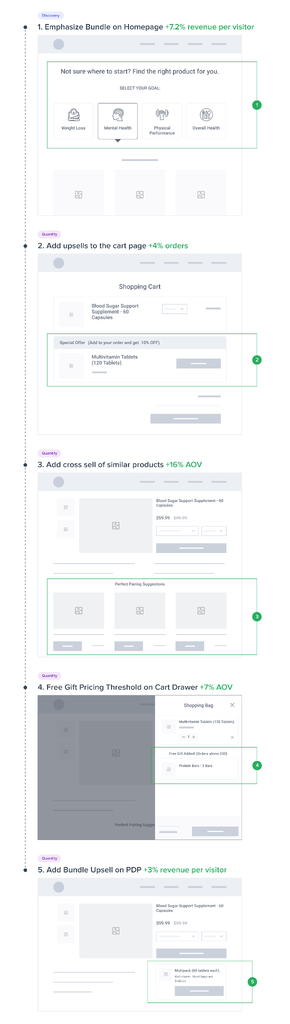
The value isn’t in the categories, it’s in tracking them. Log every test by purpose and after ten or fifteen tests you have a picture of your customer no single test could give you. If Product Detail keeps winning and Scarcity keeps losing, your shoppers are researchers rather than impulse buyers. That redirects your next five tests, and it feeds your wider ecommerce strategy: listing pages, emails, and ad creative can all stop leaning on urgency and start leaning on specificity.
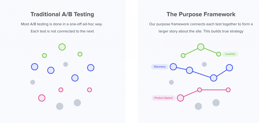
How to Choose What to Test First
Start with research, not ideas. On-page polls, post-purchase surveys, session recordings, and live user tests will tell you whether shoppers are struggling to act or simply don’t want the product enough. Guessing wrong is expensive: you can test in the wrong purpose for months and then conclude your site is “already optimized.”
If shoppers navigate the page fine and still leave, your barriers are on the desirability side: appeal, detail, price and value, brand. Bigger buttons won’t help. If they clearly want the product but stall at variant selection or hunt for shipping information, your barriers are usability.
Prioritize by traffic times potential impact, and check the device split first. A template-wide change, or one to your top ten SKUs, will almost always beat a clever change to one long-tail product.
Write each test as a set of questions rather than a prediction. This is what we call the Question Mentality, and it’s the easiest upgrade to how most teams test. Instead of “adding a video will increase conversion rate,” ask:
- Do users press play?
- How far do they watch?
- Does it change add-to-cart rate?
- Does it change how much of the product description they read?
Same test, same code. But now every outcome teaches you something, nobody’s reputation is riding on it, and there’s no incentive to stop early.
PDP Elements Worth Testing (With Results From Ours)
None of the following are guaranteed wins. They’re purposes to test, and the point of the test is learning what your customers respond to.
Image gallery and media. Number of images, which image comes first, video placement, whether zoom or 360 views increase purchase confidence. Watch page speed while you add media, since loading speed affects both rankings and conversion rates. We ran a test where product-only photos increased proceed-to-checkouts 13.5% with 97% statistical significance, while the lifestyle photo variation showed no significant difference in any key metric. Both our team and the client’s design team had preferred the lifestyle photos.
Ratings and reviews. Placement above versus below the fold, prominence of the star rating near the price, review count, pulling review snippets into the buy box as social proof, and adding customer photos or other user-generated content (UGC) alongside the gallery. Adding a star rating summary to the top of a luxury apparel client’s PDP increased conversion rate 15% with 94% significance and revenue per session 17% with 97%. Notably, add-to-cart rate didn’t move at all, which told us the reviews were persuading people after they’d added to cart.
Variant selection. Swatches versus dropdowns. Showing out-of-stock variants versus hiding them. Pre-selecting your best seller instead of forcing a choice.
Add-to-cart. For a supplement client, a sticky add-to-cart area produced 7.9% more orders with 99% significance on desktop, and a slide-up version lifted mobile orders 5.2% with 98% significance. Also worth testing: CTA copy, quantity selector placement, and whether a mini-cart drawer outperforms a redirect to the full cart page.
Price and value framing. Per-unit pricing, savings percent, bundles versus single units as the default, financing and payment options messaging, free shipping thresholds near the price rather than in a banner. We tested adding a savings percentage twice for the same client. The first test showed no difference across 280,000 visitors per variation. The second, after we varied the discount by product instead of applying one flat rate, showed a 2.57% conversion lift with 99% significance. One failed pricing test doesn’t close the question.
Product detail presentation. Accordions versus expanded product descriptions, spec tables listing product attributes, ingredient callouts, comparison charts, and fit and sizing guidance. Moving a size guide link closer to the size selector raised conversion rate 22% for an apparel client, though we published that one with a caveat: it ran 10 days with under 200 conversions per variation.
Trust and risk reduction. Shipping and returns information in the buy box instead of the footer, plainly worded return policies, delivery-date estimates, trust signals near the CTA, and clearer warranty terms.
Subscription, quantity, and scarcity offers. Subscribe-and-save framing and default selection, quantity discounts, multi-pack presentation, low-stock indicators, and order-by-X-for-delivery-by-Y messaging.
Discovery modules. Product recommendations, recently viewed items, “complete the look,” and size or shade finders for shoppers who landed on the wrong PDP.
Cross-sell and upsell modules. These often lift AOV while slightly reducing conversion rate, which is why you need both metrics to judge the net effect. A module that drops conversion 1% and raises AOV 6% is a win. A module that drops conversion 4% and raises AOV 2% is not.
Mobile PDP Optimization: Where Most of the Money Is Hiding
Mobile optimization deserves its own pass. Most ecommerce stores now get more mobile traffic than desktop, and mobile conversion rates typically run around half of desktop rates. Put those together and the mobile PDP is usually where the largest single opportunity sits.
The buy box stacks vertically instead of sitting beside the imagery, so ordering decisions matter far more than on desktop. What a shopper sees before their first scroll effectively is your PDP. Common friction points we see repeatedly:
- Variant selectors sized for a mouse, not a thumb
- Add-to-cart pushed below a long block of description copy
- Image galleries that give no visual signal that more photos exist
- Accordions that hide the one specification the shopper came to find
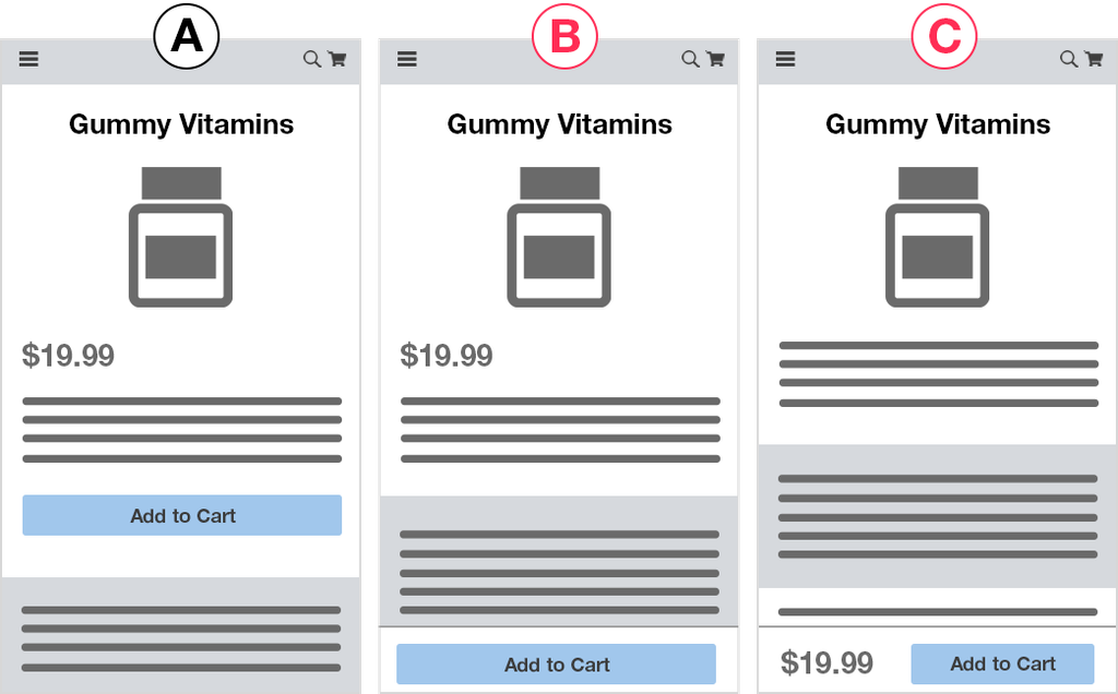
We analyzed the mobile checkout and product experiences of the 40 largest U.S. ecommerce sites. Treat the recurring patterns there as a shortlist of test candidates rather than a to-do list.
One process rule that matters more on mobile than anywhere else: always analyze PDP tests by device separately. A change that wins on desktop and loses on mobile shows up as “no difference” in the aggregate, and you throw away a real insight along with the test. We saw this directly in the savings-percent test, where the lift was 3.61% on mobile with 99% significance but only 2.22% on desktop with 89%.
How to Measure PDP Tests So You Learn Why, Not Just Whether
Set a standard goal set on every test: add-to-cart clicks, cart page views, key checkout step views, transactions, and revenue. Seeing where a lift appears and where it disappears is what tells you what actually changed. A test that lifts add-to-cart 8% and transactions 0% is telling you something specific: you pulled more people into the cart who weren’t ready to buy.
That divergence is common on PDPs, and it’s worth understanding why. In our experience, clicking add to cart is often just a way for shoppers to “bookmark” an item while they keep browsing. We routinely see add-to-cart rates as high as 15% from the PDP when purchase rates are around 5%. The buying journey is not the linear funnel most org charts assume.
Add custom goals for the element you changed. Video plays, gallery swipes, size guide opens, review expansions, accordion clicks. If nobody interacted with the thing you added, a flat result stops being a mystery.
Remember the funnel math. A 25% lift in add-to-cart, on a site where 40% of carts complete checkout, is roughly a 10% revenue lift. Not 25%. Judge PDP tests by downstream revenue, not by the metric closest to your change.
Analyze by segment and validate against analytics. Beyond device, new versus returning visitors, traffic source, and product category frequently move in opposite directions. Read results in GA4 or Adobe as well as the testing tool, which only measures what you told it to.
Flat and losing tests are data. A clear loss on a Scarcity test tells you your shoppers aren’t urgency-driven, and that’s worth more than a 1% win you can’t explain. Every result should end with a follow-up question: what did this teach us about which purposes matter here, and what do we want to ask next?
Testing a PDP Redesign Before You Ship It
Shipping a new PDP template untested is a coin flip on your highest-value page. A redesign bundles twenty changes at once, so if revenue drops you won’t know which one caused it, and the pressure to revert everything (including the parts that worked) will be immediate.
Running the new template as a variation against the current one gives you the net effect before rollout, and lets you keep the wins while reverting the elements that hurt. Breaking it into purpose-based chunks (imagery, detail presentation, buy box layout) is better still, because you learn which parts drove the lift.
Design agencies often argue against testing their own designs. It’s worth being blunt about why: it isn’t in their interest to find out whether the new version performs worse than the original.
Test data also settles the internal fight. “The new PDP raised add to cart 6% but reduced checkout completion” is a sentence nobody can argue with using an opinion.
How Growth Rock Approaches PDP Optimization
Growth Rock is a CRO agency working exclusively with ecommerce brands. We’ve run hundreds of A/B tests on product pages, carts, and checkouts.
We run both of the methods described above for clients: every test tagged by purpose under the Purpose Framework, and every test framed with the Question Mentality rather than a hypothesis.
We handle full execution: variation design, coding, goal and tracking setup, cross-device QA, and preview links before launch. For high-stakes tests we design multiple concepts, because an important idea shouldn’t die from one mediocre execution. Reporting goes past win/loss to what each result teaches us about which purposes matter, by segment and by funnel step, ending in a recommended follow-up test. We also maintain a live database of the tests we’ve run, organized by purpose, so you can see real results including the losers.
Typical outcomes: conversion lifts in the 5% to 10%+ range, higher AOV, and a clear answer to “what should we change next?”
If you’d like to discuss whether that describes your business, and get a few initial PDP test ideas from us, get in touch here.
Related Reading
- Our usability vs. desirability framework for CRO and A/B testing
- Our research study of mobile checkout best practices across the 40 largest U.S. ecommerce sites
- The ROI of A/B testing: when is A/B testing worth it?
- Case study: adding a sticky add-to-cart button on PDPs
- Case study: adding savings percent to pricing
- Case study: review star ratings on product pages
The Complete Guide to Ecommerce Conversion Rate Optimization: Building a Strategic CRO Program That Actually Works
Most ecommerce companies approach conversion rate optimization by running random, disconnected A/B tests based on the problem of the day. They might test a checkout flow because competitors are doing it, or add social proof because blogs recommend it, or (most common) test what the CEO or executives saw on a competitor’s site:
“Our PDP photos aren’t as good as competitors, let’s test it!”
“The CEO likes our competitor’s checkout process, we have to test that!”
“The personalization platform’s sales rep says we need to move their container up the page, let’s try that!”
If a test wins, you slap high fives and move on to the next one. If it loses, you shrug and move on to the next one.
The problem with this “tunnel vision testing” approach is that these tests are completely unconnected to one another so together, they produce little accumulated learning. Teams can spend years testing individual elements while barely improving their understanding of what really moves the needle for their customers.
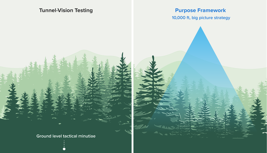
To build a successful CRO program, you need a strategic framework that connects every test together into a larger story about what compels your customers to convert. In this guide, we’ll show you how you can use our Purpose Framework to transform random testing into systematic optimization that consistently increases conversion rates for ecommerce stores.
What is Ecommerce Conversion Rate Optimization?
Ecommerce CRO (conversion rate optimization) is the activity of trying to increase the percentage of website visitors who buy. Many people try to complicate this and talk about also optimizing actions on the site like add to carts, but in the end the only conversion that matters for an ecommerce business is a purchase. So any ecommerce CRO program worth its weight should be focused on conversions to purchase.
Many people also use the term “CRO” to mean “A/B testing,” but they’re not synonymous. CRO includes A/B testing but isn’t limited to it. For example, if you get customer complaints about confusing details on your product pages or in checkout and you release a fix to improve that issue, you’re doing CRO.
But A/B testing is the most common and useful tool for CRO because it isolates the effect of a specific change on your site and lets the org make decisions on real data instead of hunches (which is the modus operandi inside any company when it comes to website changes if AB testing is not in the culture). Brands that make changes without testing invariably will assume a change helped that didn’t or assume a change hurt when it didn’t. It’s inevitable (yes, really).
For example, you fix that checkout or PDP bug, but what if next week there’s a planned promotion? You may see a conversion rate increase and wrongly assume it’s from your change, when it’s really related to the promotion. Given enough changes like this and this situation will happen. A/B testing eliminates this uncertainty by comparing your change against a control version with the same traffic.
So, in the end good CRO eventually comes down to a good A/B testing framework because what matters is what changes you test and why.
People often use different inputs to help determine their A/B test strategy:
Analytics – Where is traffic going? Where are the drop-offs? What is the bounce rate on key landing pages? As we’ll argue below, this often just gives you obvious information.
User research – This has multiple forms including on-site surveys, focus groups, and screen recordings/heatmaps. These give us qualitative (and some quantitative) data points about what users want, what frustrates them, and where the friction points are in the user experience.
But the real power comes from connecting these insights into a systematic framework for testing, which we’ll cover later in this guide.
How to Calculate Your Ecommerce Conversion Rate
Since this is our ecommerce CRO guide, let’s be thorough and define conversion rate. Conversion rate is simple to calculate using this basic formula:
(Number of conversions ÷ Total visitors) × 100 = Conversion rate percentage
For 10,000 monthly visitors with 250 purchases, your conversion rate is 2.5%.
But something we haven’t talked about yet is that even more important than conversion rate is actually revenue. Revenue is the main goal, and it’s calculated as conversion rate multiplied by average order value (AOV). This results in revenue per visit or session.
Revenue per Visitor = Conversion Rate × Average Order Value
The ultimate goal of CRO (of really any ecommerce team) is increasing revenue (actually it’s increasing profit, but that’s a can of worms for another post). But since most tests don’t affect AOV, in the industry we sort of just hand waive and say “conversion” rate optimization instead. But in reality if you could roll out a change that hurt conversion rate but increased AOV by more than CR went down and total revenue increased, most companies would take that trade. So keep this in mind. There are two things you can increase with CRO and AB testing:
- Actual conversion (purchase) rate
- AOV and thus revenue or revenue per visitor
Most ecommerce platforms automatically calculate conversion rates. Google Analytics used to as well, but now in GA4 it doesn’t out of the box, so you need to set up custom metrics for that. Understanding the mechanics helps you set up proper tracking and goals across the whole conversion funnel.
What is a Good Ecommerce Conversion Rate?
Let us say this as clearly as possible: Stop trying to achieve some arbitrary numerical conversion rate number! It doesn’t matter.
Everyone asks us “What is a good conversion rate?” and our answer is “One that is better than yesterday’s.”
Here’s why trying to achieve some quoted average ecommerce conversion rate makes no sense.
- Conversion rate depends heavily on the industry. A site selling $19 AOV sportswear to young men won’t have the same conversion rate as one selling $2000 AOV business wear to older men, even if both are in “mens apparel.” So yes, stop using the industry conversion rate metrics released by Shopify or BigCommerce or Salesforce or whoever to validate or invalidate yours.
- Conversion rate depends heavily on traffic mix. Even the same site can have wildly different conversion rates just from turning on or off a particular ad channel like display ads. If you turn on display ads for example which are notoriously low converting but also very cheap (per click), and your site conversion rate drops by 30% but you’re making money on those ads, you should keep them. The conversion rate drop is meaningless. Similarly some sites get a lot of SEO traffic to certain pages which makes the conversion rate look low. That’s fine, nothing wrong with those rankings.
- Conversion rate depends on device size. Stop using one number. Look at mobile versus desktop, it’s not the same.
- Conversion rate depends on factors outside of your store. A competitor doing a sale could hurt your conversion rate. A news story on your industry could help or hurt conversion rate. Economic issues.
The point is there are a million reasons why your conversion rate will be different from a competitor’s. Let me repeat: it is absolutely foolish to compare your absolute conversion rate to some stated metric. It makes no sense and is not useful. More useful is to compare your conversion rate to yourself and work it upwards with a good CRO strategy.
Why Most Ecommerce CRO Fails: The Tunnel Vision Testing Problem
Speaking of CRO strategy, with all that said we can finally get to what separates good versus bad conversion rate optimization strategies. Most companies run random, disconnected A/B tests based on opinions, competitor copying, or blog recommendations rather than strategic frameworks. We call this “tunnel vision testing” because you think of each test in a silo, by itself, unconnected from the rest of your tests.
This is bad CRO strategy.
This produces little accumulated learning about what actually moves the needle for specific customers. Accumulated learning means developing patterns of understanding about what matters for your users. For example: Are they price sensitive? Do they respond better to visual elements? Which benefits or value propositions of the product matter to them?
If you’re randomly testing like most companies, you’ll have no idea.
We’ve seen this literally happen: Teams spend years testing individual elements while barely improving their understanding of customer behavior and conversion drivers. Without connecting tests together, businesses miss the bigger picture of what compels their customers to buy.
The Purpose Framework: Strategic CRO That Builds Accumulated Learning
To solve this problem, we created what we call the “Purpose Framework” – categorizing every ecommerce A/B test into strategic purpose buckets. We use 8 purposes that capture virtually every test we run for ecommerce clients:
- Brand – Tests that increase trust, credibility, or appeal of the overall brand
- Discovery – Tests that make it easier to find or discover the right product
- Product Appeal – Tests that make individual products more appealing with messaging, positioning, or imagery
- Product Detail – Tests that highlight or specify details of products (like ingredients in a lotion or specs of a car part) that help customers choose
- Price & Value – Tests that make the price to value ratio better
- Usability – Tests that reduce UX friction (e.g. reduce form fields)
- Quantity – Tests that increase average order value or cart size
- Scarcity – Tests that give a sense of urgency by highlighting limited time or quantity to purchase
Here are examples of each:
Brand: Adding a section on the homepage with customer testimonials, product reviews, and press mentions increases conversion rate by building trust in your brand. Other Brand tests surface customer reviews, clear return policies, and trust signals like security badges.
Product Appeal: Testing more or larger product images on the PDP, or rewriting product descriptions, makes individual products more appealing.
Discovery: Improving navigational elements that help users find a product category or enhancing site search functionality.
Product Detail: Moving the size guide link to a more prominent position on apparel PDPs.
Price & Value: Testing free shipping messaging or savings and promotional copy.
Usability: Making form fields easier to complete, reducing checkout steps, or surfacing payment options like PayPal and Apple Pay earlier.
Quantity: Testing product bundles or upsells to increase cart size.
Scarcity: Adding limited-time offers or low-stock alerts.
If you categorize tests this way, you start connecting disparate, one-off tests into groups and patterns emerge. Specifically, you see two critical things:
1) What Are You Testing?
We find that most teams end up testing a lot of usability changes – color adjustments, CTA buttons, position tweaks, etc. Those can win, but if that’s all you’re doing, you’re not really learning much and you’re leaving a ton on the table.
Tracking purposes gives teams a massive “aha” moment about what they are testing, but more importantly, what they’re not testing. For example, most teams do not test brand positioning even though brand trust moves the needle for many customers.
2) What Tests Win More Often?
This is the key learning: What do customers care about? You can track the winning percentage of different purpose buckets. For example, for price-sensitive brands/customers, Price & Value tests often win frequently (things like free shipping mentions, anchor or strikeout prices, promotions and sales). For big stores with lots of SKUs, Discovery becomes critical.
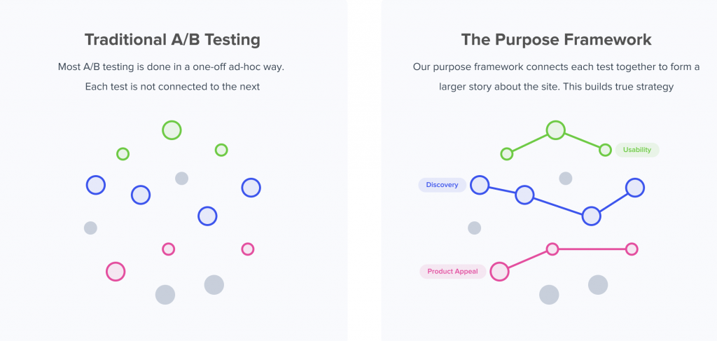
This framework connects individual tests into a comprehensive understanding of what drives conversions for each specific ecommerce store. By tracking which purposes win most often, we focus testing efforts on what matters and stop wasting time on what doesn’t.
This creates a strategic roadmap rather than random testing, leading to more consistent wins and deeper customer insights.
Question Mentality vs Hypothesis-Based Testing
Traditional CRO agencies base tests on hypotheses, creating bias toward wanting specific outcomes and reducing learning when tests “fail.”
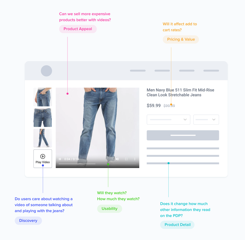
Our Question Mentality approach formulates tests around questions we want answered about customer behavior and preferences. Instead of hypothesizing “Adding a video will increase conversion rate,” we ask questions like:
“Do users care about watching product videos? Will they watch? Will it affect add to cart rates? Does it change how much other information they read?”
This approach:
- Reduces the risk of stopping tests too early
- Eliminates reputation-based bias (no one’s ego is tied to the outcome)
- Dramatically increases learning from every test
Even “losing” tests provide valuable insights about customer psychology that inform future winning strategies.
How Long Should You Run A/B Tests?
While running A/B tests, you may reach 90%+ statistical significance in just 2 days, but that doesn’t mean you should stop the test and declare a winner.
Just reaching 95% statistical significance isn’t enough. You need to:
- Check multiple goals like purchases, revenue per session, add to cart, and checkout started
- Run A/B tests for at least 2 weeks, and if sample sizes are smaller, 3-4 weeks are fine too
- Avoid stopping tests early, which is a grave mistake
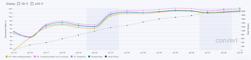
You don’t know how a test will perform in upcoming days, as initial test data is very random and you could see massive jumps in conversion rate. Data mostly starts settling down after a week or so.
How to Handle Underperforming Tests
Many times when you run tests, you’ll get a losing test when you thought the variation would win. What do you do?
Many basic A/B testers just give up and move on to the next idea. But it’s better to not give up on the larger concept just because one variation didn’t win.
Instead:
- Test multiple variations of the same concept
- Iterate on the design or approach
- Go deeper to understand why it lost
For example, we tested adding large lifestyle images on PDPs to ask: “Does showing lifestyle images help customers visualize the shoes and increase sales?” After two weeks, the test lost. We dug into the data and discovered that adding multiple lifestyle images increased page load speed, causing customers to bounce off.
This insight led us to test optimized lifestyle images that didn’t hurt page speed – and that version won.
How to Avoid Mistakes That Hurt Site Performance
When running A/B tests, make sure you:
- Check that tests don’t hurt site speed or increase load times
- Minimize flash and visual glitches before starting tests
- Run multiple QA checks before launching
- Ensure A/B tests don’t affect other functionalities, break existing user flows, or hurt mobile responsiveness
The Growth Rock CRO Process
At Growth Rock, our process focuses on systematic optimization using the Purpose Framework:
- Strategic Test Development – We don’t run random tests. We develop comprehensive testing strategies based on which purposes move the needle most for each client.
- Comprehensive Goal Tracking – We set up multiple goals for each test to get a complete picture of how changes affect the entire sales funnel, not just final conversions.
- In-Depth Analysis – We don’t just report wins and losses. We analyze why certain changes affected conversion rate and what this tells us about customer behavior.
- Question Mentality Implementation – Every test is framed around questions we want answered about customer preferences and behavior patterns.
This systematic approach typically delivers 5-10% conversion rate improvements for qualifying ecommerce businesses.
CRO Software Platforms and Tools
Tools like Optimizely, VWO, and Adobe Target are examples of A/B testing platforms. They provide testing infrastructure but require internal expertise to run strategic programs.
These platforms excel at running experiments but don’t provide the strategy, analysis, and customer insights needed for systematic optimization. Software-only approaches often lead to the tunnel vision testing problem without frameworks to connect learnings.
In our experience, it takes A/B test development experience to develop tests well in these platforms. Regular front-end developers have a learning curve because you’re injecting code via JavaScript – it’s not like normal development. There are issues around flash and other technical challenges.
If you’re doing it yourself, find a consultant or someone with A/B test development experience.
Analytics platforms like Hotjar, Contentsquare, and Lucky Orange provide heatmaps, session recordings, and user behavior insights. These can be useful, but they won’t unlock winning A/B test ideas by themselves because they often just tell you obvious things.
For example, heatmaps will always show heat where you expect it. On a PDP, there will be heat at “choose a size,” “add to cart,” photo switching, etc. These tools excel at identifying where users struggle but require additional expertise to translate insights into winning tests.
The most powerful tool is A/B testing, especially when done strategically to reveal patterns. Other analytics tools can supplement this approach.
How to Set A/B Test Priorities and Get Quick Wins
After deciding to run a CRO program, start by listing A/B tests you think would help based on the Purpose Framework. Then:
- Filter by impact and development effort (1 being lowest, 5 being highest)
- Sort by purpose to ensure balanced testing
- Pick tests with high impact and low development effort
Here are examples of quick-win tests to start with:
- Link bar on homepage (Discovery/Usability)
- Free shipping messaging sitewide, cart, PDP (Price & Value)
- Free shipping threshold messaging (Price & Value)
- Cart emphasis and call-to-action visibility (Usability)
- Product photos optimization on mobile (Product Appeal)
- Upsells and cross-sells (Quantity/Discovery)
- Navigation link labels on mobile, and simplified navigation generally (Discovery/Usability)
Common Ecommerce CRO Mistakes to Avoid
- Testing random elements without strategic frameworks leads to years of effort with minimal accumulated learning
- Stopping tests too early when results look promising creates false winners and can hurt conversion rates when implemented
- Focusing only on final conversion metrics while ignoring upstream goals like add-to-cart rates misses important insights about the customer journey
- Making changes based on competitor copying or blog “best practices” rather than testing what works for your specific customers
- Ignoring mobile optimization despite mobile traffic representing 60%+ of visitors but converting at half the rate of desktop users
Getting Started with Ecommerce CRO
Begin by auditing your store and your current conversion rates across device types, traffic sources, and key pages to establish baselines. Most ecommerce businesses need $2M+ annual revenue and 100,000+ monthly visitors to make dedicated CRO programs cost-effective.
For qualifying businesses, systematic CRO typically delivers 5-10% conversion rate improvements worth millions in additional annual revenue. Start with high-impact areas like mobile checkout optimization (guest checkout, payment methods), product page improvements, and reducing abandoned carts. Track your cart abandonment rate as the baseline.
Consider working with specialized ecommerce CRO agencies to avoid common mistakes and implement proven frameworks from day one. The return on investment from strategic CRO pays for itself many times over through increased revenue from existing traffic.
When evaluating agencies, look for those that use systematic frameworks like our Purpose Framework, focus on accumulated learning rather than one-off tests, and can demonstrate expertise specifically in ecommerce optimization challenges.
The key is moving beyond tunnel vision testing toward strategic optimization that builds comprehensive understanding of what drives conversions for your specific customers and products.
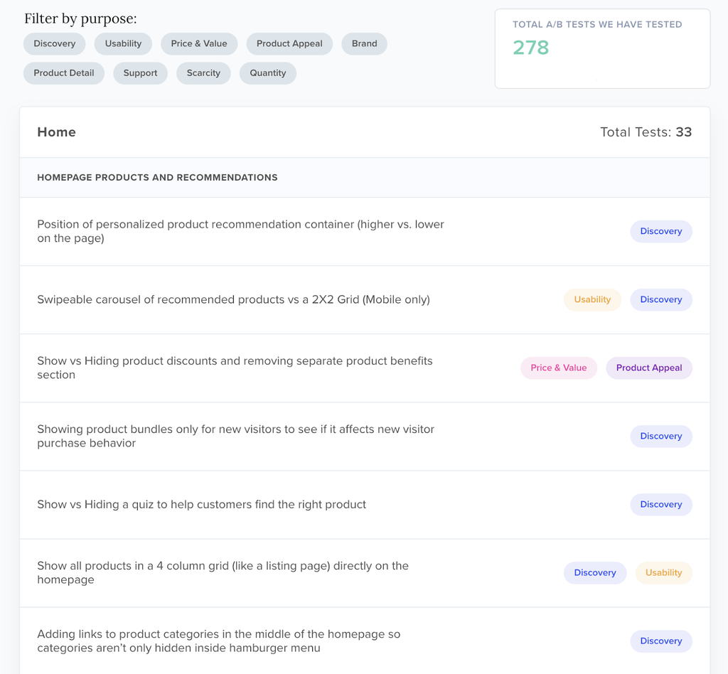
You can see our live database of every ecommerce A/B test we’ve run, organized by purpose, here. If you’re interested in working with us to implement strategic CRO for your ecommerce brand, you can learn more and reach out here.
The Ecommerce CRO Checklist We Actually Use (And How to Validate Every Item Before You Commit Dev Time)
Most ecommerce conversion rate optimization (CRO) checklists you’ll find online have the same problem: they present a long list of UX changes presented as best practices or “proven” tactics to increase conversion rate. Add trust badges. Reduce form fields. Add a countdown timer.
As though every ecommerce store is the same. As though the same UX is appropriate or guaranteed to lift conversion rate on every store.
It isn’t.
We’ve run hundreds of A/B tests on ecommerce sites, and we can tell you that a good chunk of those “obvious” conversion hacks do nothing. Many of them can lose, depending on the site.
So this checklist is organized differently. Instead of presenting a list of UX changes as though they’re “proven” to work, our list is about a series of questions to ask about your site, your customers, and their preferences, that teaches you which kinds of changes your customers respond to. This gives you long term learnings about what your customers prefer so you can understand them at a deep level. That’s more sustainable for long term conversion increases than some list of UX tactics.
Below is the full checklist in the order we’d audit a client store: foundations and speed first, discovery, product pages, cart and checkout, mobile, and the persuasion items (trust, price and value, quantity, scarcity). At the end, we discuss how to turn it into a test roadmap using our Purpose Framework and Question Mentality so your learnings compound.
Note: if you’d rather have us run this audit for you, you can learn about our ecommerce CRO agency here.
How to Use This Checklist: Every Item Is a Question, Not a Fix
Every item below is a candidate change, not a proven improvement for your store. What lifts revenue for one brand often does nothing (or even lowers conversion rate) for another.
Here’s a real example. The Link Bar is a term we coined for presenting easy navigation to popular product categories on mobile ecommerce experiences as an alternative to the clunky hamburger menu. But it doesn’t work every time in all stores. We’ve seen it make no difference in conversion rate for many clients despite working for many others.
Sticky add to cart buttons are another example. In that linked case study we show results of how it helped conversion rate on two stores. But for other clients it has made no difference.
So in our experience, as we explain in our Question Mentality strategy article, we think it’s a lot more fruitful to turn each item into a set of questions instead of a prediction:
- Do users care about this at all?
- Will they actually engage with it?
- Does it change how much of the rest of the page they read?
- Does it affect add to cart, or only checkout completion?
Question framing helps you seek the truth in what users care about instead of just marking tests as winners or losers and moving on. That, combined with Purpose Framework which groups related tests into purpose buckets lets you gather long term learnings like: “Our customers are price sensitive and respond well to discounts and promotions” or “Our customers care more about product photos than written descriptions.”.
For each new UX treatment, you have three options:
- Ship it if it’s a non-controversial usability fix with no realistic downside.
- Test it if it involves design, Test it if it involves design, copy, messaging, pricing presentation, or any judgment call.
- Skip it if your platform already handles it. Most checklists never mention this option; a lot of their items are already solved by Shopify.
Foundations Checklist: Speed and the Technical Items That Actually Matter
Site speed leads nearly every CRO checklist, and for good reason, a slow site does hurt conversion rate. But they usually start with server-level items a brand on a hosted platform can’t act on. The short, honest version:
- Core pages should meet Core Web Vitals thresholds: LCP (how fast your above the fold content renders) under 2.5s, INP under 200ms, CLS under 0.1. Check mobile and desktop separately in Google PageSpeed Insights.
- Focus speed work on product and checkout pages first. Those are where load time directly costs orders.
- Fix what actually drives the scores: oversized hero images, media in the wrong format instead of WebP, missing lazy loading on below-the-fold media, render-blocking third-party scripts, layout shift from late-loading fonts and banners.
- Audit installed apps and tracking pixels quarterly. Most stores accumulate scripts nobody owns anymore.
- Skip what your platform already handles (CDN, image optimization, caching).
In our opinion you can measure conversion rate before and after (you might as well) but a slow site is just bad user experience, so if you’re significantly under those metrics you should fix that. That said, once you get close or past those thresholds, if further speed improvements will take a lot of resources, you may be in “good enough” territory and it’s better to move on.
Discovery Checklist: Can Shoppers Find the Right Product?
The Discovery purpose in our framework,making it easier to find or discover the right product, is consistently a big needle mover for stores that have a sizable number of products (more than 50). For those stores, customers buy when they find the product they love. That’s the critical moment in the buyer’s journey. So UX that helps them more easily find those products tends to win.
- Category labels should use the words your customers use, not internal or clever names. “Cocktail Dresses” beats a generic “Clothing” tab hiding them three levels down.
- Keep navigation broad and shallow, ordered by actual click volume. On mobile, consider exposing category links directly on the homepage instead of hiding everything behind the hamburger menu.
- Curated collections often outperform taxonomy. “Winter Essentials” and “Shop by Concern” give shoppers an entry point instead of making them do the work.
- Filters and sort options should reflect how people choose in your category: size, fit, concern, occasion, compatibility. Filter state should persist on the back button (a surprisingly common bug).
- Give on-site search its own audit. Your top zero-result queries are customers telling you, in their own words, what they wanted and couldn’t find.
- Test whether collection pages need more information (star ratings, price, swatches) or fewer distractions. We’ve seen it go each way.
The real question this section answers: are shoppers leaving because they can’t find products, or because they found them and weren’t convinced? Those two problems require completely different work.
Product Page Checklist: Appeal, Detail, and the Two Different Problems They Solve
Almost every checklist lumps the product page into one bucket. We split it into two, because they solve different problems.
Product Appeal items make the product more wanted:
- Benefit-led product descriptions instead of spec-led ones
- Lifestyle and in-use imagery (though we’ve seen product-only photos win, so test it)
- Positioning your value proposition against the alternative the shopper is actually considering
- Video, where it earns its place
Product Detail items help an already-motivated shopper confirm this is the right choice:
- Ingredients, materials, dimensions, compatibility
- Fit guidance and sizing charts, placed where shoppers actually look
- Full specs, especially in considered categories like supplements, auto parts, and apparel
Then the mechanical items that apply to both:
- Variant selection clarity is a frequent silent killer. Unclear size, color, or bundle choices stall shoppers who were ready to buy. Buttons or dropdown, show all options or hide some: worth testing, not guessing.
- Shipping cost, delivery estimate, and return policy belong near the buy box. Unanswered logistics questions get resolved by leaving.
- Social proof placement matters as much as its presence. We tested adding a star rating summary near the top of an apparel client’s PDP and it increased conversion rate by 15% with 94% statistical significance.
- Sticky add to cart, on both desktop and mobile. For a supplement client, a sticky add to cart area produced 7.9% more orders with 99% significance on desktop, and a slide-up version lifted mobile orders 5.2% with 98% significance.
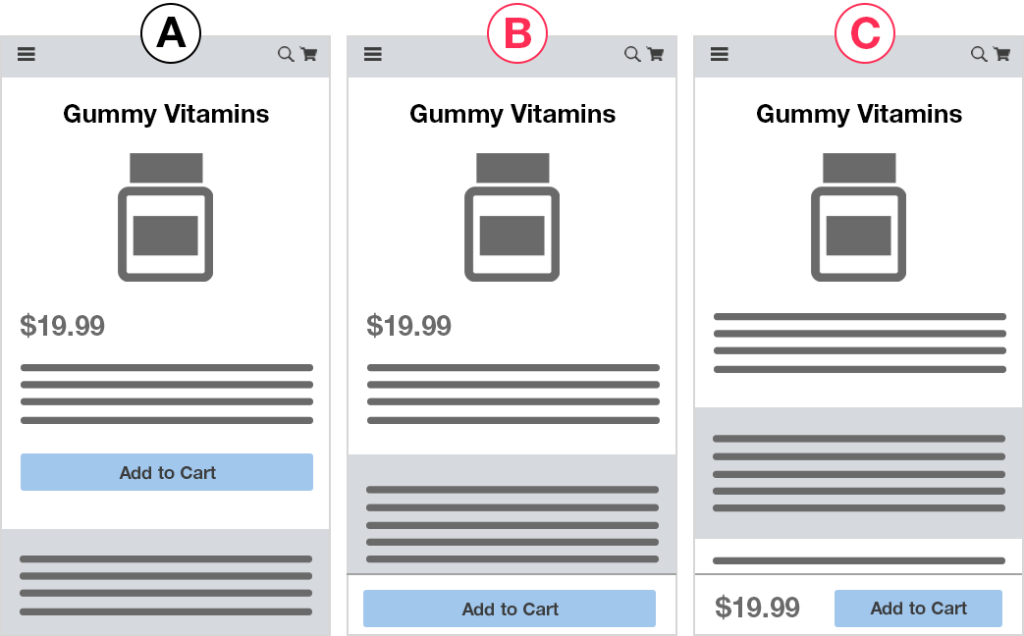
The diagnostic question for this section: do shoppers not want it enough (appeal), or can they not confirm it’s right for them (detail)? Test both, and then you know for every product page on the site.
Cart and Checkout Checklist: The Highest-Leverage Items on the List
Per the revenue math above, this is where lifts convert most directly into money. It’s also where most stores have unglamorous, fixable problems.
- Offer guest checkout. Forced account creation is one of the most reliably expensive requirements in ecommerce. If you need accounts, offer them after the purchase.
- Introduce shipping, tax, and fees as early as possible. The shopper who abandons over a $12 shipping charge discovered on step four would often have accepted it on step one.
- Reduce fields to what you genuinely need, but treat “fewer fields is better” as a generality, not a rule (see our failed field-removal test above).
- One concrete easy win: ask for zip code first and auto-fill city and state with a free lookup API. Fewer keystrokes, no judgment calls.
- Progress indicators, correct input types, autofill attributes, and basic form accessibility, inline error messages next to the offending field, visible security badges and payment logos.
- Offer the wallets your customers actually use (Apple Pay, Google Pay, buy now pay later where it fits your price point), placed where shoppers see them before they start typing an address.
- Cart page: editable quantities, visible progress toward your free-shipping threshold, a saved cart for returning visitors, no dead-end empty-cart states.
Because checkout lifts flow straight to revenue, track every step of the checkout process: cart view, checkout start, shipping step, payment step, transaction. A variation that lifts shipping-step completion 9% but transactions 3% is telling you something specific, and you’ll miss it if your only goal was “orders.”
The Mobile Checklist: The Traffic Converting at Half Your Desktop Rate
Most stores now get more mobile traffic than desktop, and mobile conversion rates are typically around half of desktop rates. That gap makes mobile optimization the largest addressable opportunity on most sites.
Audit the mobile customer journey as its own experience, on a real phone, in one hand, not in a resized desktop browser window.
- Tap targets at least the 48x48px accessibility minimum, with real spacing, so a mis-tap doesn’t add the wrong variant to the cart.
- Form inputs at 16px or larger to prevent iOS zoom. Single-column forms only.
- Primary CTAs in the thumb-reach zone, sticky add to cart on product pages, persistent cart indicator in the header.
- Mobile checkout flow specifics: field count and ordering, keyboard type per field, address autocomplete, and how many taps sit between cart and confirmation. We analyzed the mobile checkouts of the top 40 U.S. ecommerce sites on exactly these details. Count your own taps. Most teams never have.
- Popups cost more on mobile, because they take over the whole screen. If you run them, test the timing and trigger, not only the design.
- Always segment test results by device. A variation that wins overall can be losing badly on mobile while desktop carries the average.
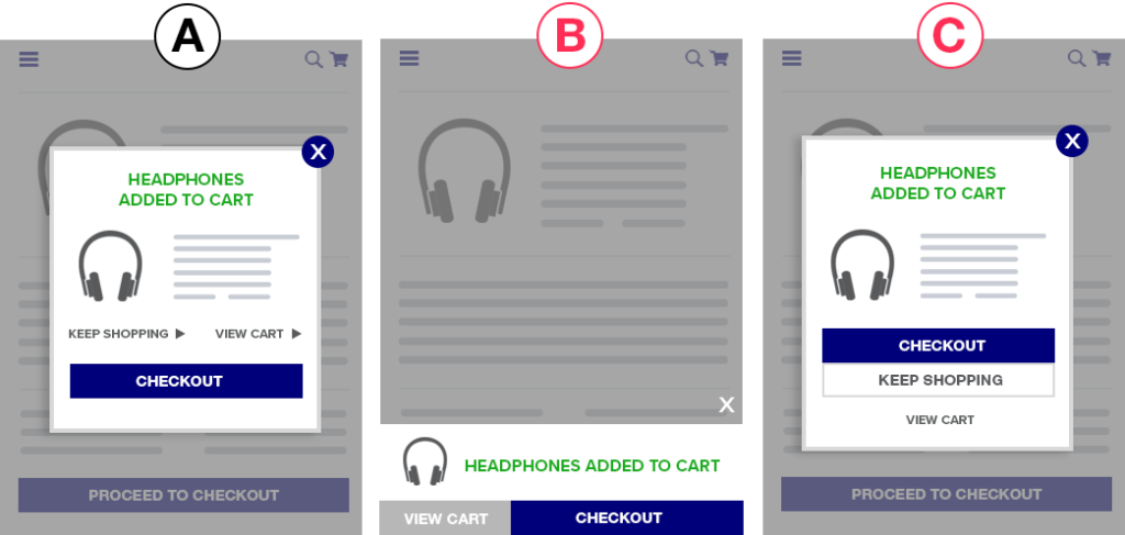
Trust, Price and Value, Quantity, and Scarcity: The Persuasion Checklist
These items map to four more purposes in our framework, and they’re the categories where “best practice” fails most often.
Brand and trust signals: aggregate customer reviews counts and cumulative brand rating; earned press mentions (real ones); category-relevant certifications; visible contact information (adding a support icon to the navbar increased conversion rate 7% with 96% significance in one of our tests); clear return, warranty, and guarantee policies.
Price and Value: free shipping thresholds and messaging, and where that messaging sits; bundle pricing; subscribe-and-save framing; financing; price presentation itself, like showing savings percentages.
Quantity (average order value): bundles and multi-buy discounts; cart upsells and cross-sells (placement matters a lot); visible progress toward the free-shipping threshold.
Scarcity: real low-stock indicators; genuine offer windows with actual end dates; back-in-stock email capture.
One warning on that last group. Fabricated scarcity erodes trust, and it does the most damage with repeat visitors, who notice your “only 3 left” badge has said “only 3 left” for six weeks.
More broadly: trust badges, countdown timers, and reassurance copy frequently produce no measurable difference in our tests. That’s not a reason to ignore them. It’s the reason they belong in a test queue rather than a deploy queue. An urgency badge that raises add to carts while leaving transactions flat manufactured intent it couldn’t sustain. You only learn that with full-funnel goals.
Before You Ship: Do You Have Enough Traffic and Revenue to Test These?
Not every store should be A/B testing this checklist. Two rough criteria: $2 million or more in annual revenue and 100,000 or more monthly unique visitors: enough conversions to reach significance, and enough revenue that a percentage lift is worth the effort. At those levels, a 10% revenue lift within about six months of consistent testing is a realistic planning assumption, and the ROI math works strongly in your favor. We break down the full math here, including costs and what changes at $500K versus $10M.
If you’re below the thresholds, work this checklist as a prioritized ship list: use the revenue math above plus session recordings and funnel data to decide the order, and revisit testing when traffic supports it.
One corollary worth sitting with: even with enough traffic, you need consistent 5% to 10% lifts to realize that ROI, not one lucky win. That consistency is exactly what ad hoc, conference-room-driven testing fails to produce.
Turn the Checklist Into a Test Roadmap So Your Learnings Compound
This is the part that determines whether six months of work leaves you with an asset or just a slightly different website.
A flat checklist produces what we call tunnel vision testing: one-off tests based on the problem of the day, with nothing accumulated at the end. Our guides on building a CRO strategy and the A/B testing framework cover this in full.
The fix: tag every item you test with one of eight purposes (Brand, Discovery, Product Appeal, Product Detail, Price & Value, Usability, Quantity, Scarcity) and track which purposes win for your store. If Product Detail tests keep winning and Usability tests keep flatlining, your customers can navigate the site fine, and what they need is more information to decide. That pattern tells you where to spend the next quarter of design and dev time, and it ends recurring internal debates with evidence instead of preferences. The full method, with client case studies, is in our Purpose Framework article.
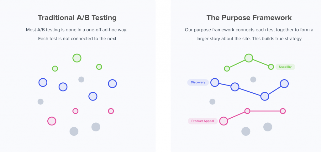
Operational rules that make it work:
- A standard goal set on every test (transactions, revenue, checkout step views, cart views, add to cart clicks) plus test-specific engagement goals: did anyone actually open the size chart?
- Analyze by segment: new vs. returning, traffic source, device. An average frequently hides two opposite stories.
- Run 2 to 3 design concepts for high-stakes items. A losing test often means a losing execution, not a losing idea, and one execution can’t tell those apart.
- Document losses and no-difference results as carefully as wins. Knowing what your customers don’t care about stops the same debate from returning next quarter.
How to Validate Each Checklist Item Before You Commit Dev Time
Before you build anything, spend a week finding out whether the item is even relevant to your store.
- Funnel drop-off analysis tells you which stage to work on, not which fix to make.
- Session recordings and heatmaps in a tool like Hotjar, filtered to abandoned carts and rage clicks, show the moment confusion sets in and whether shoppers even reach the element you’re about to redesign. The fastest way to find problems no checklist would flag.
- Polls, post-purchase surveys, and live user testing answer what a checklist can’t: why users aren’t buying. First figure that out. Then give them what they want.
- Compare your highest and lowest converting products. The differences often reveal more than any single test.
- Validate the test itself. QA across devices and browsers, confirm every goal fires, cross-check against Google Analytics, and confirm the page has enough traffic to detect the lift you care about. A broken or underpowered test is worse than no test, because you’ll act on it.
Common Mistakes Teams Make Working an Ecommerce CRO Checklist
- Shipping 15 items at once. When the number moves, you don’t know which change did it, and there’s no learning to carry forward.
- Treating a checklist as proof. “The article said to add a countdown timer” is still the loudest voice in the room, just with a citation attached.
- Starting with cosmetic sitewide tweaks while checkout and product pages carry the actual revenue leverage.
- Letting a redesign agency skip validation. A redesign is dozens of checklist changes bundled together. Test it before full rollout; a design agency has little incentive to want that answer.
- Ignoring segments, especially device, and rolling out a change that wins on desktop while losing on the majority of your traffic.
How Growth Rock Turns This Checklist Into Revenue
Growth Rock is a CRO agency working exclusively with ecommerce brands, typically $2M+ in revenue with enough traffic to run meaningful A/B tests.
We turn checklists like this into a connected testing program using the Purpose Framework and the Question Mentality, and we handle full execution: variation design, coding, goal setup, cross-device QA, and preview links before anything goes live. Reports explain why a result happened, by funnel step and segment, and end with a recommended follow-up test.
We also maintain a live database of every ecommerce A/B test we’ve run, organized by purpose, so you can see what has and hasn’t worked rather than taking best practices on faith.
Typical outcome: consistent lifts in conversion rate and AOV that compound into 10% or more revenue growth from the traffic you’re already paying for.
If you want to talk through which sections of this checklist apply to your store, you can learn about working with us here.
Our Foundational Ecommerce CRO Articles
- Our Purpose Framework
- Our Question Mentality
- Our live database of all A/B tests we’ve ever done
- Usability vs. Desirability Framework
- ROI of A/B Testing: When Is It Worth It?
The A/B Testing Framework We Use for Ecommerce (8 Purposes)
Search for an A/B testing framework and you’ll find the same five steps everywhere.
Identify a problem. Write a hypothesis. Build a variation. Split traffic. Check for statistical significance.
That’s a workflow for running a single test, and it’s fine in that use case, but it has real downsides once you’re testing month after month.
Writing a hypothesis means predicting an outcome, and predicting an outcome creates bias. People start rooting for a variation. That’s how tests get stopped early.
Measuring only the final conversion rate tells you whether a test won or lost, but never why. And because nothing links one test to the next, month six of your program looks exactly like month one: someone suggests an idea, you test it, you move on.
This article lays out the framework we use instead, across hundreds of A/B tests for ecommerce brands. Here’s what’s in it:
- The 8 Purposes. Classify every test as Brand, Discovery, Product Appeal, Product Detail, Price & Value, Usability, Quantity, or Scarcity, so you can start to notice themes around which types of changes actually move the needle for your store.
- The Question Mentality. Replace the hypothesis with a list of questions, which removes prediction bias and increases how much you learn per test.
- A standard goal set on every test. Transactions, revenue, checkout and cart pageviews, and add to cart clicks, so you can see where in the funnel a change did its work.
- Analysis by segment and by purpose. Update what you believe about each purpose, then generate the follow up test.
- ROI checkpoints. The traffic and revenue levels where this framework is worth building.
What an A/B Testing Framework Actually Is (and What It Isn’t)
A/B testing (also called split testing) itself is simple. You split traffic between a control (your baseline) and a variation, and decide based on actual user behavior rather than what users said they’d do in a survey or a conference room.
An A/B testing framework is the structure that decides what you test, how you phrase the test, what you measure, and how each result feeds the next one.
Three things routinely get called a framework, and only one of them is:
- The software. Optimizely, VWO, and Adobe Target are platforms. They give you a visual editor, randomize traffic, deliver variations for A/B and multivariate testing, and calculate significance.
- The five step build-measure-analyze loop. That’s a workflow. It runs one test.
- The layer above both, which organizes individual tests into a body of knowledge about your customers. That’s the framework.
Without that third layer, you can run a technically perfect test every two weeks for a year and still be unable to answer the only question that matters: what do our customers actually care about?
Why Most A/B Testing Frameworks Fail: Tunnel Vision Testing
We call the status quo tunnel vision testing: testing each thing on your site in a silo without connecting them into larger learnings about what your customers fundamentally want. Someone raises a concern in a Monday meeting, you build a test for it, you get a result, you move on. No connected learning accumulates.
We’ve been running conversion rate optimization (CRO) operations for ecommerce brands for 10 years, trust us when we say this: this is how 99.9999% of organizations run AB tests.
It’s understandable, because optimizing a site is a daunting task with a million possible changes, big and small. With no framework to sort them, the loudest people’s opinions get tested first.
Copying best practices doesn’t fix this. We’ve found repeatedly that many widely accepted best practices don’t improve conversion rate for every store. Best practices are someone else’s test results applied to your customers.
Reporting results as “won” or “lost” doesn’t fix it either. A year of it and you’ll have a spreadsheet with 24 rows of wins and losses, but what are the takeaways? You need an actual system to analyze results and find connected themes. It’s non-trivial, critical thinking-required, human work.
The real cost of all of this wasted AB testing is time (and, yes, ultimately revenue). Guessing wrong about which category of change matters can burn months. A store selling to twenty-somethings may have essentially zero usability issues, so six months of bigger CTAs and shorter forms gets you nowhere while the actual barrier was that they didn’t want the product enough or didn’t trust the brand yet.
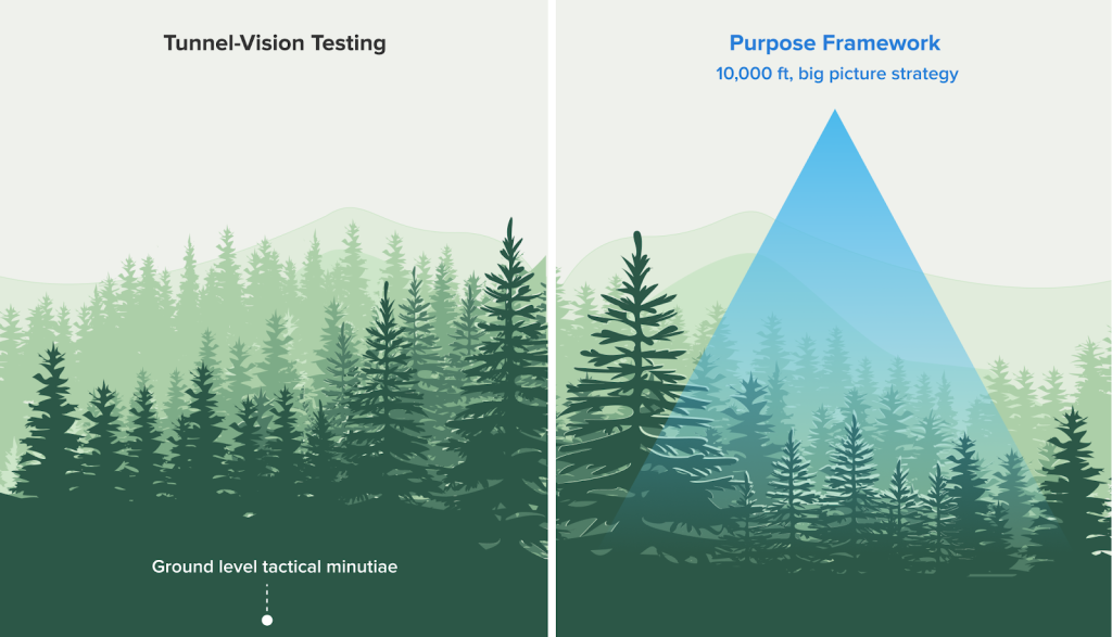
That’s the problem that our AB testing framework, The Purpose Framework, was built to solve.
The Purpose Framework: Classify Every Test Into One of 8 Purposes
Every A/B test on an ecommerce site can be categorized as having one of 8 purposes. That’s a sweeping claim, so let me explain what they are. (The full write-up, with client case studies and win-rate charts, is in our original Purpose Framework article.)
1. Brand. Tests that increase trust, credibility, or appeal of the overall brand. Adding press mentions, founder story content, guarantees, or review counts sitewide.
2. Discovery. Tests that make it easier to find or discover the right product. Navigation changes, filtering, category exposure, search prominence, quiz flows.
3. Product Appeal. Tests that make individual products more appealing through messaging, positioning, or imagery. New hero images, lifestyle photography, reworked headlines on the PDP. (Our review star rating test is an example, and it carried a second tag: Brand.)
4. Product Detail. Tests that highlight or specify details that help customers choose. Ingredients in a lotion. Specs on a car part. Fit and sizing on apparel.
5. Price & Value. Tests that improve the price to value ratio. Free shipping messaging, bundle pricing, subscription discounts, savings displays, financing.
6. Usability. Tests that reduce UX friction. Fewer form fields, larger call-to-action tap targets, fewer checkout steps. A classic example: replacing city, state, and zip fields with a zip code lookup that fills in the rest automatically.
7. Quantity. Tests that increase average order value or cart size. Upsells and cross-sells, multi-pack defaults, cart-page recommendations.
8. Scarcity. Tests that create urgency by highlighting limited time or limited quantity. Low stock indicators, sale end dates, cart timers.
The taxonomy isn’t the point. You can even create your own purpose buckets that are specific to your store (or not use some of the ones above, for example if you never have low inventory in your business, scarcity isn’t relevant for you). Once every test carries a purpose tag, individual tests connect into a larger story about what compels your customers to buy. Tracking which purposes get tested most, and which win, tells you where the real barriers are, so you can focus on what matters and stop wasting time on what doesn’t.
A note on where this came from. The Purpose Framework grew out of a simpler split we wrote about years ago: every change either makes it easier to get from A to B (usability) or makes B more desirable (desirability). Still true, but “desirability” covers too much ground to act on. The 8 purposes are that idea made actionable for ecommerce.
How to Use the Purpose Framework to Decide What to Test Next
Once you’ve established the purpose buckets and gotten buy in with the organization on this framework, here are the steps we’ve found work well to put it into practice.
Start with an audit of tests you’ve already run. Tag your last 12 to 24 tests with purposes. (To audit the site itself rather than your test history, use our ecommerce CRO checklist.) This almost always reveals heavy clustering into one or two purposes (usually Usability, because it’s the easiest to build) and purposes with zero tests. The unexplored purposes are frequently where the biggest lifts hide: if you’ve never run a Price & Value or Quantity test, you don’t know they don’t work. You know you haven’t looked.
When a purpose wins repeatedly, double down. When one loses repeatedly, stop spending design and dev cycles there. A store that wins on Product Detail over and over is telling you its customers need more specification before they’ll buy. Three losses on Scarcity is information too: reallocate.
Purpose tagging also resolves internal debates. “Should we make the button bigger” is an argument between opinions. “Is usability a barrier for our customers” is a question with a test record behind it.
Weight checkout and payment steps higher. A lift at the bottom of the funnel flows straight to revenue: 25% more people completing the payment page is a 25% revenue increase, while 25% more add to carts on a store where 40% of carts check out is roughly a 10% increase. Same test effort, different leverage.
Use user research to point you at purposes. On-page polls, post-purchase surveys, heatmaps, session recordings, and live user testing are cheap relative to a testing program. First figure out why users aren’t converting. Then give them what they want.
Note: if you’d like us to run a purpose audit on your existing test history and tell you which purposes you’ve never explored, you can learn about working with us here.
The Question Mentality: A Better Alternative to Hypothesis-Based Testing
Another more subtle, and unusual, framework we use is around the team psychology around AB testing. We wrote the full argument here, but this is the short version.
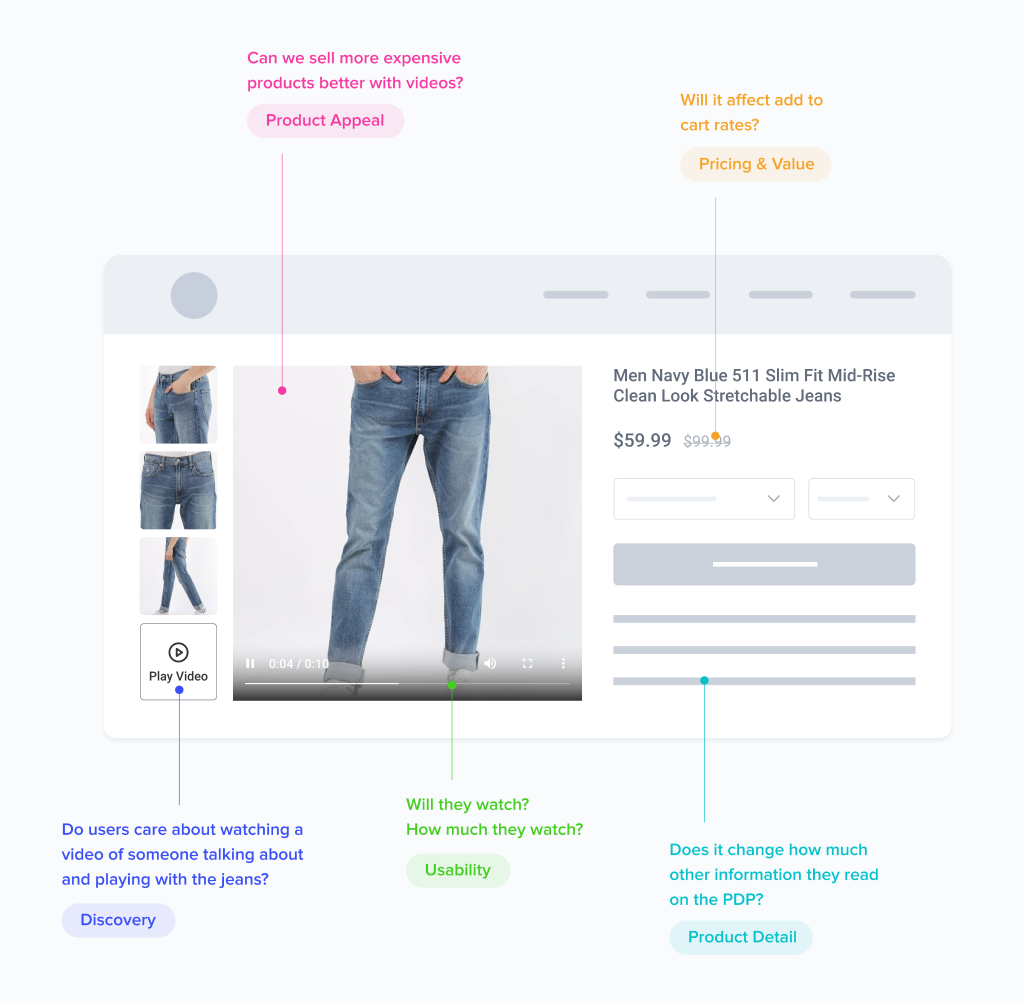
Every framework you’ll read tells you to write a hypothesis. “Adding a product video to the PDP will increase conversion rate by 8%.”
On the surface nothing is wrong with this and it’s true that on paper, every AB test has a hypothesis behind it. But in practice we’ve noticed a practical issue: Hypotheses naturally carry a prediction (“Video will increase conversion rate”) and that prediction comes from a person (on the team or in an agency) and humans have feelings, emotions, and bias. So when someone feels like their prediction and thus some of their credibility is on the line because a test was “theirs” (This is real language people use on CRO teams: “That’s Jen’s video test.”) they have a bias to it winning. That bias is counter-productive.
To avoid this, we use questions instead. For that same video test, the questions are:
- Do users care about watching a video at all?
- Will they actually watch it, and how far in?
- Will it affect add to cart rate?
- Does it change how much of the other information on the page they read?
- Does it affect returning users differently than new users?
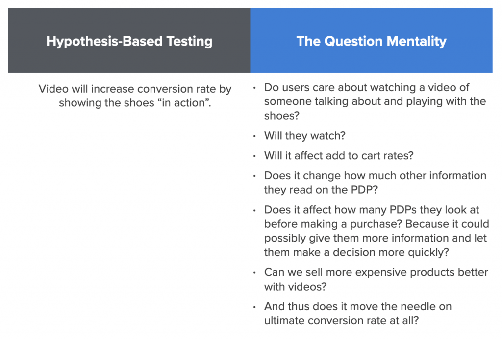
Look at how refreshingly unbiased those questions are. Three things happen when you frame tests this way.
It reduces the risk of stopping tests early. When you’re waiting for a prediction to be confirmed, four days of favorable data feels like confirmation. When you’re waiting to answer five questions, it doesn’t answer any of them yet.
It stops people from tying their reputation to a test outcome. If the marketing manager predicted the video would win, the test is now about the marketing manager. Questions have no author to embarrass.
It increases learning per test. You set out to answer several things rather than validate one, so you get several answers.
The clearest benefit shows up on losing tests. Under hypothesis framing, a loss goes in the “lost” column of the spreadsheet and nobody revisits it. Under the Question Mentality, a loss teaches you that users don’t care about the thing you added, which redirects your view of that entire purpose.
Goal Tracking: What to Measure on Every Test
Most framework guides focus on statistical analysis and barely mention what to measure. That’s backwards: significance tells you whether a difference is real, your goal set tells you what happened. (We wrote a practical breakdown of ecommerce goal setups here.)
Use a standard set of success metrics on every test, so results are comparable across your whole program:
- Transactions
- Revenue (and revenue per visitor)
- Pageviews of each key page in the checkout flow
- Cart page views
- Add to cart clicks
Then add test-specific goals on the exact element you changed. If you added an accordion of ingredient detail, put a click goal on it. A flat result where nobody opened the accordion means something completely different than one where it got a 30% click-through rate and those users still didn’t buy. Track both click goals (intent) and pageview goals (the user actually arrived).
Integrate the testing tool with Google Analytics or Adobe Analytics, so you can validate its numbers independently and analyze metrics it never captured.
Here’s why this matters in practice. A test that raises add to cart clicks but doesn’t move transactions is a completely different lesson than a test that moves nothing: the first worked and something downstream ate the gain, the second didn’t register with anybody. Those results point at entirely different follow-up tests, and only funnel level goals can tell them apart.
Analyzing Results So Each Test Informs the Next
This is the step that turns a workflow into a framework that compounds, and it’s the core of how we build a CRO strategy for clients. It’s also the step most programs skip.
Report more than won or lost. State what the result changes about your understanding of that purpose. If the Product Detail test won, does that mean detail generally, or detail about this one attribute?
Segment every result. At minimum, new vs. returning users and traffic source. A flat overall result frequently hides a real win in one segment and a real loss in another: Brand tests, for example, often do nothing for returning users who already know you and a lot for new visitors.
Examine how every goal in the funnel moved, not only your primary metric, to locate where user behavior actually changed.
Feed the result back into the purpose ledger. Keep a running score for each of the 8 purposes: tests run, won, lost, inconclusive. This document is the actual deliverable of a CRO program; the individual results are just the raw material.
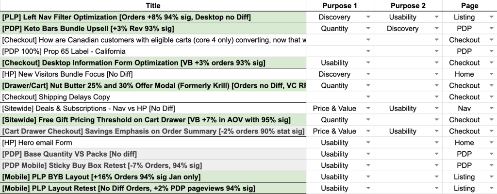
End every analysis with a specific follow-up test. Not “we should explore this further.” An actual named next test. This is what keeps a program moving instead of restarting the idea hunt every two weeks.
Applying the Framework to Mobile
Most ecommerce stores now get more mobile traffic than desktop, and mobile conversion rates are typically around half of desktop rates. That gap is the single largest unexplored area in most testing programs.
Three adjustments when you apply the framework to mobile:
Run the purpose audit separately for mobile and desktop. The winning purposes frequently differ, and a combined ledger averages away the difference. Expect Usability to pay off more on mobile, where form fields, tap targets, and extra checkout steps create friction that desktop users barely notice.
Discovery is often the mobile bottleneck. Mobile collapses the entire catalog behind the hamburger menu, one hidden click away from every visitor. We’ve tested exposing category links directly on the mobile homepage (we call it a Link Bar) and saw pageviews of those category landing pages increase 10% to 12% with 99%+ significance, along with a likely lift in completed orders. Our study of the top 40 U.S. ecommerce sites’ mobile checkouts is a useful starting list of further mobile test candidates.
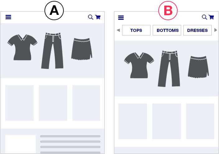
QA every variation across devices before launch. A variation that’s broken on one popular device produces a false loss, which enters your purpose ledger and misleads your strategy for months.
When an A/B Testing Framework Is Worth Building (ROI Prerequisites)
None of the above is worth doing at every company. Two rough criteria: $2 million or more in annual revenue and 100,000 or more monthly unique visitors. Enough traffic to reach meaningful sample sizes, and enough revenue that a percentage lift is worth the effort. The numbers are arbitrary in the way a driver’s license age is arbitrary: don’t argue the exact digits, adjust them for your business.
A reasonable planning assumption: a 10% revenue increase within about 6 months. At $5,000/month in testing costs, that’s $30,000 spent against a $200,000 annual lift on $2 million in revenue. Above $10 million, starting a program is a no-brainer. Below $1 million the math gets murky, and businesses at that level usually have bigger fruit hanging: we’ve seen client traffic double from one year to the next through SEO or paid media. If that’s still available to you, pick it first. The full ROI math is here, including agency costs versus in-house. And no one can predict your exact result, including us, but 10% in 6 months is achievable and our agency has hit it multiple times for multiple businesses.
The corollary rule. Meeting the thresholds gives you the potential for a good ROI, not a guarantee. If you’ve been testing for six months without routine lifts of 5% to 10% or more in orders, your framework isn’t working. That’s usually a strategy problem, not a traffic problem.
Common A/B Testing Framework Mistakes
Most “mistakes to avoid” lists are about statistics. These are the ones that happen at the framework level, which cost more.
Testing best practices without asking whether that purpose is even a barrier. Free shipping banners don’t help a store whose customers already know shipping is free. We removed two form fields for one client and saw no difference across nearly 100 conversion events per variation, while a messy-form cleanup we cited in the same article apparently lifted submissions 35%. Same purpose, opposite results, which is why the ledger has to be built per store.
Only testing one purpose because it’s the easiest to build. Usually Usability, because it needs no new copy, no photography, and no merchandising approval. Meanwhile Brand, Price & Value, and Quantity go untouched for a year.
Testing low-leverage pages. Blog templates, About pages, and low-traffic landing pages are safe to test and rarely worth testing. Checkout and payment steps convert lifts directly into revenue.
Building one design concept for an important test. Design details can decide the outcome, so one mediocre execution can bury a good idea, and you’ll write the idea off rather than the design.
Letting a web design agency roll out a full redesign untested. It isn’t in their interest to find out whether the new design performs worse than the original. Test it in phases and find out which elements helped and which hurt.
Aside: we once had an in-house designer at a client ask if they could put a hamburger menu on desktop because it “looked sleek.” That’s test selection without a framework.
A/B Testing Frameworks vs. A/B Testing Tools
Some people arrive at this topic looking for a tool recommendation, so briefly:
Platforms like Optimizely, VWO, and Adobe Target handle randomization, visual editors, variation delivery, goal tracking, and significance calculation. Any of them can run the framework described in this article. We’ve run it in all three, and compared them at length here (no affiliate relationship with any of them).
The tool decides how you serve a test. The framework decides which test is worth serving. The second decision has far more effect on your results, which is why switching platforms rarely fixes a program that has no framework. Whatever tool you use, the framework requirements are identical.
How Growth Rock Runs This Framework for Ecommerce Brands
Growth Rock is a CRO agency that works exclusively with ecommerce brands. We built the Purpose Framework and the Question Mentality out of running hundreds of A/B tests for ecommerce clients, because we needed a way to make test number 40 smarter than test number 4.
As a service, we run everything in this article for you: purpose tagging and analysis, variation design (multiple concepts on important tests), coding, goal and analytics setup, cross-device QA, and preview links so your team reviews every variation before it goes live. We also maintain a live database of the A/B tests we’ve run, organized by purpose, so you can look at the results behind the framework before you commit to anything.
Typical outcomes are conversion lifts of 5% to 10% or more, higher average order value, and a documented understanding of what motivates your specific customers. Best fit: ecommerce brands doing $2M+ in annual revenue with enough traffic to run meaningful tests, especially teams tired of settling site debates by opinion.
And as always: don’t assume any result in this article will apply to your store. What wins depends on your customers, and the only way to find out what they care about is to ask them with tests.
Learn more about working with us here, or join our email list to get new articles and A/B tests when we publish them.
How to Build a CRO Strategy (The 8-Purpose Framework We Use on 200+ Tests a Year)
Most conversion rate optimization (CRO) “strategies” look like this. A team gathers in a conference room, everyone throws out their favorite pet idea, the loudest voice wins, and a test goes live. Six months later there’s a spreadsheet of wins and losses and no clearer idea of what actually makes customers buy.
We call this tunnel vision testing, and years ago, with the benefit of hindsight, we were doing it too.
The more sophisticated version has its own problems. Teams write a hypothesis (“adding a video will increase conversion rate”), which biases them toward a result, tempts them to stop the test the moment it’s trending their way, and turns every outcome into a referendum on somebody’s judgment. And because each test is isolated, learning doesn’t accumulate. Test 40 is its own independent idea tested in a silo so it teaches you no more than test 4 did.
We’ve been running A/B tests for ecommerce brands for 10 years, at a rate of roughly 200 a year, and we catalog every one of them publicly. Our strategy is built specifically to avoid those problems. In this article we’ll cover:
- How to decide whether CRO is even the right investment right now, using revenue and traffic thresholds, so you don’t build a strategy you can’t statistically run.
- How to define what you’re trying to learn, not only what you’re trying to lift, so tests answer business questions instead of settling arguments.
- How to categorize every test by Purpose (Brand, Discovery, Product Appeal, Product Detail, Price & Value, Usability, Quantity, Scarcity) so you can see which types of changes move the needle for your specific store.
- Why we replaced hypotheses with questions, which removes bias, prevents stopping tests early, and multiplies what you learn from each one.
- How to track the full funnel KPIs — add to cart, cart views, checkout steps, revenue, AOV — because that’s how you understand why a test won or lost.
- How to analyze by segment and turn every result into the next test, so your roadmap compounds instead of resetting each month.
Note: if you’d rather have someone run this for you, you can learn about our ecommerce CRO agency here.
A CRO Strategy Is a Plan for What You’ll Learn, Not a List of Changes You’d Like to Make
A CRO strategy is a systematic plan for what you’ll test, in what order, and what you intend to learn from it. That’s the difference between a real conversion rate optimization strategy and a to-do list of CRO tactics.
Tactics are the individual changes: moving a call-to-action (CTA), rewriting a product description, cutting a form field, adding a review widget to the PDP (product detail page). Strategy is what decides which of those is worth your next two weeks.
Here’s the tell that a team has tactics but no strategy. They can list the tests they ran, but they can’t tell you what those tests collectively taught them about their customers. Most CRO programs are heavy on tactics but completely missing strategy. Everyone has ideas of what to test, but they are testing them all as one off AB tests, there’s no connecting through-line, no strategy. .
Some clients ask about implementing CRO “best practices” for their ecommerce store but even most “best practice” tactics are borrowed from someone else’s store or from competitor analysis, which means they are specific to the products, customers and details of that brand and may not work with yours. We’ve watched plenty of popular “best practices” lose or do nothing at all for our clients. Reducing form fields is a classic example. We removed “How did you hear about us?” and “What industry are you in?” from a SaaS client’s form and after almost 100 conversion events per variation there was no difference — if anything, the fewer fields were trending toward hurting conversion rates. “Less form fields is better” is a popular best practice. It just wasn’t a real problem for that company’s users.
A working CRO strategy produces two things over time: revenue lift, and an accumulated understanding of what makes your specific customers buy. The second one is what makes the first one repeatable.
Before You Build a CRO Strategy: Do You Have the Traffic and Revenue for It?
Almost no one asks this first, and it’s the question that decides whether everything below is worth your time.
Two rough criteria: roughly $2 million or more in annual revenue and roughly 100,000 monthly unique visitors.
The traffic threshold is a bit arbitrary, but 100,000 is a nice round number that’s easy to remember, that’s why we cite it.. A/B tests actually need conversions, not visits, to reach statistical significance, and typically we look for around 3000 conversions per month. At a 3% conversion rate (a generous estimate for most brands), that works out to 100,000 visitors, hence us citing that number. If your store gets less than 3000 conversions per month, we suggest focusing on growing traffic rather than AB testing.
The revenue side is often ignored but just as important because AB testing isn’t free. At $2 million, a single test producing a 10% lift is $200,000 a year. Round math on a typical CRO engagement with an agency like ours is $10,000 a month, so $120,000 per year. So $2 million of annual revenue, with a couple winning tests a year is likely to get you ROI on that CRO agency, but below that it starts to get questionable. We broke down the full ROI math here if you want to run your own numbers.
Aside: these cutoffs are guidelines, not laws. Don’t apply them to the exact digit. The principle underneath is what matters: compare the revenue increase CRO could realistically produce against what the same money would produce in SEO, content marketing, paid media, or product.
One corollary most guides skip. Meeting the thresholds only creates the potential for good ROI. You still need to actually produce consistent 5 to 10% lifts in orders, and ad hoc conference room testing rarely delivers that.
Step 1: Define What You’re Trying to Learn, Not Only What You’re Trying to Lift
Set one revenue-level program goal tied to the business. “Increase revenue per session by 6% in two quarters” is a goal. “Improve conversions” isn’t.
Then split your test intent into two categories. Tests meant to earn are the likely wins that fund the program and keep stakeholders happy. Tests meant to learn are the bigger questions: does this target audience respond to price framing, does ingredient detail matter, does a bundle change what people buy?
Learning goals matter because the winning variation is the smallest thing a test produces. Understanding why it won is what makes the next five tests better.
A useful exercise: write down the business questions your leadership team actually argues about.
- Do customers care about ingredient detail, or is that our own obsession?
- Does free shipping messaging beat a discount?
- Do people need to see the product in use before they’ll buy?
- Are our “luxury” shoppers really insensitive to promotions, or do we just assume that?
That last one is worth dwelling on. We had a luxury apparel client selling $2,000 handbags and $4,000 coats, and everyone’s thinking was that these customers aren’t price-constrained, so department-store tactics like promos and coupon codes wouldn’t move them. Price & Value ended up being one of their highest win-rate categories. Their luxury shoppers did notice those things and were affected by them.
Those arguments are your testing themes, and they’re better roadmap material than any list of UI tweaks.
One warning. Be careful with vanity conversion goals. Newsletter signups, bounce rate, and add to cart clicks are easy to move. On an ecommerce site, optimize toward transactions, revenue, and average order value. It’s easy to make clicks on some element go up. It’s harder to get more people to buy from your store.
Step 2: Research Where the Real Barriers Are (Usability vs. Desirability)
Before you build a roadmap, figure out which of two problems you have.
Every proposed change to your site falls into one of two buckets. This was our original framework, before we developed the Purpose Framework. Usability changes make it easier for a customer to get from A to B. Desirability changes make B more worth getting to.
Usability changes: reducing form fields, cutting distractions, moving elements above the fold, faster load times, faster page load speed, bigger CTAs, clearer navigation. None of them make anyone want the product more.
Desirability changes: clearer value propositions, benefit-led copy, customer testimonials, trust badges and other trust signals, product video, reassurance copy near the buy button.
In our experience, changes that affect a user’s desire to check out usually have a bigger impact than reducing friction, largely because most modern ecommerce sites already have good enough user experience. Guessing the wrong bucket costs you months. A store whose target audience is twenty-somethings who live on their phones may have no meaningful usability problem at all, and a bigger add to cart button will not fix a trust problem or a price-to-value problem.
Which bucket to focus on is a user research question. On-page polls, post-purchase surveys, session recordings, live user testing, review mining, and drop-off points in your analytics will all tell you more than a conference room will.
Pro Tip: run research in parallel with your first tests. Most agency processes ask you to pause for six to ten weeks of discovery before a single test goes live. You can start testing the obvious things while the user feedback comes in.
Step 3: Build Your Test Roadmap Around the 8 Purposes
This is the part that turns a list of tests into strategic CRO.
Every A/B test on an ecommerce site can be categorized by the purpose it serves. (We go deeper on the mechanics in our A/B testing framework guide.) These are the eight buckets in our Purpose Framework:
- Brand – Increase trust, credibility, or appeal of the overall brand.
- Discovery – Make it easier to find or discover the right product.
- Product Appeal – Make individual products more appealing with messaging, positioning, or imagery.
- Product Detail – Highlight details (ingredients in a lotion, specs on a car part) that help customers choose.
- Price & Value – Make the price-to-value ratio better.
- Usability – Reduce UX friction, like cutting form fields or using a zip code lookup to auto-fill city and state at checkout.
- Quantity – Increase average order value or cart size.
- Scarcity – Create urgency by highlighting limited time or limited quantity.
Tag every test with its purpose. Some tests get two — our review star rating test was Product Appeal and Brand, because a star rating is social proof that makes both the individual product and the overall brand more appealing. Two is the practical ceiling. Past that the labels stop meaning anything.
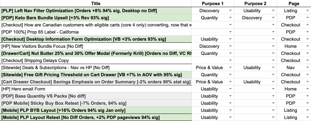
Then track which purposes win and which fall flat for your store. That pattern is your strategy.
Here’s what that looks like in practice. For one food client with 30 to 50 products, Discovery and Quantity were winning more than half the time. We dug in and found the pattern was a series of cart upsell tests, labeled both Discovery and Quantity because presenting upsells helps shoppers discover new products and increases cart size. So we kept tapping on those two purposes with more tests, and they kept moving the needle.
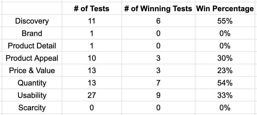
The same graph works in reverse. On another client we saw a wall of Usability tests and almost no Brand tests, for a client whose brand was their single biggest asset. Nobody decided that. It just happened. Big picture strategy is hard. Testing UX minutiae is easy.
After 15 or 20 tagged tests you know whether your customers respond to product detail or to price framing, and you can put your next quarter behind the answer instead of behind a guess.
It also solves the too-many-cooks problem. Ideas stop competing on volume and start getting slotted into purposes, then prioritized against what the evidence from your own store already says.
Step 4: Prioritize Tests by Revenue Impact, Not Page Traffic
Where a lift lands in the customer journey changes what it’s worth.
A 25% lift on the payment step is a 25% increase in transactions. A 25% lift in add to cart rate, on a store where only 40% of cart additions go on to check out, works out to 25% × 40%, or roughly a 10% increase in transactions. Same headline number, less than half the impact.
That’s why cart and checkout tests are usually the highest-leverage work on the roadmap. Any lift at the bottom of the sales funnel goes straight to your bank account.
Weigh traffic volume too. A brilliant test on a page with 800 monthly visitors will never reach significance, no matter how good the idea is.
Balance the roadmap between quick, low-build tests that keep momentum and bigger swings on high-traffic templates like the PDP, collection pages, and paid landing pages.
Mobile deserves disproportionate space on your roadmap. Most stores crossed over from majority-desktop to majority-mobile traffic years ago, and we typically see mobile conversion rates hover around half of desktop. That gap is the massive elephant in the room for most ecommerce stores, and usually the largest single opportunity on the site. It’s why we analyzed the mobile checkout flows of the top 40 ecommerce sites in the U.S. feature by feature.
If you want a concrete starting list of candidates, work through our ecommerce CRO checklist. Score tests by expected revenue impact, build effort, and how much you’ll learn. Not by how confident someone feels about the idea.
Step 5: Frame Tests as Questions Instead of Hypotheses
Almost every CRO guide treats hypothesis-driven testing as gospel. We stopped using it, and we wrote up why at length. We call the replacement the Question Mentality.
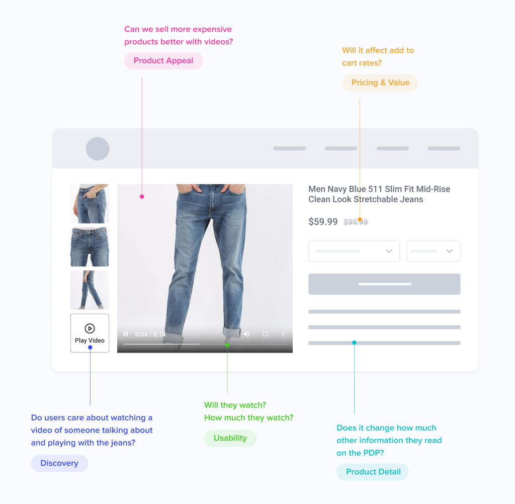
A hypothesis is a prediction, and predictions create bias. Once you’ve written down what you think will happen, you start rooting for an outcome instead of observing one. This is true even of a “good” hypothesis backed by survey data and heatmaps — arguably more so, because all that evidence convinces the team it just has to be true. And in a business setting, where money and career reputation are both at stake, that bias runs far stronger than it would in a science lab.
It shows up two ways. Teams call tests early because the numbers are trending the way they hoped, and early trends reverse constantly. Then the test ends, everyone pats themselves on the back or shrugs, and nobody asks what actually happened.
So instead of “adding a video will increase conversion rate,” we write a list of questions:
- Do users care about watching a video? Will they actually play it?
- How far into the video do they get?
- Of only the users who watched, how much did their conversion rate change versus users who didn’t?
- Does it affect add to cart rate?
- Does it change how much of the rest of the page they read?
- Does it change average order value, or just conversion rate?
Questions produce learning whether the variation wins, loses, or does nothing at all, which means no test is wasted. We don’t run A/B tests because we’re sure of the result. We run them because we aren’t sure.
There’s a practical side effect too. Every question you write implies a goal you need to track, so the question list forces a better measurement setup before the test ever launches.
Step 6: Set Up Full-Funnel Goal Tracking So You Learn Why, Not Just Whether
This is where most in-house programs fail, and we’ve written a full breakdown of the goal setup.
Tracking only transactions tells you a test lost. Tracking the conversion funnel tells you it lost because add to cart clicks went up but checkout starts went down, which is a completely different and far more useful piece of information.
Use a standard goal set on every test: transactions, revenue, add to cart clicks, cart page views, and pageviews of each step in your checkout flow.
Then add unique goals for the specific element you changed: video plays, accordion opens, size guide clicks, image swipes, review expansions. That’s how you find out whether anyone engaged with your idea at all. On one apparel test we ran Hotjar heatmaps and found that only 2 of 348 desktop users clicked the size guide link in its original position, and only 3 of 1,356 mobile users tapped it. Those two numbers reframed the whole test.
Use both pageview goals and click goals. Clicks show intent, pageviews confirm the user actually got there.
Integrate your testing tool with Google Analytics or Adobe Analytics so you can validate results and analyze metrics the testing tool never captured.
Finally, track AOV and revenue per visitor alongside conversion rate. Quantity-purpose tests can raise revenue meaningfully while leaving conversion rate flat. On one cart upsell test, average order value increased by $55 with 92% statistical significance after 41 days, over 4,000 transactions and $5,600,000 in tracked revenue. If conversion rate had been our only number, we’d have called that test a dud.
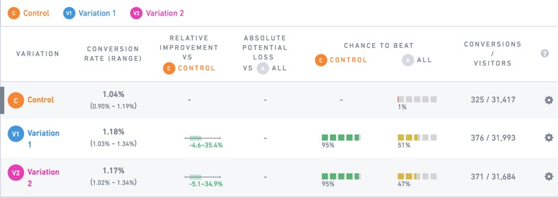
In our experience, when a variation is a clear winner, all or most goals trend upward together. When they don’t agree, that disagreement is the finding.
Step 7: Design, Build, and QA Variations That Don’t Undermine the Test
A test only measures your idea if the execution is good. An ugly or off-brand variation tests your design skills, not your concept.
For high-stakes tests, develop multiple design concepts rather than betting the whole idea on one execution. If a big idea loses, you want to know it was the idea and not the layout.
Design variations to pixel precision, and check visual consistency with the rest of the page. New elements that don’t match the site read as third-party ads, and users skip right past them. We ran a test where swapping lifestyle photos for product-only photos increased proceed-to-checkout by 13.5% — and mind you, both our team and the client’s design team preferred the lifestyle photos.
Code and QA across devices and browsers before launch. Flicker, broken mobile layouts, and misfiring goals all produce false losses, and a false loss is worse than no test, because you’ll wrongly cross a good idea off the list.
Give stakeholders preview links so the debate about the variation happens before the test goes live, not in week two.
This step is also where in-house programs bottleneck. Strategy gets approved, the roadmap looks great, and then the first variation sits in a dev queue for a quarter behind feature work.
Step 8: Analyze by Segment and Feed Learnings Back Into the Roadmap
Don’t stop at won or lost. Write down how the result changes your current understanding of which purposes matter to your customers.
Segment every result: new vs. returning visitors, traffic source, device, mobile vs. desktop. A flat overall result often hides a strong win in one segment and a loss in another, and that’s a finding, not noise.
Then read the whole funnel to explain the outcome. A/B tests tell you what happened, and you have to interpret why. State plainly what you now believe about your customers, and hold it loosely. It’s an interpretation, not a fact.
Be honest about how much weight a result can carry. We ran a size guide test that showed a 22% conversion rate increase, and we still told readers to take it with a grain of salt: it ran 10 days with under 200 conversions per variation, despite clearing 95% significance.
Every test should generate at least one follow-up: a refinement, a bigger version of the same idea, or a test of the same purpose on a different template.
Keep a searchable repository tagged by purpose, page, build size, and outcome, so patterns surface across dozens of tests instead of dying in old slide decks. We track six page categories — home, navigation, listing, PDP, checkout, and sitewide — alongside the purpose tags, so we can see which pages we’re over-testing as well as which purposes.
This is what makes CRO compound. Test 40 should be smarter than test 4 because of everything in between.
How to Use Your CRO Strategy to De-Risk a Redesign
A redesign is the single largest uncontrolled change most ecommerce brands ever make to their site. Plenty of good-looking redesigns lose revenue, and because they launch all at once, nobody can say which part did the damage. Our position on this is blunt: rolling out a large change without testing it first is irresponsible.
So test the redesign against the current site before full rollout, and where possible break it into testable pieces so you can tell which elements help and which hurt. And be careful if the design agency argues you should skip the test — it isn’t in their interest to find out whether the new design performs better. Customers and their wallets are the true, and ruthless, judge of whether the site is “better.”
Common CRO Strategy Mistakes We See at $2M+ Ecommerce Brands
- Obsessing over button colors and CTA copy. The vast majority of the time these make no difference. Pick something and save your mental energy for the roadmap.
- Stopping tests early on a promising trend. Statistical significance alone isn’t enough. You need enough conversion events and enough calendar time, and we rarely stop a test before it’s run two full weeks.
- Treating research as a one-time six-to-ten-week project rather than an ongoing input to the roadmap.
- Ignoring mobile, despite it being the majority of traffic at roughly half the conversion rate.
- Testing the loudest voice’s ideas first. This makes CRO a political process instead of a learning one, and the quiet cost is that people stop proposing bold tests.
- Building an in-house team before the volume justifies it. Internal headcount almost always costs more than an agency.
Agency vs. In-House: Who Should Run Your CRO Strategy
When we surveyed the market, conversion rate optimization agencies charged somewhere between $2,000 and $15,000 per month, with the more experienced ones toward the middle and high end of that range. (That was an un-scientific survey and it’s a few years old now, so treat it as a rough map, not a price list. For reference, our own retainer sits at $7,000 to $12,000 per month.)
Building in-house almost always costs more once you account for the roles a real program needs: a strategist, a designer, a front-end developer, and someone who can actually do the analyze results.
In-house wins on institutional context and dev access. Agencies win on pattern recognition, because they’ve run hundreds of tests across many stores and have seen which purposes tend to matter for which kinds of products.
A hybrid is common. An agency runs strategy, design, build, and data analysis, while your team owns the site and has final say on prioritization.
Whichever route you pick, judge it on consistent 5 to 10% lifts in orders and on how much you’re actually learning. Not on test volume.
How Growth Rock Builds and Runs CRO Strategies for Ecommerce Brands
We’re a boutique CRO agency working exclusively with ecommerce brands. We’ve been doing this for 7 years and have run hundreds of A/B tests for brands including TOMS, Denon, Empire Today, Amerisleep, Kettle & Fire, and Edible Arrangements.
Every program runs on the Purpose Framework and the Question Mentality — the two things described above. Clients learn which types of changes actually move their conversion rate and stop spending time on the ones that don’t.
We handle execution end to end: research, pixel-precise designs, multiple concepts on important tests, coded variations, full-funnel tracking setup, cross-device QA, and preview links before launch. We’re platform agnostic across the major CRO tools: Convert, VWO, Optimizely, and Adobe Target.
Our reports explain why a result happened, by segment and by funnel step, in terms of what it changes about our understanding of your customers. Every report ends with a recommended follow-up test.
And we maintain a live public database of every A/B test we’ve run, organized by purpose, so you can see our results — including the losers — before you ever talk to us. We also anonymize our clients in case studies, and that link explains why.
An ongoing program like this works best for stores doing at least 3,000 monthly transactions, and our ideal clients are above 20,000. If that’s you and you want an evaluation of your conversion opportunities, you can apply to work with us here.
Want more?
- Join our email newsletter to get our latest articles and AB tests
- Our foundational Purpose Framework for Ecommerce CRO
- Why we base AB tests on Questions Instead of Hypotheses
- When AB testing is worth it (the full ROI math)
- Our mobile checkout study of the top 40 U.S. ecommerce sites
- All of our articles