


A PDP (product detail page) is where a shopper decides whether to buy. Imagery, title, price, variant selectors, reviews, shipping details, specs, and the add-to-cart button all live there, competing for attention in a space that is usually one screen wide on a phone.
PDP optimization is the practice of systematically testing changes to that page to increase add-to-cart rate, conversion rate, and average order value from the traffic you already have.
PDP traffic is the most qualified traffic you get. Someone on a product page has already self-selected past your ads, your search results, and your listing pages, and improving the conversion rate of that traffic is usually cheaper than buying more of it.
One clarification before we go further. In the mobile app world, “Product Page Optimization” refers to Apple’s native App Store A/B testing feature for icons and screenshots. Different topic. This guide is about the ecommerce version, the product detail page on your own store.
Note: if you’d rather have us run this for you, you can learn about our ecommerce CRO agency here.
Why Most PDP Optimization Doesn’t Produce Lifts
There is a ton of advice online about how to best design an ecommerce product page. Most of it is just over-extending best practices to beyond where they apply. Here’s what our experience has taught us…
Best-practice checklists are averages, and averages don’t describe your customers. We’ve run the same PDP change on two different stores and watched it win on one and lose on the other. A checklist that says “always put reviews above the fold” is describing thousands of stores, most of which don’t sell what you sell to who you sell it to. Stop obsessing over best practices. Yes, some of the most common sense ones are reasonable (if you’re selling apparel, good imagery is key, that’s obvious). But someone stating a detail like whether price is best above or below a product name is not really telling you a best practice. Those details differ by store.
Tunnel vision testing produces a pile of results and no understanding. Change something here because someone complained, something there because a competitor did it. Six months later you have a spreadsheet of wins and losses and no clearer picture of what your shoppers care about.
Hypothesis-driven testing creates bias. The moment someone writes “adding a video will increase conversion rate,” their judgment is attached to the outcome, and tests start getting called on day three.
Most teams track one metric. You learn whether the test won, never why, so the next test isn’t any smarter than the last one. Meanwhile layout debates get settled by whoever is most senior in the room.
Underpowered tests convince people testing doesn’t work. A brand with low PDP traffic runs a test that never reaches a conclusion and decides A/B testing isn’t for them. The test design was the problem, not the method.
The 8 Purposes of Every PDP Test
Here’s the framework we use to get out of the “what should we test next?” argument.
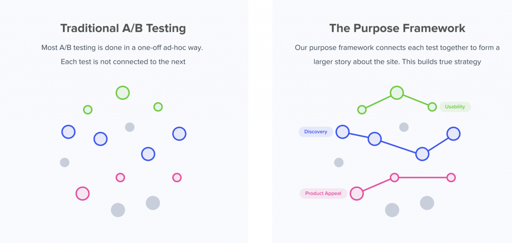
Instead of debating individual ideas, we categorize every possible change to an ecommerce site into one of 8 purposes. You then test themes rather than one-offs, and over time you learn which themes move your customers.
- Product Appeal. Making the item more desirable through imagery, positioning, and benefit-led copy. Swapping studio shots for lifestyle photography, or leading the description with an outcome instead of a feature.
- Product Detail. Surfacing the specifics that let a shopper choose confidently. Ingredients in a lotion, fitment specs on a car part, fabric and care instructions, sizing guidance.
- Price & Value. Improving the price-to-value ratio. Bundling, per-unit pricing, financing messaging, free shipping thresholds, or reframing what’s included.
- Usability. Anything that helps reduce friction on the path to add to cart. Simplifying variant selectors, sticky add-to-cart, collapsing or expanding long accordions, and general user experience cleanup.
- Brand. Increasing trust and credibility. Customer reviews placement, guarantees, press mentions, trust signals, clear return policies, sourcing or founder story.
- Quantity. Raising average order value and cart size. Subscribe-and-save, quantity discounts, promotions, complementary product modules, post-add-to-cart upsells.
- Scarcity. Creating urgency with low-stock indicators, back-in-stock timing, or limited-run messaging.
- Discovery. Helping the shopper who landed on the wrong PDP get to the right one. Product recommendations, best sellers, comparison modules, size or shade finders.
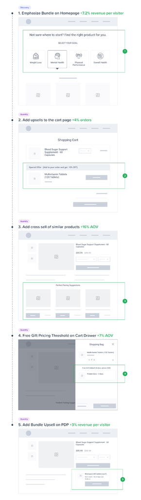
The value isn’t in the categories, it’s in tracking them. Log every test by purpose and after ten or fifteen tests you have a picture of your customer no single test could give you. If Product Detail keeps winning and Scarcity keeps losing, your shoppers are researchers rather than impulse buyers. That redirects your next five tests, and it feeds your wider ecommerce strategy: listing pages, emails, and ad creative can all stop leaning on urgency and start leaning on specificity.
How to Choose What to Test First
Start with research, not ideas. On-page polls, post-purchase surveys, session recordings, and live user tests will tell you whether shoppers are struggling to act or simply don’t want the product enough. Guessing wrong is expensive: you can test in the wrong purpose for months and then conclude your site is “already optimized.”
If shoppers navigate the page fine and still leave, your barriers are on the desirability side: appeal, detail, price and value, brand. Bigger buttons won’t help. If they clearly want the product but stall at variant selection or hunt for shipping information, your barriers are usability.
Prioritize by traffic times potential impact, and check the device split first. A template-wide change, or one to your top ten SKUs, will almost always beat a clever change to one long-tail product.
Write each test as a set of questions rather than a prediction. This is what we call the Question Mentality, and it’s the easiest upgrade to how most teams test. Instead of “adding a video will increase conversion rate,” ask:
- Do users press play?
- How far do they watch?
- Does it change add-to-cart rate?
- Does it change how much of the product description they read?
Same test, same code. But now every outcome teaches you something, nobody’s reputation is riding on it, and there’s no incentive to stop early.
PDP Elements Worth Testing (With Results From Ours)
None of the following are guaranteed wins. They’re purposes to test, and the point of the test is learning what your customers respond to.
Image gallery and media. Number of images, which image comes first, video placement, whether zoom or 360 views increase purchase confidence. Watch page speed while you add media, since loading speed affects both rankings and conversion rates. We ran a test where product-only photos increased proceed-to-checkouts 13.5% with 97% statistical significance, while the lifestyle photo variation showed no significant difference in any key metric. Both our team and the client’s design team had preferred the lifestyle photos.
Ratings and reviews. Placement above versus below the fold, prominence of the star rating near the price, review count, pulling review snippets into the buy box as social proof, and adding customer photos or other user-generated content (UGC) alongside the gallery. Adding a star rating summary to the top of a luxury apparel client’s PDP increased conversion rate 15% with 94% significance and revenue per session 17% with 97%. Notably, add-to-cart rate didn’t move at all, which told us the reviews were persuading people after they’d added to cart.
Variant selection. Swatches versus dropdowns. Showing out-of-stock variants versus hiding them. Pre-selecting your best seller instead of forcing a choice.
Add-to-cart. For a supplement client, a sticky add-to-cart area produced 7.9% more orders with 99% significance on desktop, and a slide-up version lifted mobile orders 5.2% with 98% significance. Also worth testing: CTA copy, quantity selector placement, and whether a mini-cart drawer outperforms a redirect to the full cart page.
Price and value framing. Per-unit pricing, savings percent, bundles versus single units as the default, financing and payment options messaging, free shipping thresholds near the price rather than in a banner. We tested adding a savings percentage twice for the same client. The first test showed no difference across 280,000 visitors per variation. The second, after we varied the discount by product instead of applying one flat rate, showed a 2.57% conversion lift with 99% significance. One failed pricing test doesn’t close the question.
Product detail presentation. Accordions versus expanded product descriptions, spec tables listing product attributes, ingredient callouts, comparison charts, and fit and sizing guidance. Moving a size guide link closer to the size selector raised conversion rate 22% for an apparel client, though we published that one with a caveat: it ran 10 days with under 200 conversions per variation.
Trust and risk reduction. Shipping and returns information in the buy box instead of the footer, plainly worded return policies, delivery-date estimates, trust signals near the CTA, and clearer warranty terms.
Subscription, quantity, and scarcity offers. Subscribe-and-save framing and default selection, quantity discounts, multi-pack presentation, low-stock indicators, and order-by-X-for-delivery-by-Y messaging.
Discovery modules. Product recommendations, recently viewed items, “complete the look,” and size or shade finders for shoppers who landed on the wrong PDP.
Cross-sell and upsell modules. These often lift AOV while slightly reducing conversion rate, which is why you need both metrics to judge the net effect. A module that drops conversion 1% and raises AOV 6% is a win. A module that drops conversion 4% and raises AOV 2% is not.
Mobile PDP Optimization: Where Most of the Money Is Hiding
Mobile optimization deserves its own pass. Most ecommerce stores now get more mobile traffic than desktop, and mobile conversion rates typically run around half of desktop rates. Put those together and the mobile PDP is usually where the largest single opportunity sits.
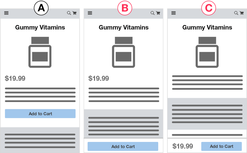
The buy box stacks vertically instead of sitting beside the imagery, so ordering decisions matter far more than on desktop. What a shopper sees before their first scroll effectively is your PDP. Common friction points we see repeatedly:
- Variant selectors sized for a mouse, not a thumb
- Add-to-cart pushed below a long block of description copy
- Image galleries that give no visual signal that more photos exist
- Accordions that hide the one specification the shopper came to find
We analyzed the mobile checkout and product experiences of the 40 largest U.S. ecommerce sites. Treat the recurring patterns there as a shortlist of test candidates rather than a to-do list.
One process rule that matters more on mobile than anywhere else: always analyze PDP tests by device separately. A change that wins on desktop and loses on mobile shows up as “no difference” in the aggregate, and you throw away a real insight along with the test. We saw this directly in the savings-percent test, where the lift was 3.61% on mobile with 99% significance but only 2.22% on desktop with 89%.
How to Measure PDP Tests So You Learn Why, Not Just Whether
Set a standard goal set on every test: add-to-cart clicks, cart page views, key checkout step views, transactions, and revenue. Seeing where a lift appears and where it disappears is what tells you what actually changed. A test that lifts add-to-cart 8% and transactions 0% is telling you something specific: you pulled more people into the cart who weren’t ready to buy.
That divergence is common on PDPs, and it’s worth understanding why. In our experience, clicking add to cart is often just a way for shoppers to “bookmark” an item while they keep browsing. We routinely see add-to-cart rates as high as 15% from the PDP when purchase rates are around 5%. The buying journey is not the linear funnel most org charts assume.
Add custom goals for the element you changed. Video plays, gallery swipes, size guide opens, review expansions, accordion clicks. If nobody interacted with the thing you added, a flat result stops being a mystery.
Remember the funnel math. A 25% lift in add-to-cart, on a site where 40% of carts complete checkout, is roughly a 10% revenue lift. Not 25%. Judge PDP tests by downstream revenue, not by the metric closest to your change.
Analyze by segment and validate against analytics. Beyond device, new versus returning visitors, traffic source, and product category frequently move in opposite directions. Read results in GA4 or Adobe as well as the testing tool, which only measures what you told it to.
Flat and losing tests are data. A clear loss on a Scarcity test tells you your shoppers aren’t urgency-driven, and that’s worth more than a 1% win you can’t explain. Every result should end with a follow-up question: what did this teach us about which purposes matter here, and what do we want to ask next?
Testing a PDP Redesign Before You Ship It
Shipping a new PDP template untested is a coin flip on your highest-value page. A redesign bundles twenty changes at once, so if revenue drops you won’t know which one caused it, and the pressure to revert everything (including the parts that worked) will be immediate.
Running the new template as a variation against the current one gives you the net effect before rollout, and lets you keep the wins while reverting the elements that hurt. Breaking it into purpose-based chunks (imagery, detail presentation, buy box layout) is better still, because you learn which parts drove the lift.
Design agencies often argue against testing their own designs. It’s worth being blunt about why: it isn’t in their interest to find out whether the new version performs worse than the original.
Test data also settles the internal fight. “The new PDP raised add to cart 6% but reduced checkout completion” is a sentence nobody can argue with using an opinion.
How Growth Rock Approaches PDP Optimization
Growth Rock is a CRO agency working exclusively with ecommerce brands. We’ve run hundreds of A/B tests on product pages, carts, and checkouts.
We run both of the methods described above for clients: every test tagged by purpose under the Purpose Framework, and every test framed with the Question Mentality rather than a hypothesis.
We handle full execution: variation design, coding, goal and tracking setup, cross-device QA, and preview links before launch. For high-stakes tests we design multiple concepts, because an important idea shouldn’t die from one mediocre execution. Reporting goes past win/loss to what each result teaches us about which purposes matter, by segment and by funnel step, ending in a recommended follow-up test. We also maintain a live database of the tests we’ve run, organized by purpose, so you can see real results including the losers.
Typical outcomes: conversion lifts in the 5% to 10%+ range, higher AOV, and a clear answer to “what should we change next?”
If you’d like to discuss whether that describes your business, and get a few initial PDP test ideas from us, get in touch here.
Related Reading
- Our usability vs. desirability framework for CRO and A/B testing
- Our research study of mobile checkout best practices across the 40 largest U.S. ecommerce sites
- The ROI of A/B testing: when is A/B testing worth it?
- Case study: adding a sticky add-to-cart button on PDPs
- Case study: adding savings percent to pricing
- Case study: review star ratings on product pages