


Most ecommerce conversion rate optimization (CRO) checklists you’ll find online have the same problem: they present a long list of UX changes presented as best practices or “proven” tactics to increase conversion rate. Add trust badges. Reduce form fields. Add a countdown timer.
As though every ecommerce store is the same. As though the same UX is appropriate or guaranteed to lift conversion rate on every store.
It isn’t.
We’ve run hundreds of A/B tests on ecommerce sites, and we can tell you that a good chunk of those “obvious” conversion hacks do nothing. Many of them can lose, depending on the site.
So this checklist is organized differently. Instead of presenting a list of UX changes as though they’re “proven” to work, our list is about a series of questions to ask about your site, your customers, and their preferences, that teaches you which kinds of changes your customers respond to. This gives you long term learnings about what your customers prefer so you can understand them at a deep level. That’s more sustainable for long term conversion increases than some list of UX tactics.
Below is the full checklist in the order we’d audit a client store: foundations and speed first, discovery, product pages, cart and checkout, mobile, and the persuasion items (trust, price and value, quantity, scarcity). At the end, we discuss how to turn it into a test roadmap using our Purpose Framework and Question Mentality so your learnings compound.
Note: if you’d rather have us run this audit for you, you can learn about our ecommerce CRO agency here.
How to Use This Checklist: Every Item Is a Question, Not a Fix
Every item below is a candidate change, not a proven improvement for your store. What lifts revenue for one brand often does nothing (or even lowers conversion rate) for another.
Here’s a real example. The Link Bar is a term we coined for presenting easy navigation to popular product categories on mobile ecommerce experiences as an alternative to the clunky hamburger menu. But it doesn’t work every time in all stores. We’ve seen it make no difference in conversion rate for many clients despite working for many others.
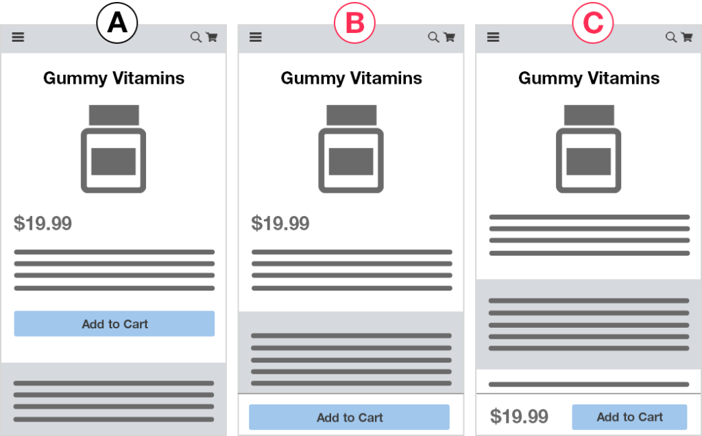
Sticky add to cart buttons are another example. In that linked case study we show results of how it helped conversion rate on two stores. But for other clients it has made no difference.
So in our experience, as we explain in our Question Mentality strategy article, we think it’s a lot more fruitful to turn each item into a set of questions instead of a prediction:
- Do users care about this at all?
- Will they actually engage with it?
- Does it change how much of the rest of the page they read?
- Does it affect add to cart, or only checkout completion?
Question framing helps you seek the truth in what users care about instead of just marking tests as winners or losers and moving on. That, combined with Purpose Framework which groups related tests into purpose buckets lets you gather long term learnings like: “Our customers are price sensitive and respond well to discounts and promotions” or “Our customers care more about product photos than written descriptions.”.
For each new UX treatment, you have three options:
- Ship it if it’s a non-controversial usability fix with no realistic downside.
- Test it if it involves design, Test it if it involves design, copy, messaging, pricing presentation, or any judgment call.
- Skip it if your platform already handles it. Most checklists never mention this option; a lot of their items are already solved by Shopify.
Foundations Checklist: Speed and the Technical Items That Actually Matter
Site speed leads nearly every CRO checklist, and for good reason, a slow site does hurt conversion rate. But they usually start with server-level items a brand on a hosted platform can’t act on. The short, honest version:
- Core pages should meet Core Web Vitals thresholds: LCP (how fast your above the fold content renders) under 2.5s, INP under 200ms, CLS under 0.1. Check mobile and desktop separately in Google PageSpeed Insights.
- Focus speed work on product and checkout pages first. Those are where load time directly costs orders.
- Fix what actually drives the scores: oversized hero images, media in the wrong format instead of WebP, missing lazy loading on below-the-fold media, render-blocking third-party scripts, layout shift from late-loading fonts and banners.
- Audit installed apps and tracking pixels quarterly. Most stores accumulate scripts nobody owns anymore.
- Skip what your platform already handles (CDN, image optimization, caching).
In our opinion you can measure conversion rate before and after (you might as well) but a slow site is just bad user experience, so if you’re significantly under those metrics you should fix that. That said, once you get close or past those thresholds, if further speed improvements will take a lot of resources, you may be in “good enough” territory and it’s better to move on.
Discovery Checklist: Can Shoppers Find the Right Product?
The Discovery purpose in our framework,making it easier to find or discover the right product, is consistently a big needle mover for stores that have a sizable number of products (more than 50). For those stores, customers buy when they find the product they love. That’s the critical moment in the buyer’s journey. So UX that helps them more easily find those products tends to win.
- Category labels should use the words your customers use, not internal or clever names. “Cocktail Dresses” beats a generic “Clothing” tab hiding them three levels down.
- Keep navigation broad and shallow, ordered by actual click volume. On mobile, consider exposing category links directly on the homepage instead of hiding everything behind the hamburger menu.
- Curated collections often outperform taxonomy. “Winter Essentials” and “Shop by Concern” give shoppers an entry point instead of making them do the work.
- Filters and sort options should reflect how people choose in your category: size, fit, concern, occasion, compatibility. Filter state should persist on the back button (a surprisingly common bug).
- Give on-site search its own audit. Your top zero-result queries are customers telling you, in their own words, what they wanted and couldn’t find.
- Test whether collection pages need more information (star ratings, price, swatches) or fewer distractions. We’ve seen it go each way.
The real question this section answers: are shoppers leaving because they can’t find products, or because they found them and weren’t convinced? Those two problems require completely different work.
Product Page Checklist: Appeal, Detail, and the Two Different Problems They Solve
Almost every checklist lumps the product page into one bucket. We split it into two, because they solve different problems.
Product Appeal items make the product more wanted:
- Benefit-led product descriptions instead of spec-led ones
- Lifestyle and in-use imagery (though we’ve seen product-only photos win, so test it)
- Positioning your value proposition against the alternative the shopper is actually considering
- Video, where it earns its place
Product Detail items help an already-motivated shopper confirm this is the right choice:
- Ingredients, materials, dimensions, compatibility
- Fit guidance and sizing charts, placed where shoppers actually look
- Full specs, especially in considered categories like supplements, auto parts, and apparel
Then the mechanical items that apply to both:
- Variant selection clarity is a frequent silent killer. Unclear size, color, or bundle choices stall shoppers who were ready to buy. Buttons or dropdown, show all options or hide some: worth testing, not guessing.
- Shipping cost, delivery estimate, and return policy belong near the buy box. Unanswered logistics questions get resolved by leaving.
- Social proof placement matters as much as its presence. We tested adding a star rating summary near the top of an apparel client’s PDP and it increased conversion rate by 15% with 94% statistical significance.
- Sticky add to cart, on both desktop and mobile. For a supplement client, a sticky add to cart area produced 7.9% more orders with 99% significance on desktop, and a slide-up version lifted mobile orders 5.2% with 98% significance.
The diagnostic question for this section: do shoppers not want it enough (appeal), or can they not confirm it’s right for them (detail)? Test both, and then you know for every product page on the site.
Cart and Checkout Checklist: The Highest-Leverage Items on the List
Per the revenue math above, this is where lifts convert most directly into money. It’s also where most stores have unglamorous, fixable problems.
- Offer guest checkout. Forced account creation is one of the most reliably expensive requirements in ecommerce. If you need accounts, offer them after the purchase.
- Introduce shipping, tax, and fees as early as possible. The shopper who abandons over a $12 shipping charge discovered on step four would often have accepted it on step one.
- Reduce fields to what you genuinely need, but treat “fewer fields is better” as a generality, not a rule (see our failed field-removal test above).
- One concrete easy win: ask for zip code first and auto-fill city and state with a free lookup API. Fewer keystrokes, no judgment calls.
- Progress indicators, correct input types, autofill attributes, and basic form accessibility, inline error messages next to the offending field, visible security badges and payment logos.
- Offer the wallets your customers actually use (Apple Pay, Google Pay, buy now pay later where it fits your price point), placed where shoppers see them before they start typing an address.
- Cart page: editable quantities, visible progress toward your free-shipping threshold, a saved cart for returning visitors, no dead-end empty-cart states.
Because checkout lifts flow straight to revenue, track every step of the checkout process: cart view, checkout start, shipping step, payment step, transaction. A variation that lifts shipping-step completion 9% but transactions 3% is telling you something specific, and you’ll miss it if your only goal was “orders.”
The Mobile Checklist: The Traffic Converting at Half Your Desktop Rate
Most stores now get more mobile traffic than desktop, and mobile conversion rates are typically around half of desktop rates. That gap makes mobile optimization the largest addressable opportunity on most sites.
Audit the mobile customer journey as its own experience, on a real phone, in one hand, not in a resized desktop browser window.
- Tap targets at least the 48x48px accessibility minimum, with real spacing, so a mis-tap doesn’t add the wrong variant to the cart.
- Form inputs at 16px or larger to prevent iOS zoom. Single-column forms only.
- Primary CTAs in the thumb-reach zone, sticky add to cart on product pages, persistent cart indicator in the header.
- Mobile checkout flow specifics: field count and ordering, keyboard type per field, address autocomplete, and how many taps sit between cart and confirmation. We analyzed the mobile checkouts of the top 40 U.S. ecommerce sites on exactly these details. Count your own taps. Most teams never have.
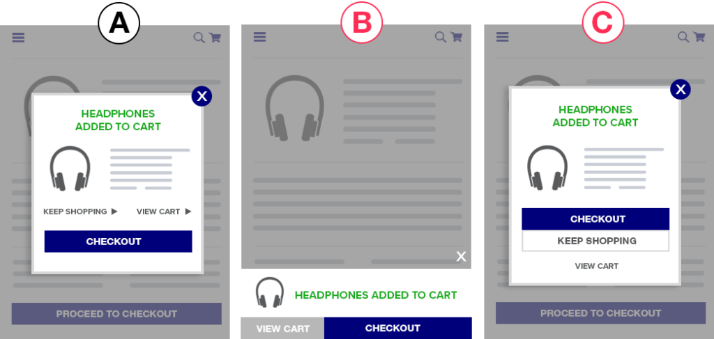
- Popups cost more on mobile, because they take over the whole screen. If you run them, test the timing and trigger, not only the design.
- Always segment test results by device. A variation that wins overall can be losing badly on mobile while desktop carries the average.
Trust, Price and Value, Quantity, and Scarcity: The Persuasion Checklist
These items map to four more purposes in our framework, and they’re the categories where “best practice” fails most often.
Brand and trust signals: aggregate customer reviews counts and cumulative brand rating; earned press mentions (real ones); category-relevant certifications; visible contact information (adding a support icon to the navbar increased conversion rate 7% with 96% significance in one of our tests); clear return, warranty, and guarantee policies.
Price and Value: free shipping thresholds and messaging, and where that messaging sits; bundle pricing; subscribe-and-save framing; financing; price presentation itself, like showing savings percentages.
Quantity (average order value): bundles and multi-buy discounts; cart upsells and cross-sells (placement matters a lot); visible progress toward the free-shipping threshold.
Scarcity: real low-stock indicators; genuine offer windows with actual end dates; back-in-stock email capture.
One warning on that last group. Fabricated scarcity erodes trust, and it does the most damage with repeat visitors, who notice your “only 3 left” badge has said “only 3 left” for six weeks.
More broadly: trust badges, countdown timers, and reassurance copy frequently produce no measurable difference in our tests. That’s not a reason to ignore them. It’s the reason they belong in a test queue rather than a deploy queue. An urgency badge that raises add to carts while leaving transactions flat manufactured intent it couldn’t sustain. You only learn that with full-funnel goals.
Before You Ship: Do You Have Enough Traffic and Revenue to Test These?
Not every store should be A/B testing this checklist. Two rough criteria: $2 million or more in annual revenue and 100,000 or more monthly unique visitors: enough conversions to reach significance, and enough revenue that a percentage lift is worth the effort. At those levels, a 10% revenue lift within about six months of consistent testing is a realistic planning assumption, and the ROI math works strongly in your favor. We break down the full math here, including costs and what changes at $500K versus $10M.
If you’re below the thresholds, work this checklist as a prioritized ship list: use the revenue math above plus session recordings and funnel data to decide the order, and revisit testing when traffic supports it.
One corollary worth sitting with: even with enough traffic, you need consistent 5% to 10% lifts to realize that ROI, not one lucky win. That consistency is exactly what ad hoc, conference-room-driven testing fails to produce.
Turn the Checklist Into a Test Roadmap So Your Learnings Compound
This is the part that determines whether six months of work leaves you with an asset or just a slightly different website.
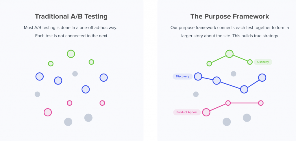
A flat checklist produces what we call tunnel vision testing: one-off tests based on the problem of the day, with nothing accumulated at the end. Our guides on building a CRO strategy and the A/B testing framework cover this in full.
The fix: tag every item you test with one of eight purposes (Brand, Discovery, Product Appeal, Product Detail, Price & Value, Usability, Quantity, Scarcity) and track which purposes win for your store. If Product Detail tests keep winning and Usability tests keep flatlining, your customers can navigate the site fine, and what they need is more information to decide. That pattern tells you where to spend the next quarter of design and dev time, and it ends recurring internal debates with evidence instead of preferences. The full method, with client case studies, is in our Purpose Framework article.
Operational rules that make it work:
- A standard goal set on every test (transactions, revenue, checkout step views, cart views, add to cart clicks) plus test-specific engagement goals: did anyone actually open the size chart?
- Analyze by segment: new vs. returning, traffic source, device. An average frequently hides two opposite stories.
- Run 2 to 3 design concepts for high-stakes items. A losing test often means a losing execution, not a losing idea, and one execution can’t tell those apart.
- Document losses and no-difference results as carefully as wins. Knowing what your customers don’t care about stops the same debate from returning next quarter.
How to Validate Each Checklist Item Before You Commit Dev Time
Before you build anything, spend a week finding out whether the item is even relevant to your store.
- Funnel drop-off analysis tells you which stage to work on, not which fix to make.
- Session recordings and heatmaps in a tool like Hotjar, filtered to abandoned carts and rage clicks, show the moment confusion sets in and whether shoppers even reach the element you’re about to redesign. The fastest way to find problems no checklist would flag.
- Polls, post-purchase surveys, and live user testing answer what a checklist can’t: why users aren’t buying. First figure that out. Then give them what they want.
- Compare your highest and lowest converting products. The differences often reveal more than any single test.
- Validate the test itself. QA across devices and browsers, confirm every goal fires, cross-check against Google Analytics, and confirm the page has enough traffic to detect the lift you care about. A broken or underpowered test is worse than no test, because you’ll act on it.
Common Mistakes Teams Make Working an Ecommerce CRO Checklist
- Shipping 15 items at once. When the number moves, you don’t know which change did it, and there’s no learning to carry forward.
- Treating a checklist as proof. “The article said to add a countdown timer” is still the loudest voice in the room, just with a citation attached.
- Starting with cosmetic sitewide tweaks while checkout and product pages carry the actual revenue leverage.
- Letting a redesign agency skip validation. A redesign is dozens of checklist changes bundled together. Test it before full rollout; a design agency has little incentive to want that answer.
- Ignoring segments, especially device, and rolling out a change that wins on desktop while losing on the majority of your traffic.
How Growth Rock Turns This Checklist Into Revenue
Growth Rock is a CRO agency working exclusively with ecommerce brands, typically $2M+ in revenue with enough traffic to run meaningful A/B tests.
We turn checklists like this into a connected testing program using the Purpose Framework and the Question Mentality, and we handle full execution: variation design, coding, goal setup, cross-device QA, and preview links before anything goes live. Reports explain why a result happened, by funnel step and segment, and end with a recommended follow-up test.
We also maintain a live database of every ecommerce A/B test we’ve run, organized by purpose, so you can see what has and hasn’t worked rather than taking best practices on faith.
Typical outcome: consistent lifts in conversion rate and AOV that compound into 10% or more revenue growth from the traffic you’re already paying for.
If you want to talk through which sections of this checklist apply to your store, you can learn about working with us here.
Our Foundational Ecommerce CRO Articles
- Our Purpose Framework
- Our Question Mentality
- Our live database of all A/B tests we’ve ever done
- Usability vs. Desirability Framework
- ROI of A/B Testing: When Is It Worth It?
1 Comment
The Complete Guide to Ecommerce Conversion Rate Optimization: Building a Strategic CRO Program That Actually Works
August 21, 2026[…] by auditing your store and your current conversion rates across device types, traffic sources, and key pages to establish […]